Issue number: internal
---------
<!-- Please do not submit updates to dependencies unless it fixes an
issue. -->
<!-- Please try to limit your pull request to one type (bugfix, feature,
etc). Submit multiple pull requests if needed. -->
## What is the current behavior?
<!-- Please describe the current behavior that you are modifying. -->
There are a few items to note:
- Styles are using a non-existing focus class. It currently uses
`.has-focus` which isn't being used anywhere within `select.tsx`. It
seems that `.has-focus` comes a copy and paste that wasn't updated.
- Icon uses the highlight color when expanded, in item, and no fill.
This leads to the styling looking weird compared to when it's not in an
item especially since labels do not change colors. Only applies to `md`
mode.
| List no lines | List with lines |
| --- | ----------- |
| 
| 
|
- The focus without a validation status does not update the border
correctly when inside an item and has a solid fill. Only applies to `md`
mode.
| Outside item | Inside item |
|--------|--------|
| 
| 
|
## What is the new behavior?
<!-- Please describe the behavior or changes that are being added by
this PR. -->
- Styles are now using the correct focus class: `.has-focus`, removing
`ion-focused`.
- If the select is inside an item and has no fill then the icon will not
use the highlight color. Only applies to `md` mode.
| List no lines | List with lines |
| --- | ----------- |
| 
| 
|
- The focus without a validation status uses the highlight color when
inside an item and has a solid fill. Only applies to `md` mode.
| Outside item | Inside item |
|--------|--------|
| 
| 
|
## Does this introduce a breaking change?
- [ ] Yes
- [x] No
<!--
If this introduces a breaking change:
1. Describe the impact and migration path for existing applications
below.
2. Update the BREAKING.md file with the breaking change.
3. Add "BREAKING CHANGE: [...]" to the commit description when merging.
See
https://github.com/ionic-team/ionic-framework/blob/main/docs/CONTRIBUTING.md#footer
for more information.
-->
## Other information
<!-- Any other information that is important to this PR such as
screenshots of how the component looks before and after the change. -->
Dev build: `8.5.4-dev.11744743162.1ec9251d`
Select cannot have a focused class and an expanded class at the same
time. It's one or the other.
---------
Co-authored-by: Brandy Smith <brandyscarney@users.noreply.github.com>
- Remove the default property value in favor of setting the default style in the CSS to match the other form controls.
- Updates the e2e test for `label` to remove the explicit width & add more examples with long labels and a default select without justify set.
Issue number: Internal

---------

<!-- Please do not submit updates to dependencies unless it fixes an
issue. -->

<!-- Please try to limit your pull request to one type (bugfix, feature,
etc). Submit multiple pull requests if needed. -->

## What is the current behavior?
<!-- Please describe the current behavior that you are modifying. -->

We add margin on content in the start/end slots so they do not run up
against either the visible text label of the text in the input. However,
we did not account for when multiple elements are placed into the same
slot. As a result, this margin is added more times than it needs to be.

## What is the new behavior?
<!-- Please describe the behavior or changes that are being added by
this PR. -->

- Updated the selector so the margin is only applied to either the last
or first element in the slot.

## Does this introduce a breaking change?

- [ ] Yes
- [x] No

<!--
  If this introduces a breaking change:
1. Describe the impact and migration path for existing applications
below.
  2. Update the BREAKING.md file with the breaking change.
3. Add "BREAKING CHANGE: [...]" to the commit description when merging.
See
https://github.com/ionic-team/ionic-framework/blob/main/.github/CONTRIBUTING.md#footer
for more information.
-->


## Other information

<!-- Any other information that is important to this PR such as
screenshots of how the component looks before and after the change. -->


Test Steps:

1. Check out `feature-8.0`
2. Add multiple `ion-button` elements into either the start or end slot
on an input (you can reuse the template in
`src/components/input/test/slots`
3. Observe that margin is added to every `ion-button`.

---------

Co-authored-by: ionitron <hi@ionicframework.com>
Issue number: Internal

---------

<!-- Please do not submit updates to dependencies unless it fixes an
issue. -->

<!-- Please try to limit your pull request to one type (bugfix, feature,
etc). Submit multiple pull requests if needed. -->

## What is the current behavior?
<!-- Please describe the current behavior that you are modifying. -->

In v7, using the legacy syntax, the height of the highlight on an item
could be adjusted using the `--highlight-height` variable. This variable
was not added to input and therefore would not work using the modern
syntax.

## What is the new behavior?
<!-- Please describe the behavior or changes that are being added by
this PR. -->

Adds the `--highlight-height` variable to `ion-input`, `ion-textarea`
and `ion-select` so that developers can customize this height in `md`
mode. Since the highlight element is not added for `ios` mode, this
variable won't do anything for `ios`. Note that this diverges from the
v7 behavior, where setting `--highlight-height` enabled the highlight
for `ios`. A design document outlining this has been proposed here:
https://github.com/ionic-team/ionic-framework-design-documents/pull/252

## Does this introduce a breaking change?

- [ ] Yes
- [x] No

<!--
  If this introduces a breaking change:
1. Describe the impact and migration path for existing applications
below.
  2. Update the BREAKING.md file with the breaking change.
3. Add "BREAKING CHANGE: [...]" to the commit description when merging.
See
https://github.com/ionic-team/ionic-framework/blob/main/.github/CONTRIBUTING.md#footer
for more information.
-->


## Other information

<!-- Any other information that is important to this PR such as
screenshots of how the component looks before and after the change. -->

---------

Co-authored-by: Brandy Carney <brandyscarney@users.noreply.github.com>
Issue number: internal

---------

## What is the current behavior?

In Ionic Framework v7, we [simplified the select
syntax](https://ionic.io/blog/ionic-7-is-here#simplified-form-control-syntax)
so that it was no longer required to be placed inside of an `ion-item`.
We maintained backwards compatibility by adding a `legacy` property
which allowed it to continue to be styled properly when written in the
following way:

```html
<ion-item>
  <ion-label>Label</ion-label>
  <ion-select></ion-select>
</ion-item>
```

While this was supported in v7, console warnings were logged to notify
developers that they needed to update this syntax for the best
accessibility experience.

## What is the new behavior?

- Removes the `legacy` property and support for the legacy syntax.
Developers should follow the [migration
guide](https://ionicframework.com/docs/api/select#migrating-from-legacy-select-syntax)
in the select documentation to update their apps. The new syntax
requires a `label` or `aria-label` on `ion-select`:
    ```html
    <ion-item>
      <ion-select label="Label"></ion-select>
    </ion-item>
    ```
- Removes the legacy tests under under `select/test/legacy/` and all
related screenshots
- Removes the select usage from `item/test/disabled`,
`item/test/legacy/alignment`, and `item/test/legacy/disabled` and all
related screenshots if the test was removed

## Does this introduce a breaking change?

- [x] Yes
- [ ] No

1. Developers have had console warnings when using the legacy syntax
since the v7 release. The migration guide for the new select syntax is
outlined in the [Select
documentation](https://ionicframework.com/docs/api/select#migrating-from-legacy-select-syntax).
2. This change has been documented in the Breaking Changes document with
a link to the migration guide.

BREAKING CHANGE:

The `legacy` property and support for the legacy syntax, which involved
placing an `ion-select` inside of an `ion-item` with an `ion-label`,
have been removed from select. For more information on migrating from
the legacy select syntax, refer to the [Select
documentation](https://ionicframework.com/docs/api/select#migrating-from-legacy-select-syntax).

---------

Co-authored-by: ionitron <hi@ionicframework.com>
Issue number: N/A

---------

<!-- Please do not submit updates to dependencies unless it fixes an
issue. -->

<!-- Please try to limit your pull request to one type (bugfix, feature,
etc). Submit multiple pull requests if needed. -->

## What is the current behavior?
<!-- Please describe the current behavior that you are modifying. -->

Buttons slotted in the start/end slots of input, textarea, or select
have a lot of excess padding that can cause them to look misaligned from
other pieces such as the control's label, especially when using
`fill="clear"`.

## What is the new behavior?
<!-- Please describe the behavior or changes that are being added by
this PR. -->

Padding removed, and a border radius added so that non-clear buttons as
well as the focus state on clear buttons still look okay. Existing
screenshot tests have also been updated to include buttons (non-clear
ones so you can see the border radius in the screenshots).

Let me know if you think this should go on a feature branch instead. I
chose `main` because the current experience looks somewhat broken and we
just did a minor release recently, but this could be considered a
notable enough behavior change.

## Does this introduce a breaking change?

- [ ] Yes
- [x] No

<!-- If this introduces a breaking change, please describe the impact
and migration path for existing applications below. -->


## Other information

<!-- Any other information that is important to this PR such as
screenshots of how the component looks before and after the change. -->

---------

Co-authored-by: ionitron <hi@ionicframework.com>
Issue number: Internal

---------

<!-- Please do not submit updates to dependencies unless it fixes an
issue. -->

<!-- Please try to limit your pull request to one type (bugfix, feature,
etc). Submit multiple pull requests if needed. -->

## What is the current behavior?
<!-- Please describe the current behavior that you are modifying. -->

We currently apply a workaround to `ion-select` so it can wrap correctly
inside of `ion-item`:
357b8b2beb/core/src/components/select/select.scss (L99-L103)

However, this causes issues when a parent element has `display: flex`
because the `ion-select` width becomes 0.

## What is the new behavior?
<!-- Please describe the behavior or changes that are being added by
this PR. -->

- In order to get the desired behavior, we need the `ion-select` (and
other elements in the default slot) to either truncate or wrap within
its own container and then have the entire container (i.e. the entire
`ion-select`) wrap to the next line once the container is too small.

To achieve this, I needed to set a min-width on `.item-inner` to define
the point at which the element should wrap to the next line. I also
changed the flex basis from `auto` to `0` which means the initial main
size of the flex item will be 0px. In reality, this will be
`--inner-min-width` since we also set `min-width:
var(--inner-min-width)`. I used `0` for simplicity but I can change this
to use the CSS variable if that's more clear. Since we also set
`flex-grow: 1` we indicate that the element can grow from that basis
(but it cannot shrink).

I chose `--inner-min-width: 4rem` to minimize the number of diffs. We
can certainly change this, but it may cause some diffs as certain
elements will start wrapping sooner. I also chose to use `rem` because
having a fixed min-width means that fewer characters are going to fit in
the same space as text scales.

I made this a CSS variable but left it undocumented. If developers need
a way of changing this `min-width` they can request it and we can easily
expose this variable. However, I think `4rem` is small enough that this
should be sufficient.

## Does this introduce a breaking change?

- [ ] Yes
- [x] No

<!-- If this introduces a breaking change, please describe the impact
and migration path for existing applications below. -->


## Other information

<!-- Any other information that is important to this PR such as
screenshots of how the component looks before and after the change. -->

The visual diffs here are correct. The table below shows the screenshot
group and an explanation for why the changes are correct.


| Path | Example | Details |
| - | - | - |
| `disabled` |
[Link](https://github.com/ionic-team/ionic-framework/pull/28631/files#diff-d529716f95f7a7aa82c88588104220775b728af67077f48cd47a8afa04423143)
| The searchbar is able to shrink slightly to fit on the same line as
the checkbox at the bottom. |
| `highlight` |
[Link](https://github.com/ionic-team/ionic-framework/pull/28631/files#diff-0b64f24c91393923701d1ced4e330a1c6b926d72ee461b8ab1e135e708be3457)
| We're changing how small the main content can get, so the input is
only wrapping once it gets to `--inner-min-width`. |
| `legacy/fill` |
[Link](https://github.com/ionic-team/ionic-framework/pull/28631/files#diff-2ef8dbfa5e69e2b96c3e1ed29ab962f08cf5ba2aaf2af773e40bd143e38a4bef)
| We're changing how small the main content can get, so the input is
only wrapping once it gets to `--inner-min-width`. |
| `slotted-inputs` |
[Link](https://github.com/ionic-team/ionic-framework/pull/28631/files#diff-2f173c7303969d6a6c58f30a618cebc3caf918d3761fc83df5642fd48dfabd7b)
| We're changing how small the main content can get, so the range is
only wrapping once it gets to `--inner-min-width`. |

`slotted-inputs` note: I'd argue many of these examples are not best
practices. For example, adding a range in the start slot and the end
slot is a bit unusual. I'm not aware of any native apps that implement
this pattern.

popover note: I [removed the `ion-item` from the `popover/test/async`
test](331fcb859c).
There was a diff because the min-width increased, but IMO that component
should not be used in the popover test since we want to test the
popover, not the item.

--------

Demo:

| `feature-7.6` | `branch` |
| - | - |
| <video
src="https://github.com/ionic-team/ionic-framework/assets/2721089/693d4947-fa33-460d-bc7f-7b96b6338032"></video>
| <video
src="https://github.com/ionic-team/ionic-framework/assets/2721089/df35ca73-87aa-4e76-9bb7-99f0f2810640"></video>
|

(In this demo I updated the `ion-select` to wrap within its own
container first instead of truncate. We may want to consider doing this
by default, but I think this is out of scope for this task)

---------

Co-authored-by: ionitron <hi@ionicframework.com>
Co-authored-by: Brandy Carney <brandy@ionic.io>
Issue number: Resolves#26297
---------
<!-- Please do not submit updates to dependencies unless it fixes an
issue. -->
<!-- Please try to limit your pull request to one type (bugfix, feature,
etc). Submit multiple pull requests if needed. -->
## What is the current behavior?
<!-- Please describe the current behavior that you are modifying. -->
With the modern form control syntax, it is not possible to add icon
buttons or other decorators to the sides of `ion-input`, `ion-textarea`,
or `ion-select`, as you can with `ion-item`.
## What is the new behavior?
<!-- Please describe the behavior or changes that are being added by
this PR. -->
`start` and `end` slots added to each component.
This PR is a combination of several others that were already approved.
If needed, it might be easiest to review the PRs individually by looking
at the commit history here.
## Does this introduce a breaking change?
- [ ] Yes
- [x] No
<!-- If this introduces a breaking change, please describe the impact
and migration path for existing applications below. -->
## Other information
<!-- Any other information that is important to this PR such as
screenshots of how the component looks before and after the change. -->
Docs PR: https://github.com/ionic-team/ionic-docs/pull/3271
Dev build: `7.5.4-dev.11701112913.1ea61220`
---------
Co-authored-by: ionitron <hi@ionicframework.com>
Co-authored-by: Maria Hutt <thetaPC@users.noreply.github.com>
Co-authored-by: Liam DeBeasi <liamdebeasi@users.noreply.github.com>
aIssue number: resolves#28388
---------
<!-- Please do not submit updates to dependencies unless it fixes an
issue. -->
<!-- Please try to limit your pull request to one type (bugfix, feature,
etc). Submit multiple pull requests if needed. -->
## What is the current behavior?
<!-- Please describe the current behavior that you are modifying. -->
We added a `min-height: 56px` to the input, textarea, and select
components for MD mode. However, these were added for the outline/solid
style inputs to align with the Material Design spec:
https://material-components.github.io/material-components-web-catalog/#/component/text-field
They should not apply to regular inputs in an item. The end result is
inconsistently sized items when used with non-control items.
## What is the new behavior?
<!-- Please describe the behavior or changes that are being added by
this PR. -->
- Non-filled and non-stacked/floating label controls are now have a
minimum height of 44px.
There should be **no changes** to the following types of controls:
1. iOS controls (all variants)
2. MD filled controls
3. MD stacked controls
## Does this introduce a breaking change?
- [ ] Yes
- [x] No
<!-- If this introduces a breaking change, please describe the impact
and migration path for existing applications below. -->
## Other information
<!-- Any other information that is important to this PR such as
screenshots of how the component looks before and after the change. -->
Dev build: `7.5.2-dev.11697818830.1a33c881`
---------
Co-authored-by: ionitron <hi@ionicframework.com>
1) Wraps the label text and other content in an item when there is not enough room for everything to fit, instead of truncating the label with an ellipsis. Does not apply to items containing legacy inputs.
2) Passes the legacy property up to item from checkbox, input, radio, range, select, textarea and toggle. Item adds classes for all of these and does not wrap its contents if that class exists. If a developer is using a legacy input without the legacy property on it then they will need to add the legacy property to prevent the wrapping.
3) If a developer does not want the text to wrap for labels in modern items, the `ion-text-nowrap` class can be added to the label.
Issue number: resolves#27184
---------
## What is the current behavior?
The modern form controls do not use the same opacity for their labels
when disabled, resulting in inconsistent UI when using two different
types in the same view (select vs checkbox, for example).
## What is the new behavior?
The checkbox, input, radio, range, select, textarea and toggle labels
have been updated on both modes to use the same opacity as each other
when disabled. The checkbox and radio icons have been updated to use a
different opacity than the label for `md` mode.
- Updates `ios` mode so all form controls use the same opacity of `0.3`
- I could not find any guidelines by Apple for what color these should
be, so I decided to just make them the same as what is most commonly
used & match item
- Updates `md` mode so all form control labels use the same opacity of
`0.38`
- I used the [Material Design 3
documentation](https://m2.material.io/components) to get this number as
well as the opacity of the disabled selection controls in the [Material
Design 2 figma design
kit](https://www.figma.com/community/file/778763161265841481). The
Material Design 2 documentation does not mention the opacity, but this
is also the number used by Material Design 1 so it's safe to assume it
is what the disabled form labels should also use for Material Design 2.
- Updates the `md` range so the slotted elements are also included when
setting the opacity on the label
- Updates the range, radio & checkbox tests to make sure there are
screenshots in the different disabled states
- Updates the item/disabled test to include radio & textarea so you can
see all form controls side by side
## Does this introduce a breaking change?
- [ ] Yes
- [x] No
## Other information
I downloaded screenshots of the item disabled tests and put them side by
side for `main` and this branch in order to see the differences in the
labels. The grey boxes to the left of each item are just a bigger
version of the label color for that item, so it's easier to see when
they aren't the same.


---------
Co-authored-by: ionitron <hi@ionicframework.com>
Issue number: resolves#27129
---------
<!-- Please do not submit updates to dependencies unless it fixes an
issue. -->
<!-- Please try to limit your pull request to one type (bugfix, feature,
etc). Submit multiple pull requests if needed. -->
## What is the current behavior?
<!-- Please describe the current behavior that you are modifying. -->
Material Design has 16px of margin between the form control and the
label, but we have 8px:
https://m2.material.io/components/selection-controls#usage
## What is the new behavior?
<!-- Please describe the behavior or changes that are being added by
this PR. -->
- Updates default margin from 8px to 16px for checkbox, input, radio,
range, select, textarea, and toggle.
Note: This should only apply to labels that are on the same line as the
form control. In other words, they do not apply to stacked/floating
labels.
## Does this introduce a breaking change?
- [ ] Yes
- [x] No
<!-- If this introduces a breaking change, please describe the impact
and migration path for existing applications below. -->
## Other information
<!-- Any other information that is important to this PR such as
screenshots of how the component looks before and after the change. -->
---------
Co-authored-by: ionitron <hi@ionicframework.com>
Issue number: resolves#27116
---------
<!-- Please do not submit updates to dependencies unless it fixes an
issue. -->
<!-- Please try to limit your pull request to one type (bugfix, feature,
etc). Submit multiple pull requests if needed. -->
## What is the current behavior?
<!-- Please describe the current behavior that you are modifying. -->
With `ion-input`, `ion-select`, or `ion-textarea` using
`fill="outline"`, applying a large value for the `--border-radius` CSS
prop causes the radius to render differently on the left and right
sides:

This is due to the structure of the outline container, which is used to
render the empty space in the border when a `stacked` or `floating`
label floats upwards. The container has three pieces, which combine to
form a seamless-looking border:
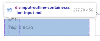
The issue is that the browser will only render a radius that fits within
the element's dimensions, and the piece on the left side (or right on
RTL) is not wide enough.
## What is the new behavior?
<!-- Please describe the behavior or changes that are being added by
this PR. -->
While we could fix this issue by making the left-side piece wider (and
there was originally a PR for this at
https://github.com/ionic-team/ionic-framework/pull/27459), it was
decided to not include this fix in Ionic automatically. This is because
the fix does not work for `label-placement="stacked"` or `"floating"`;
the notch spacer (the middle piece of the outline) is pushed to the
side, leading to broken visuals:
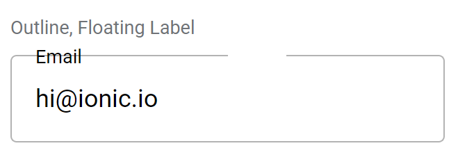
We decided that introducing inconsistent behavior across different
values for `label-placement` would be confusing for developers. Even if
we did restructure the outline container to position the notch spacer
correctly, it could easily be made to fall on the curve of the border,
creating awkward visuals.
Instead, developers looking to use a large `--border-radius` with
`fill="outline"` should either increase `--padding-start` to be at least
as high as the `--border-radius` (which will increase the width of the
left outline piece while also moving the floating label in step), or use
`shape="round"` (which will change both the padding and border radius
automatically). This PR documents this workaround in the
`--border-radius` description.
## Does this introduce a breaking change?
- [ ] Yes
- [x] No
<!-- If this introduces a breaking change, please describe the impact
and migration path for existing applications below. -->
## Other information
<!-- Any other information that is important to this PR such as
screenshots of how the component looks before and after the change. -->
Issue number: resolves#27201
---------
<!-- Please do not submit updates to dependencies unless it fixes an
issue. -->
<!-- Please try to limit your pull request to one type (bugfix, feature,
etc). Submit multiple pull requests if needed. -->
## What is the current behavior?
<!-- Please describe the current behavior that you are modifying. -->
Selects with a floating label, no value, and a placeholder should have
the label cover the placeholder when blurred. One focus, the label
should translate to the top of the select, and the placeholder should be
visible.
## What is the new behavior?
<!-- Please describe the behavior or changes that are being added by
this PR. -->
- Floating label now covers the select and hides the placeholder when
the select is blurred, matching the `ion-input` and `ion-textarea`
behaviors.
## Does this introduce a breaking change?
- [ ] Yes
- [x] No
<!-- If this introduces a breaking change, please describe the impact
and migration path for existing applications below. -->
## Other information
<!-- Any other information that is important to this PR such as
screenshots of how the component looks before and after the change. -->
---------
Co-authored-by: ionitron <hi@ionicframework.com>
Issue number: resolves#27305
---------
<!-- Please refer to our contributing documentation for any questions on
submitting a pull request, or let us know here if you need any help:
https://ionicframework.com/docs/building/contributing -->
<!-- Some docs updates need to be made in the `ionic-docs` repo, in a
separate PR. See
https://github.com/ionic-team/ionic-framework/blob/main/.github/CONTRIBUTING.md#modifying-documentation
for details. -->
<!-- Please do not submit updates to dependencies unless it fixes an
issue. -->
<!-- Please try to limit your pull request to one type (bugfix, feature,
etc). Submit multiple pull requests if needed. -->
## What is the current behavior?
<!-- Please describe the current behavior that you are modifying. -->
Checkbox, radio, range, select, and toggle take up 100% of its width
even when in a start/end slot.
## What is the new behavior?
<!-- Please describe the behavior or changes that are being added by
this PR. -->
- Checkbox, radio, range, select, and toggle do not take up 100% of its
width even when in a start/end slot.
. The "no slot" behavior is unchanged and aligns with the legacy select.
## Does this introduce a breaking change?
- [ ] Yes
- [x] No
<!-- If this introduces a breaking change, please describe the impact
and migration path for existing applications below. -->
## Other information
<!-- Any other information that is important to this PR such as
screenshots of how the component looks before and after the change. -->
Issue URL: resolves#27086
---------
<!-- Please refer to our contributing documentation for any questions on
submitting a pull request, or let us know here if you need any help:
https://ionicframework.com/docs/building/contributing -->
<!-- Some docs updates need to be made in the `ionic-docs` repo, in a
separate PR. See
https://github.com/ionic-team/ionic-framework/blob/main/.github/CONTRIBUTING.md#modifying-documentation
for details. -->
<!-- Please do not submit updates to dependencies unless it fixes an
issue. -->
<!-- Please try to limit your pull request to one type (bugfix, feature,
etc). Submit multiple pull requests if needed. -->
## What is the current behavior?
<!-- Please describe the current behavior that you are modifying. -->
When an `ion-select` is inside a card, the label is slightly lower than
it should be, making it out of alignment with the label of an
`ion-input`.
<!-- Issues are required for both bug fixes and features. -->
## What is the new behavior?
<!-- Please describe the behavior or changes that are being added by
this PR. -->
- When inside a card, the labels of `ion-input` and `ion-select` are in
line with each other.
## Does this introduce a breaking change?
- [ ] Yes
- [x] No
<!-- If this introduces a breaking change, please describe the impact
and migration path for existing applications below. -->
## Other information
<!-- Any other information that is important to this PR such as
screenshots of how the component looks before and after the change. -->
This bug was occurring because the label of ion-select is in the shadow
DOM. [As
recommended](https://github.com/ionic-team/ionic-framework/issues/27086#issuecomment-1494427311),
this fix was also added to ion-input and ion-textarea in case those
labels are also later moved to the shadow DOM.
Before:
<img width="534" alt="Screenshot 2023-04-13 at 4 35 44 PM"
src="https://user-images.githubusercontent.com/14926794/231877123-02f8e381-2137-4d3c-8dab-ae9051ad3591.png">
After:
<img width="535" alt="Screenshot 2023-04-13 at 4 36 02 PM"
src="https://user-images.githubusercontent.com/14926794/231877151-bd49b87b-762a-4d20-b6b7-57c1ab3bb368.png">
---------
Co-authored-by: ionitron <hi@ionicframework.com>
Issue URL: resolves#27208
---------
<!-- Please refer to our contributing documentation for any questions on
submitting a pull request, or let us know here if you need any help:
https://ionicframework.com/docs/building/contributing -->
<!-- Some docs updates need to be made in the `ionic-docs` repo, in a
separate PR. See
https://github.com/ionic-team/ionic-framework/blob/main/.github/CONTRIBUTING.md#modifying-documentation
for details. -->
<!-- Please do not submit updates to dependencies unless it fixes an
issue. -->
<!-- Please try to limit your pull request to one type (bugfix, feature,
etc). Submit multiple pull requests if needed. -->
## What is the current behavior?
<!-- Please describe the current behavior that you are modifying. -->
<!-- Issues are required for both bug fixes and features. -->
The `--border-radius` CSS variable was not consumed in the base select
stylesheet.
## What is the new behavior?
<!-- Please describe the behavior or changes that are being added by
this PR. -->
- Added `--border-radius` usage on `.select-wrapper`. This aligns with
input and textarea implementations:
Input:
dca31f5940/core/src/components/input/input.scss (L285)
Textarea:
dca31f5940/core/src/components/textarea/textarea.scss (L246)
## Does this introduce a breaking change?
- [ ] Yes
- [x] No
<!-- If this introduces a breaking change, please describe the impact
and migration path for existing applications below. -->
## Other information
<!-- Any other information that is important to this PR such as
screenshots of how the component looks before and after the change. -->
---------
Co-authored-by: ionitron <hi@ionicframework.com>
<!-- Please refer to our contributing documentation for any questions on
submitting a pull request, or let us know here if you need any help:
https://ionicframework.com/docs/building/contributing -->
<!-- Some docs updates need to be made in the `ionic-docs` repo, in a
separate PR. See
https://github.com/ionic-team/ionic-framework/blob/main/.github/CONTRIBUTING.md#modifying-documentation
for details. -->
<!-- Please do not submit updates to dependencies unless it fixes an
issue. -->
<!-- Please try to limit your pull request to one type (bugfix, feature,
etc). Submit multiple pull requests if needed. -->
## What is the current behavior?
<!-- Please describe the current behavior that you are modifying. -->
<!-- Issues are required for both bug fixes and features. -->
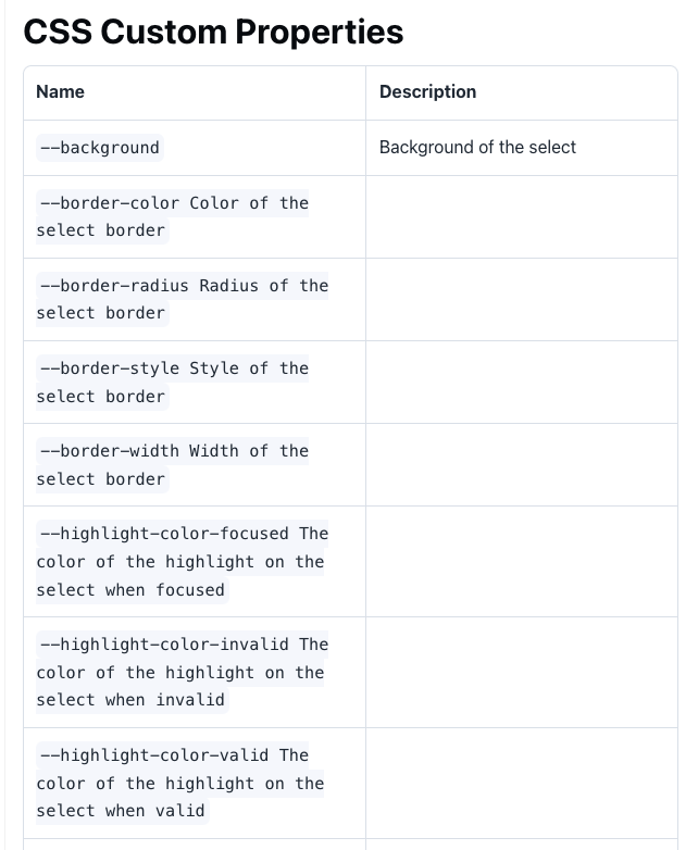
Several CSS custom properties on `ion-select` are missing a `:` which is
breaking formatting on the docs:
https://ionicframework.com/docs/api/select#css-custom-properties
## What is the new behavior?
<!-- Please describe the behavior or changes that are being added by
this PR. -->
- Adds `:` to remaining CSS props
## Does this introduce a breaking change?
- [ ] Yes
- [x] No
<!-- If this introduces a breaking change, please describe the impact
and migration path for existing applications below. -->
## Other information
<!-- Any other information that is important to this PR such as
screenshots of how the component looks before and after the change. -->
<!-- Please refer to our contributing documentation for any questions on
submitting a pull request, or let us know here if you need any help:
https://ionicframework.com/docs/building/contributing -->
<!-- Some docs updates need to be made in the `ionic-docs` repo, in a
separate PR. See
https://github.com/ionic-team/ionic-framework/blob/main/.github/CONTRIBUTING.md#modifying-documentation
for details. -->
<!-- Please do not submit updates to dependencies unless it fixes an
issue. -->
<!-- Please try to limit your pull request to one type (bugfix, feature,
etc). Submit multiple pull requests if needed. -->
## What is the current behavior?
<!-- Please describe the current behavior that you are modifying. -->
<!-- Issues are required for both bug fixes and features. -->
Issue URL: resolves#27081
When using stacked/floating labels the icon needs to be centered with
the entire component, not just the placeholder/selected text. As a
result, we set `position: absolute`. However, this causes the long
selected texts to overlap the icon. This is not happening with
non-stacked/floating labels because the icon is `position: relative` and
follows the normal document flow.
## What is the new behavior?
<!-- Please describe the behavior or changes that are being added by
this PR. -->
- Moved the icon sizes to sass variables
- Added code to set the .native-wrapper width to 100% minus the width of
the icon _and_ the additional margin that .select-icon adds
## Does this introduce a breaking change?
- [ ] Yes
- [x] No
<!-- If this introduces a breaking change, please describe the impact
and migration path for existing applications below. -->
## Other information
<!-- Any other information that is important to this PR such as
screenshots of how the component looks before and after the change. -->
---------
Co-authored-by: ionitron <hi@ionicframework.com>
Co-authored-by: Brandy Carney <brandyscarney@users.noreply.github.com>
BREAKING CHANGE:

The default value for the `--placeholder-opacity` CSS Variable on `ion-input`, `ion-searchbar`, `ion-select`, and `ion-textarea` has been updated to `0.6`.
- adds custom test for styling the select parts
- set opacity on icon container
- align items center, this makes the select text align vertically with the icon when used standalone even when changing the font size of the text
- style all slotted content to order properly in a toolbar, not only buttons
- removes duplicated sass variables
- use current color in select so icon will inherit toolbar color

BREAKING CHANGES

- Removes `--icon-color` and `--placeholder-color` from select in favor of inheritance with opacity






