mirror of
https://github.com/ionic-team/ionic-framework.git
synced 2026-03-13 10:22:08 +08:00
Compare commits
7 Commits
| Author | SHA1 | Date | |
|---|---|---|---|
|
bd1f207db5 | ||
|
|
cc91da867e | ||
|
|
3a9b679962 | ||
|
|
2bdaadddfb | ||
|
|
644f9f4627 | ||
|
|
e27bb2e862 | ||
|
|
f9f1775241 |
2
.github/ISSUE_TEMPLATE.md
vendored
2
.github/ISSUE_TEMPLATE.md
vendored
@@ -1,4 +1,4 @@
|
||||
<!-- Before submitting an issue, please consult our docs (https://ionicframework.com/docs/) and API reference (https://ionicframework.com/docs/api/) -->
|
||||
<!-- Before submitting an issue, please consult our docs (https://beta.ionicframework.com/docs/) and API reference (https://beta.ionicframework.com/docs/api/) -->
|
||||
|
||||
<!-- Please make sure you are posting an issue pertaining to the Ionic Framework. If you are having an issue with the Ionic Appflow services (Ionic View, Ionic Deploy, etc.) please consult the Ionic Appflow support portal (https://ionic.zendesk.com/hc/en-us) -->
|
||||
|
||||
|
||||
2
.github/ISSUE_TEMPLATE/bug_report.md
vendored
2
.github/ISSUE_TEMPLATE/bug_report.md
vendored
@@ -1,7 +1,7 @@
|
||||
---
|
||||
name: Bug Report
|
||||
about: Create a report to help us improve
|
||||
title: 'bug: '
|
||||
title: ''
|
||||
labels: ''
|
||||
assignees: ''
|
||||
---
|
||||
|
||||
2
.github/ISSUE_TEMPLATE/feature_request.md
vendored
2
.github/ISSUE_TEMPLATE/feature_request.md
vendored
@@ -1,7 +1,7 @@
|
||||
---
|
||||
name: Feature Request
|
||||
about: Suggest an idea for this project
|
||||
title: 'feat: '
|
||||
title: ''
|
||||
labels: ''
|
||||
assignees: ''
|
||||
---
|
||||
|
||||
2
.github/ISSUE_TEMPLATE/support_question.md
vendored
2
.github/ISSUE_TEMPLATE/support_question.md
vendored
@@ -1,7 +1,7 @@
|
||||
---
|
||||
name: Support Question
|
||||
about: Question on how to use this project
|
||||
title: 'support: '
|
||||
title: ''
|
||||
labels: 'ionitron: support'
|
||||
assignees: ''
|
||||
---
|
||||
|
||||
121
.github/PROCESS.md
vendored
121
.github/PROCESS.md
vendored
@@ -1,12 +1,11 @@
|
||||
# Process
|
||||
|
||||
This document is to describe the internal process that the Ionic team uses for issue management, project planning and the development workflow.
|
||||
This document is to describe the internal process that the Ionic team uses for issue management and project planning.
|
||||
|
||||
## Table of contents
|
||||
* [Project Boards](#project-boards)
|
||||
* [Managing Issues](#managing-issues)
|
||||
* [Workflow](#workflow)
|
||||
* [Releasing](#releasing)
|
||||
|
||||
## Project Boards
|
||||
|
||||
@@ -81,79 +80,11 @@ if there is no response within 30 days, the issue will be closed and locked.
|
||||
|
||||
## Workflow
|
||||
|
||||
### Overview
|
||||
|
||||
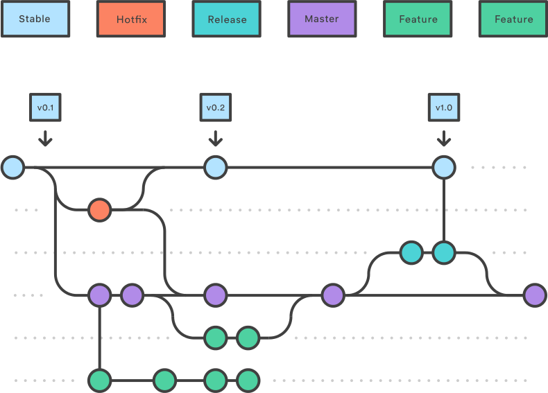
|
||||
|
||||
We have two long-living branches:
|
||||
|
||||
- `master`: completed features, bug fixes, refactors, chores
|
||||
- `stable`: the latest release
|
||||
|
||||
The overall flow:
|
||||
|
||||
1. Feature, refactor, and bug fix branches are created from `master`
|
||||
1. When a feature, refactor, or fix is complete it is merged into `master`
|
||||
1. A release branch is created from `master`
|
||||
1. When the release branch is done it is merged into `master` and `stable`
|
||||
1. If an issue in `stable` is detected a hotfix branch is created from `stable`
|
||||
1. Once the hotfix is complete it is merged to both `master` and `stable`
|
||||
1. All branches should follow the syntax of `{type}-{details}` where `{type}` is the type of branch (`hotfix`, `release`, or one of the [commit types](https://github.com/ionic-team/ionic/blob/master/.github/CONTRIBUTING.md#commit-message-format)) and `{details}` is a few hyphen separated words explaining the branch
|
||||
|
||||
### Stable and Master Branches
|
||||
|
||||
#### Stable Branch
|
||||
|
||||
Branches created from `stable`:
|
||||
|
||||
The following branch should be merged back to **both** `master` and `stable`:
|
||||
|
||||
- A `hotfix` branch (e.g. `hotfix-missing-export`): a bug fix that is fixing a regression or issue with a published release
|
||||
|
||||
A `hotfix` branch should be the **only** branch that is created from stable.
|
||||
|
||||
#### Master Branch
|
||||
|
||||
Branches created from `master`:
|
||||
|
||||
The following branches should be merged back to `master` via a pull request:
|
||||
|
||||
1. A feature branch (e.g. `feat-desktop-support`): an addition to the API that is not a bug fix or regression fix
|
||||
1. A bug fix branch (e.g. `fix-tab-color`): a bug fix that is not fixing a regression or issue with a published release
|
||||
1. All other types listed in the [commit message types](https://github.com/ionic-team/ionic/blob/master/.github/CONTRIBUTING.md#commit-message-format): `docs`, `style`, `refactor`, `perf`, `test`, `chore`
|
||||
|
||||
The following branch should be merged back to **both** `master` and `stable`:
|
||||
|
||||
1. A `release` branch (e.g. `release-4.1.x`): contains all fixes and (optionally) features that are tested and should go into the release
|
||||
|
||||
|
||||
### Feature Branches
|
||||
|
||||
Each new feature should reside in its own branch, based on the `master` branch. When a feature is complete, it should go into a pull request that gets merged back into `master`. A pull request adding a feature should be approved by two team members. Features should never interact directly with `stable`.
|
||||
|
||||
|
||||
### Release Branches
|
||||
|
||||
Once `master` has acquired enough features for a release (or a predetermined release date is approaching), fork a release branch off of `master`. Creating this branch starts the next release cycle, so no new features can be added after this point - only bug fixes, documentation generation, and other release-oriented tasks should go in this branch.
|
||||
|
||||
Once the release is ready to ship, it will get merged into `stable` and `master`, then the release branch will be deleted. It’s important to merge back into `master` because critical updates may have been added to the release branch and they need to be accessible to new features. This should be done in a pull request after review.
|
||||
|
||||
See the [steps for releasing](#releasing) below for detailed information on how to publish a release.
|
||||
|
||||
### Version Branches
|
||||
|
||||
Once a release has shipped and the release branch has been merged into `stable` and `master` it should also be merged into its corrsponding version branch. These version branches allow us to ship updates for specific versions of the framework (i.e. Lets us ship a bug fix that only affects 4.2.x).
|
||||
|
||||
Patch releases should be merged into their corresponding version branches. For example, a `release-4.1.1` branch should be merged into the `4.1.x` version branch and a `release-5.0.1` branch should be merged into the `5.0.x` version branch.
|
||||
|
||||
When releasing a major version such as `5.0.0 ` or a minor version such as `4.1.0` , the version branch will not exist. The version branch should be created once the release branch has been merged into `stable` and `master`. For example, when releasing `4.1.0`, the `release-4.1.0` release branch should be merged into `stable` and `master` and then the `4.1.x` version branch should be created off the latest `stable`.
|
||||
|
||||
|
||||
### Hotfix Branches
|
||||
|
||||
Maintenance or “hotfix” branches are used to quickly patch production releases. This is the only branch that should fork directly off of `stable`. As soon as the fix is complete, it should be merged into both `stable` and `master` (or the current release branch).
|
||||
|
||||
|
||||
### Examples
|
||||
|
||||
#### Making a Change
|
||||
@@ -180,7 +111,7 @@ Maintenance or “hotfix” branches are used to quickly patch production releas
|
||||
|
||||
1. Confirm squash and merge into `master`.
|
||||
|
||||
#### Updating from `master`
|
||||
#### Merging Changes from `master` into your Branch
|
||||
|
||||
1. Pull the latest changes locally.
|
||||
1. Merge the changes, fixing any conflicts.
|
||||
@@ -194,6 +125,23 @@ OR
|
||||
|
||||
1. Pull the merged changes locally.
|
||||
|
||||
#### Making a Release
|
||||
|
||||
1. Freeze `master`. Only the person doing the release should be modifying `master`.
|
||||
1. Follow the [Making a Change](#making-a-change) steps to prepare the release.
|
||||
|
||||
- Run `npm run release.prepare`
|
||||
- Version changes
|
||||
- `CHANGELOG.MD` tweaks
|
||||
|
||||
1. Create a PR to merge `master` into `stable`.
|
||||
1. Click **Merge pull request**. Use the dropdown to select this option if necessary. This will preserve the commit history from `master` by creating a merge commit.
|
||||
|
||||
<img width="191" alt="Merge pull request button" src="https://user-images.githubusercontent.com/236501/47032669-8be1b980-d138-11e8-9a90-d1518c223184.png">
|
||||
|
||||
1. CI builds `stable`, performing the release.
|
||||
1. Unfreeze `master`.
|
||||
|
||||
#### Hotfixes
|
||||
|
||||
Hotfixes bypass `master` and should only be used for urgent fixes that can't wait for the next release to be ready.
|
||||
@@ -217,34 +165,3 @@ Hotfixes bypass `master` and should only be used for urgent fixes that can't wai
|
||||
1. Click **Merge pull request**. Use the dropdown to select this option if necessary.
|
||||
|
||||
<img width="191" alt="Merge pull request button" src="https://user-images.githubusercontent.com/236501/47032669-8be1b980-d138-11e8-9a90-d1518c223184.png">
|
||||
|
||||
|
||||
## Releasing
|
||||
|
||||
1. Create the release branch from `master`, for example: `release-4.1.0`.
|
||||
|
||||
1. Submit a pull request from the release branch into `stable`. Do not merge this pull request yet.
|
||||
|
||||
1. Verify all tests are passing, fix any bugs if needed and make sure no undesired commits are in.
|
||||
|
||||
1. Navigate to the root of the repository while on the release branch.
|
||||
|
||||
1. Run `npm i` if it hasn't already been done.
|
||||
|
||||
1. Run `npm run release.prepare`
|
||||
- Select the version based on the type of commits and the [Ionic Versioning](https://ionicframework.com/docs/intro/versioning)
|
||||
- After the process completes, verify the version number in all packages (`core`, `docs`, `angular`)
|
||||
- Verify the changelog commits are accurate and follow the [proper format]((https://github.com/ionic-team/ionic/blob/master/.github/CONTRIBUTING.md#commit-message-format))
|
||||
- Commit these changes with the version number as the message, e.g. `git commit -m "4.1.0"`
|
||||
|
||||
1. Run `npm run release`
|
||||
|
||||
1. Click **Merge pull request**. Use the dropdown to select this option if necessary.
|
||||
|
||||
<img width="191" alt="Merge pull request button" src="https://user-images.githubusercontent.com/236501/47032669-8be1b980-d138-11e8-9a90-d1518c223184.png">
|
||||
|
||||
1. Rewrite the commit message to `merge release-4.1.0` with the proper release branch.
|
||||
|
||||
1. Create a pull request and merge the release branch back into `master` using the same commit format in the last step, to ensure any changes made on the release branch get added to future releases.
|
||||
|
||||
1. Merge the release branch into its corresponding version branch. If this is a major or minor release, create the version branch off the latest `stable`.
|
||||
|
||||
47
.github/PULL_REQUEST_TEMPLATE.md
vendored
47
.github/PULL_REQUEST_TEMPLATE.md
vendored
@@ -1,51 +1,12 @@
|
||||
<!-- Please refer to our contributing documentation for any questions on submitting a pull request, or let us know here if you need any help: https://ionicframework.com/docs/building/contributing -->
|
||||
|
||||
## Pull request checklist
|
||||
|
||||
Please check if your PR fulfills the following requirements:
|
||||
- [ ] Tests for the changes have been added (for bug fixes / features)
|
||||
- [ ] Docs have been reviewed and added / updated if needed (for bug fixes / features)
|
||||
- [ ] Build (`npm run build`) was run locally and any changes were pushed
|
||||
- [ ] Lint (`npm run lint`) has passed locally and any fixes were made for failures
|
||||
#### Short description of what this resolves:
|
||||
|
||||
|
||||
## Pull request type
|
||||
|
||||
<!-- Please do not submit updates to dependencies unless it fixes an issue. -->
|
||||
|
||||
<!-- Please try to limit your pull request to one type, submit multiple pull requests if needed. -->
|
||||
|
||||
Please check the type of change your PR introduces:
|
||||
- [ ] Bugfix
|
||||
- [ ] Feature
|
||||
- [ ] Code style update (formatting, renaming)
|
||||
- [ ] Refactoring (no functional changes, no api changes)
|
||||
- [ ] Build related changes
|
||||
- [ ] Documentation content changes
|
||||
- [ ] Other (please describe):
|
||||
|
||||
|
||||
## What is the current behavior?
|
||||
<!-- Please describe the current behavior that you are modifying, or link to a relevant issue. -->
|
||||
|
||||
Issue Number: N/A
|
||||
|
||||
|
||||
## What is the new behavior?
|
||||
<!-- Please describe the behavior or changes that are being added by this PR. -->
|
||||
#### Changes proposed in this pull request:
|
||||
|
||||
-
|
||||
-
|
||||
-
|
||||
|
||||
## Does this introduce a breaking change?
|
||||
**Ionic Version**:
|
||||
|
||||
- [ ] Yes
|
||||
- [ ] No
|
||||
|
||||
<!-- If this introduces a breaking change, please describe the impact and migration path for existing applications below. -->
|
||||
|
||||
|
||||
## Other information
|
||||
|
||||
<!-- Any other information that is important to this PR such as screenshots of how the component looks before and after the change. -->
|
||||
**Fixes**: #
|
||||
|
||||
29
.github/ionic-issue-bot.yml
vendored
29
.github/ionic-issue-bot.yml
vendored
@@ -3,26 +3,6 @@ triage:
|
||||
removeLabelWhenProjectAssigned: true
|
||||
dryRun: false
|
||||
|
||||
comment:
|
||||
labels:
|
||||
- label: "help wanted"
|
||||
message: >
|
||||
This issue has been labeled as `help wanted`. This label is added to issues
|
||||
that we believe would be good for contributors.
|
||||
|
||||
|
||||
If you'd like to work on this issue, please comment here letting us know that
|
||||
you would like to submit a pull request for it. This helps us to keep track of
|
||||
the pull request and make sure there isn't duplicated effort.
|
||||
|
||||
|
||||
For a guide on how to create a pull request and test this project locally to see
|
||||
your changes, see our [contributing documentation](https://ionicframework.com/docs/building/contributing).
|
||||
|
||||
|
||||
Thank you!
|
||||
dryRun: false
|
||||
|
||||
closeAndLock:
|
||||
labels:
|
||||
- label: "ionitron: support"
|
||||
@@ -118,15 +98,6 @@ labelPullRequest:
|
||||
|
||||
wrongRepo:
|
||||
repos:
|
||||
- label: "ionitron: capacitor"
|
||||
repo: capacitor
|
||||
message: >
|
||||
Thanks for the issue! We use this issue tracker exclusively for bug reports and feature requests
|
||||
associated with the Ionic Framework. It appears that this issue is associated with Capacitor.
|
||||
I am moving this issue to the Capacitor repository. Please track this issue over there.
|
||||
|
||||
|
||||
Thank you for using Ionic!
|
||||
- label: "ionitron: v3"
|
||||
repo: ionic-v3
|
||||
message: >
|
||||
|
||||
@@ -37,9 +37,9 @@ function checkGit(tasks) {
|
||||
{
|
||||
title: 'Check current branch',
|
||||
task: () => execa.stdout('git', ['symbolic-ref', '--short', 'HEAD']).then(branch => {
|
||||
if (branch.indexOf('release') === -1 && branch.indexOf('hotfix') === -1) {
|
||||
throw new Error(`Must be on a "release" or "hotfix" branch.`);
|
||||
}
|
||||
// if (branch !== 'master') {
|
||||
// throw new Error(`Not on "master" branch`);
|
||||
// }
|
||||
})
|
||||
},
|
||||
{
|
||||
|
||||
126
CHANGELOG.md
126
CHANGELOG.md
@@ -1,118 +1,3 @@
|
||||
# [4.3.0 Lithium](https://github.com/ionic-team/ionic/compare/v4.2.0...v4.3.0) (2019-04-17)
|
||||
|
||||
|
||||
### Bug Fixes
|
||||
|
||||
* **action-sheet:** default buttons to empty array ([9e63947](https://github.com/ionic-team/ionic/commit/9e63947))
|
||||
* **angular:** back button correctly goes back to proper tab ([#18005](https://github.com/ionic-team/ionic/issues/18005)) ([52e5a8d](https://github.com/ionic-team/ionic/commit/52e5a8d)), closes [#17278](https://github.com/ionic-team/ionic/issues/17278) [#15216](https://github.com/ionic-team/ionic/issues/15216)
|
||||
* **components:** add mode classes to components for use in shadow elements ([#17838](https://github.com/ionic-team/ionic/issues/17838)) ([e5c8c10](https://github.com/ionic-team/ionic/commit/e5c8c10)), closes [#17608](https://github.com/ionic-team/ionic/issues/17608)
|
||||
* **datetime:** date strings no longer revert to previous day ([#18018](https://github.com/ionic-team/ionic/issues/18018)) ([cc60b60](https://github.com/ionic-team/ionic/commit/cc60b60)), closes [#17977](https://github.com/ionic-team/ionic/issues/17977)
|
||||
* **input:** prevent input from losing focus when tapping clear button ([#18004](https://github.com/ionic-team/ionic/issues/18004)) ([29bb4fc](https://github.com/ionic-team/ionic/commit/29bb4fc)), closes [#18002](https://github.com/ionic-team/ionic/issues/18002)
|
||||
* **item:** use the correct input highlight for an inset line item ([#18052](https://github.com/ionic-team/ionic/issues/18052)) ([72be80c](https://github.com/ionic-team/ionic/commit/72be80c)), closes [#18051](https://github.com/ionic-team/ionic/issues/18051)
|
||||
* **item-sliding:** hide closed side options while dragging side options open ([#17986](https://github.com/ionic-team/ionic/issues/17986)) ([f13722c](https://github.com/ionic-team/ionic/commit/f13722c)), closes [#17822](https://github.com/ionic-team/ionic/issues/17822)
|
||||
* **slides:** allow zoom to work ([18b347b](https://github.com/ionic-team/ionic/commit/18b347b)), closes [#17981](https://github.com/ionic-team/ionic/issues/17981)
|
||||
* **slides:** expose interface to provide custom animations ([#17959](https://github.com/ionic-team/ionic/issues/17959)) ([4474974](https://github.com/ionic-team/ionic/commit/4474974)), closes [#16616](https://github.com/ionic-team/ionic/issues/16616)
|
||||
* **textarea:** float label when a value is changed async ([#18024](https://github.com/ionic-team/ionic/issues/18024)) ([494991e](https://github.com/ionic-team/ionic/commit/494991e)), closes [#17555](https://github.com/ionic-team/ionic/issues/17555) [#17559](https://github.com/ionic-team/ionic/issues/17559)
|
||||
* **textarea:** update label alignment for inputs and textareas ([#18042](https://github.com/ionic-team/ionic/issues/18042)) ([38ae362](https://github.com/ionic-team/ionic/commit/38ae362)), closes [#16187](https://github.com/ionic-team/ionic/issues/16187)
|
||||
* **vue:** use direction type from core ([#17901](https://github.com/ionic-team/ionic/issues/17901)) ([fa13173](https://github.com/ionic-team/ionic/commit/fa13173))
|
||||
|
||||
|
||||
### Features
|
||||
|
||||
* **toast:** add header and additional custom toast buttons ([#17147](https://github.com/ionic-team/ionic/issues/17147)) ([6e1a8f1](https://github.com/ionic-team/ionic/commit/6e1a8f1)), closes [#16791](https://github.com/ionic-team/ionic/issues/16791) [#16237](https://github.com/ionic-team/ionic/issues/16237) [#17611](https://github.com/ionic-team/ionic/issues/17611)
|
||||
* **toast:** add variables to change position start/end of toast ([#17961](https://github.com/ionic-team/ionic/issues/17961)) ([07e739a](https://github.com/ionic-team/ionic/commit/07e739a)), closes [#17854](https://github.com/ionic-team/ionic/issues/17854)
|
||||
|
||||
|
||||
|
||||
# [4.2.0 Helium](https://github.com/ionic-team/ionic/compare/v4.1.2...v4.2.0) (2019-04-03)
|
||||
|
||||
|
||||
### Bug Fixes
|
||||
|
||||
* **angular:** properly check for replaceUrl in routing ([#17879](https://github.com/ionic-team/ionic/issues/17879)) ([f2c8db9](https://github.com/ionic-team/ionic/commit/f2c8db9)), closes [#15181](https://github.com/ionic-team/ionic/issues/15181)
|
||||
* **angular:** return proper types in the overlay.getTop method ([#17802](https://github.com/ionic-team/ionic/issues/17802)) ([439b10e](https://github.com/ionic-team/ionic/commit/439b10e))
|
||||
* **angular:** support relative router links ([d9a7c63](https://github.com/ionic-team/ionic/commit/d9a7c63)), closes [#17888](https://github.com/ionic-team/ionic/issues/17888) [#16534](https://github.com/ionic-team/ionic/issues/16534) [#16736](https://github.com/ionic-team/ionic/issues/16736) [#16954](https://github.com/ionic-team/ionic/issues/16954)
|
||||
* **angular:** update ng-add schematic ([9443bfe](https://github.com/ionic-team/ionic/commit/9443bfe))
|
||||
* **css:** resolve spinner and checkbox issues on older chrome versions ([#17896](https://github.com/ionic-team/ionic/issues/17896)) ([dbb39cd](https://github.com/ionic-team/ionic/commit/dbb39cd)), closes [#17524](https://github.com/ionic-team/ionic/issues/17524) [#17501](https://github.com/ionic-team/ionic/issues/17501)
|
||||
* **datetime:** default to local date when no date given ([#17706](https://github.com/ionic-team/ionic/issues/17706)) ([bab56e8](https://github.com/ionic-team/ionic/commit/bab56e8))
|
||||
* **datetime:** recalculate day column when month or year is changed ([#17815](https://github.com/ionic-team/ionic/issues/17815)) ([9273f97](https://github.com/ionic-team/ionic/commit/9273f97)), closes [#14233](https://github.com/ionic-team/ionic/issues/14233) [#14732](https://github.com/ionic-team/ionic/issues/14732) [#15452](https://github.com/ionic-team/ionic/issues/15452) [#15794](https://github.com/ionic-team/ionic/issues/15794) [#17633](https://github.com/ionic-team/ionic/issues/16733) [#17060](https://github.com/ionic-team/ionic/issues/17060) [#17510](https://github.com/ionic-team/ionic/issues/17510) [#17521](https://github.com/ionic-team/ionic/issues/17521)
|
||||
* **item-option:** add styling and behaviour for disabled item-option ([#17909](https://github.com/ionic-team/ionic/issues/17909)) ([346ecb2](https://github.com/ionic-team/ionic/commit/346ecb2)), closes [#17905](https://github.com/ionic-team/ionic/issues/17905)
|
||||
* **progress-bar:** flip rtl using the existing reversed property ([#17464](https://github.com/ionic-team/ionic/issues/17464)) ([fccaaf8](https://github.com/ionic-team/ionic/commit/fccaaf8)), closes [#17012](https://github.com/ionic-team/ionic/issues/17012)
|
||||
* **react:** ensure tabs are resilient to optional tabs ([#17862](https://github.com/ionic-team/ionic/issues/17862)) ([c29f5a6](https://github.com/ionic-team/ionic/commit/c29f5a6))
|
||||
* **reorder-group:** add ability to reorder items inside shadow ([#17747](https://github.com/ionic-team/ionic/issues/17747)) ([352797e](https://github.com/ionic-team/ionic/commit/352797e)), closes [#17746](https://github.com/ionic-team/ionic/issues/17746)
|
||||
* **select:** update overlay options when added asynchronously ([#17860](https://github.com/ionic-team/ionic/issues/17860)) ([1ecfcd1](https://github.com/ionic-team/ionic/commit/1ecfcd1)), closes [#15716](https://github.com/ionic-team/ionic/issues/15716) [#17851](https://github.com/ionic-team/ionic/issues/17851)
|
||||
* **virtual-scroll:** use correct item top calculation with header or footer function ([#15948](https://github.com/ionic-team/ionic/issues/15948)) ([#17345](https://github.com/ionic-team/ionic/issues/17345)) ([a8a48a4](https://github.com/ionic-team/ionic/commit/a8a48a4)), closes [#17298](https://github.com/ionic-team/ionic/issues/17298)
|
||||
* **vue:** back button event handling ([#17877](https://github.com/ionic-team/ionic/issues/17877)) ([dceec07](https://github.com/ionic-team/ionic/commit/dceec07))
|
||||
* **vue:** update popover to use correct controller ([#17865](https://github.com/ionic-team/ionic/issues/17865)) ([0cb7db0](https://github.com/ionic-team/ionic/commit/0cb7db0))
|
||||
|
||||
|
||||
### Features
|
||||
|
||||
* **img:** add ionError event ([#17134](https://github.com/ionic-team/ionic/issues/17134)) ([04f931f](https://github.com/ionic-team/ionic/commit/04f931f)), closes [#16947](https://github.com/ionic-team/ionic/issues/16947)
|
||||
* **range:** add ticks attribute ([#17718](https://github.com/ionic-team/ionic/issues/17718)) ([016fa16](https://github.com/ionic-team/ionic/commit/016fa16)), closes [#17717](https://github.com/ionic-team/ionic/issues/17717)
|
||||
* **vue:** support for ion-tabs ([#17678](https://github.com/ionic-team/ionic/issues/17678)) ([ee71675](https://github.com/ionic-team/ionic/commit/ee71675))
|
||||
* **vue:** support ion-vue-router ([#17821](https://github.com/ionic-team/ionic/issues/17821)) ([71e5994](https://github.com/ionic-team/ionic/commit/71e5994))
|
||||
|
||||
|
||||
|
||||
## [4.1.2](https://github.com/ionic-team/ionic/compare/v4.1.1...v4.1.2) (2019-03-20)
|
||||
|
||||
|
||||
### Bug Fixes
|
||||
|
||||
* **chip:** use transparent outline on color chips ([#17719](https://github.com/ionic-team/ionic/issues/17719)) ([f6783db](https://github.com/ionic-team/ionic/commit/f6783db))
|
||||
* **datetime:** default to local date ([#17706](https://github.com/ionic-team/ionic/issues/17706)) ([bab56e8](https://github.com/ionic-team/ionic/commit/bab56e8))
|
||||
* **input:** use max-height for input for consistency across browsers ([#17394](https://github.com/ionic-team/ionic/issues/17394)) ([67a9137](https://github.com/ionic-team/ionic/commit/67a9137))
|
||||
* **item:** add missing ripple color CSS property ([#17814](https://github.com/ionic-team/ionic/issues/17814)) ([807820f](https://github.com/ionic-team/ionic/commit/807820f)), closes [#17523](https://github.com/ionic-team/ionic/issues/17523)
|
||||
* **item-option:** add styling for slots other than icon-only ([#17711](https://github.com/ionic-team/ionic/issues/17711)) ([14f758c](https://github.com/ionic-team/ionic/commit/14f758c)), closes [#17737](https://github.com/ionic-team/ionic/issues/17737) [#17402](https://github.com/ionic-team/ionic/issues/17402)
|
||||
* **platform:** account for larger tablets ([#17630](https://github.com/ionic-team/ionic/issues/17630)) ([29dbd07](https://github.com/ionic-team/ionic/commit/29dbd07))
|
||||
* **popover:** update animation origin in RTL/MD ([#17645](https://github.com/ionic-team/ionic/issues/17645)) ([617453b](https://github.com/ionic-team/ionic/commit/617453b)), closes [#17012](https://github.com/ionic-team/ionic/issues/17012)
|
||||
* **spinner:** fix default spinner logic for relevant components ([#17660](https://github.com/ionic-team/ionic/issues/17660)) ([9c48fa7](https://github.com/ionic-team/ionic/commit/9c48fa7)), closes [#17659](https://github.com/ionic-team/ionic/issues/17659)
|
||||
* **toggle:** do not use the contrast color for toggle inner color ([#17798](https://github.com/ionic-team/ionic/issues/17798)) ([2225941](https://github.com/ionic-team/ionic/commit/2225941)), closes [#17536](https://github.com/ionic-team/ionic/issues/17536)
|
||||
* **transition:** animate all toolbars in iOS page transitions ([#17224](https://github.com/ionic-team/ionic/issues/17224)) ([7d01207](https://github.com/ionic-team/ionic/commit/7d01207))
|
||||
|
||||
|
||||
|
||||
## [4.1.1](https://github.com/ionic-team/ionic/compare/v4.1.0...v4.1.1) (2019-03-07)
|
||||
|
||||
|
||||
### Bug Fixes
|
||||
|
||||
* **display:** update to correct css classes ([cabbeb2](https://github.com/ionic-team/ionic/commit/cabbeb2))
|
||||
|
||||
|
||||
|
||||
# [4.1.0 Hydrogen](https://github.com/ionic-team/ionic/compare/v4.0.2...v4.1.0) (2019-03-06)
|
||||
|
||||
|
||||
### Bug Fixes
|
||||
|
||||
* **angular:** fix adding [@ionic](https://github.com/ionic)/angular when using ng add ([#17597](https://github.com/ionic-team/ionic/issues/17597)) ([484d92c](https://github.com/ionic-team/ionic/commit/484d92c)), closes [#17596](https://github.com/ionic-team/ionic/issues/17596)
|
||||
* **animation:** fix header flicker on ios ([#17422](https://github.com/ionic-team/ionic/issues/17422)) ([ad20bd6](https://github.com/ionic-team/ionic/commit/ad20bd6))
|
||||
* **css:** add the missing css classes to flex and float utils ([#17570](https://github.com/ionic-team/ionic/issues/17570)) ([c49276c](https://github.com/ionic-team/ionic/commit/c49276c)), closes [#17569](https://github.com/ionic-team/ionic/issues/17569)
|
||||
* **fab:** disabled fab button no longer opens fab list ([#17620](https://github.com/ionic-team/ionic/issues/17620)) ([c475dab](https://github.com/ionic-team/ionic/commit/c475dab))
|
||||
* **img:** remove space under img ([#17582](https://github.com/ionic-team/ionic/issues/17582)) ([621c79b](https://github.com/ionic-team/ionic/commit/621c79b))
|
||||
* **item:** slotted ion-icon receives custom color ([#17585](https://github.com/ionic-team/ionic/issues/17585)) ([14dd871](https://github.com/ionic-team/ionic/commit/14dd871))
|
||||
* **item-sliding:** no longer close all open items when deleting an item ([#17579](https://github.com/ionic-team/ionic/issues/17579)) ([3de7795](https://github.com/ionic-team/ionic/commit/3de7795))
|
||||
* **loading:** add backdropDismiss to the interface ([#17668](https://github.com/ionic-team/ionic/issues/17668)) ([28fd75e](https://github.com/ionic-team/ionic/commit/28fd75e)), closes [#17369](https://github.com/ionic-team/ionic/issues/17369)
|
||||
* **popover:** update placement per md spec ([#17429](https://github.com/ionic-team/ionic/issues/17429)) ([a99d179](https://github.com/ionic-team/ionic/commit/a99d179))
|
||||
* **range:** clamp values that are out of bounds ([#17623](https://github.com/ionic-team/ionic/issues/17623)) ([5a197ca](https://github.com/ionic-team/ionic/commit/5a197ca))
|
||||
* **refresher:** check for cancelable before preventing default ([#17351](https://github.com/ionic-team/ionic/issues/17351)) ([f205b10](https://github.com/ionic-team/ionic/commit/f205b10)), closes [#15256](https://github.com/ionic-team/ionic/issues/15256)
|
||||
* **reorder:** allow sliding items to be reordered ([#17568](https://github.com/ionic-team/ionic/issues/17568)) ([3b331b5](https://github.com/ionic-team/ionic/commit/3b331b5))
|
||||
* **ssr:** fix angular global window and document references ([f44c17e](https://github.com/ionic-team/ionic/commit/f44c17e))
|
||||
* **ssr:** fix global window and document references ([#17590](https://github.com/ionic-team/ionic/issues/17590)) ([4646f53](https://github.com/ionic-team/ionic/commit/4646f53))
|
||||
* **vue:** correct passing of props and data to components ([#17188](https://github.com/ionic-team/ionic/issues/17188)) ([2ce4940](https://github.com/ionic-team/ionic/commit/2ce4940))
|
||||
|
||||
|
||||
### Features
|
||||
|
||||
* **checkbox:** implement indeterminate state ([#16951](https://github.com/ionic-team/ionic/issues/16951)) ([c641ae1](https://github.com/ionic-team/ionic/commit/c641ae1)), closes [#16943](https://github.com/ionic-team/ionic/issues/16943)
|
||||
* **css:** add CSS display utilities ([#17359](https://github.com/ionic-team/ionic/issues/17359)) ([6bea9d3](https://github.com/ionic-team/ionic/commit/6bea9d3)), closes [#10904](https://github.com/ionic-team/ionic/issues/10904)
|
||||
* **select:** add compareWith property ([#17358](https://github.com/ionic-team/ionic/issues/17358)) ([69ecebb](https://github.com/ionic-team/ionic/commit/69ecebb))
|
||||
* **skeleton-text:** adds animated prop and support for CSS styling ([#17612](https://github.com/ionic-team/ionic/issues/17612)) ([d66b12b](https://github.com/ionic-team/ionic/commit/d66b12b)), closes [ionic-team/ionic-docs#407](https://github.com/ionic-team/ionic-docs/issues/407)
|
||||
|
||||
|
||||
|
||||
## [4.0.2](https://github.com/ionic-team/ionic/compare/v4.0.1...v4.0.2) (2019-02-20)
|
||||
|
||||
|
||||
@@ -535,7 +420,7 @@ Tabs got the last bit of changes needed in order to support lazy loading of comp
|
||||
pathMatch: 'full'
|
||||
}
|
||||
];
|
||||
```
|
||||
```
|
||||
|
||||
</detail>
|
||||
|
||||
@@ -666,14 +551,14 @@ Segment Button now requires the text to be wrapped in an `ion-label` element for
|
||||
<ion-segment-button>
|
||||
Item One
|
||||
</ion-segment-button>
|
||||
```
|
||||
```
|
||||
*New usage:*
|
||||
|
||||
```html
|
||||
<ion-segment-button>
|
||||
<ion-label>Item One</ion-label>
|
||||
</ion-segment-button>
|
||||
```
|
||||
```
|
||||
|
||||
#### Simplifying Chip
|
||||
|
||||
@@ -832,8 +717,8 @@ Here, we have an `ion-tab` element that accepts an icon, a label, and a link to
|
||||
<ion-tab-bar>
|
||||
|
||||
<!-- No ion-tab, just a link that looks like a tab -->
|
||||
<ion-tab-button href="https://ionicframework.com">
|
||||
<!-- <a href="https://ionicframework.com"> -->
|
||||
<ion-tab-button href="https://beta.ionicframework.com">
|
||||
<!-- <a href="https://beta.ionicframework.com"> -->
|
||||
<ion-icon name="globe"></ion-icon>
|
||||
<ion-label>Schedule</ion-label>
|
||||
</ion-tab-button>
|
||||
@@ -2189,5 +2074,4 @@ The following dependencies need to be updated to resolve build errors
|
||||
|
||||
|
||||
<a name="0.1.0"></a>
|
||||
|
||||
## [0.1.0](https://github.com/ionic-team/ionic/commit/43a8c4c7a719169336a84964fc1c737562d764a6) (2018-03-01)
|
||||
|
||||
@@ -5,7 +5,7 @@
|
||||
|
||||
### Migration Guide
|
||||
|
||||
If you aren't sure where to start in upgrading to v4, we recommend reading through our [migration guide](https://ionicframework.com/docs/building/migration) first.
|
||||
If you aren't sure where to start in upgrading to v4, we recommend reading through our [migration guide](https://beta.ionicframework.com/docs/building/migration) first.
|
||||
|
||||
### Migration Linter
|
||||
|
||||
@@ -182,14 +182,13 @@ These have been renamed to the following, and moved from the button element to t
|
||||
|
||||
In addition, several sets of mutually exclusive boolean attributes have been combined into a single string attribute.
|
||||
|
||||
The `small` and `large` attributes are now combined under the `size` attribute. The `clear`, `outline`, and `solid` attributes have been combined under `fill`. The `full` and `block` attributes have been combined under `expand`. And, lastly, the `round` attribute is now used under `shape`.
|
||||
The `small` and `large` attributes are now combined under the `size` attribute. The `clear`, `outline`, and `solid` attributes have been combined under `fill`. And, lastly, the `full` and `block` attributes have been combined under `expand`.
|
||||
|
||||
| Old Property | New Property | Property Behavior |
|
||||
| --------------------------- | ------------ | --------------------------- |
|
||||
| `small`, `large` | `size` | Sets the button size. |
|
||||
| `clear`, `outline`, `solid` | `fill` | Sets the button fill style. |
|
||||
| `full`, `block` | `expand` | Sets the button width. |
|
||||
| `round` | `shape` | Sets the button shape. |
|
||||
|
||||
|
||||
**Old Usage Example:**
|
||||
@@ -226,10 +225,6 @@ The `small` and `large` attributes are now combined under the `size` attribute.
|
||||
<ion-button full>
|
||||
Full-width Button
|
||||
</ion-button>
|
||||
|
||||
<ion-button round>
|
||||
Round Button
|
||||
</ion-button>
|
||||
```
|
||||
|
||||
**New Usage Example:**
|
||||
@@ -256,10 +251,6 @@ The `small` and `large` attributes are now combined under the `size` attribute.
|
||||
<ion-button expand="full">
|
||||
Full-width Button
|
||||
</ion-button>
|
||||
|
||||
<ion-button shape="round">
|
||||
Round Button
|
||||
</ion-button>
|
||||
```
|
||||
|
||||
|
||||
@@ -1074,11 +1065,11 @@ async openLoading() {
|
||||
let loading = this.loadingCtrl.create({
|
||||
content: 'Loading...'
|
||||
});
|
||||
|
||||
|
||||
await loading.present();
|
||||
|
||||
|
||||
const { role, data } = await loading.onDidDismiss();
|
||||
|
||||
|
||||
console.log('Loading dismissed!');
|
||||
}
|
||||
```
|
||||
@@ -1749,19 +1740,19 @@ Changes the `font-family` of the whole page based on the mode selected (iOS or M
|
||||
The following set of CSS files are optional and can safely be commented out if the application is not using any of the features.
|
||||
|
||||
- **padding.css**
|
||||
Adds utility attributes that allow adding `padding` and `margin` attributes to any element. See [content space](https://ionicframework.com/docs/layout/css-utilities#content-space) for what this includes.
|
||||
Adds utility attributes that allow adding `padding` and `margin` attributes to any element. See [content space](https://beta.ionicframework.com/docs/layout/css-utilities#content-space) for what this includes.
|
||||
|
||||
- **float-elements.css**
|
||||
Adds utility attributes that allow adding `float` attributes to any element. See [element placement](https://ionicframework.com/docs/layout/css-utilities/#element-placement) for what this includes.
|
||||
Adds utility attributes that allow adding `float` attributes to any element. See [element placement](https://beta.ionicframework.com/docs/layout/css-utilities/#element-placement) for what this includes.
|
||||
|
||||
- **text-alignment.css**
|
||||
Adds utility attributes that allow adding text alignment attributes to any element. See [text alignment](https://ionicframework.com/docs/layout/css-utilities/#text-alignment) for what this includes.
|
||||
Adds utility attributes that allow adding text alignment attributes to any element. See [text alignment](https://beta.ionicframework.com/docs/layout/css-utilities/#text-alignment) for what this includes.
|
||||
|
||||
- **text-transformation.css**
|
||||
Adds utility attributes that allow adding text transformation attributes to any element. See [text transformation](https://ionicframework.com/docs/layout/css-utilities/#text-transformation) for what this includes.
|
||||
Adds utility attributes that allow adding text transformation attributes to any element. See [text transformation](https://beta.ionicframework.com/docs/layout/css-utilities/#text-transformation) for what this includes.
|
||||
|
||||
- **flex-utils.css**
|
||||
Adds utility attributes that allow adding flex container and item attributes to any element. See [flex properties](https://ionicframework.com/docs/layout/css-utilities/#flex-properties) for what this includes.
|
||||
Adds utility attributes that allow adding flex container and item attributes to any element. See [flex properties](https://beta.ionicframework.com/docs/layout/css-utilities/#flex-properties) for what this includes.
|
||||
|
||||
|
||||
#### Including the CSS Files
|
||||
@@ -1840,7 +1831,7 @@ p {
|
||||
|
||||
Sass variables should no longer be used to change Ionic components. We have built Ionic to be customizable using CSS variables, instead.
|
||||
|
||||
For more information on theming, check out the [theming documentation](https://ionicframework.com/docs/theming/basics).
|
||||
For more information on theming, check out the [theming documentation](https://beta.ionicframework.com/docs/theming/basics).
|
||||
|
||||
|
||||
## Toast
|
||||
|
||||
@@ -1,6 +1,6 @@
|
||||
{
|
||||
"name": "@ionic/angular",
|
||||
"version": "4.3.0",
|
||||
"version": "4.0.2",
|
||||
"description": "Angular specific wrappers for @ionic/core",
|
||||
"keywords": [
|
||||
"ionic",
|
||||
@@ -45,7 +45,7 @@
|
||||
"css/"
|
||||
],
|
||||
"dependencies": {
|
||||
"@ionic/core": "4.3.0",
|
||||
"@ionic/core": "4.0.2",
|
||||
"tslib": "^1.9.3"
|
||||
},
|
||||
"peerDependencies": {
|
||||
|
||||
@@ -3,10 +3,10 @@ import { defineCustomElements } from '@ionic/core/loader';
|
||||
import { Config } from './providers/config';
|
||||
import { IonicWindow } from './types/interfaces';
|
||||
|
||||
export function appInitialize(config: Config, doc: Document) {
|
||||
export function appInitialize(config: Config) {
|
||||
return (): any => {
|
||||
const win: IonicWindow | undefined = doc.defaultView as any;
|
||||
if (win) {
|
||||
const win: IonicWindow | undefined = window as any;
|
||||
if (typeof win !== 'undefined') {
|
||||
const Ionic = win.Ionic = win.Ionic || {};
|
||||
|
||||
Ionic.config = config;
|
||||
|
||||
@@ -1,7 +1,5 @@
|
||||
import { Attribute, ChangeDetectorRef, ComponentFactoryResolver, ComponentRef, Directive, ElementRef, EventEmitter, Injector, NgZone, OnDestroy, OnInit, Optional, Output, SkipSelf, ViewContainerRef } from '@angular/core';
|
||||
import { ActivatedRoute, ChildrenOutletContexts, OutletContext, PRIMARY_OUTLET, Router } from '@angular/router';
|
||||
import { BehaviorSubject, Observable } from 'rxjs';
|
||||
import { distinctUntilChanged, filter, switchMap } from 'rxjs/operators';
|
||||
|
||||
import { Config } from '../../providers/config';
|
||||
import { NavController } from '../../providers/nav-controller';
|
||||
@@ -15,6 +13,7 @@ import { RouteView, getUrl } from './stack-utils';
|
||||
inputs: ['animated', 'swipeGesture']
|
||||
})
|
||||
export class IonRouterOutlet implements OnDestroy, OnInit {
|
||||
|
||||
private activated: ComponentRef<any> | null = null;
|
||||
private activatedView: RouteView | null = null;
|
||||
|
||||
@@ -24,12 +23,6 @@ export class IonRouterOutlet implements OnDestroy, OnInit {
|
||||
private stackCtrl: StackController;
|
||||
private nativeEl: HTMLIonRouterOutletElement;
|
||||
|
||||
// Maintain map of activated route proxies for each component instance
|
||||
private proxyMap = new WeakMap<any, ActivatedRoute>();
|
||||
|
||||
// Keep the latest activated route in a subject for the proxy routes to switch map to
|
||||
private currentActivatedRoute$ = new BehaviorSubject<{ component: any; activatedRoute: ActivatedRoute } | null>(null);
|
||||
|
||||
tabsPrefix: string | undefined;
|
||||
|
||||
@Output() stackEvents = new EventEmitter<any>();
|
||||
@@ -89,13 +82,11 @@ export class IonRouterOutlet implements OnDestroy, OnInit {
|
||||
this.activateWith(context.route, context.resolver || null);
|
||||
}
|
||||
}
|
||||
if ((this.nativeEl as any).componentOnReady) {
|
||||
this.nativeEl.componentOnReady().then(() => {
|
||||
if (this._swipeGesture === undefined) {
|
||||
this.swipeGesture = this.config.getBoolean('swipeBackEnabled', this.nativeEl.mode === 'ios');
|
||||
}
|
||||
});
|
||||
}
|
||||
this.nativeEl.componentOnReady().then(() => {
|
||||
if (this._swipeGesture === undefined) {
|
||||
this.swipeGesture = this.config.getBoolean('swipeBackEnabled', this.nativeEl.mode === 'ios');
|
||||
}
|
||||
});
|
||||
}
|
||||
|
||||
get isActivated(): boolean {
|
||||
@@ -166,8 +157,6 @@ export class IonRouterOutlet implements OnDestroy, OnInit {
|
||||
const context = this.getContext()!;
|
||||
context.children['contexts'] = saved;
|
||||
}
|
||||
// Updated activated route proxy for this component
|
||||
this.updateActivatedRouteProxy(cmpRef.instance, activatedRoute);
|
||||
} else {
|
||||
const snapshot = (activatedRoute as any)._futureSnapshot;
|
||||
const component = snapshot.routeConfig!.component as any;
|
||||
@@ -176,25 +165,12 @@ export class IonRouterOutlet implements OnDestroy, OnInit {
|
||||
const factory = resolver.resolveComponentFactory(component);
|
||||
const childContexts = this.parentContexts.getOrCreateContext(this.name).children;
|
||||
|
||||
// We create an activated route proxy object that will maintain future updates for this component
|
||||
// over its lifecycle in the stack.
|
||||
const component$ = new BehaviorSubject<any>(null);
|
||||
const activatedRouteProxy = this.createActivatedRouteProxy(component$, activatedRoute);
|
||||
|
||||
const injector = new OutletInjector(activatedRouteProxy, childContexts, this.location.injector);
|
||||
const injector = new OutletInjector(activatedRoute, childContexts, this.location.injector);
|
||||
cmpRef = this.activated = this.location.createComponent(factory, this.location.length, injector);
|
||||
|
||||
// Once the component is created we can push it to our local subject supplied to the proxy
|
||||
component$.next(cmpRef.instance);
|
||||
|
||||
// Calling `markForCheck` to make sure we will run the change detection when the
|
||||
// `RouterOutlet` is inside a `ChangeDetectionStrategy.OnPush` component.
|
||||
enteringView = this.stackCtrl.createView(this.activated, activatedRoute);
|
||||
|
||||
// Store references to the proxy by component
|
||||
this.proxyMap.set(cmpRef.instance, activatedRouteProxy);
|
||||
this.currentActivatedRoute$.next({ component: cmpRef.instance, activatedRoute });
|
||||
|
||||
this.changeDetector.markForCheck();
|
||||
}
|
||||
|
||||
@@ -234,66 +210,6 @@ export class IonRouterOutlet implements OnDestroy, OnInit {
|
||||
getActiveStackId(): string | undefined {
|
||||
return this.stackCtrl.getActiveStackId();
|
||||
}
|
||||
|
||||
/**
|
||||
* Since the activated route can change over the life time of a component in an ion router outlet, we create
|
||||
* a proxy so that we can update the values over time as a user navigates back to components already in the stack.
|
||||
*/
|
||||
private createActivatedRouteProxy(component$: Observable<any>, activatedRoute: ActivatedRoute): ActivatedRoute {
|
||||
const proxy: any = new ActivatedRoute();
|
||||
|
||||
proxy._futureSnapshot = (activatedRoute as any)._futureSnapshot;
|
||||
proxy._routerState = (activatedRoute as any)._routerState;
|
||||
proxy.snapshot = activatedRoute.snapshot;
|
||||
proxy.outlet = activatedRoute.outlet;
|
||||
proxy.component = activatedRoute.component;
|
||||
|
||||
// Setup wrappers for the observables so consumers don't have to worry about switching to new observables as the state updates
|
||||
(proxy as any)._paramMap = this.proxyObservable(component$, 'paramMap');
|
||||
(proxy as any)._queryParamMap = this.proxyObservable(component$, 'queryParamMap');
|
||||
proxy.url = this.proxyObservable(component$, 'url');
|
||||
proxy.params = this.proxyObservable(component$, 'params');
|
||||
proxy.queryParams = this.proxyObservable(component$, 'queryParams');
|
||||
proxy.fragment = this.proxyObservable(component$, 'fragment');
|
||||
proxy.data = this.proxyObservable(component$, 'data');
|
||||
|
||||
return proxy as ActivatedRoute;
|
||||
}
|
||||
|
||||
/**
|
||||
* Create a wrapped observable that will switch to the latest activated route matched by the given component
|
||||
*/
|
||||
private proxyObservable(component$: Observable<any>, path: string): Observable<any> {
|
||||
return component$.pipe(
|
||||
// First wait until the component instance is pushed
|
||||
filter(component => !!component),
|
||||
switchMap(component =>
|
||||
this.currentActivatedRoute$.pipe(
|
||||
filter(current => current !== null && current.component === component),
|
||||
switchMap(current => current && (current.activatedRoute as any)[path]),
|
||||
distinctUntilChanged()
|
||||
)
|
||||
)
|
||||
);
|
||||
}
|
||||
|
||||
/**
|
||||
* Updates the activated route proxy for the given component to the new incoming router state
|
||||
*/
|
||||
private updateActivatedRouteProxy(component: any, activatedRoute: ActivatedRoute): void {
|
||||
const proxy = this.proxyMap.get(component);
|
||||
if (!proxy) {
|
||||
throw new Error(`Could not find activated route proxy for view`);
|
||||
}
|
||||
|
||||
(proxy as any)._futureSnapshot = (activatedRoute as any)._futureSnapshot;
|
||||
(proxy as any)._routerState = (activatedRoute as any)._routerState;
|
||||
proxy.snapshot = activatedRoute.snapshot;
|
||||
proxy.outlet = activatedRoute.outlet;
|
||||
proxy.component = activatedRoute.component;
|
||||
|
||||
this.currentActivatedRoute$.next({ component, activatedRoute });
|
||||
}
|
||||
}
|
||||
|
||||
class OutletInjector implements Injector {
|
||||
|
||||
@@ -58,25 +58,6 @@ export class StackController {
|
||||
animation = undefined;
|
||||
}
|
||||
const viewsSnapshot = this.views.slice();
|
||||
|
||||
const currentNavigation = this.router.getCurrentNavigation();
|
||||
/**
|
||||
* If the navigation action
|
||||
* sets `replaceUrl: true`
|
||||
* then we need to make sure
|
||||
* we remove the last item
|
||||
* from our views stack
|
||||
*/
|
||||
if (
|
||||
currentNavigation &&
|
||||
currentNavigation.extras &&
|
||||
currentNavigation.extras.replaceUrl
|
||||
) {
|
||||
if (this.views.length > 0) {
|
||||
this.views.splice(-1, 1);
|
||||
}
|
||||
}
|
||||
|
||||
const views = this.insertView(enteringView, direction);
|
||||
return this.wait(async () => {
|
||||
await this.transition(enteringView, leavingView, animation, this.canGoBack(1), false);
|
||||
@@ -101,23 +82,7 @@ export class StackController {
|
||||
return Promise.resolve(false);
|
||||
}
|
||||
const view = views[views.length - deep - 1];
|
||||
let url = view.url;
|
||||
|
||||
const viewSavedData = view.savedData;
|
||||
if (viewSavedData) {
|
||||
const primaryOutlet = viewSavedData.get('primary');
|
||||
if (
|
||||
primaryOutlet &&
|
||||
primaryOutlet.route &&
|
||||
primaryOutlet.route._routerState &&
|
||||
primaryOutlet.route._routerState.snapshot &&
|
||||
primaryOutlet.route._routerState.snapshot.url
|
||||
) {
|
||||
url = primaryOutlet.route._routerState.snapshot.url;
|
||||
}
|
||||
}
|
||||
|
||||
return this.navCtrl.navigateBack(url).then(() => true);
|
||||
return this.navCtrl.navigateBack(view.url).then(() => true);
|
||||
});
|
||||
}
|
||||
|
||||
|
||||
@@ -140,7 +140,7 @@ export class IonCardTitle {
|
||||
proxyInputs(IonCardTitle, ['color', 'mode']);
|
||||
|
||||
export declare interface IonCheckbox extends StencilComponents<'IonCheckbox'> {}
|
||||
@Component({ selector: 'ion-checkbox', changeDetection: 0, template: '<ng-content></ng-content>', inputs: ['color', 'mode', 'name', 'checked', 'indeterminate', 'disabled', 'value'] })
|
||||
@Component({ selector: 'ion-checkbox', changeDetection: 0, template: '<ng-content></ng-content>', inputs: ['color', 'mode', 'name', 'checked', 'disabled', 'value'] })
|
||||
export class IonCheckbox {
|
||||
ionChange!: EventEmitter<CustomEvent>;
|
||||
ionFocus!: EventEmitter<CustomEvent>;
|
||||
@@ -152,7 +152,7 @@ export class IonCheckbox {
|
||||
proxyOutputs(this, this.el, ['ionChange', 'ionFocus', 'ionBlur']);
|
||||
}
|
||||
}
|
||||
proxyInputs(IonCheckbox, ['color', 'mode', 'name', 'checked', 'indeterminate', 'disabled', 'value']);
|
||||
proxyInputs(IonCheckbox, ['color', 'mode', 'name', 'checked', 'disabled', 'value']);
|
||||
|
||||
export declare interface IonChip extends StencilComponents<'IonChip'> {}
|
||||
@Component({ selector: 'ion-chip', changeDetection: 0, template: '<ng-content></ng-content>', inputs: ['color', 'mode', 'outline'] })
|
||||
@@ -294,12 +294,11 @@ export declare interface IonImg extends StencilComponents<'IonImg'> {}
|
||||
@Component({ selector: 'ion-img', changeDetection: 0, template: '<ng-content></ng-content>', inputs: ['alt', 'src'] })
|
||||
export class IonImg {
|
||||
ionImgDidLoad!: EventEmitter<CustomEvent>;
|
||||
ionError!: EventEmitter<CustomEvent>;
|
||||
protected el: HTMLElement;
|
||||
constructor(c: ChangeDetectorRef, r: ElementRef) {
|
||||
c.detach();
|
||||
this.el = r.nativeElement;
|
||||
proxyOutputs(this, this.el, ['ionImgDidLoad', 'ionError']);
|
||||
proxyOutputs(this, this.el, ['ionImgDidLoad']);
|
||||
}
|
||||
}
|
||||
proxyInputs(IonImg, ['alt', 'src']);
|
||||
@@ -587,7 +586,7 @@ export class IonRadioGroup {
|
||||
proxyInputs(IonRadioGroup, ['allowEmptySelection', 'name', 'value']);
|
||||
|
||||
export declare interface IonRange extends StencilComponents<'IonRange'> {}
|
||||
@Component({ selector: 'ion-range', changeDetection: 0, template: '<ng-content></ng-content>', inputs: ['color', 'mode', 'debounce', 'name', 'dualKnobs', 'min', 'max', 'pin', 'snaps', 'step', 'ticks', 'disabled', 'value'] })
|
||||
@Component({ selector: 'ion-range', changeDetection: 0, template: '<ng-content></ng-content>', inputs: ['color', 'mode', 'debounce', 'name', 'dualKnobs', 'min', 'max', 'pin', 'snaps', 'step', 'disabled', 'value'] })
|
||||
export class IonRange {
|
||||
ionChange!: EventEmitter<CustomEvent>;
|
||||
ionFocus!: EventEmitter<CustomEvent>;
|
||||
@@ -599,7 +598,7 @@ export class IonRange {
|
||||
proxyOutputs(this, this.el, ['ionChange', 'ionFocus', 'ionBlur']);
|
||||
}
|
||||
}
|
||||
proxyInputs(IonRange, ['color', 'mode', 'debounce', 'name', 'dualKnobs', 'min', 'max', 'pin', 'snaps', 'step', 'ticks', 'disabled', 'value']);
|
||||
proxyInputs(IonRange, ['color', 'mode', 'debounce', 'name', 'dualKnobs', 'min', 'max', 'pin', 'snaps', 'step', 'disabled', 'value']);
|
||||
|
||||
export declare interface IonRefresher extends StencilComponents<'IonRefresher'> {}
|
||||
@Component({ selector: 'ion-refresher', changeDetection: 0, template: '<ng-content></ng-content>', inputs: ['pullMin', 'pullMax', 'closeDuration', 'snapbackDuration', 'disabled'] })
|
||||
@@ -721,7 +720,7 @@ export class IonSegmentButton {
|
||||
proxyInputs(IonSegmentButton, ['mode', 'checked', 'disabled', 'layout', 'value']);
|
||||
|
||||
export declare interface IonSelect extends StencilComponents<'IonSelect'> {}
|
||||
@Component({ selector: 'ion-select', changeDetection: 0, template: '<ng-content></ng-content>', inputs: ['mode', 'disabled', 'cancelText', 'okText', 'placeholder', 'name', 'selectedText', 'multiple', 'interface', 'interfaceOptions', 'compareWith', 'value'] })
|
||||
@Component({ selector: 'ion-select', changeDetection: 0, template: '<ng-content></ng-content>', inputs: ['mode', 'disabled', 'cancelText', 'okText', 'placeholder', 'name', 'selectedText', 'multiple', 'interface', 'interfaceOptions', 'value'] })
|
||||
export class IonSelect {
|
||||
ionChange!: EventEmitter<CustomEvent>;
|
||||
ionCancel!: EventEmitter<CustomEvent>;
|
||||
@@ -735,7 +734,7 @@ export class IonSelect {
|
||||
}
|
||||
}
|
||||
proxyMethods(IonSelect, ['open']);
|
||||
proxyInputs(IonSelect, ['mode', 'disabled', 'cancelText', 'okText', 'placeholder', 'name', 'selectedText', 'multiple', 'interface', 'interfaceOptions', 'compareWith', 'value']);
|
||||
proxyInputs(IonSelect, ['mode', 'disabled', 'cancelText', 'okText', 'placeholder', 'name', 'selectedText', 'multiple', 'interface', 'interfaceOptions', 'value']);
|
||||
|
||||
export declare interface IonSelectOption extends StencilComponents<'IonSelectOption'> {}
|
||||
@Component({ selector: 'ion-select-option', changeDetection: 0, template: '<ng-content></ng-content>', inputs: ['disabled', 'selected', 'value'] })
|
||||
@@ -749,7 +748,7 @@ export class IonSelectOption {
|
||||
proxyInputs(IonSelectOption, ['disabled', 'selected', 'value']);
|
||||
|
||||
export declare interface IonSkeletonText extends StencilComponents<'IonSkeletonText'> {}
|
||||
@Component({ selector: 'ion-skeleton-text', changeDetection: 0, template: '<ng-content></ng-content>', inputs: ['animated', 'width'] })
|
||||
@Component({ selector: 'ion-skeleton-text', changeDetection: 0, template: '<ng-content></ng-content>', inputs: ['width'] })
|
||||
export class IonSkeletonText {
|
||||
protected el: HTMLElement;
|
||||
constructor(c: ChangeDetectorRef, r: ElementRef) {
|
||||
@@ -757,7 +756,7 @@ export class IonSkeletonText {
|
||||
this.el = r.nativeElement;
|
||||
}
|
||||
}
|
||||
proxyInputs(IonSkeletonText, ['animated', 'width']);
|
||||
proxyInputs(IonSkeletonText, ['width']);
|
||||
|
||||
export declare interface IonSlide extends StencilComponents<'IonSlide'> {}
|
||||
@Component({ selector: 'ion-slide', changeDetection: 0, template: '<ng-content></ng-content>' })
|
||||
|
||||
@@ -1,4 +1,4 @@
|
||||
import { CommonModule, DOCUMENT } from '@angular/common';
|
||||
import { CommonModule } from '@angular/common';
|
||||
import { APP_INITIALIZER, ModuleWithProviders, NgModule } from '@angular/core';
|
||||
import { IonicConfig } from '@ionic/core';
|
||||
|
||||
@@ -141,8 +141,7 @@ export class IonicModule {
|
||||
useFactory: appInitialize,
|
||||
multi: true,
|
||||
deps: [
|
||||
ConfigToken,
|
||||
DOCUMENT
|
||||
ConfigToken
|
||||
]
|
||||
}
|
||||
]
|
||||
|
||||
@@ -1,5 +1,4 @@
|
||||
import { DOCUMENT } from '@angular/common';
|
||||
import { Inject, Injectable } from '@angular/core';
|
||||
import { Injectable } from '@angular/core';
|
||||
import { ActionSheetOptions } from '@ionic/core';
|
||||
|
||||
import { OverlayBaseController } from '../util/overlay';
|
||||
@@ -8,7 +7,7 @@ import { OverlayBaseController } from '../util/overlay';
|
||||
providedIn: 'root',
|
||||
})
|
||||
export class ActionSheetController extends OverlayBaseController<ActionSheetOptions, HTMLIonActionSheetElement> {
|
||||
constructor(@Inject(DOCUMENT) doc: any) {
|
||||
super('ion-action-sheet-controller', doc);
|
||||
constructor() {
|
||||
super('ion-action-sheet-controller');
|
||||
}
|
||||
}
|
||||
|
||||
@@ -1,5 +1,4 @@
|
||||
import { DOCUMENT } from '@angular/common';
|
||||
import { Inject, Injectable } from '@angular/core';
|
||||
import { Injectable } from '@angular/core';
|
||||
import { AlertOptions } from '@ionic/core';
|
||||
|
||||
import { OverlayBaseController } from '../util/overlay';
|
||||
@@ -8,7 +7,7 @@ import { OverlayBaseController } from '../util/overlay';
|
||||
providedIn: 'root',
|
||||
})
|
||||
export class AlertController extends OverlayBaseController<AlertOptions, HTMLIonAlertElement> {
|
||||
constructor(@Inject(DOCUMENT) doc: any) {
|
||||
super('ion-alert-controller', doc);
|
||||
constructor() {
|
||||
super('ion-alert-controller');
|
||||
}
|
||||
}
|
||||
|
||||
@@ -43,8 +43,9 @@ export class Config {
|
||||
export const ConfigToken = new InjectionToken<any>('USERCONFIG');
|
||||
|
||||
function getConfig(): CoreConfig | null {
|
||||
if (typeof (window as any) !== 'undefined') {
|
||||
const Ionic = (window as IonicWindow).Ionic;
|
||||
const win: IonicWindow | undefined = window as any;
|
||||
if (typeof win !== 'undefined') {
|
||||
const Ionic = win.Ionic;
|
||||
if (Ionic && Ionic.config) {
|
||||
return Ionic.config;
|
||||
}
|
||||
|
||||
@@ -23,23 +23,14 @@ export class DomController {
|
||||
}
|
||||
|
||||
function getQueue() {
|
||||
const win = typeof (window as any) !== 'undefined' ? window : null as any;
|
||||
|
||||
if (win != null) {
|
||||
const Ionic = win.Ionic;
|
||||
if (Ionic && Ionic.queue) {
|
||||
return Ionic.queue;
|
||||
}
|
||||
|
||||
return {
|
||||
read: (cb: any) => win.requestAnimationFrame(cb),
|
||||
write: (cb: any) => win.requestAnimationFrame(cb)
|
||||
};
|
||||
const Ionic = (window as any).Ionic;
|
||||
if (Ionic && Ionic.queue) {
|
||||
return Ionic.queue;
|
||||
}
|
||||
|
||||
return {
|
||||
read: (cb: any) => cb(),
|
||||
write: (cb: any) => cb()
|
||||
read: (cb: any) => window.requestAnimationFrame(cb),
|
||||
write: (cb: any) => window.requestAnimationFrame(cb)
|
||||
};
|
||||
}
|
||||
|
||||
|
||||
@@ -1,5 +1,4 @@
|
||||
import { DOCUMENT } from '@angular/common';
|
||||
import { Inject, Injectable } from '@angular/core';
|
||||
import { Injectable } from '@angular/core';
|
||||
import { LoadingOptions } from '@ionic/core';
|
||||
|
||||
import { OverlayBaseController } from '../util/overlay';
|
||||
@@ -8,7 +7,7 @@ import { OverlayBaseController } from '../util/overlay';
|
||||
providedIn: 'root',
|
||||
})
|
||||
export class LoadingController extends OverlayBaseController<LoadingOptions, HTMLIonLoadingElement> {
|
||||
constructor(@Inject(DOCUMENT) doc: any) {
|
||||
super('ion-loading-controller', doc);
|
||||
constructor() {
|
||||
super('ion-loading-controller');
|
||||
}
|
||||
}
|
||||
|
||||
@@ -1,5 +1,4 @@
|
||||
import { DOCUMENT } from '@angular/common';
|
||||
import { Inject, Injectable } from '@angular/core';
|
||||
import { Injectable } from '@angular/core';
|
||||
|
||||
import { proxyMethod } from '../util/util';
|
||||
|
||||
@@ -9,16 +8,13 @@ const CTRL = 'ion-menu-controller';
|
||||
})
|
||||
export class MenuController {
|
||||
|
||||
constructor(@Inject(DOCUMENT) private doc: any) {
|
||||
}
|
||||
|
||||
/**
|
||||
* Programmatically open the Menu.
|
||||
* @param [menuId] Optionally get the menu by its id, or side.
|
||||
* @return returns a promise when the menu is fully opened
|
||||
*/
|
||||
open(menuId?: string): Promise<boolean> {
|
||||
return proxyMethod(CTRL, this.doc, 'open', menuId);
|
||||
return proxyMethod(CTRL, 'open', menuId);
|
||||
}
|
||||
|
||||
/**
|
||||
@@ -29,7 +25,7 @@ export class MenuController {
|
||||
* @return returns a promise when the menu is fully closed
|
||||
*/
|
||||
close(menuId?: string): Promise<boolean> {
|
||||
return proxyMethod(CTRL, this.doc, 'close', menuId);
|
||||
return proxyMethod(CTRL, 'close', menuId);
|
||||
}
|
||||
|
||||
/**
|
||||
@@ -39,7 +35,7 @@ export class MenuController {
|
||||
* @return returns a promise when the menu has been toggled
|
||||
*/
|
||||
toggle(menuId?: string): Promise<boolean> {
|
||||
return proxyMethod(CTRL, this.doc, 'toggle', menuId);
|
||||
return proxyMethod(CTRL, 'toggle', menuId);
|
||||
}
|
||||
|
||||
/**
|
||||
@@ -51,7 +47,7 @@ export class MenuController {
|
||||
* @return Returns the instance of the menu, which is useful for chaining.
|
||||
*/
|
||||
enable(shouldEnable: boolean, menuId?: string): Promise<HTMLIonMenuElement> {
|
||||
return proxyMethod(CTRL, this.doc, 'enable', shouldEnable, menuId);
|
||||
return proxyMethod(CTRL, 'enable', shouldEnable, menuId);
|
||||
}
|
||||
|
||||
/**
|
||||
@@ -61,7 +57,7 @@ export class MenuController {
|
||||
* @return Returns the instance of the menu, which is useful for chaining.
|
||||
*/
|
||||
swipeEnable(shouldEnable: boolean, menuId?: string): Promise<HTMLIonMenuElement> {
|
||||
return proxyMethod(CTRL, this.doc, 'swipeEnable', shouldEnable, menuId);
|
||||
return proxyMethod(CTRL, 'swipeEnable', shouldEnable, menuId);
|
||||
}
|
||||
|
||||
/**
|
||||
@@ -70,7 +66,7 @@ export class MenuController {
|
||||
* If the menuId is not specified, it returns true if ANY menu is currenly open.
|
||||
*/
|
||||
isOpen(menuId?: string): Promise<boolean> {
|
||||
return proxyMethod(CTRL, this.doc, 'isOpen', menuId);
|
||||
return proxyMethod(CTRL, 'isOpen', menuId);
|
||||
}
|
||||
|
||||
/**
|
||||
@@ -78,7 +74,7 @@ export class MenuController {
|
||||
* @return Returns true if the menu is currently enabled, otherwise false.
|
||||
*/
|
||||
isEnabled(menuId?: string): Promise<boolean> {
|
||||
return proxyMethod(CTRL, this.doc, 'isEnabled', menuId);
|
||||
return proxyMethod(CTRL, 'isEnabled', menuId);
|
||||
}
|
||||
|
||||
/**
|
||||
@@ -91,20 +87,20 @@ export class MenuController {
|
||||
* @return Returns the instance of the menu if found, otherwise `null`.
|
||||
*/
|
||||
get(menuId?: string): Promise<HTMLIonMenuElement> {
|
||||
return proxyMethod(CTRL, this.doc, 'get', menuId);
|
||||
return proxyMethod(CTRL, 'get', menuId);
|
||||
}
|
||||
|
||||
/**
|
||||
* @return Returns the instance of the menu already opened, otherwise `null`.
|
||||
*/
|
||||
getOpen(): Promise<HTMLIonMenuElement> {
|
||||
return proxyMethod(CTRL, this.doc, 'getOpen');
|
||||
return proxyMethod(CTRL, 'getOpen');
|
||||
}
|
||||
|
||||
/**
|
||||
* @return Returns an array of all menu instances.
|
||||
*/
|
||||
getMenus(): Promise<HTMLIonMenuElement[]> {
|
||||
return proxyMethod(CTRL, this.doc, 'getMenus');
|
||||
return proxyMethod(CTRL, 'getMenus');
|
||||
}
|
||||
}
|
||||
|
||||
@@ -1,5 +1,4 @@
|
||||
import { DOCUMENT } from '@angular/common';
|
||||
import { ComponentFactoryResolver, Inject, Injectable, Injector } from '@angular/core';
|
||||
import { ComponentFactoryResolver, Injectable, Injector } from '@angular/core';
|
||||
import { ModalOptions } from '@ionic/core';
|
||||
|
||||
import { OverlayBaseController } from '../util/overlay';
|
||||
@@ -13,9 +12,8 @@ export class ModalController extends OverlayBaseController<ModalOptions, HTMLIon
|
||||
private angularDelegate: AngularDelegate,
|
||||
private resolver: ComponentFactoryResolver,
|
||||
private injector: Injector,
|
||||
@Inject(DOCUMENT) doc: any
|
||||
) {
|
||||
super('ion-modal-controller', doc);
|
||||
super('ion-modal-controller');
|
||||
}
|
||||
|
||||
create(opts: ModalOptions): Promise<HTMLIonModalElement> {
|
||||
|
||||
@@ -1,5 +1,4 @@
|
||||
import { DOCUMENT } from '@angular/common';
|
||||
import { Inject, Injectable } from '@angular/core';
|
||||
import { Injectable } from '@angular/core';
|
||||
import { PickerOptions } from '@ionic/core';
|
||||
|
||||
import { OverlayBaseController } from '../util/overlay';
|
||||
@@ -8,7 +7,7 @@ import { OverlayBaseController } from '../util/overlay';
|
||||
providedIn: 'root',
|
||||
})
|
||||
export class PickerController extends OverlayBaseController<PickerOptions, HTMLIonPickerElement> {
|
||||
constructor(@Inject(DOCUMENT) doc: any) {
|
||||
super('ion-picker-controller', doc);
|
||||
constructor() {
|
||||
super('ion-picker-controller');
|
||||
}
|
||||
}
|
||||
|
||||
@@ -1,5 +1,4 @@
|
||||
import { DOCUMENT } from '@angular/common';
|
||||
import { Inject, Injectable } from '@angular/core';
|
||||
import { Injectable } from '@angular/core';
|
||||
import { BackButtonEventDetail, Platforms, getPlatforms, isPlatform } from '@ionic/core';
|
||||
import { Subject, Subscription } from 'rxjs';
|
||||
|
||||
@@ -13,7 +12,6 @@ export interface BackButtonEmitter extends Subject<BackButtonEventDetail> {
|
||||
export class Platform {
|
||||
|
||||
private _readyPromise: Promise<string>;
|
||||
private win: any;
|
||||
|
||||
/**
|
||||
* @hidden
|
||||
@@ -42,24 +40,22 @@ export class Platform {
|
||||
*/
|
||||
resize = new Subject<void>();
|
||||
|
||||
constructor(@Inject(DOCUMENT) private doc: any) {
|
||||
this.win = doc.defaultView;
|
||||
|
||||
constructor() {
|
||||
this.backButton.subscribeWithPriority = function(priority, callback) {
|
||||
return this.subscribe(ev => {
|
||||
ev.register(priority, callback);
|
||||
});
|
||||
};
|
||||
|
||||
proxyEvent(this.pause, doc, 'pause');
|
||||
proxyEvent(this.resume, doc, 'resume');
|
||||
proxyEvent(this.backButton, doc, 'ionBackButton');
|
||||
proxyEvent(this.resize, this.win, 'resize');
|
||||
proxyEvent(this.pause, document, 'pause');
|
||||
proxyEvent(this.resume, document, 'resume');
|
||||
proxyEvent(this.backButton, document, 'ionBackButton');
|
||||
proxyEvent(this.resize, window, 'resize');
|
||||
|
||||
let readyResolve: (value: string) => void;
|
||||
this._readyPromise = new Promise(res => { readyResolve = res; });
|
||||
if (this.win && this.win['cordova']) {
|
||||
doc.addEventListener('deviceready', () => {
|
||||
if ((window as any)['cordova']) {
|
||||
document.addEventListener('deviceready', () => {
|
||||
readyResolve('cordova');
|
||||
}, { once: true });
|
||||
} else {
|
||||
@@ -110,7 +106,7 @@ export class Platform {
|
||||
*
|
||||
*/
|
||||
is(platformName: Platforms): boolean {
|
||||
return isPlatform(this.win, platformName);
|
||||
return isPlatform(window, platformName);
|
||||
}
|
||||
|
||||
/**
|
||||
@@ -133,7 +129,7 @@ export class Platform {
|
||||
* ```
|
||||
*/
|
||||
platforms(): string[] {
|
||||
return getPlatforms(this.win);
|
||||
return getPlatforms(window);
|
||||
}
|
||||
|
||||
/**
|
||||
@@ -176,14 +172,14 @@ export class Platform {
|
||||
* [W3C: Structural markup and right-to-left text in HTML](http://www.w3.org/International/questions/qa-html-dir)
|
||||
*/
|
||||
get isRTL(): boolean {
|
||||
return this.doc.dir === 'rtl';
|
||||
return document.dir === 'rtl';
|
||||
}
|
||||
|
||||
/**
|
||||
* Get the query string parameter
|
||||
*/
|
||||
getQueryParam(key: string): string | null {
|
||||
return readQueryParam(this.win.location.href, key);
|
||||
return readQueryParam(window.location.href, key);
|
||||
}
|
||||
|
||||
/**
|
||||
@@ -197,48 +193,45 @@ export class Platform {
|
||||
* Returns `true` if the app is in portait mode.
|
||||
*/
|
||||
isPortrait(): boolean {
|
||||
return this.win.matchMedia && this.win.matchMedia('(orientation: portrait)').matches;
|
||||
return window.matchMedia('(orientation: portrait)').matches;
|
||||
}
|
||||
|
||||
testUserAgent(expression: string): boolean {
|
||||
const nav = this.win.navigator;
|
||||
return !!(nav && nav.userAgent && nav.userAgent.indexOf(expression) >= 0);
|
||||
return navigator.userAgent.indexOf(expression) >= 0;
|
||||
}
|
||||
|
||||
/**
|
||||
* Get the current url.
|
||||
*/
|
||||
url() {
|
||||
return this.win.location.href;
|
||||
return window.location.href;
|
||||
}
|
||||
|
||||
/**
|
||||
* Gets the width of the platform's viewport using `window.innerWidth`.
|
||||
*/
|
||||
width() {
|
||||
return this.win.innerWidth;
|
||||
return window.innerWidth;
|
||||
}
|
||||
|
||||
/**
|
||||
* Gets the height of the platform's viewport using `window.innerHeight`.
|
||||
*/
|
||||
height(): number {
|
||||
return this.win.innerHeight;
|
||||
return window.innerHeight;
|
||||
}
|
||||
}
|
||||
|
||||
const readQueryParam = (url: string, key: string) => {
|
||||
function readQueryParam(url: string, key: string) {
|
||||
key = key.replace(/[\[]/, '\\[').replace(/[\]]/, '\\]');
|
||||
const regex = new RegExp('[\\?&]' + key + '=([^&#]*)');
|
||||
const results = regex.exec(url);
|
||||
return results ? decodeURIComponent(results[1].replace(/\+/g, ' ')) : null;
|
||||
};
|
||||
}
|
||||
|
||||
const proxyEvent = <T>(emitter: Subject<T>, el: EventTarget, eventName: string) => {
|
||||
if ((el as any)) {
|
||||
el.addEventListener(eventName, (ev: Event | undefined | null) => {
|
||||
// ?? cordova might emit "null" events
|
||||
emitter.next(ev != null ? (ev as any).detail as T : undefined);
|
||||
});
|
||||
}
|
||||
};
|
||||
function proxyEvent<T>(emitter: Subject<T>, el: EventTarget, eventName: string) {
|
||||
el.addEventListener(eventName, (ev: Event | undefined | null) => {
|
||||
// ?? cordova might emit "null" events
|
||||
emitter.next(ev != null ? (ev as any).detail as T : undefined);
|
||||
});
|
||||
}
|
||||
|
||||
@@ -1,5 +1,4 @@
|
||||
import { DOCUMENT } from '@angular/common';
|
||||
import { ComponentFactoryResolver, Inject, Injectable, Injector } from '@angular/core';
|
||||
import { ComponentFactoryResolver, Injectable, Injector } from '@angular/core';
|
||||
import { PopoverOptions } from '@ionic/core';
|
||||
|
||||
import { OverlayBaseController } from '../util/overlay';
|
||||
@@ -13,9 +12,8 @@ export class PopoverController extends OverlayBaseController<PopoverOptions, HTM
|
||||
private angularDelegate: AngularDelegate,
|
||||
private resolver: ComponentFactoryResolver,
|
||||
private injector: Injector,
|
||||
@Inject(DOCUMENT) doc: any
|
||||
) {
|
||||
super('ion-popover-controller', doc);
|
||||
super('ion-popover-controller');
|
||||
}
|
||||
|
||||
create(opts: PopoverOptions): Promise<HTMLIonPopoverElement> {
|
||||
|
||||
@@ -1,5 +1,4 @@
|
||||
import { DOCUMENT } from '@angular/common';
|
||||
import { Inject, Injectable } from '@angular/core';
|
||||
import { Injectable } from '@angular/core';
|
||||
import { ToastOptions } from '@ionic/core';
|
||||
|
||||
import { OverlayBaseController } from '../util/overlay';
|
||||
@@ -8,7 +7,7 @@ import { OverlayBaseController } from '../util/overlay';
|
||||
providedIn: 'root',
|
||||
})
|
||||
export class ToastController extends OverlayBaseController<ToastOptions, HTMLIonToastElement> {
|
||||
constructor(@Inject(DOCUMENT) doc: any) {
|
||||
super('ion-toast-controller', doc);
|
||||
constructor() {
|
||||
super('ion-toast-controller');
|
||||
}
|
||||
}
|
||||
|
||||
@@ -1,6 +1,6 @@
|
||||
/* Ionic Variables and Theming. */
|
||||
/* This is just a placeholder file For more info, please see: */
|
||||
/* https://ionicframework.com/docs/theming/basics */
|
||||
/* https://beta.ionicframework.com/docs/theming/basics */
|
||||
|
||||
/* To quickly generate your own theme, check out the color generator */
|
||||
/* https://ionicframework.com/docs/theming/color-generator */
|
||||
/* https://beta.ionicframework.com/docs/theming/color-generator */
|
||||
|
||||
@@ -1,9 +1,20 @@
|
||||
import { join, Path } from '@angular-devkit/core';
|
||||
import { apply, chain, mergeWith, move, Rule, SchematicContext, SchematicsException, template, Tree, url } from '@angular-devkit/schematics';
|
||||
import {
|
||||
Rule,
|
||||
SchematicContext,
|
||||
SchematicsException,
|
||||
Tree,
|
||||
apply,
|
||||
chain,
|
||||
mergeWith,
|
||||
move,
|
||||
template,
|
||||
url
|
||||
} from '@angular-devkit/schematics';
|
||||
import { Path, join } from '@angular-devkit/core';
|
||||
import { NodePackageInstallTask } from '@angular-devkit/schematics/tasks';
|
||||
import { addModuleImportToRootModule } from './../utils/ast';
|
||||
import { addArchitectBuilder, addStyle, getWorkspace, addAsset } from './../utils/config';
|
||||
import { addPackageToPackageJson } from './../utils/package';
|
||||
import { addModuleImportToRootModule } from './../utils/ast';
|
||||
import { addStyle, getWorkspace, addArchitectBuilder } from './../utils/config';
|
||||
import { Schema as IonAddOptions } from './schema';
|
||||
|
||||
function addIonicAngularToPackageJson(): Rule {
|
||||
@@ -25,11 +36,10 @@ function addIonicAngularToolkitToPackageJson(): Rule {
|
||||
};
|
||||
}
|
||||
|
||||
function addIonicAngularModuleToAppModule(projectSourceRoot): Rule {
|
||||
function addIonicAngularModuleToAppModule(): Rule {
|
||||
return (host: Tree) => {
|
||||
addModuleImportToRootModule(
|
||||
host,
|
||||
projectSourceRoot,
|
||||
'IonicModule.forRoot()',
|
||||
'@ionic/angular'
|
||||
);
|
||||
@@ -57,18 +67,6 @@ function addIonicStyles(): Rule {
|
||||
};
|
||||
}
|
||||
|
||||
function addIonicons(): Rule {
|
||||
return (host: Tree) => {
|
||||
const ioniconsGlob = {
|
||||
glob: '**/*.svg',
|
||||
input: 'node_modules/ionicons/dist/ionicons/svg',
|
||||
output: './svg'
|
||||
};
|
||||
addAsset(host, ioniconsGlob);
|
||||
return host;
|
||||
};
|
||||
}
|
||||
|
||||
function addIonicBuilder(): Rule {
|
||||
return (host: Tree) => {
|
||||
addArchitectBuilder(host, 'ionic-cordova-serve', {
|
||||
@@ -127,10 +125,9 @@ export default function ngAdd(options: IonAddOptions): Rule {
|
||||
// @ionic/angular
|
||||
addIonicAngularToPackageJson(),
|
||||
addIonicAngularToolkitToPackageJson(),
|
||||
addIonicAngularModuleToAppModule(sourcePath),
|
||||
addIonicAngularModuleToAppModule(),
|
||||
addIonicBuilder(),
|
||||
addIonicStyles(),
|
||||
addIonicons(),
|
||||
mergeWith(rootTemplateSource),
|
||||
// install freshly added dependencies
|
||||
installNodeDeps()
|
||||
|
||||
@@ -27,13 +27,12 @@ export function getSourceFile(host: Tree, path: string): ts.SourceFile {
|
||||
*/
|
||||
export function addModuleImportToRootModule(
|
||||
host: Tree,
|
||||
projectSourceRoot,
|
||||
moduleName: string,
|
||||
importSrc: string
|
||||
) {
|
||||
addModuleImportToModule(
|
||||
host,
|
||||
normalize(`${projectSourceRoot}/app/app.module.ts`),
|
||||
normalize(`src/app/app.module.ts`),
|
||||
moduleName,
|
||||
importSrc
|
||||
);
|
||||
|
||||
@@ -64,18 +64,6 @@ export function addStyle(host: Tree, stylePath: string) {
|
||||
}
|
||||
}
|
||||
|
||||
export function addAsset(host: Tree, asset: string | {glob: string; input: string; output: string}) {
|
||||
const config = readConfig(host);
|
||||
const appConfig = getAngularAppConfig(config);
|
||||
|
||||
if (appConfig) {
|
||||
appConfig.architect.build.options.assets.push(asset);
|
||||
writeConfig(host, config);
|
||||
} else {
|
||||
throw new SchematicsException(`Cannot find valid app`);
|
||||
}
|
||||
}
|
||||
|
||||
export function addArchitectBuilder(host: Tree, builderName: string, builderOpts: any){
|
||||
const config = readConfig(host);
|
||||
const appConfig = getAngularAppConfig(config);
|
||||
|
||||
@@ -1,26 +1,26 @@
|
||||
import { proxyMethod } from './util';
|
||||
|
||||
export class OverlayBaseController<Opts, Overlay> {
|
||||
constructor(private ctrl: string, private doc: Document) {}
|
||||
constructor(private ctrl: string) {}
|
||||
|
||||
/**
|
||||
* Creates a new overlay
|
||||
*/
|
||||
create(opts?: Opts): Promise<Overlay> {
|
||||
return proxyMethod(this.ctrl, this.doc, 'create', opts);
|
||||
return proxyMethod(this.ctrl, 'create', opts);
|
||||
}
|
||||
|
||||
/**
|
||||
* When `id` is not provided, it dismisses the top overlay.
|
||||
*/
|
||||
dismiss(data?: any, role?: string, id?: string): Promise<void> {
|
||||
return proxyMethod(this.ctrl, this.doc, 'dismiss', data, role, id);
|
||||
return proxyMethod(this.ctrl, 'dismiss', data, role, id);
|
||||
}
|
||||
|
||||
/**
|
||||
* Returns the top overlay.
|
||||
*/
|
||||
getTop(): Promise<Overlay | undefined> {
|
||||
return proxyMethod(this.ctrl, this.doc, 'getTop');
|
||||
getTop(): Promise<Overlay> {
|
||||
return proxyMethod(this.ctrl, 'getTop');
|
||||
}
|
||||
}
|
||||
|
||||
@@ -1,15 +1,15 @@
|
||||
|
||||
export function proxyMethod(ctrlName: string, doc: Document, methodName: string, ...args: any[]) {
|
||||
const controller = ensureElementInBody(ctrlName, doc);
|
||||
export function proxyMethod(ctrlName: string, methodName: string, ...args: any[]) {
|
||||
const controller = ensureElementInBody(ctrlName);
|
||||
return controller.componentOnReady()
|
||||
.then(() => (controller as any)[methodName].apply(controller, args));
|
||||
}
|
||||
|
||||
export function ensureElementInBody(elementName: string, doc: Document) {
|
||||
let element = doc.querySelector(elementName);
|
||||
export function ensureElementInBody(elementName: string) {
|
||||
let element = document.querySelector(elementName);
|
||||
if (!element) {
|
||||
element = doc.createElement(elementName);
|
||||
doc.body.appendChild(element);
|
||||
element = document.createElement(elementName);
|
||||
document.body.appendChild(element);
|
||||
}
|
||||
return element as HTMLStencilElement;
|
||||
}
|
||||
|
||||
@@ -130,25 +130,6 @@ describe('tabs', () => {
|
||||
expect(await tab.$('ion-back-button').isDisplayed()).toBe(false);
|
||||
});
|
||||
});
|
||||
|
||||
describe('enter url - /tabs/contact/one', () => {
|
||||
beforeEach(async () => {
|
||||
await browser.get('/tabs/contact/one');
|
||||
});
|
||||
|
||||
it('should return to correct tab after going to page in different outlet', async () => {
|
||||
const tab = await getSelectedTab();
|
||||
await tab.$('#goto-nested-page1').click();
|
||||
|
||||
await testStack('app-nested-outlet ion-router-outlet', ['app-nested-outlet-page']);
|
||||
|
||||
const nestedOutlet = await element(by.css('app-nested-outlet'));
|
||||
const backButton = await nestedOutlet.$('ion-back-button');
|
||||
await backButton.click();
|
||||
|
||||
await testTabTitle('Tab 2 - Page 1');
|
||||
});
|
||||
})
|
||||
});
|
||||
|
||||
async function testState(count: number, tab: string) {
|
||||
|
||||
@@ -1,8 +1,5 @@
|
||||
<ion-header>
|
||||
<ion-toolbar>
|
||||
<ion-buttons slot="start">
|
||||
<ion-back-button></ion-back-button>
|
||||
</ion-buttons>
|
||||
<ion-title>
|
||||
NESTED OUTLET
|
||||
</ion-title>
|
||||
|
||||
@@ -9,6 +9,5 @@
|
||||
<p>
|
||||
<ion-button routerLink="/tabs/account" id="goto-tab1-page1">Go to Tab 1 - Page 1</ion-button>
|
||||
<ion-button routerLink="/tabs/account/nested/12" id="goto-tab1-page2">Go to Tab 1 - Page 2</ion-button>
|
||||
<ion-button routerLink="/nested-outlet/page" id="goto-nested-page1">Go to nested</ion-button>
|
||||
</p>
|
||||
</ion-content>
|
||||
|
||||
@@ -7,7 +7,6 @@ ignoreFiles:
|
||||
- src/css/flex-utils.scss
|
||||
- src/css/normalize.scss
|
||||
- src/css/text-alignment.scss
|
||||
- src/css/display.scss
|
||||
- src/components/slides/slides-vendor.scss
|
||||
- src/themes/ionic.mixins.scss
|
||||
- src/themes/ionic.functions.color.scss
|
||||
@@ -273,4 +272,4 @@ rules:
|
||||
- transform-origin
|
||||
|
||||
string-quotes:
|
||||
- double
|
||||
- double
|
||||
@@ -23,8 +23,8 @@ The Ionic Core package contains the Web Components that make up the reusable UI
|
||||
Easiest way to start using Ionic Core is by adding a script tag to the CDN:
|
||||
|
||||
```html
|
||||
<link href="https://unpkg.com/@ionic/core@4.3.0/css/ionic.bundle.css" rel="stylesheet">
|
||||
<script src="https://unpkg.com/@ionic/core@4.3.0/dist/ionic.js"></script>
|
||||
<link href="https://unpkg.com/@ionic/core@4.0.2/css/ionic.bundle.css" rel="stylesheet">
|
||||
<script src="https://unpkg.com/@ionic/core@4.0.2/dist/ionic.js"></script>
|
||||
```
|
||||
|
||||
Any Ionic component added to the webpage will automatically load. This includes writing the component tag directly in HTML, or using JavaScript such as `document.createElement('ion-toggle')`.
|
||||
|
||||
16
core/api.txt
16
core/api.txt
@@ -7,7 +7,7 @@ ion-action-sheet-controller,method,getTop,getTop() => Promise<HTMLIonActionSheet
|
||||
ion-action-sheet,scoped
|
||||
ion-action-sheet,prop,animated,boolean,true,false,false
|
||||
ion-action-sheet,prop,backdropDismiss,boolean,true,false,false
|
||||
ion-action-sheet,prop,buttons,(string | ActionSheetButton)[],[],false,false
|
||||
ion-action-sheet,prop,buttons,(string | ActionSheetButton)[],undefined,true,false
|
||||
ion-action-sheet,prop,cssClass,string | string[] | undefined,undefined,false,false
|
||||
ion-action-sheet,prop,enterAnimation,((Animation: Animation, baseEl: any, opts?: any) => Promise<Animation>) | undefined,undefined,false,false
|
||||
ion-action-sheet,prop,header,string | undefined,undefined,false,false
|
||||
@@ -195,7 +195,6 @@ ion-checkbox,shadow
|
||||
ion-checkbox,prop,checked,boolean,false,false,false
|
||||
ion-checkbox,prop,color,string | undefined,undefined,false,false
|
||||
ion-checkbox,prop,disabled,boolean,false,false,false
|
||||
ion-checkbox,prop,indeterminate,boolean,false,false,false
|
||||
ion-checkbox,prop,mode,"ios" | "md",undefined,false,false
|
||||
ion-checkbox,prop,name,string,this.inputId,false,false
|
||||
ion-checkbox,prop,value,string,'on',false,false
|
||||
@@ -380,7 +379,6 @@ ion-header,prop,translucent,boolean,false,false,false
|
||||
ion-img,shadow
|
||||
ion-img,prop,alt,string | undefined,undefined,false,false
|
||||
ion-img,prop,src,string | undefined,undefined,false,false
|
||||
ion-img,event,ionError,void,true
|
||||
ion-img,event,ionImgDidLoad,void,true
|
||||
|
||||
ion-infinite-scroll-content,none
|
||||
@@ -510,7 +508,6 @@ ion-item,css-prop,--padding-bottom
|
||||
ion-item,css-prop,--padding-end
|
||||
ion-item,css-prop,--padding-start
|
||||
ion-item,css-prop,--padding-top
|
||||
ion-item,css-prop,--ripple-color
|
||||
ion-item,css-prop,--transition
|
||||
|
||||
ion-label,scoped
|
||||
@@ -806,7 +803,6 @@ ion-range,prop,name,string,'',false,false
|
||||
ion-range,prop,pin,boolean,false,false,false
|
||||
ion-range,prop,snaps,boolean,false,false,false
|
||||
ion-range,prop,step,number,1,false,false
|
||||
ion-range,prop,ticks,boolean,true,false,false
|
||||
ion-range,prop,value,number | { lower: number; upper: number; },0,false,false
|
||||
ion-range,event,ionBlur,void,true
|
||||
ion-range,event,ionChange,RangeChangeEventDetail,true
|
||||
@@ -958,7 +954,6 @@ ion-select-option,prop,value,any,undefined,false,false
|
||||
|
||||
ion-select,shadow
|
||||
ion-select,prop,cancelText,string,'Cancel',false,false
|
||||
ion-select,prop,compareWith,((currentValue: any, compareValue: any) => boolean) | null | string | undefined,undefined,false,false
|
||||
ion-select,prop,disabled,boolean,false,false,false
|
||||
ion-select,prop,interface,"action-sheet" | "alert" | "popover",'alert',false,false
|
||||
ion-select,prop,interfaceOptions,any,{},false,false
|
||||
@@ -980,11 +975,8 @@ ion-select,css-prop,--padding-start
|
||||
ion-select,css-prop,--padding-top
|
||||
|
||||
ion-skeleton-text,shadow
|
||||
ion-skeleton-text,prop,animated,boolean,false,false,false
|
||||
ion-skeleton-text,prop,width,string | undefined,undefined,false,false
|
||||
ion-skeleton-text,prop,width,string,'100%',false,false
|
||||
ion-skeleton-text,css-prop,--background
|
||||
ion-skeleton-text,css-prop,--background-rgb
|
||||
ion-skeleton-text,css-prop,--border-radius
|
||||
|
||||
ion-slide,none
|
||||
|
||||
@@ -1135,13 +1127,11 @@ ion-toast-controller,method,getTop,getTop() => Promise<HTMLIonToastElement | und
|
||||
|
||||
ion-toast,shadow
|
||||
ion-toast,prop,animated,boolean,true,false,false
|
||||
ion-toast,prop,buttons,(string | ToastButton)[] | undefined,undefined,false,false
|
||||
ion-toast,prop,closeButtonText,string | undefined,undefined,false,false
|
||||
ion-toast,prop,color,string | undefined,undefined,false,false
|
||||
ion-toast,prop,cssClass,string | string[] | undefined,undefined,false,false
|
||||
ion-toast,prop,duration,number,0,false,false
|
||||
ion-toast,prop,enterAnimation,((Animation: Animation, baseEl: any, opts?: any) => Promise<Animation>) | undefined,undefined,false,false
|
||||
ion-toast,prop,header,string | undefined,undefined,false,false
|
||||
ion-toast,prop,keyboardClose,boolean,false,false,false
|
||||
ion-toast,prop,leaveAnimation,((Animation: Animation, baseEl: any, opts?: any) => Promise<Animation>) | undefined,undefined,false,false
|
||||
ion-toast,prop,message,string | undefined,undefined,false,false
|
||||
@@ -1165,13 +1155,11 @@ ion-toast,css-prop,--border-width
|
||||
ion-toast,css-prop,--box-shadow
|
||||
ion-toast,css-prop,--button-color
|
||||
ion-toast,css-prop,--color
|
||||
ion-toast,css-prop,--end
|
||||
ion-toast,css-prop,--height
|
||||
ion-toast,css-prop,--max-height
|
||||
ion-toast,css-prop,--max-width
|
||||
ion-toast,css-prop,--min-height
|
||||
ion-toast,css-prop,--min-width
|
||||
ion-toast,css-prop,--start
|
||||
ion-toast,css-prop,--width
|
||||
|
||||
ion-toggle,shadow
|
||||
|
||||
@@ -1,6 +1,6 @@
|
||||
{
|
||||
"name": "@ionic/core",
|
||||
"version": "4.3.0",
|
||||
"version": "4.0.2",
|
||||
"description": "Base components for Ionic",
|
||||
"keywords": [
|
||||
"ionic",
|
||||
@@ -30,7 +30,7 @@
|
||||
"loader/"
|
||||
],
|
||||
"dependencies": {
|
||||
"ionicons": "4.5.6"
|
||||
"ionicons": "4.5.5"
|
||||
},
|
||||
"devDependencies": {
|
||||
"@stencil/core": "0.17.3-0",
|
||||
|
||||
@@ -23,10 +23,8 @@ class IonicConnector extends ScreenshotConnector {
|
||||
return true
|
||||
});
|
||||
|
||||
while (missingImages.length > 0) {
|
||||
const images = missingImages.splice(0, 20);
|
||||
|
||||
await Promise.all(images.map(async image => {
|
||||
if (missingImages.length > 0) {
|
||||
await Promise.all(missingImages.map(async image => {
|
||||
this.logger.debug(`downloading: ${image}`);
|
||||
|
||||
try {
|
||||
|
||||
68
core/src/components.d.ts
vendored
68
core/src/components.d.ts
vendored
@@ -68,7 +68,6 @@ import {
|
||||
TabButtonLayout,
|
||||
TextareaChangeEventDetail,
|
||||
TextFieldTypes,
|
||||
ToastButton,
|
||||
ToastOptions,
|
||||
ToggleChangeEventDetail,
|
||||
TransitionDoneFn,
|
||||
@@ -78,9 +77,6 @@ import {
|
||||
import {
|
||||
EventEmitter,
|
||||
} from '@stencil/core';
|
||||
import {
|
||||
SelectCompareFn,
|
||||
} from './components/select/select-interface';
|
||||
|
||||
|
||||
export namespace Components {
|
||||
@@ -176,7 +172,7 @@ export namespace Components {
|
||||
/**
|
||||
* An array of buttons for the action sheet.
|
||||
*/
|
||||
'buttons'?: (ActionSheetButton | string)[];
|
||||
'buttons': (ActionSheetButton | string)[];
|
||||
/**
|
||||
* Additional classes to apply for custom CSS. If multiple classes are provided they should be separated by spaces.
|
||||
*/
|
||||
@@ -750,10 +746,6 @@ export namespace Components {
|
||||
*/
|
||||
'disabled': boolean;
|
||||
/**
|
||||
* If `true`, the checkbox will visually appear as indeterminate.
|
||||
*/
|
||||
'indeterminate': boolean;
|
||||
/**
|
||||
* The mode determines which platform styles to use.
|
||||
*/
|
||||
'mode': Mode;
|
||||
@@ -780,10 +772,6 @@ export namespace Components {
|
||||
*/
|
||||
'disabled'?: boolean;
|
||||
/**
|
||||
* If `true`, the checkbox will visually appear as indeterminate.
|
||||
*/
|
||||
'indeterminate'?: boolean;
|
||||
/**
|
||||
* The mode determines which platform styles to use.
|
||||
*/
|
||||
'mode'?: Mode;
|
||||
@@ -1194,7 +1182,7 @@ export namespace Components {
|
||||
*/
|
||||
'pickerFormat'?: string;
|
||||
/**
|
||||
* Any additional options that the picker interface can accept. See the [Picker API docs](../picker) for the picker options.
|
||||
* Any additional options that the picker interface can accept. See the [Picker API docs](../../picker/Picker) for the picker options.
|
||||
*/
|
||||
'pickerOptions'?: DatetimeOptions;
|
||||
/**
|
||||
@@ -1300,7 +1288,7 @@ export namespace Components {
|
||||
*/
|
||||
'pickerFormat'?: string;
|
||||
/**
|
||||
* Any additional options that the picker interface can accept. See the [Picker API docs](../picker) for the picker options.
|
||||
* Any additional options that the picker interface can accept. See the [Picker API docs](../../picker/Picker) for the picker options.
|
||||
*/
|
||||
'pickerOptions'?: DatetimeOptions;
|
||||
/**
|
||||
@@ -1547,11 +1535,7 @@ export namespace Components {
|
||||
*/
|
||||
'alt'?: string;
|
||||
/**
|
||||
* Emitted when the img fails to load
|
||||
*/
|
||||
'onIonError'?: (event: CustomEvent<void>) => void;
|
||||
/**
|
||||
* Emitted when the img src has been set
|
||||
* Emitted when the img src is loaded
|
||||
*/
|
||||
'onIonImgDidLoad'?: (event: CustomEvent<void>) => void;
|
||||
/**
|
||||
@@ -2001,7 +1985,7 @@ export namespace Components {
|
||||
*/
|
||||
'color'?: Color;
|
||||
/**
|
||||
* If `true`, a detail arrow will appear on the item. Defaults to `false` unless the `mode` is `ios` and an `href` or `button` property is present.
|
||||
* If `true`, a detail arrow will appear on the item. Defaults to `false` unless the `mode` is `ios` and an `href`, `onclick` or `button` property is present.
|
||||
*/
|
||||
'detail'?: boolean;
|
||||
/**
|
||||
@@ -2043,7 +2027,7 @@ export namespace Components {
|
||||
*/
|
||||
'color'?: Color;
|
||||
/**
|
||||
* If `true`, a detail arrow will appear on the item. Defaults to `false` unless the `mode` is `ios` and an `href` or `button` property is present.
|
||||
* If `true`, a detail arrow will appear on the item. Defaults to `false` unless the `mode` is `ios` and an `href`, `onclick` or `button` property is present.
|
||||
*/
|
||||
'detail'?: boolean;
|
||||
/**
|
||||
@@ -3337,10 +3321,6 @@ export namespace Components {
|
||||
*/
|
||||
'step': number;
|
||||
/**
|
||||
* If `true`, tick marks are displayed based on the step value. Only applies when `snaps` is `true`.
|
||||
*/
|
||||
'ticks': boolean;
|
||||
/**
|
||||
* the value of the range.
|
||||
*/
|
||||
'value': RangeValue;
|
||||
@@ -3403,10 +3383,6 @@ export namespace Components {
|
||||
*/
|
||||
'step'?: number;
|
||||
/**
|
||||
* If `true`, tick marks are displayed based on the step value. Only applies when `snaps` is `true`.
|
||||
*/
|
||||
'ticks'?: boolean;
|
||||
/**
|
||||
* the value of the range.
|
||||
*/
|
||||
'value'?: RangeValue;
|
||||
@@ -4017,10 +3993,6 @@ export namespace Components {
|
||||
*/
|
||||
'cancelText': string;
|
||||
/**
|
||||
* A property name or function used to compare object values
|
||||
*/
|
||||
'compareWith'?: string | SelectCompareFn | null;
|
||||
/**
|
||||
* If `true`, the user cannot interact with the select.
|
||||
*/
|
||||
'disabled': boolean;
|
||||
@@ -4071,10 +4043,6 @@ export namespace Components {
|
||||
*/
|
||||
'cancelText'?: string;
|
||||
/**
|
||||
* A property name or function used to compare object values
|
||||
*/
|
||||
'compareWith'?: string | SelectCompareFn | null;
|
||||
/**
|
||||
* If `true`, the user cannot interact with the select.
|
||||
*/
|
||||
'disabled'?: boolean;
|
||||
@@ -4134,16 +4102,14 @@ export namespace Components {
|
||||
|
||||
interface IonSkeletonText {
|
||||
/**
|
||||
* If `true`, the skeleton text will animate.
|
||||
* Width for the element to render at.
|
||||
*/
|
||||
'animated': boolean;
|
||||
'width'?: string;
|
||||
'width': string;
|
||||
}
|
||||
interface IonSkeletonTextAttributes extends StencilHTMLAttributes {
|
||||
/**
|
||||
* If `true`, the skeleton text will animate.
|
||||
* Width for the element to render at.
|
||||
*/
|
||||
'animated'?: boolean;
|
||||
'width'?: string;
|
||||
}
|
||||
|
||||
@@ -4758,10 +4724,6 @@ export namespace Components {
|
||||
*/
|
||||
'animated': boolean;
|
||||
/**
|
||||
* An array of buttons for the toast.
|
||||
*/
|
||||
'buttons'?: (ToastButton | string)[];
|
||||
/**
|
||||
* Text to display in the close button.
|
||||
*/
|
||||
'closeButtonText'?: string;
|
||||
@@ -4786,10 +4748,6 @@ export namespace Components {
|
||||
*/
|
||||
'enterAnimation'?: AnimationBuilder;
|
||||
/**
|
||||
* Header to be shown in the toast.
|
||||
*/
|
||||
'header'?: string;
|
||||
/**
|
||||
* If `true`, the keyboard will be automatically dismissed when the overlay is presented.
|
||||
*/
|
||||
'keyboardClose': boolean;
|
||||
@@ -4837,10 +4795,6 @@ export namespace Components {
|
||||
*/
|
||||
'animated'?: boolean;
|
||||
/**
|
||||
* An array of buttons for the toast.
|
||||
*/
|
||||
'buttons'?: (ToastButton | string)[];
|
||||
/**
|
||||
* Text to display in the close button.
|
||||
*/
|
||||
'closeButtonText'?: string;
|
||||
@@ -4861,10 +4815,6 @@ export namespace Components {
|
||||
*/
|
||||
'enterAnimation'?: AnimationBuilder;
|
||||
/**
|
||||
* Header to be shown in the toast.
|
||||
*/
|
||||
'header'?: string;
|
||||
/**
|
||||
* If `true`, the keyboard will be automatically dismissed when the overlay is presented.
|
||||
*/
|
||||
'keyboardClose'?: boolean;
|
||||
|
||||
@@ -51,7 +51,7 @@ export class ActionSheet implements ComponentInterface, OverlayInterface {
|
||||
/**
|
||||
* An array of buttons for the action sheet.
|
||||
*/
|
||||
@Prop() buttons: (ActionSheetButton | string)[] = [];
|
||||
@Prop() buttons!: (ActionSheetButton | string)[];
|
||||
|
||||
/**
|
||||
* Additional classes to apply for custom CSS. If multiple classes are
|
||||
@@ -196,8 +196,6 @@ export class ActionSheet implements ComponentInterface, OverlayInterface {
|
||||
zIndex: 20000 + this.overlayIndex,
|
||||
},
|
||||
class: {
|
||||
[`${this.mode}`]: true,
|
||||
|
||||
...getClassMap(this.cssClass),
|
||||
'action-sheet-translucent': this.translucent
|
||||
}
|
||||
|
||||
@@ -123,153 +123,22 @@ async function presentActionSheet() {
|
||||
```
|
||||
|
||||
|
||||
### React
|
||||
|
||||
```typescript
|
||||
import React, { Component } from 'react'
|
||||
import { IonActionSheet } from '@ionic/react';
|
||||
|
||||
type Props = {}
|
||||
type State = {
|
||||
showActionSheet: boolean
|
||||
}
|
||||
|
||||
export default class ActionSheetExample extends Component<Props, State> {
|
||||
|
||||
constructor(props: Props) {
|
||||
super(props);
|
||||
this.state = {
|
||||
showActionSheet: false
|
||||
};
|
||||
}
|
||||
|
||||
render() {
|
||||
return (
|
||||
<IonActionSheet
|
||||
isOpen={this.state.showActionSheet}
|
||||
onDidDismiss={() => this.setState(() => ({ showActionSheet: false }))}
|
||||
buttons={[{
|
||||
text: 'Delete',
|
||||
role: 'destructive',
|
||||
icon: 'trash',
|
||||
handler: () => {
|
||||
console.log('Delete clicked');
|
||||
}
|
||||
}, {
|
||||
text: 'Share',
|
||||
icon: 'share',
|
||||
handler: () => {
|
||||
console.log('Share clicked');
|
||||
}
|
||||
}, {
|
||||
text: 'Play (open modal)',
|
||||
icon: 'arrow-dropright-circle',
|
||||
handler: () => {
|
||||
console.log('Play clicked');
|
||||
}
|
||||
}, {
|
||||
text: 'Favorite',
|
||||
icon: 'heart',
|
||||
handler: () => {
|
||||
console.log('Favorite clicked');
|
||||
}
|
||||
}, {
|
||||
text: 'Cancel',
|
||||
icon: 'close',
|
||||
role: 'cancel',
|
||||
handler: () => {
|
||||
console.log('Cancel clicked');
|
||||
}
|
||||
}]}
|
||||
>
|
||||
</IonActionSheet>
|
||||
);
|
||||
}
|
||||
}
|
||||
|
||||
```
|
||||
|
||||
|
||||
### Vue
|
||||
|
||||
```html
|
||||
<template>
|
||||
<IonVuePage :title="'Action Sheet'">
|
||||
<ion-button @click="presentActionSheet">Show Action Sheet</ion-button>
|
||||
</IonVuePage>
|
||||
</template>
|
||||
|
||||
<script>
|
||||
export default {
|
||||
methods: {
|
||||
presentActionSheet() {
|
||||
return this.$ionic.actionSheetController
|
||||
.create({
|
||||
header: 'Albums',
|
||||
buttons: [
|
||||
{
|
||||
text: 'Delete',
|
||||
role: 'destructive',
|
||||
icon: 'trash',
|
||||
handler: () => {
|
||||
console.log('Delete clicked')
|
||||
},
|
||||
},
|
||||
{
|
||||
text: 'Share',
|
||||
icon: 'share',
|
||||
handler: () => {
|
||||
console.log('Share clicked')
|
||||
},
|
||||
},
|
||||
{
|
||||
text: 'Play (open modal)',
|
||||
icon: 'arrow-dropright-circle',
|
||||
handler: () => {
|
||||
console.log('Play clicked')
|
||||
},
|
||||
},
|
||||
{
|
||||
text: 'Favorite',
|
||||
icon: 'heart',
|
||||
handler: () => {
|
||||
console.log('Favorite clicked')
|
||||
},
|
||||
},
|
||||
{
|
||||
text: 'Cancel',
|
||||
icon: 'close',
|
||||
role: 'cancel',
|
||||
handler: () => {
|
||||
console.log('Cancel clicked')
|
||||
},
|
||||
},
|
||||
],
|
||||
})
|
||||
.then(a => a.present())
|
||||
},
|
||||
},
|
||||
}
|
||||
</script>
|
||||
```
|
||||
|
||||
|
||||
|
||||
## Properties
|
||||
|
||||
| Property | Attribute | Description | Type | Default |
|
||||
| ----------------- | ------------------ | ------------------------------------------------------------------------------------------------------------------------------- | -------------------------------------------------------------------------------------- | ----------- |
|
||||
| `animated` | `animated` | If `true`, the action sheet will animate. | `boolean` | `true` |
|
||||
| `backdropDismiss` | `backdrop-dismiss` | If `true`, the action sheet will be dismissed when the backdrop is clicked. | `boolean` | `true` |
|
||||
| `buttons` | -- | An array of buttons for the action sheet. | `(string \| ActionSheetButton)[]` | `[]` |
|
||||
| `cssClass` | `css-class` | Additional classes to apply for custom CSS. If multiple classes are provided they should be separated by spaces. | `string \| string[] \| undefined` | `undefined` |
|
||||
| `enterAnimation` | -- | Animation to use when the action sheet is presented. | `((Animation: Animation, baseEl: any, opts?: any) => Promise<Animation>) \| undefined` | `undefined` |
|
||||
| `header` | `header` | Title for the action sheet. | `string \| undefined` | `undefined` |
|
||||
| `keyboardClose` | `keyboard-close` | If `true`, the keyboard will be automatically dismissed when the overlay is presented. | `boolean` | `true` |
|
||||
| `leaveAnimation` | -- | Animation to use when the action sheet is dismissed. | `((Animation: Animation, baseEl: any, opts?: any) => Promise<Animation>) \| undefined` | `undefined` |
|
||||
| `mode` | `mode` | The mode determines which platform styles to use. | `"ios" \| "md"` | `undefined` |
|
||||
| `subHeader` | `sub-header` | Subtitle for the action sheet. | `string \| undefined` | `undefined` |
|
||||
| `translucent` | `translucent` | If `true`, the action sheet will be translucent. Only applies when the mode is `"ios"` and the device supports backdrop-filter. | `boolean` | `false` |
|
||||
| Property | Attribute | Description | Type | Default |
|
||||
| ---------------------- | ------------------ | ------------------------------------------------------------------------------------------------------------------------------- | -------------------------------------------------------------------------------------- | ----------- |
|
||||
| `animated` | `animated` | If `true`, the action sheet will animate. | `boolean` | `true` |
|
||||
| `backdropDismiss` | `backdrop-dismiss` | If `true`, the action sheet will be dismissed when the backdrop is clicked. | `boolean` | `true` |
|
||||
| `buttons` _(required)_ | -- | An array of buttons for the action sheet. | `(string \| ActionSheetButton)[]` | `undefined` |
|
||||
| `cssClass` | `css-class` | Additional classes to apply for custom CSS. If multiple classes are provided they should be separated by spaces. | `string \| string[] \| undefined` | `undefined` |
|
||||
| `enterAnimation` | -- | Animation to use when the action sheet is presented. | `((Animation: Animation, baseEl: any, opts?: any) => Promise<Animation>) \| undefined` | `undefined` |
|
||||
| `header` | `header` | Title for the action sheet. | `string \| undefined` | `undefined` |
|
||||
| `keyboardClose` | `keyboard-close` | If `true`, the keyboard will be automatically dismissed when the overlay is presented. | `boolean` | `true` |
|
||||
| `leaveAnimation` | -- | Animation to use when the action sheet is dismissed. | `((Animation: Animation, baseEl: any, opts?: any) => Promise<Animation>) \| undefined` | `undefined` |
|
||||
| `mode` | `mode` | The mode determines which platform styles to use. | `"ios" \| "md"` | `undefined` |
|
||||
| `subHeader` | `sub-header` | Subtitle for the action sheet. | `string \| undefined` | `undefined` |
|
||||
| `translucent` | `translucent` | If `true`, the action sheet will be translucent. Only applies when the mode is `"ios"` and the device supports backdrop-filter. | `boolean` | `false` |
|
||||
|
||||
|
||||
## Events
|
||||
|
||||
@@ -1,71 +1,91 @@
|
||||
import { testActionSheet, testActionSheetAlert, testActionSheetBackdrop } from '../test.utils';
|
||||
|
||||
const DIRECTORY = 'basic';
|
||||
import { newE2EPage } from '@stencil/core/testing';
|
||||
|
||||
test('action-sheet: basic', async () => {
|
||||
await testActionSheet(DIRECTORY, '#basic');
|
||||
await openActionSheet('#basic');
|
||||
});
|
||||
|
||||
test('action-sheet: basic, alert from action sheet', async () => {
|
||||
await testActionSheet(DIRECTORY, '#alertFromActionSheet', false, testActionSheetAlert);
|
||||
await openActionSheet('#alertFromActionSheet');
|
||||
});
|
||||
|
||||
test('action-sheet: basic, cancel only', async () => {
|
||||
await testActionSheet(DIRECTORY, '#cancelOnly');
|
||||
await openActionSheet('#cancelOnly');
|
||||
});
|
||||
|
||||
test('action-sheet: basic, custom', async () => {
|
||||
await testActionSheet(DIRECTORY, '#custom');
|
||||
await openActionSheet('#custom');
|
||||
});
|
||||
|
||||
test('action-sheet: basic, icons', async () => {
|
||||
await testActionSheet(DIRECTORY, '#icons');
|
||||
await openActionSheet('#icons');
|
||||
});
|
||||
|
||||
test('action-sheet: basic, no backdrop dismiss', async () => {
|
||||
await testActionSheet(DIRECTORY, '#noBackdropDismiss', false, testActionSheetBackdrop);
|
||||
await openActionSheet('#noBackdropDismiss');
|
||||
});
|
||||
|
||||
test('action-sheet: basic, scrollable options', async () => {
|
||||
await testActionSheet(DIRECTORY, '#scrollableOptions');
|
||||
await openActionSheet('#scrollableOptions');
|
||||
});
|
||||
|
||||
test('action-sheet: basic, scroll without cancel', async () => {
|
||||
await testActionSheet(DIRECTORY, '#scrollWithoutCancel');
|
||||
await openActionSheet('#scrollWithoutCancel');
|
||||
});
|
||||
|
||||
/**
|
||||
* RTL Tests
|
||||
*/
|
||||
// Opens an action sheet on button click
|
||||
async function openActionSheet(selector: string) {
|
||||
const page = await newE2EPage({
|
||||
url: `/src/components/action-sheet/test/basic?ionic:_testing=true`
|
||||
});
|
||||
|
||||
test('action-sheet:rtl: basic', async () => {
|
||||
await testActionSheet(DIRECTORY, '#basic', true);
|
||||
});
|
||||
const compares = [];
|
||||
|
||||
test('action-sheet:rtl: basic, alert from action sheet', async () => {
|
||||
await testActionSheet(DIRECTORY, '#alertFromActionSheet', true, testActionSheetAlert);
|
||||
});
|
||||
await page.click(selector);
|
||||
|
||||
test('action-sheet:rtl: basic, cancel only', async () => {
|
||||
await testActionSheet(DIRECTORY, '#cancelOnly', true);
|
||||
});
|
||||
let actionSheet = await page.find('ion-action-sheet');
|
||||
expect(actionSheet).not.toBe(null);
|
||||
await actionSheet.waitForVisible();
|
||||
|
||||
test('action-sheet:rtl: basic, custom', async () => {
|
||||
await testActionSheet(DIRECTORY, '#custom', true);
|
||||
});
|
||||
compares.push(await page.compareScreenshot());
|
||||
|
||||
test('action-sheet:rtl: basic, icons', async () => {
|
||||
await testActionSheet(DIRECTORY, '#icons', true);
|
||||
});
|
||||
if (selector === '#alertFromActionSheet') {
|
||||
const openAlertBtn = await page.find({ text: 'Open Alert' });
|
||||
await openAlertBtn.click();
|
||||
|
||||
test('action-sheet:rtl: basic, no backdrop dismiss', async () => {
|
||||
await testActionSheet(DIRECTORY, '#noBackdropDismiss', true, testActionSheetBackdrop);
|
||||
});
|
||||
const alert = await page.find('ion-alert');
|
||||
await alert.waitForVisible();
|
||||
await page.waitFor(250);
|
||||
|
||||
test('action-sheet:rtl: basic, scrollable options', async () => {
|
||||
await testActionSheet(DIRECTORY, '#scrollableOptions', true);
|
||||
});
|
||||
compares.push(await page.compareScreenshot(`alert open`));
|
||||
|
||||
test('action-sheet:rtl: basic, scroll without cancel', async () => {
|
||||
await testActionSheet(DIRECTORY, '#scrollWithoutCancel', true);
|
||||
});
|
||||
const alertOkayBtn = await page.find({ contains: 'Okay' });
|
||||
await alertOkayBtn.click();
|
||||
}
|
||||
|
||||
if (selector === '#noBackdropDismiss') {
|
||||
const backdrop = await page.find('ion-backdrop');
|
||||
await backdrop.click();
|
||||
|
||||
compares.push(await page.compareScreenshot(`dismissed`));
|
||||
|
||||
const isVisible = await actionSheet.isVisible();
|
||||
expect(isVisible).toBe(true);
|
||||
|
||||
const cancel = await page.find('.action-sheet-cancel');
|
||||
await cancel.click();
|
||||
|
||||
await actionSheet.waitForNotVisible();
|
||||
} else {
|
||||
await actionSheet.callMethod('dismiss');
|
||||
await actionSheet.waitForNotVisible();
|
||||
|
||||
compares.push(await page.compareScreenshot(`dismissed`));
|
||||
}
|
||||
|
||||
actionSheet = await page.find('ion-action-sheet');
|
||||
expect(actionSheet).toBe(null);
|
||||
|
||||
for (const compare of compares) {
|
||||
expect(compare).toMatchScreenshot();
|
||||
}
|
||||
}
|
||||
|
||||
@@ -1,7 +1,28 @@
|
||||
import { testActionSheet } from '../test.utils';
|
||||
|
||||
const DIRECTORY = 'spec';
|
||||
import { newE2EPage } from '@stencil/core/testing';
|
||||
|
||||
test('action-sheet: spec', async () => {
|
||||
await testActionSheet(DIRECTORY, '#spec');
|
||||
const page = await newE2EPage({
|
||||
url: `/src/components/action-sheet/test/spec?ionic:_testing=true`
|
||||
});
|
||||
|
||||
const presentBtn = await page.find('#spec');
|
||||
await presentBtn.click();
|
||||
|
||||
let actionSheet = await page.find('ion-action-sheet');
|
||||
await actionSheet.waitForVisible();
|
||||
|
||||
const compares = [];
|
||||
compares.push(await page.compareScreenshot());
|
||||
|
||||
await actionSheet.callMethod('dismiss');
|
||||
await actionSheet.waitForNotVisible();
|
||||
|
||||
compares.push(await page.compareScreenshot(`dismissed`));
|
||||
|
||||
actionSheet = await page.find('ion-action-sheet');
|
||||
expect(actionSheet).toBe(null);
|
||||
|
||||
for (const compare of compares) {
|
||||
expect(compare).toMatchScreenshot();
|
||||
}
|
||||
});
|
||||
|
||||
@@ -1,85 +0,0 @@
|
||||
import { newE2EPage } from '@stencil/core/testing';
|
||||
|
||||
import { generateE2EUrl } from '../../../utils/test/utils';
|
||||
|
||||
export async function testActionSheet(
|
||||
type: string,
|
||||
selector: string,
|
||||
rtl = false,
|
||||
afterScreenshotHook = async (..._args: any[]): Promise<void> => {/**/}
|
||||
) {
|
||||
try {
|
||||
const pageUrl = generateE2EUrl('action-sheet', type, rtl);
|
||||
|
||||
const page = await newE2EPage({
|
||||
url: pageUrl
|
||||
});
|
||||
|
||||
const screenshotCompares = [];
|
||||
|
||||
const presentBtn = await page.find(selector);
|
||||
await presentBtn.click();
|
||||
|
||||
let actionSheet = await page.find('ion-action-sheet');
|
||||
await actionSheet.waitForVisible();
|
||||
|
||||
screenshotCompares.push(await page.compareScreenshot());
|
||||
|
||||
await afterScreenshotHook(page, screenshotCompares, actionSheet);
|
||||
|
||||
await actionSheet.callMethod('dismiss');
|
||||
await actionSheet.waitForNotVisible();
|
||||
|
||||
screenshotCompares.push(await page.compareScreenshot('dismiss'));
|
||||
|
||||
actionSheet = await page.find('ion-action-sheet');
|
||||
expect(actionSheet).toBe(null);
|
||||
|
||||
for (const screenshotCompare of screenshotCompares) {
|
||||
expect(screenshotCompare).toMatchScreenshot();
|
||||
}
|
||||
|
||||
} catch (err) {
|
||||
throw err;
|
||||
}
|
||||
}
|
||||
|
||||
export async function testActionSheetBackdrop(
|
||||
page: any,
|
||||
screenshotCompares: any,
|
||||
actionSheet: any
|
||||
) {
|
||||
try {
|
||||
console.log('backdrop hook');
|
||||
const backdrop = await page.find('ion-backdrop');
|
||||
await backdrop.click();
|
||||
|
||||
screenshotCompares.push(await page.compareScreenshot(`dismiss backdrop`));
|
||||
|
||||
const isVisible = await actionSheet.isVisible();
|
||||
expect(isVisible).toBe(true);
|
||||
} catch (err) {
|
||||
throw err;
|
||||
}
|
||||
}
|
||||
|
||||
export async function testActionSheetAlert(
|
||||
page: any,
|
||||
screenshotCompares: any
|
||||
) {
|
||||
try {
|
||||
const openAlertBtn = await page.find({ text: 'Open Alert' });
|
||||
await openAlertBtn.click();
|
||||
|
||||
const alert = await page.find('ion-alert');
|
||||
await alert.waitForVisible();
|
||||
await page.waitFor(250);
|
||||
|
||||
screenshotCompares.push(await page.compareScreenshot(`alert open`));
|
||||
|
||||
const alertOkayBtn = await page.find({ contains: 'Okay' });
|
||||
await alertOkayBtn.click();
|
||||
} catch (err) {
|
||||
throw err;
|
||||
}
|
||||
}
|
||||
@@ -1,7 +1,27 @@
|
||||
import { testActionSheet } from '../test.utils';
|
||||
|
||||
const DIRECTORY = 'translucent';
|
||||
import { newE2EPage } from '@stencil/core/testing';
|
||||
|
||||
test('action-sheet: translucent', async () => {
|
||||
await testActionSheet(DIRECTORY, '#basic');
|
||||
const page = await newE2EPage({
|
||||
url: `/src/components/action-sheet/test/translucent?ionic:_testing=true`
|
||||
});
|
||||
|
||||
const presentBtn = await page.find('#basic');
|
||||
await presentBtn.click();
|
||||
|
||||
let actionSheet = await page.find('ion-action-sheet');
|
||||
await actionSheet.waitForVisible();
|
||||
|
||||
let compare = await page.compareScreenshot();
|
||||
expect(compare).toMatchScreenshot();
|
||||
|
||||
await actionSheet.callMethod('dismiss');
|
||||
|
||||
await actionSheet.waitForNotVisible();
|
||||
|
||||
compare = await page.compareScreenshot(`dismissed`);
|
||||
expect(compare).toMatchScreenshot();
|
||||
|
||||
actionSheet = await page.find('ion-action-sheet');
|
||||
|
||||
expect(actionSheet).toBe(null);
|
||||
});
|
||||
|
||||
@@ -1,63 +0,0 @@
|
||||
```typescript
|
||||
import React, { Component } from 'react'
|
||||
import { IonActionSheet } from '@ionic/react';
|
||||
|
||||
type Props = {}
|
||||
type State = {
|
||||
showActionSheet: boolean
|
||||
}
|
||||
|
||||
export default class ActionSheetExample extends Component<Props, State> {
|
||||
|
||||
constructor(props: Props) {
|
||||
super(props);
|
||||
this.state = {
|
||||
showActionSheet: false
|
||||
};
|
||||
}
|
||||
|
||||
render() {
|
||||
return (
|
||||
<IonActionSheet
|
||||
isOpen={this.state.showActionSheet}
|
||||
onDidDismiss={() => this.setState(() => ({ showActionSheet: false }))}
|
||||
buttons={[{
|
||||
text: 'Delete',
|
||||
role: 'destructive',
|
||||
icon: 'trash',
|
||||
handler: () => {
|
||||
console.log('Delete clicked');
|
||||
}
|
||||
}, {
|
||||
text: 'Share',
|
||||
icon: 'share',
|
||||
handler: () => {
|
||||
console.log('Share clicked');
|
||||
}
|
||||
}, {
|
||||
text: 'Play (open modal)',
|
||||
icon: 'arrow-dropright-circle',
|
||||
handler: () => {
|
||||
console.log('Play clicked');
|
||||
}
|
||||
}, {
|
||||
text: 'Favorite',
|
||||
icon: 'heart',
|
||||
handler: () => {
|
||||
console.log('Favorite clicked');
|
||||
}
|
||||
}, {
|
||||
text: 'Cancel',
|
||||
icon: 'close',
|
||||
role: 'cancel',
|
||||
handler: () => {
|
||||
console.log('Cancel clicked');
|
||||
}
|
||||
}]}
|
||||
>
|
||||
</IonActionSheet>
|
||||
);
|
||||
}
|
||||
}
|
||||
|
||||
```
|
||||
@@ -1,60 +0,0 @@
|
||||
```html
|
||||
<template>
|
||||
<IonVuePage :title="'Action Sheet'">
|
||||
<ion-button @click="presentActionSheet">Show Action Sheet</ion-button>
|
||||
</IonVuePage>
|
||||
</template>
|
||||
|
||||
<script>
|
||||
export default {
|
||||
methods: {
|
||||
presentActionSheet() {
|
||||
return this.$ionic.actionSheetController
|
||||
.create({
|
||||
header: 'Albums',
|
||||
buttons: [
|
||||
{
|
||||
text: 'Delete',
|
||||
role: 'destructive',
|
||||
icon: 'trash',
|
||||
handler: () => {
|
||||
console.log('Delete clicked')
|
||||
},
|
||||
},
|
||||
{
|
||||
text: 'Share',
|
||||
icon: 'share',
|
||||
handler: () => {
|
||||
console.log('Share clicked')
|
||||
},
|
||||
},
|
||||
{
|
||||
text: 'Play (open modal)',
|
||||
icon: 'arrow-dropright-circle',
|
||||
handler: () => {
|
||||
console.log('Play clicked')
|
||||
},
|
||||
},
|
||||
{
|
||||
text: 'Favorite',
|
||||
icon: 'heart',
|
||||
handler: () => {
|
||||
console.log('Favorite clicked')
|
||||
},
|
||||
},
|
||||
{
|
||||
text: 'Cancel',
|
||||
icon: 'close',
|
||||
role: 'cancel',
|
||||
handler: () => {
|
||||
console.log('Cancel clicked')
|
||||
},
|
||||
},
|
||||
],
|
||||
})
|
||||
.then(a => a.present())
|
||||
},
|
||||
},
|
||||
}
|
||||
</script>
|
||||
```
|
||||
@@ -392,7 +392,6 @@ export class Alert implements ComponentInterface, OverlayInterface {
|
||||
},
|
||||
class: {
|
||||
...getClassMap(this.cssClass),
|
||||
[`${this.mode}`]: true,
|
||||
'alert-translucent': this.translucent
|
||||
}
|
||||
};
|
||||
|
||||
@@ -526,532 +526,6 @@ async function presentAlertCheckbox() {
|
||||
```
|
||||
|
||||
|
||||
### React
|
||||
|
||||
```tsx
|
||||
import React, { Component } from 'react'
|
||||
import { IonAlert } from '@ionic/react';
|
||||
|
||||
type Props = {}
|
||||
type State = {
|
||||
showAlert1: boolean
|
||||
showAlert2: boolean
|
||||
showAlert3: boolean
|
||||
showAlert4: boolean
|
||||
showAlert5: boolean
|
||||
showAlert6: boolean
|
||||
}
|
||||
|
||||
export default class AlertExample extends Component<Props, State> {
|
||||
|
||||
constructor(props: Props) {
|
||||
super(props);
|
||||
this.state = {
|
||||
showAlert1: false
|
||||
showAlert2: false
|
||||
showAlert3: false
|
||||
showAlert4: false
|
||||
showAlert5: false
|
||||
showAlert6: false
|
||||
};
|
||||
}
|
||||
|
||||
render() {
|
||||
return (
|
||||
<IonAlert
|
||||
isOpen={this.state.showAlert1}
|
||||
onDidDismiss={() => this.setState(() => ({ showAlert1: false }))}
|
||||
header={'Alert'}
|
||||
subHeader={'Subtitle'}
|
||||
message={'This is an alert message.'}
|
||||
buttons={['OK']}
|
||||
>
|
||||
</IonAlert>
|
||||
|
||||
|
||||
<IonAlert
|
||||
isOpen={this.state.showAlert2}
|
||||
onDidDismiss={() => this.setState(() => ({ showAlert2: false }))}
|
||||
header={'Alert'}
|
||||
subHeader={'Subtitle'}
|
||||
message={'This is an alert message.'}
|
||||
buttons={['Cancel', 'Open Modal', 'Delete']}
|
||||
>
|
||||
</IonAlert>
|
||||
|
||||
|
||||
<IonAlert
|
||||
isOpen={this.state.showAlert3}
|
||||
onDidDismiss={() => this.setState(() => ({ showAlert3: false }))}
|
||||
header={'Confirm!'}
|
||||
message={'Message <strong>text</strong>!!!'}
|
||||
buttons={[
|
||||
{
|
||||
text: 'Cancel',
|
||||
role: 'cancel',
|
||||
cssClass: 'secondary',
|
||||
handler: (blah) => {
|
||||
console.log('Confirm Cancel: blah');
|
||||
}
|
||||
}, {
|
||||
text: 'Okay',
|
||||
handler: () => {
|
||||
console.log('Confirm Okay');
|
||||
}
|
||||
}
|
||||
]}
|
||||
>
|
||||
</IonAlert>
|
||||
|
||||
|
||||
<IonAlert
|
||||
isOpen={this.state.showAlert4}
|
||||
onDidDismiss={() => this.setState(() => ({ showAlert4: false }))}
|
||||
header={'Prompt!'}
|
||||
inputs={[
|
||||
{
|
||||
name: 'name1',
|
||||
type: 'text',
|
||||
placeholder: 'Placeholder 1'
|
||||
},
|
||||
{
|
||||
name: 'name2',
|
||||
type: 'text',
|
||||
id: 'name2-id',
|
||||
value: 'hello',
|
||||
placeholder: 'Placeholder 2'
|
||||
},
|
||||
{
|
||||
name: 'name3',
|
||||
value: 'http://ionicframework.com',
|
||||
type: 'url',
|
||||
placeholder: 'Favorite site ever'
|
||||
},
|
||||
// input date with min & max
|
||||
{
|
||||
name: 'name4',
|
||||
type: 'date',
|
||||
min: '2017-03-01',
|
||||
max: '2018-01-12'
|
||||
},
|
||||
// input date without min nor max
|
||||
{
|
||||
name: 'name5',
|
||||
type: 'date'
|
||||
},
|
||||
{
|
||||
name: 'name6',
|
||||
type: 'number',
|
||||
min: -5,
|
||||
max: 10
|
||||
},
|
||||
{
|
||||
name: 'name7',
|
||||
type: 'number'
|
||||
}
|
||||
]}
|
||||
buttons={[
|
||||
{
|
||||
text: 'Cancel',
|
||||
role: 'cancel',
|
||||
cssClass: 'secondary',
|
||||
handler: () => {
|
||||
console.log('Confirm Cancel');
|
||||
}
|
||||
}, {
|
||||
text: 'Ok',
|
||||
handler: () => {
|
||||
console.log('Confirm Ok');
|
||||
}
|
||||
}
|
||||
]}
|
||||
>
|
||||
</IonAlert>
|
||||
|
||||
|
||||
|
||||
|
||||
<IonAlert
|
||||
isOpen={this.state.showAlert5}
|
||||
onDidDismiss={() => this.setState(() => ({ showAlert5: false }))}
|
||||
header={'Radio'}
|
||||
inputs={[
|
||||
{
|
||||
name: 'radio1',
|
||||
type: 'radio',
|
||||
label: 'Radio 1',
|
||||
value: 'value1',
|
||||
checked: true
|
||||
},
|
||||
{
|
||||
name: 'radio2',
|
||||
type: 'radio',
|
||||
label: 'Radio 2',
|
||||
value: 'value2'
|
||||
},
|
||||
{
|
||||
name: 'radio3',
|
||||
type: 'radio',
|
||||
label: 'Radio 3',
|
||||
value: 'value3'
|
||||
},
|
||||
{
|
||||
name: 'radio4',
|
||||
type: 'radio',
|
||||
label: 'Radio 4',
|
||||
value: 'value4'
|
||||
},
|
||||
{
|
||||
name: 'radio5',
|
||||
type: 'radio',
|
||||
label: 'Radio 5',
|
||||
value: 'value5'
|
||||
},
|
||||
{
|
||||
name: 'radio6',
|
||||
type: 'radio',
|
||||
label: 'Radio 6',
|
||||
value: 'value6'
|
||||
}
|
||||
]}
|
||||
buttons={[
|
||||
{
|
||||
text: 'Cancel',
|
||||
role: 'cancel',
|
||||
cssClass: 'secondary',
|
||||
handler: () => {
|
||||
console.log('Confirm Cancel');
|
||||
}
|
||||
}, {
|
||||
text: 'Ok',
|
||||
handler: () => {
|
||||
console.log('Confirm Ok');
|
||||
}
|
||||
}
|
||||
]}
|
||||
>
|
||||
</IonAlert>
|
||||
|
||||
|
||||
|
||||
<IonAlert
|
||||
isOpen={this.state.showAlert6}
|
||||
onDidDismiss={() => this.setState(() => ({ showAlert6: false }))}
|
||||
header={'Checkbox'}
|
||||
inputs={[
|
||||
{
|
||||
name: 'checkbox1',
|
||||
type: 'checkbox',
|
||||
label: 'Checkbox 1',
|
||||
value: 'value1',
|
||||
checked: true
|
||||
},
|
||||
{
|
||||
name: 'checkbox2',
|
||||
type: 'checkbox',
|
||||
label: 'Checkbox 2',
|
||||
value: 'value2'
|
||||
},
|
||||
{
|
||||
name: 'checkbox3',
|
||||
type: 'checkbox',
|
||||
label: 'Checkbox 3',
|
||||
value: 'value3'
|
||||
},
|
||||
{
|
||||
name: 'checkbox4',
|
||||
type: 'checkbox',
|
||||
label: 'Checkbox 4',
|
||||
value: 'value4'
|
||||
},
|
||||
{
|
||||
name: 'checkbox5',
|
||||
type: 'checkbox',
|
||||
label: 'Checkbox 5',
|
||||
value: 'value5'
|
||||
},
|
||||
{
|
||||
name: 'checkbox6',
|
||||
type: 'checkbox',
|
||||
label: 'Checkbox 6',
|
||||
value: 'value6'
|
||||
}
|
||||
]}
|
||||
buttons={[
|
||||
{
|
||||
text: 'Cancel',
|
||||
role: 'cancel',
|
||||
cssClass: 'secondary',
|
||||
handler: () => {
|
||||
console.log('Confirm Cancel');
|
||||
}
|
||||
}, {
|
||||
text: 'Ok',
|
||||
handler: () => {
|
||||
console.log('Confirm Ok');
|
||||
}
|
||||
}
|
||||
]}
|
||||
>
|
||||
</IonAlert>
|
||||
);
|
||||
}
|
||||
}
|
||||
|
||||
```
|
||||
|
||||
|
||||
### Vue
|
||||
|
||||
```html
|
||||
<template>
|
||||
<IonVuePage :title="'Alert'">
|
||||
<ion-button @click="presentAlert">Show Alert</ion-button>
|
||||
<ion-button @click="presentAlertMultipleButtons">Show Alert (multiple buttons)</ion-button>
|
||||
<ion-button @click="presentAlertConfirm">Show Alert (confirm)</ion-button>
|
||||
<ion-button @click="presentAlertPrompt">Show Alert (prompt)</ion-button>
|
||||
<ion-button @click="presentAlertRadio">Show Alert (radio)</ion-button>
|
||||
<ion-button @click="presentAlertCheckbox">Show Alert (checkbox)</ion-button>
|
||||
</IonVuePage>
|
||||
</template>
|
||||
|
||||
<script>
|
||||
export default {
|
||||
methods: {
|
||||
presentAlert() {
|
||||
return this.$ionic.alertController
|
||||
.create({
|
||||
header: 'Alert',
|
||||
subHeader: 'Subtitle',
|
||||
message: 'This is an alert message.',
|
||||
buttons: ['OK'],
|
||||
})
|
||||
.then(a => a.present())
|
||||
},
|
||||
|
||||
presentAlertMultipleButtons() {
|
||||
return this.$ionic.alertController
|
||||
.create({
|
||||
header: 'Alert',
|
||||
subHeader: 'Subtitle',
|
||||
message: 'This is an alert message.',
|
||||
buttons: ['Cancel', 'Open Modal', 'Delete'],
|
||||
})
|
||||
.then(a => a.present())
|
||||
},
|
||||
|
||||
presentAlertConfirm() {
|
||||
return this.$ionic.alertController
|
||||
.create({
|
||||
header: 'Confirm!',
|
||||
message: 'Message <strong>text</strong>!!!',
|
||||
buttons: [
|
||||
{
|
||||
text: 'Cancel',
|
||||
role: 'cancel',
|
||||
cssClass: 'secondary',
|
||||
handler: blah => {
|
||||
console.log('Confirm Cancel:', blah)
|
||||
},
|
||||
},
|
||||
{
|
||||
text: 'Okay',
|
||||
handler: () => {
|
||||
console.log('Confirm Okay')
|
||||
},
|
||||
},
|
||||
],
|
||||
})
|
||||
.then(a => a.present())
|
||||
},
|
||||
|
||||
presentAlertPrompt() {
|
||||
return this.$ionic.alertController
|
||||
.create({
|
||||
header: 'Prompt!',
|
||||
inputs: [
|
||||
{
|
||||
placeholder: 'Placeholder 1',
|
||||
},
|
||||
{
|
||||
name: 'name2',
|
||||
id: 'name2-id',
|
||||
value: 'hello',
|
||||
placeholder: 'Placeholder 2',
|
||||
},
|
||||
{
|
||||
name: 'name3',
|
||||
value: 'http://ionicframework.com',
|
||||
type: 'url',
|
||||
placeholder: 'Favorite site ever',
|
||||
},
|
||||
// input date with min & max
|
||||
{
|
||||
name: 'name4',
|
||||
type: 'date',
|
||||
min: '2017-03-01',
|
||||
max: '2018-01-12',
|
||||
},
|
||||
// input date without min nor max
|
||||
{
|
||||
name: 'name5',
|
||||
type: 'date',
|
||||
},
|
||||
{
|
||||
name: 'name6',
|
||||
type: 'number',
|
||||
min: -5,
|
||||
max: 10,
|
||||
},
|
||||
{
|
||||
name: 'name7',
|
||||
type: 'number',
|
||||
},
|
||||
],
|
||||
buttons: [
|
||||
{
|
||||
text: 'Cancel',
|
||||
role: 'cancel',
|
||||
cssClass: 'secondary',
|
||||
handler: () => {
|
||||
console.log('Confirm Cancel')
|
||||
},
|
||||
},
|
||||
{
|
||||
text: 'Ok',
|
||||
handler: () => {
|
||||
console.log('Confirm Ok')
|
||||
},
|
||||
},
|
||||
],
|
||||
})
|
||||
.then(a => a.present())
|
||||
},
|
||||
|
||||
presentAlertRadio() {
|
||||
return this.$ionic.alertController
|
||||
.create({
|
||||
header: 'Radio',
|
||||
inputs: [
|
||||
{
|
||||
type: 'radio',
|
||||
label: 'Radio 1',
|
||||
value: 'value1',
|
||||
checked: true,
|
||||
},
|
||||
{
|
||||
type: 'radio',
|
||||
label: 'Radio 2',
|
||||
value: 'value2',
|
||||
},
|
||||
{
|
||||
type: 'radio',
|
||||
label: 'Radio 3',
|
||||
value: 'value3',
|
||||
},
|
||||
{
|
||||
type: 'radio',
|
||||
label: 'Radio 4',
|
||||
value: 'value4',
|
||||
},
|
||||
{
|
||||
type: 'radio',
|
||||
label: 'Radio 5',
|
||||
value: 'value5',
|
||||
},
|
||||
{
|
||||
type: 'radio',
|
||||
label: 'Radio 6',
|
||||
value: 'value6',
|
||||
},
|
||||
],
|
||||
buttons: [
|
||||
{
|
||||
text: 'Cancel',
|
||||
role: 'cancel',
|
||||
cssClass: 'secondary',
|
||||
handler: () => {
|
||||
console.log('Confirm Cancel')
|
||||
},
|
||||
},
|
||||
{
|
||||
text: 'Ok',
|
||||
handler: () => {
|
||||
console.log('Confirm Ok')
|
||||
},
|
||||
},
|
||||
],
|
||||
})
|
||||
.then(a => a.present())
|
||||
},
|
||||
|
||||
presentAlertCheckbox() {
|
||||
return this.$ionic.alertController
|
||||
.create({
|
||||
header: 'Checkbox',
|
||||
inputs: [
|
||||
{
|
||||
type: 'checkbox',
|
||||
label: 'Checkbox 1',
|
||||
value: 'value1',
|
||||
checked: true,
|
||||
},
|
||||
|
||||
{
|
||||
type: 'checkbox',
|
||||
label: 'Checkbox 2',
|
||||
value: 'value2',
|
||||
},
|
||||
|
||||
{
|
||||
type: 'checkbox',
|
||||
label: 'Checkbox 3',
|
||||
value: 'value3',
|
||||
},
|
||||
|
||||
{
|
||||
type: 'checkbox',
|
||||
label: 'Checkbox 4',
|
||||
value: 'value4',
|
||||
},
|
||||
|
||||
{
|
||||
type: 'checkbox',
|
||||
label: 'Checkbox 5',
|
||||
value: 'value5',
|
||||
},
|
||||
|
||||
{
|
||||
type: 'checkbox',
|
||||
label: 'Checkbox 6',
|
||||
value: 'value6',
|
||||
},
|
||||
],
|
||||
buttons: [
|
||||
{
|
||||
text: 'Cancel',
|
||||
role: 'cancel',
|
||||
cssClass: 'secondary',
|
||||
handler: () => {
|
||||
console.log('Confirm Cancel')
|
||||
},
|
||||
},
|
||||
{
|
||||
text: 'Ok',
|
||||
handler: () => {
|
||||
console.log('Confirm Ok')
|
||||
},
|
||||
},
|
||||
],
|
||||
})
|
||||
.then(a => a.present())
|
||||
},
|
||||
},
|
||||
}
|
||||
</script>
|
||||
```
|
||||
|
||||
|
||||
|
||||
## Properties
|
||||
|
||||
|
||||
@@ -1,70 +1,95 @@
|
||||
import { testAlert } from '../test.utils';
|
||||
import { newE2EPage } from '@stencil/core/testing';
|
||||
|
||||
const DIRECTORY = 'basic';
|
||||
async function openAlert(selector: string, rtl = false) {
|
||||
const pageUrl = rtl
|
||||
? '/src/components/alert/test/basic?ionic:_testing=true&rtl=true'
|
||||
: '/src/components/alert/test/basic?ionic:_testing=true';
|
||||
const page = await newE2EPage({
|
||||
url: pageUrl
|
||||
});
|
||||
|
||||
await page.click(selector);
|
||||
|
||||
let alert = await page.find('ion-alert');
|
||||
expect(alert).not.toBe(null);
|
||||
await alert.waitForVisible();
|
||||
await page.waitFor(250);
|
||||
|
||||
const compare = rtl
|
||||
? await page.compareScreenshot('rtl')
|
||||
: await page.compareScreenshot();
|
||||
expect(compare).toMatchScreenshot();
|
||||
|
||||
await alert.callMethod('dismiss');
|
||||
await alert.waitForNotVisible();
|
||||
|
||||
alert = await page.find('ion-alert');
|
||||
expect(alert).toBe(null);
|
||||
}
|
||||
|
||||
test(`alert: basic`, async () => {
|
||||
await testAlert(DIRECTORY, '#basic');
|
||||
await openAlert('#basic');
|
||||
});
|
||||
|
||||
test(`alert: basic, long message`, async () => {
|
||||
await testAlert(DIRECTORY, '#longMessage');
|
||||
await openAlert('#longMessage');
|
||||
});
|
||||
|
||||
test(`alert: basic, multiple buttons`, async () => {
|
||||
await testAlert(DIRECTORY, '#multipleButtons');
|
||||
await openAlert('#multipleButtons');
|
||||
});
|
||||
|
||||
test(`alert: basic, no message`, async () => {
|
||||
await testAlert(DIRECTORY, '#noMessage');
|
||||
await openAlert('#noMessage');
|
||||
});
|
||||
|
||||
test(`alert: basic, confirm`, async () => {
|
||||
await testAlert(DIRECTORY, '#confirm');
|
||||
await openAlert('#confirm');
|
||||
});
|
||||
|
||||
test(`alert: basic, prompt`, async () => {
|
||||
await testAlert(DIRECTORY, '#prompt');
|
||||
await openAlert('#prompt');
|
||||
});
|
||||
|
||||
test(`alert: basic, radio`, async () => {
|
||||
await testAlert(DIRECTORY, '#radio');
|
||||
await openAlert('#radio');
|
||||
});
|
||||
|
||||
test(`alert: basic, checkbox`, async () => {
|
||||
await testAlert(DIRECTORY, '#checkbox');
|
||||
await openAlert('#checkbox');
|
||||
});
|
||||
|
||||
// Right to Left tests
|
||||
// ------------------------------------------------------
|
||||
|
||||
test(`alert:rtl: basic`, async () => {
|
||||
await testAlert(DIRECTORY, '#basic', true);
|
||||
test(`alert: basic`, async () => {
|
||||
await openAlert('#basic', true);
|
||||
});
|
||||
|
||||
test(`alert:rtl: basic, long message`, async () => {
|
||||
await testAlert(DIRECTORY, '#longMessage', true);
|
||||
test(`alert: basic, long message`, async () => {
|
||||
await openAlert('#longMessage', true);
|
||||
});
|
||||
|
||||
test(`alert:rtl: basic, multiple buttons`, async () => {
|
||||
await testAlert(DIRECTORY, '#multipleButtons', true);
|
||||
test(`alert: basic, multiple buttons`, async () => {
|
||||
await openAlert('#multipleButtons', true);
|
||||
});
|
||||
|
||||
test(`alert:rtl: basic, no message`, async () => {
|
||||
await testAlert(DIRECTORY, '#noMessage', true);
|
||||
test(`alert: basic, no message`, async () => {
|
||||
await openAlert('#noMessage', true);
|
||||
});
|
||||
|
||||
test(`alert:rtl: basic, confirm`, async () => {
|
||||
await testAlert(DIRECTORY, '#confirm', true);
|
||||
test(`alert: basic, confirm`, async () => {
|
||||
await openAlert('#confirm', true);
|
||||
});
|
||||
|
||||
test(`alert:rtl: basic, prompt`, async () => {
|
||||
await testAlert(DIRECTORY, '#prompt', true);
|
||||
test(`alert: basic, prompt`, async () => {
|
||||
await openAlert('#prompt', true);
|
||||
});
|
||||
|
||||
test(`alert:rtl: basic, radio`, async () => {
|
||||
await testAlert(DIRECTORY, '#radio', true);
|
||||
test(`alert: basic, radio`, async () => {
|
||||
await openAlert('#radio', true);
|
||||
});
|
||||
|
||||
test(`alert:rtl: basic, checkbox`, async () => {
|
||||
await testAlert(DIRECTORY, '#checkbox', true);
|
||||
test(`alert: basic, checkbox`, async () => {
|
||||
await openAlert('#checkbox', true);
|
||||
});
|
||||
|
||||
@@ -1,35 +1,55 @@
|
||||
import { testAlert } from '../test.utils';
|
||||
import { newE2EPage } from '@stencil/core/testing';
|
||||
|
||||
const DIRECTORY = 'standalone';
|
||||
async function openAlert(selector: string) {
|
||||
const page = await newE2EPage({
|
||||
url: '/src/components/alert/test/standalone?ionic:_testing=true'
|
||||
});
|
||||
|
||||
await page.click(selector);
|
||||
|
||||
let alert = await page.find('ion-alert');
|
||||
expect(alert).not.toBe(null);
|
||||
await alert.waitForVisible();
|
||||
await page.waitFor(250);
|
||||
|
||||
const compare = await page.compareScreenshot();
|
||||
expect(compare).toMatchScreenshot();
|
||||
|
||||
await alert.callMethod('dismiss');
|
||||
await alert.waitForNotVisible();
|
||||
|
||||
alert = await page.find('ion-alert');
|
||||
expect(alert).toBe(null);
|
||||
}
|
||||
|
||||
test(`alert: standalone`, async () => {
|
||||
await testAlert(DIRECTORY, '#basic');
|
||||
await openAlert('#basic');
|
||||
});
|
||||
|
||||
test(`alert: standalone, long message`, async () => {
|
||||
await testAlert(DIRECTORY, '#longMessage');
|
||||
await openAlert('#longMessage');
|
||||
});
|
||||
|
||||
test(`alert: standalone, multiple buttons`, async () => {
|
||||
await testAlert(DIRECTORY, '#multipleButtons');
|
||||
await openAlert('#multipleButtons');
|
||||
});
|
||||
|
||||
test(`alert: standalone, no message`, async () => {
|
||||
await testAlert(DIRECTORY, '#noMessage');
|
||||
await openAlert('#noMessage');
|
||||
});
|
||||
|
||||
test(`alert: standalone, confirm`, async () => {
|
||||
await testAlert(DIRECTORY, '#confirm');
|
||||
await openAlert('#confirm');
|
||||
});
|
||||
|
||||
test(`alert: standalone, prompt`, async () => {
|
||||
await testAlert(DIRECTORY, '#prompt');
|
||||
await openAlert('#prompt');
|
||||
});
|
||||
|
||||
test(`alert: standalone, radio`, async () => {
|
||||
await testAlert(DIRECTORY, '#radio');
|
||||
await openAlert('#radio');
|
||||
});
|
||||
|
||||
test(`alert: standalone, checkbox`, async () => {
|
||||
await testAlert(DIRECTORY, '#checkbox');
|
||||
await openAlert('#checkbox');
|
||||
});
|
||||
|
||||
@@ -1,44 +0,0 @@
|
||||
import { newE2EPage } from '@stencil/core/testing';
|
||||
|
||||
import { generateE2EUrl } from '../../../utils/test/utils';
|
||||
|
||||
export async function testAlert(
|
||||
type: string,
|
||||
selector: string,
|
||||
rtl = false
|
||||
) {
|
||||
try {
|
||||
const pageUrl = generateE2EUrl('alert', type, rtl);
|
||||
|
||||
const page = await newE2EPage({
|
||||
url: pageUrl
|
||||
});
|
||||
|
||||
const screenshotCompares = [];
|
||||
|
||||
await page.click(selector);
|
||||
await page.waitForSelector(selector);
|
||||
|
||||
let alert = await page.find('ion-alert');
|
||||
|
||||
expect(alert).not.toBe(null);
|
||||
await alert.waitForVisible();
|
||||
|
||||
screenshotCompares.push(await page.compareScreenshot());
|
||||
|
||||
await alert.callMethod('dismiss');
|
||||
await alert.waitForNotVisible();
|
||||
|
||||
screenshotCompares.push(await page.compareScreenshot('dismiss'));
|
||||
|
||||
alert = await page.find('ion-alert');
|
||||
expect(alert).toBe(null);
|
||||
|
||||
for (const screenshotCompare of screenshotCompares) {
|
||||
expect(screenshotCompare).toMatchScreenshot();
|
||||
}
|
||||
|
||||
} catch (err) {
|
||||
throw err;
|
||||
}
|
||||
}
|
||||
@@ -1,271 +0,0 @@
|
||||
```tsx
|
||||
import React, { Component } from 'react'
|
||||
import { IonAlert } from '@ionic/react';
|
||||
|
||||
type Props = {}
|
||||
type State = {
|
||||
showAlert1: boolean
|
||||
showAlert2: boolean
|
||||
showAlert3: boolean
|
||||
showAlert4: boolean
|
||||
showAlert5: boolean
|
||||
showAlert6: boolean
|
||||
}
|
||||
|
||||
export default class AlertExample extends Component<Props, State> {
|
||||
|
||||
constructor(props: Props) {
|
||||
super(props);
|
||||
this.state = {
|
||||
showAlert1: false
|
||||
showAlert2: false
|
||||
showAlert3: false
|
||||
showAlert4: false
|
||||
showAlert5: false
|
||||
showAlert6: false
|
||||
};
|
||||
}
|
||||
|
||||
render() {
|
||||
return (
|
||||
<IonAlert
|
||||
isOpen={this.state.showAlert1}
|
||||
onDidDismiss={() => this.setState(() => ({ showAlert1: false }))}
|
||||
header={'Alert'}
|
||||
subHeader={'Subtitle'}
|
||||
message={'This is an alert message.'}
|
||||
buttons={['OK']}
|
||||
>
|
||||
</IonAlert>
|
||||
|
||||
|
||||
<IonAlert
|
||||
isOpen={this.state.showAlert2}
|
||||
onDidDismiss={() => this.setState(() => ({ showAlert2: false }))}
|
||||
header={'Alert'}
|
||||
subHeader={'Subtitle'}
|
||||
message={'This is an alert message.'}
|
||||
buttons={['Cancel', 'Open Modal', 'Delete']}
|
||||
>
|
||||
</IonAlert>
|
||||
|
||||
|
||||
<IonAlert
|
||||
isOpen={this.state.showAlert3}
|
||||
onDidDismiss={() => this.setState(() => ({ showAlert3: false }))}
|
||||
header={'Confirm!'}
|
||||
message={'Message <strong>text</strong>!!!'}
|
||||
buttons={[
|
||||
{
|
||||
text: 'Cancel',
|
||||
role: 'cancel',
|
||||
cssClass: 'secondary',
|
||||
handler: (blah) => {
|
||||
console.log('Confirm Cancel: blah');
|
||||
}
|
||||
}, {
|
||||
text: 'Okay',
|
||||
handler: () => {
|
||||
console.log('Confirm Okay');
|
||||
}
|
||||
}
|
||||
]}
|
||||
>
|
||||
</IonAlert>
|
||||
|
||||
|
||||
<IonAlert
|
||||
isOpen={this.state.showAlert4}
|
||||
onDidDismiss={() => this.setState(() => ({ showAlert4: false }))}
|
||||
header={'Prompt!'}
|
||||
inputs={[
|
||||
{
|
||||
name: 'name1',
|
||||
type: 'text',
|
||||
placeholder: 'Placeholder 1'
|
||||
},
|
||||
{
|
||||
name: 'name2',
|
||||
type: 'text',
|
||||
id: 'name2-id',
|
||||
value: 'hello',
|
||||
placeholder: 'Placeholder 2'
|
||||
},
|
||||
{
|
||||
name: 'name3',
|
||||
value: 'http://ionicframework.com',
|
||||
type: 'url',
|
||||
placeholder: 'Favorite site ever'
|
||||
},
|
||||
// input date with min & max
|
||||
{
|
||||
name: 'name4',
|
||||
type: 'date',
|
||||
min: '2017-03-01',
|
||||
max: '2018-01-12'
|
||||
},
|
||||
// input date without min nor max
|
||||
{
|
||||
name: 'name5',
|
||||
type: 'date'
|
||||
},
|
||||
{
|
||||
name: 'name6',
|
||||
type: 'number',
|
||||
min: -5,
|
||||
max: 10
|
||||
},
|
||||
{
|
||||
name: 'name7',
|
||||
type: 'number'
|
||||
}
|
||||
]}
|
||||
buttons={[
|
||||
{
|
||||
text: 'Cancel',
|
||||
role: 'cancel',
|
||||
cssClass: 'secondary',
|
||||
handler: () => {
|
||||
console.log('Confirm Cancel');
|
||||
}
|
||||
}, {
|
||||
text: 'Ok',
|
||||
handler: () => {
|
||||
console.log('Confirm Ok');
|
||||
}
|
||||
}
|
||||
]}
|
||||
>
|
||||
</IonAlert>
|
||||
|
||||
|
||||
|
||||
|
||||
<IonAlert
|
||||
isOpen={this.state.showAlert5}
|
||||
onDidDismiss={() => this.setState(() => ({ showAlert5: false }))}
|
||||
header={'Radio'}
|
||||
inputs={[
|
||||
{
|
||||
name: 'radio1',
|
||||
type: 'radio',
|
||||
label: 'Radio 1',
|
||||
value: 'value1',
|
||||
checked: true
|
||||
},
|
||||
{
|
||||
name: 'radio2',
|
||||
type: 'radio',
|
||||
label: 'Radio 2',
|
||||
value: 'value2'
|
||||
},
|
||||
{
|
||||
name: 'radio3',
|
||||
type: 'radio',
|
||||
label: 'Radio 3',
|
||||
value: 'value3'
|
||||
},
|
||||
{
|
||||
name: 'radio4',
|
||||
type: 'radio',
|
||||
label: 'Radio 4',
|
||||
value: 'value4'
|
||||
},
|
||||
{
|
||||
name: 'radio5',
|
||||
type: 'radio',
|
||||
label: 'Radio 5',
|
||||
value: 'value5'
|
||||
},
|
||||
{
|
||||
name: 'radio6',
|
||||
type: 'radio',
|
||||
label: 'Radio 6',
|
||||
value: 'value6'
|
||||
}
|
||||
]}
|
||||
buttons={[
|
||||
{
|
||||
text: 'Cancel',
|
||||
role: 'cancel',
|
||||
cssClass: 'secondary',
|
||||
handler: () => {
|
||||
console.log('Confirm Cancel');
|
||||
}
|
||||
}, {
|
||||
text: 'Ok',
|
||||
handler: () => {
|
||||
console.log('Confirm Ok');
|
||||
}
|
||||
}
|
||||
]}
|
||||
>
|
||||
</IonAlert>
|
||||
|
||||
|
||||
|
||||
<IonAlert
|
||||
isOpen={this.state.showAlert6}
|
||||
onDidDismiss={() => this.setState(() => ({ showAlert6: false }))}
|
||||
header={'Checkbox'}
|
||||
inputs={[
|
||||
{
|
||||
name: 'checkbox1',
|
||||
type: 'checkbox',
|
||||
label: 'Checkbox 1',
|
||||
value: 'value1',
|
||||
checked: true
|
||||
},
|
||||
{
|
||||
name: 'checkbox2',
|
||||
type: 'checkbox',
|
||||
label: 'Checkbox 2',
|
||||
value: 'value2'
|
||||
},
|
||||
{
|
||||
name: 'checkbox3',
|
||||
type: 'checkbox',
|
||||
label: 'Checkbox 3',
|
||||
value: 'value3'
|
||||
},
|
||||
{
|
||||
name: 'checkbox4',
|
||||
type: 'checkbox',
|
||||
label: 'Checkbox 4',
|
||||
value: 'value4'
|
||||
},
|
||||
{
|
||||
name: 'checkbox5',
|
||||
type: 'checkbox',
|
||||
label: 'Checkbox 5',
|
||||
value: 'value5'
|
||||
},
|
||||
{
|
||||
name: 'checkbox6',
|
||||
type: 'checkbox',
|
||||
label: 'Checkbox 6',
|
||||
value: 'value6'
|
||||
}
|
||||
]}
|
||||
buttons={[
|
||||
{
|
||||
text: 'Cancel',
|
||||
role: 'cancel',
|
||||
cssClass: 'secondary',
|
||||
handler: () => {
|
||||
console.log('Confirm Cancel');
|
||||
}
|
||||
}, {
|
||||
text: 'Ok',
|
||||
handler: () => {
|
||||
console.log('Confirm Ok');
|
||||
}
|
||||
}
|
||||
]}
|
||||
>
|
||||
</IonAlert>
|
||||
);
|
||||
}
|
||||
}
|
||||
|
||||
```
|
||||
@@ -1,247 +0,0 @@
|
||||
```html
|
||||
<template>
|
||||
<IonVuePage :title="'Alert'">
|
||||
<ion-button @click="presentAlert">Show Alert</ion-button>
|
||||
<ion-button @click="presentAlertMultipleButtons">Show Alert (multiple buttons)</ion-button>
|
||||
<ion-button @click="presentAlertConfirm">Show Alert (confirm)</ion-button>
|
||||
<ion-button @click="presentAlertPrompt">Show Alert (prompt)</ion-button>
|
||||
<ion-button @click="presentAlertRadio">Show Alert (radio)</ion-button>
|
||||
<ion-button @click="presentAlertCheckbox">Show Alert (checkbox)</ion-button>
|
||||
</IonVuePage>
|
||||
</template>
|
||||
|
||||
<script>
|
||||
export default {
|
||||
methods: {
|
||||
presentAlert() {
|
||||
return this.$ionic.alertController
|
||||
.create({
|
||||
header: 'Alert',
|
||||
subHeader: 'Subtitle',
|
||||
message: 'This is an alert message.',
|
||||
buttons: ['OK'],
|
||||
})
|
||||
.then(a => a.present())
|
||||
},
|
||||
|
||||
presentAlertMultipleButtons() {
|
||||
return this.$ionic.alertController
|
||||
.create({
|
||||
header: 'Alert',
|
||||
subHeader: 'Subtitle',
|
||||
message: 'This is an alert message.',
|
||||
buttons: ['Cancel', 'Open Modal', 'Delete'],
|
||||
})
|
||||
.then(a => a.present())
|
||||
},
|
||||
|
||||
presentAlertConfirm() {
|
||||
return this.$ionic.alertController
|
||||
.create({
|
||||
header: 'Confirm!',
|
||||
message: 'Message <strong>text</strong>!!!',
|
||||
buttons: [
|
||||
{
|
||||
text: 'Cancel',
|
||||
role: 'cancel',
|
||||
cssClass: 'secondary',
|
||||
handler: blah => {
|
||||
console.log('Confirm Cancel:', blah)
|
||||
},
|
||||
},
|
||||
{
|
||||
text: 'Okay',
|
||||
handler: () => {
|
||||
console.log('Confirm Okay')
|
||||
},
|
||||
},
|
||||
],
|
||||
})
|
||||
.then(a => a.present())
|
||||
},
|
||||
|
||||
presentAlertPrompt() {
|
||||
return this.$ionic.alertController
|
||||
.create({
|
||||
header: 'Prompt!',
|
||||
inputs: [
|
||||
{
|
||||
placeholder: 'Placeholder 1',
|
||||
},
|
||||
{
|
||||
name: 'name2',
|
||||
id: 'name2-id',
|
||||
value: 'hello',
|
||||
placeholder: 'Placeholder 2',
|
||||
},
|
||||
{
|
||||
name: 'name3',
|
||||
value: 'http://ionicframework.com',
|
||||
type: 'url',
|
||||
placeholder: 'Favorite site ever',
|
||||
},
|
||||
// input date with min & max
|
||||
{
|
||||
name: 'name4',
|
||||
type: 'date',
|
||||
min: '2017-03-01',
|
||||
max: '2018-01-12',
|
||||
},
|
||||
// input date without min nor max
|
||||
{
|
||||
name: 'name5',
|
||||
type: 'date',
|
||||
},
|
||||
{
|
||||
name: 'name6',
|
||||
type: 'number',
|
||||
min: -5,
|
||||
max: 10,
|
||||
},
|
||||
{
|
||||
name: 'name7',
|
||||
type: 'number',
|
||||
},
|
||||
],
|
||||
buttons: [
|
||||
{
|
||||
text: 'Cancel',
|
||||
role: 'cancel',
|
||||
cssClass: 'secondary',
|
||||
handler: () => {
|
||||
console.log('Confirm Cancel')
|
||||
},
|
||||
},
|
||||
{
|
||||
text: 'Ok',
|
||||
handler: () => {
|
||||
console.log('Confirm Ok')
|
||||
},
|
||||
},
|
||||
],
|
||||
})
|
||||
.then(a => a.present())
|
||||
},
|
||||
|
||||
presentAlertRadio() {
|
||||
return this.$ionic.alertController
|
||||
.create({
|
||||
header: 'Radio',
|
||||
inputs: [
|
||||
{
|
||||
type: 'radio',
|
||||
label: 'Radio 1',
|
||||
value: 'value1',
|
||||
checked: true,
|
||||
},
|
||||
{
|
||||
type: 'radio',
|
||||
label: 'Radio 2',
|
||||
value: 'value2',
|
||||
},
|
||||
{
|
||||
type: 'radio',
|
||||
label: 'Radio 3',
|
||||
value: 'value3',
|
||||
},
|
||||
{
|
||||
type: 'radio',
|
||||
label: 'Radio 4',
|
||||
value: 'value4',
|
||||
},
|
||||
{
|
||||
type: 'radio',
|
||||
label: 'Radio 5',
|
||||
value: 'value5',
|
||||
},
|
||||
{
|
||||
type: 'radio',
|
||||
label: 'Radio 6',
|
||||
value: 'value6',
|
||||
},
|
||||
],
|
||||
buttons: [
|
||||
{
|
||||
text: 'Cancel',
|
||||
role: 'cancel',
|
||||
cssClass: 'secondary',
|
||||
handler: () => {
|
||||
console.log('Confirm Cancel')
|
||||
},
|
||||
},
|
||||
{
|
||||
text: 'Ok',
|
||||
handler: () => {
|
||||
console.log('Confirm Ok')
|
||||
},
|
||||
},
|
||||
],
|
||||
})
|
||||
.then(a => a.present())
|
||||
},
|
||||
|
||||
presentAlertCheckbox() {
|
||||
return this.$ionic.alertController
|
||||
.create({
|
||||
header: 'Checkbox',
|
||||
inputs: [
|
||||
{
|
||||
type: 'checkbox',
|
||||
label: 'Checkbox 1',
|
||||
value: 'value1',
|
||||
checked: true,
|
||||
},
|
||||
|
||||
{
|
||||
type: 'checkbox',
|
||||
label: 'Checkbox 2',
|
||||
value: 'value2',
|
||||
},
|
||||
|
||||
{
|
||||
type: 'checkbox',
|
||||
label: 'Checkbox 3',
|
||||
value: 'value3',
|
||||
},
|
||||
|
||||
{
|
||||
type: 'checkbox',
|
||||
label: 'Checkbox 4',
|
||||
value: 'value4',
|
||||
},
|
||||
|
||||
{
|
||||
type: 'checkbox',
|
||||
label: 'Checkbox 5',
|
||||
value: 'value5',
|
||||
},
|
||||
|
||||
{
|
||||
type: 'checkbox',
|
||||
label: 'Checkbox 6',
|
||||
value: 'value6',
|
||||
},
|
||||
],
|
||||
buttons: [
|
||||
{
|
||||
text: 'Cancel',
|
||||
role: 'cancel',
|
||||
cssClass: 'secondary',
|
||||
handler: () => {
|
||||
console.log('Confirm Cancel')
|
||||
},
|
||||
},
|
||||
{
|
||||
text: 'Ok',
|
||||
handler: () => {
|
||||
console.log('Confirm Ok')
|
||||
},
|
||||
},
|
||||
],
|
||||
})
|
||||
.then(a => a.present())
|
||||
},
|
||||
},
|
||||
}
|
||||
</script>
|
||||
```
|
||||
@@ -1,6 +1,6 @@
|
||||
import { Component, ComponentInterface, Listen, Prop } from '@stencil/core';
|
||||
|
||||
import { Color, Mode, RouterDirection } from '../../interface';
|
||||
import { Color, RouterDirection } from '../../interface';
|
||||
import { createColorClasses, openURL } from '../../utils/theme';
|
||||
|
||||
@Component({
|
||||
@@ -9,7 +9,6 @@ import { createColorClasses, openURL } from '../../utils/theme';
|
||||
shadow: true
|
||||
})
|
||||
export class Anchor implements ComponentInterface {
|
||||
mode!: Mode;
|
||||
|
||||
@Prop({ context: 'window' }) win!: Window;
|
||||
|
||||
@@ -41,7 +40,6 @@ export class Anchor implements ComponentInterface {
|
||||
return {
|
||||
class: {
|
||||
...createColorClasses(this.color),
|
||||
[`${this.mode}`]: true,
|
||||
'ion-activatable': true
|
||||
}
|
||||
};
|
||||
|
||||
@@ -1,6 +1,6 @@
|
||||
import { Component, ComponentInterface, Element, Prop, QueueApi } from '@stencil/core';
|
||||
|
||||
import { Config, Mode } from '../../interface';
|
||||
import { Config } from '../../interface';
|
||||
import { rIC } from '../../utils/helpers';
|
||||
import { isPlatform } from '../../utils/platform';
|
||||
|
||||
@@ -9,7 +9,6 @@ import { isPlatform } from '../../utils/platform';
|
||||
styleUrl: 'app.scss'
|
||||
})
|
||||
export class App implements ComponentInterface {
|
||||
mode!: Mode;
|
||||
|
||||
@Element() el!: HTMLElement;
|
||||
|
||||
@@ -35,7 +34,6 @@ export class App implements ComponentInterface {
|
||||
hostData() {
|
||||
return {
|
||||
class: {
|
||||
[`${this.mode}`]: true,
|
||||
'ion-page': true,
|
||||
'force-statusbar-padding': this.config.getBoolean('_forceStatusbarPadding')
|
||||
}
|
||||
|
||||
@@ -1,7 +1,5 @@
|
||||
import { Component, ComponentInterface } from '@stencil/core';
|
||||
|
||||
import { Mode } from '../../interface';
|
||||
|
||||
@Component({
|
||||
tag: 'ion-avatar',
|
||||
styleUrls: {
|
||||
@@ -11,15 +9,6 @@ import { Mode } from '../../interface';
|
||||
shadow: true
|
||||
})
|
||||
export class Avatar implements ComponentInterface {
|
||||
mode!: Mode;
|
||||
|
||||
hostData() {
|
||||
return {
|
||||
class: {
|
||||
[`${this.mode}`]: true,
|
||||
}
|
||||
};
|
||||
}
|
||||
|
||||
render() {
|
||||
return <slot></slot>;
|
||||
|
||||
@@ -33,63 +33,6 @@ Avatars can be used by themselves or inside of any element. If placed inside of
|
||||
```
|
||||
|
||||
|
||||
### React
|
||||
|
||||
```tsx
|
||||
import React from 'react'
|
||||
import { IonAvatar, IonChip, IonItem, IonLabel } from '@ionic/react';
|
||||
|
||||
const AvatarExample: React.SFC<{}> = () => (
|
||||
<>
|
||||
<IonAvatar>
|
||||
<img src="https://gravatar.com/avatar/dba6bae8c566f9d4041fb9cd9ada7741?d=identicon&f=y" />
|
||||
</IonAvatar>
|
||||
|
||||
<IonChip>
|
||||
<IonAvatar>
|
||||
<img src="https://gravatar.com/avatar/dba6bae8c566f9d4041fb9cd9ada7741?d=identicon&f=y" />
|
||||
</IonAvatar>
|
||||
<IonLabel>Chip Avatar</IonLabel>
|
||||
</IonChip>
|
||||
|
||||
<IonItem>
|
||||
<IonAvatar slot="start">
|
||||
<img src="https://gravatar.com/avatar/dba6bae8c566f9d4041fb9cd9ada7741?d=identicon&f=y" />
|
||||
</IonAvatar>
|
||||
<IonLabel>Item Avatar</IonLabel>
|
||||
</IonItem>
|
||||
</>
|
||||
);
|
||||
|
||||
export default AvatarExample;
|
||||
```
|
||||
|
||||
|
||||
### Vue
|
||||
|
||||
```html
|
||||
<template>
|
||||
<ion-avatar>
|
||||
<img src="https://gravatar.com/avatar/dba6bae8c566f9d4041fb9cd9ada7741?d=identicon&f=y">
|
||||
</ion-avatar>
|
||||
|
||||
<ion-chip>
|
||||
<ion-avatar>
|
||||
<img src="https://gravatar.com/avatar/dba6bae8c566f9d4041fb9cd9ada7741?d=identicon&f=y">
|
||||
</ion-avatar>
|
||||
<ion-label>Chip Avatar</ion-label>
|
||||
</ion-chip>
|
||||
|
||||
<ion-item>
|
||||
<ion-avatar slot="start">
|
||||
<img src="https://gravatar.com/avatar/dba6bae8c566f9d4041fb9cd9ada7741?d=identicon&f=y">
|
||||
</ion-avatar>
|
||||
<ion-label>Item Avatar</ion-label>
|
||||
</ion-item>
|
||||
</template>
|
||||
```
|
||||
|
||||
|
||||
|
||||
## CSS Custom Properties
|
||||
|
||||
|
||||
@@ -1,28 +0,0 @@
|
||||
```tsx
|
||||
import React from 'react'
|
||||
import { IonAvatar, IonChip, IonItem, IonLabel } from '@ionic/react';
|
||||
|
||||
const AvatarExample: React.SFC<{}> = () => (
|
||||
<>
|
||||
<IonAvatar>
|
||||
<img src="https://gravatar.com/avatar/dba6bae8c566f9d4041fb9cd9ada7741?d=identicon&f=y" />
|
||||
</IonAvatar>
|
||||
|
||||
<IonChip>
|
||||
<IonAvatar>
|
||||
<img src="https://gravatar.com/avatar/dba6bae8c566f9d4041fb9cd9ada7741?d=identicon&f=y" />
|
||||
</IonAvatar>
|
||||
<IonLabel>Chip Avatar</IonLabel>
|
||||
</IonChip>
|
||||
|
||||
<IonItem>
|
||||
<IonAvatar slot="start">
|
||||
<img src="https://gravatar.com/avatar/dba6bae8c566f9d4041fb9cd9ada7741?d=identicon&f=y" />
|
||||
</IonAvatar>
|
||||
<IonLabel>Item Avatar</IonLabel>
|
||||
</IonItem>
|
||||
</>
|
||||
);
|
||||
|
||||
export default AvatarExample;
|
||||
```
|
||||
@@ -1,21 +0,0 @@
|
||||
```html
|
||||
<template>
|
||||
<ion-avatar>
|
||||
<img src="https://gravatar.com/avatar/dba6bae8c566f9d4041fb9cd9ada7741?d=identicon&f=y">
|
||||
</ion-avatar>
|
||||
|
||||
<ion-chip>
|
||||
<ion-avatar>
|
||||
<img src="https://gravatar.com/avatar/dba6bae8c566f9d4041fb9cd9ada7741?d=identicon&f=y">
|
||||
</ion-avatar>
|
||||
<ion-label>Chip Avatar</ion-label>
|
||||
</ion-chip>
|
||||
|
||||
<ion-item>
|
||||
<ion-avatar slot="start">
|
||||
<img src="https://gravatar.com/avatar/dba6bae8c566f9d4041fb9cd9ada7741?d=identicon&f=y">
|
||||
</ion-avatar>
|
||||
<ion-label>Item Avatar</ion-label>
|
||||
</ion-item>
|
||||
</template>
|
||||
```
|
||||
@@ -62,7 +62,6 @@ export class BackButton implements ComponentInterface {
|
||||
return {
|
||||
class: {
|
||||
...createColorClasses(this.color),
|
||||
[`${this.mode}`]: true,
|
||||
|
||||
'button': true, // ion-buttons target .button
|
||||
'ion-activatable': true,
|
||||
|
||||
@@ -115,127 +115,6 @@ To change what is displayed in the back button, use the `text` and `icon` proper
|
||||
```
|
||||
|
||||
|
||||
### React
|
||||
|
||||
```tsx
|
||||
import React from 'react';
|
||||
|
||||
import { IonBackButton, IonHeader, IonToolbar, IonButtons, IonMenuButton } from '@ionic/react';
|
||||
|
||||
const Example: React.SFC<{}> = () => (
|
||||
<>
|
||||
{/*-- Default back button --*/}
|
||||
<IonHeader>
|
||||
<IonToolbar>
|
||||
<IonButtons slot="start">
|
||||
<IonBackButton goBack={() => {}} />
|
||||
</IonButtons>
|
||||
</IonToolbar>
|
||||
</IonHeader>
|
||||
|
||||
{/*-- Back button with a default href --*/}
|
||||
<IonHeader>
|
||||
<IonToolbar>
|
||||
<IonButtons slot="start">
|
||||
<IonBackButton goBack={() => {}} defaultHref="home" />
|
||||
</IonButtons>
|
||||
</IonToolbar>
|
||||
</IonHeader>
|
||||
|
||||
{/*-- Back button with custom text and icon --*/}
|
||||
<IonHeader>
|
||||
<IonToolbar>
|
||||
<IonButtons slot="start">
|
||||
<IonBackButton
|
||||
goBack={() => {}}
|
||||
text="buttonText"
|
||||
icon="buttonIcon"
|
||||
/>
|
||||
</IonButtons>
|
||||
</IonToolbar>
|
||||
</IonHeader>
|
||||
|
||||
{/*-- Back button with no text and custom icon --*/}
|
||||
<IonHeader>
|
||||
<IonToolbar>
|
||||
<IonButtons slot="start">
|
||||
<IonBackButton goBack={() => {}} text="" icon="add" />
|
||||
</IonButtons>
|
||||
</IonToolbar>
|
||||
</IonHeader>
|
||||
|
||||
{/*-- Danger back button next to a menu button --*/}
|
||||
<IonHeader>
|
||||
<IonToolbar>
|
||||
<IonButtons slot="start">
|
||||
<IonMenuButton />
|
||||
<IonBackButton goBack={() => {}} color="danger" />
|
||||
</IonButtons>
|
||||
</IonToolbar>
|
||||
</IonHeader>
|
||||
</>
|
||||
);
|
||||
|
||||
export default Example;
|
||||
```
|
||||
|
||||
|
||||
### Vue
|
||||
|
||||
```html
|
||||
<template>
|
||||
<!-- Default back button -->
|
||||
<ion-header>
|
||||
<ion-toolbar>
|
||||
<ion-buttons slot="start">
|
||||
<ion-back-button></ion-back-button>
|
||||
</ion-buttons>
|
||||
</ion-toolbar>
|
||||
</ion-header>
|
||||
|
||||
<!-- Back button with a default href -->
|
||||
<ion-header>
|
||||
<ion-toolbar>
|
||||
<ion-buttons slot="start">
|
||||
<ion-back-button defaultHref="home"></ion-back-button>
|
||||
</ion-buttons>
|
||||
</ion-toolbar>
|
||||
</ion-header>
|
||||
|
||||
<!-- Back button with custom text and icon -->
|
||||
<ion-header>
|
||||
<ion-toolbar>
|
||||
<ion-buttons slot="start">
|
||||
<ion-back-button
|
||||
:text="buttonText"
|
||||
:icon="buttonIcon">
|
||||
</ion-back-button>
|
||||
</ion-buttons>
|
||||
</ion-toolbar>
|
||||
</ion-header>
|
||||
|
||||
<!-- Back button with no text and custom icon -->
|
||||
<ion-header>
|
||||
<ion-toolbar>
|
||||
<ion-buttons slot="start">
|
||||
<ion-back-button text="" icon="add"></ion-back-button>
|
||||
</ion-buttons>
|
||||
</ion-toolbar>
|
||||
</ion-header>
|
||||
|
||||
<!-- Danger back button next to a menu button -->
|
||||
<ion-header>
|
||||
<ion-toolbar>
|
||||
<ion-buttons slot="start">
|
||||
<ion-menu-button></ion-menu-button>
|
||||
<ion-back-button color="danger"></ion-back-button>
|
||||
</ion-buttons>
|
||||
</ion-toolbar>
|
||||
</ion-header>
|
||||
</template>
|
||||
```
|
||||
|
||||
|
||||
|
||||
## Properties
|
||||
|
||||
|
||||
@@ -1,61 +0,0 @@
|
||||
```tsx
|
||||
import React from 'react';
|
||||
|
||||
import { IonBackButton, IonHeader, IonToolbar, IonButtons, IonMenuButton } from '@ionic/react';
|
||||
|
||||
const Example: React.SFC<{}> = () => (
|
||||
<>
|
||||
{/*-- Default back button --*/}
|
||||
<IonHeader>
|
||||
<IonToolbar>
|
||||
<IonButtons slot="start">
|
||||
<IonBackButton goBack={() => {}} />
|
||||
</IonButtons>
|
||||
</IonToolbar>
|
||||
</IonHeader>
|
||||
|
||||
{/*-- Back button with a default href --*/}
|
||||
<IonHeader>
|
||||
<IonToolbar>
|
||||
<IonButtons slot="start">
|
||||
<IonBackButton goBack={() => {}} defaultHref="home" />
|
||||
</IonButtons>
|
||||
</IonToolbar>
|
||||
</IonHeader>
|
||||
|
||||
{/*-- Back button with custom text and icon --*/}
|
||||
<IonHeader>
|
||||
<IonToolbar>
|
||||
<IonButtons slot="start">
|
||||
<IonBackButton
|
||||
goBack={() => {}}
|
||||
text="buttonText"
|
||||
icon="buttonIcon"
|
||||
/>
|
||||
</IonButtons>
|
||||
</IonToolbar>
|
||||
</IonHeader>
|
||||
|
||||
{/*-- Back button with no text and custom icon --*/}
|
||||
<IonHeader>
|
||||
<IonToolbar>
|
||||
<IonButtons slot="start">
|
||||
<IonBackButton goBack={() => {}} text="" icon="add" />
|
||||
</IonButtons>
|
||||
</IonToolbar>
|
||||
</IonHeader>
|
||||
|
||||
{/*-- Danger back button next to a menu button --*/}
|
||||
<IonHeader>
|
||||
<IonToolbar>
|
||||
<IonButtons slot="start">
|
||||
<IonMenuButton />
|
||||
<IonBackButton goBack={() => {}} color="danger" />
|
||||
</IonButtons>
|
||||
</IonToolbar>
|
||||
</IonHeader>
|
||||
</>
|
||||
);
|
||||
|
||||
export default Example;
|
||||
```
|
||||
@@ -1,52 +0,0 @@
|
||||
```html
|
||||
<template>
|
||||
<!-- Default back button -->
|
||||
<ion-header>
|
||||
<ion-toolbar>
|
||||
<ion-buttons slot="start">
|
||||
<ion-back-button></ion-back-button>
|
||||
</ion-buttons>
|
||||
</ion-toolbar>
|
||||
</ion-header>
|
||||
|
||||
<!-- Back button with a default href -->
|
||||
<ion-header>
|
||||
<ion-toolbar>
|
||||
<ion-buttons slot="start">
|
||||
<ion-back-button defaultHref="home"></ion-back-button>
|
||||
</ion-buttons>
|
||||
</ion-toolbar>
|
||||
</ion-header>
|
||||
|
||||
<!-- Back button with custom text and icon -->
|
||||
<ion-header>
|
||||
<ion-toolbar>
|
||||
<ion-buttons slot="start">
|
||||
<ion-back-button
|
||||
:text="buttonText"
|
||||
:icon="buttonIcon">
|
||||
</ion-back-button>
|
||||
</ion-buttons>
|
||||
</ion-toolbar>
|
||||
</ion-header>
|
||||
|
||||
<!-- Back button with no text and custom icon -->
|
||||
<ion-header>
|
||||
<ion-toolbar>
|
||||
<ion-buttons slot="start">
|
||||
<ion-back-button text="" icon="add"></ion-back-button>
|
||||
</ion-buttons>
|
||||
</ion-toolbar>
|
||||
</ion-header>
|
||||
|
||||
<!-- Danger back button next to a menu button -->
|
||||
<ion-header>
|
||||
<ion-toolbar>
|
||||
<ion-buttons slot="start">
|
||||
<ion-menu-button></ion-menu-button>
|
||||
<ion-back-button color="danger"></ion-back-button>
|
||||
</ion-buttons>
|
||||
</ion-toolbar>
|
||||
</ion-header>
|
||||
</template>
|
||||
```
|
||||
@@ -1,6 +1,5 @@
|
||||
import { Component, ComponentInterface, Event, EventEmitter, Listen, Prop } from '@stencil/core';
|
||||
|
||||
import { Mode } from '../../interface';
|
||||
import { GESTURE_CONTROLLER } from '../../utils/gesture';
|
||||
import { now } from '../../utils/helpers';
|
||||
|
||||
@@ -13,7 +12,6 @@ import { now } from '../../utils/helpers';
|
||||
shadow: true
|
||||
})
|
||||
export class Backdrop implements ComponentInterface {
|
||||
mode!: Mode;
|
||||
|
||||
private lastClick = -10000;
|
||||
private blocker = GESTURE_CONTROLLER.createBlocker({
|
||||
@@ -80,7 +78,6 @@ export class Backdrop implements ComponentInterface {
|
||||
return {
|
||||
tabindex: '-1',
|
||||
class: {
|
||||
[`${this.mode}`]: true,
|
||||
'backdrop-hide': !this.visible,
|
||||
'backdrop-no-tappable': !this.tappable,
|
||||
}
|
||||
|
||||
@@ -74,76 +74,6 @@ backdrop.stopPropagation = false;
|
||||
```
|
||||
|
||||
|
||||
### React
|
||||
|
||||
```tsx
|
||||
import React from 'react';
|
||||
|
||||
import { IonBackdrop } from '@ionic/react';
|
||||
|
||||
const Example: React.SFC<{}> = () => (
|
||||
<>
|
||||
{/*-- Default backdrop --*/}
|
||||
<IonBackdrop />
|
||||
|
||||
{/*-- Backdrop that is not tappable --*/}
|
||||
<IonBackdrop tappable={false} />
|
||||
|
||||
{/*-- Backdrop that is not visible --*/}
|
||||
<IonBackdrop visible={false} />
|
||||
|
||||
{/*-- Backdrop with propagation --*/}
|
||||
<IonBackdrop stopPropagation={false} />
|
||||
|
||||
<IonBackdrop
|
||||
tappable={true}
|
||||
visible={true}
|
||||
stopPropagation={true}
|
||||
/>
|
||||
</>
|
||||
);
|
||||
|
||||
export default Example;
|
||||
```
|
||||
|
||||
|
||||
### Vue
|
||||
|
||||
```html
|
||||
<template>
|
||||
<!-- Default backdrop -->
|
||||
<ion-backdrop></ion-backdrop>
|
||||
|
||||
<!-- Backdrop that is not tappable -->
|
||||
<ion-backdrop tappable="false"></ion-backdrop>
|
||||
|
||||
<!-- Backdrop that is not visible -->
|
||||
<ion-backdrop visible="false"></ion-backdrop>
|
||||
|
||||
<!-- Backdrop with propagation -->
|
||||
<ion-backdrop stopPropagation="false"></ion-backdrop>
|
||||
|
||||
<!-- Backdrop that sets dynamic properties -->
|
||||
<ion-backdrop
|
||||
:tappable="enableBackdropDismiss"
|
||||
:visible="showBackdrop"
|
||||
:stopPropagation="shouldPropagate">
|
||||
</ion-backdrop>
|
||||
</template>
|
||||
|
||||
<script lang="ts">
|
||||
import { Component, Vue } from 'vue-property-decorator';
|
||||
|
||||
@Component()
|
||||
export default class Menu extends Vue {
|
||||
backdropDismiss = false;
|
||||
showBackdrop = false;
|
||||
shouldPropagate = false;
|
||||
}
|
||||
</script>
|
||||
```
|
||||
|
||||
|
||||
|
||||
## Properties
|
||||
|
||||
|
||||
@@ -1,29 +0,0 @@
|
||||
```tsx
|
||||
import React from 'react';
|
||||
|
||||
import { IonBackdrop } from '@ionic/react';
|
||||
|
||||
const Example: React.SFC<{}> = () => (
|
||||
<>
|
||||
{/*-- Default backdrop --*/}
|
||||
<IonBackdrop />
|
||||
|
||||
{/*-- Backdrop that is not tappable --*/}
|
||||
<IonBackdrop tappable={false} />
|
||||
|
||||
{/*-- Backdrop that is not visible --*/}
|
||||
<IonBackdrop visible={false} />
|
||||
|
||||
{/*-- Backdrop with propagation --*/}
|
||||
<IonBackdrop stopPropagation={false} />
|
||||
|
||||
<IonBackdrop
|
||||
tappable={true}
|
||||
visible={true}
|
||||
stopPropagation={true}
|
||||
/>
|
||||
</>
|
||||
);
|
||||
|
||||
export default Example;
|
||||
```
|
||||
@@ -1,33 +0,0 @@
|
||||
```html
|
||||
<template>
|
||||
<!-- Default backdrop -->
|
||||
<ion-backdrop></ion-backdrop>
|
||||
|
||||
<!-- Backdrop that is not tappable -->
|
||||
<ion-backdrop tappable="false"></ion-backdrop>
|
||||
|
||||
<!-- Backdrop that is not visible -->
|
||||
<ion-backdrop visible="false"></ion-backdrop>
|
||||
|
||||
<!-- Backdrop with propagation -->
|
||||
<ion-backdrop stopPropagation="false"></ion-backdrop>
|
||||
|
||||
<!-- Backdrop that sets dynamic properties -->
|
||||
<ion-backdrop
|
||||
:tappable="enableBackdropDismiss"
|
||||
:visible="showBackdrop"
|
||||
:stopPropagation="shouldPropagate">
|
||||
</ion-backdrop>
|
||||
</template>
|
||||
|
||||
<script lang="ts">
|
||||
import { Component, Vue } from 'vue-property-decorator';
|
||||
|
||||
@Component()
|
||||
export default class Menu extends Vue {
|
||||
backdropDismiss = false;
|
||||
showBackdrop = false;
|
||||
shouldPropagate = false;
|
||||
}
|
||||
</script>
|
||||
```
|
||||
@@ -26,10 +26,7 @@ export class Badge implements ComponentInterface {
|
||||
|
||||
hostData() {
|
||||
return {
|
||||
class: {
|
||||
...createColorClasses(this.color),
|
||||
[`${this.mode}`]: true
|
||||
}
|
||||
class: createColorClasses(this.color)
|
||||
};
|
||||
}
|
||||
|
||||
|
||||
@@ -34,70 +34,6 @@ Badges are inline block elements that usually appear near another element. Typic
|
||||
```
|
||||
|
||||
|
||||
### React
|
||||
|
||||
```tsx
|
||||
import React from 'react';
|
||||
|
||||
import { IonBadge, IonItem, IonLabel } from '@ionic/react';
|
||||
|
||||
const Example: React.SFC<{}> = () => (
|
||||
<>
|
||||
{/*-- Default --*/}
|
||||
<IonBadge>99</IonBadge>
|
||||
|
||||
{/*-- Colors --*/}
|
||||
<IonBadge color="primary">11</IonBadge>
|
||||
<IonBadge color="secondary">22</IonBadge>
|
||||
<IonBadge color="tertiary">33</IonBadge>
|
||||
<IonBadge color="success">44</IonBadge>
|
||||
<IonBadge color="warning">55</IonBadge>
|
||||
<IonBadge color="danger">66</IonBadge>
|
||||
<IonBadge color="light">77</IonBadge>
|
||||
<IonBadge color="medium">88</IonBadge>
|
||||
<IonBadge color="dark">99</IonBadge>
|
||||
|
||||
{/*-- Item with badge on left and right --*/}
|
||||
<IonItem>
|
||||
<IonBadge slot="start">11</IonBadge>
|
||||
<IonLabel>My Item</IonLabel>
|
||||
<IonBadge slot="end">22</IonBadge>
|
||||
</IonItem>
|
||||
</>
|
||||
);
|
||||
|
||||
export default Example;
|
||||
```
|
||||
|
||||
|
||||
### Vue
|
||||
|
||||
```html
|
||||
<template>
|
||||
<!-- Default -->
|
||||
<ion-badge>99</ion-badge>
|
||||
|
||||
<!-- Colors -->
|
||||
<ion-badge color="primary">11</ion-badge>
|
||||
<ion-badge color="secondary">22</ion-badge>
|
||||
<ion-badge color="tertiary">33</ion-badge>
|
||||
<ion-badge color="success">44</ion-badge>
|
||||
<ion-badge color="warning">55</ion-badge>
|
||||
<ion-badge color="danger">66</ion-badge>
|
||||
<ion-badge color="light">77</ion-badge>
|
||||
<ion-badge color="medium">88</ion-badge>
|
||||
<ion-badge color="dark">99</ion-badge>
|
||||
|
||||
<!-- Item with badge on left and right -->
|
||||
<ion-item>
|
||||
<ion-badge slot="start">11</ion-badge>
|
||||
<ion-label>My Item</ion-label>
|
||||
<ion-badge slot="end">22</ion-badge>
|
||||
</ion-item>
|
||||
</template>
|
||||
```
|
||||
|
||||
|
||||
|
||||
## Properties
|
||||
|
||||
|
||||
@@ -1,32 +0,0 @@
|
||||
```tsx
|
||||
import React from 'react';
|
||||
|
||||
import { IonBadge, IonItem, IonLabel } from '@ionic/react';
|
||||
|
||||
const Example: React.SFC<{}> = () => (
|
||||
<>
|
||||
{/*-- Default --*/}
|
||||
<IonBadge>99</IonBadge>
|
||||
|
||||
{/*-- Colors --*/}
|
||||
<IonBadge color="primary">11</IonBadge>
|
||||
<IonBadge color="secondary">22</IonBadge>
|
||||
<IonBadge color="tertiary">33</IonBadge>
|
||||
<IonBadge color="success">44</IonBadge>
|
||||
<IonBadge color="warning">55</IonBadge>
|
||||
<IonBadge color="danger">66</IonBadge>
|
||||
<IonBadge color="light">77</IonBadge>
|
||||
<IonBadge color="medium">88</IonBadge>
|
||||
<IonBadge color="dark">99</IonBadge>
|
||||
|
||||
{/*-- Item with badge on left and right --*/}
|
||||
<IonItem>
|
||||
<IonBadge slot="start">11</IonBadge>
|
||||
<IonLabel>My Item</IonLabel>
|
||||
<IonBadge slot="end">22</IonBadge>
|
||||
</IonItem>
|
||||
</>
|
||||
);
|
||||
|
||||
export default Example;
|
||||
```
|
||||
@@ -1,24 +0,0 @@
|
||||
```html
|
||||
<template>
|
||||
<!-- Default -->
|
||||
<ion-badge>99</ion-badge>
|
||||
|
||||
<!-- Colors -->
|
||||
<ion-badge color="primary">11</ion-badge>
|
||||
<ion-badge color="secondary">22</ion-badge>
|
||||
<ion-badge color="tertiary">33</ion-badge>
|
||||
<ion-badge color="success">44</ion-badge>
|
||||
<ion-badge color="warning">55</ion-badge>
|
||||
<ion-badge color="danger">66</ion-badge>
|
||||
<ion-badge color="light">77</ion-badge>
|
||||
<ion-badge color="medium">88</ion-badge>
|
||||
<ion-badge color="dark">99</ion-badge>
|
||||
|
||||
<!-- Item with badge on left and right -->
|
||||
<ion-item>
|
||||
<ion-badge slot="start">11</ion-badge>
|
||||
<ion-label>My Item</ion-label>
|
||||
<ion-badge slot="end">22</ion-badge>
|
||||
</ion-item>
|
||||
</template>
|
||||
```
|
||||
@@ -120,7 +120,7 @@ export class Button implements ComponentInterface {
|
||||
if (form) {
|
||||
ev.preventDefault();
|
||||
|
||||
const fakeButton = this.win.document.createElement('button');
|
||||
const fakeButton = document.createElement('button');
|
||||
fakeButton.type = this.type;
|
||||
fakeButton.style.display = 'none';
|
||||
form.appendChild(fakeButton);
|
||||
@@ -148,7 +148,6 @@ export class Button implements ComponentInterface {
|
||||
'aria-disabled': disabled ? 'true' : null,
|
||||
class: {
|
||||
...createColorClasses(color),
|
||||
[`${this.mode}`]: true,
|
||||
[buttonType]: true,
|
||||
[`${buttonType}-${expand}`]: expand !== undefined,
|
||||
[`${buttonType}-${size}`]: size !== undefined,
|
||||
|
||||
@@ -91,126 +91,6 @@ This attribute specifies the size of the button. Setting this attribute will cha
|
||||
```
|
||||
|
||||
|
||||
### React
|
||||
|
||||
```tsx
|
||||
import React from 'react';
|
||||
|
||||
import { IonButton, IonIcon } from '@ionic/react';
|
||||
|
||||
const Example: React.SFC<{}> = () => (
|
||||
<>
|
||||
{/*-- Default --*/}
|
||||
<IonButton>Default</IonButton>
|
||||
|
||||
{/*-- Anchor --*/}
|
||||
<IonButton href="#">Anchor</IonButton>
|
||||
|
||||
{/*-- Colors --*/}
|
||||
<IonButton color="primary">Primary</IonButton>
|
||||
<IonButton color="secondary">Secondary</IonButton>
|
||||
<IonButton color="tertiary">Tertiary</IonButton>
|
||||
<IonButton color="success">Success</IonButton>
|
||||
<IonButton color="warning">Warning</IonButton>
|
||||
<IonButton color="danger">Danger</IonButton>
|
||||
<IonButton color="light">Light</IonButton>
|
||||
<IonButton color="medium">Medium</IonButton>
|
||||
<IonButton color="dark">Dark</IonButton>
|
||||
|
||||
{/*-- Expand --*/}
|
||||
<IonButton expand="full">Full Button</IonButton>
|
||||
<IonButton expand="block">Block Button</IonButton>
|
||||
|
||||
{/*-- Round --*/}
|
||||
<IonButton shape="round">Round Button</IonButton>
|
||||
|
||||
{/*-- Fill --*/}
|
||||
<IonButton expand="full" fill="outline">Outline + Full</IonButton>
|
||||
<IonButton expand="block" fill="outline">Outline + Block</IonButton>
|
||||
<IonButton shape="round" fill="outline">Outline + Round</IonButton>
|
||||
|
||||
{/*-- Icons --*/}
|
||||
<IonButton>
|
||||
<IonIcon slot="start" name="star" />
|
||||
Left Icon
|
||||
</IonButton>
|
||||
|
||||
<IonButton>
|
||||
Right Icon
|
||||
<IonIcon slot="end" name="star" />
|
||||
</IonButton>
|
||||
|
||||
<IonButton>
|
||||
<IonIcon slot="icon-only" name="star" />
|
||||
</IonButton>
|
||||
|
||||
{/*-- Sizes --*/}
|
||||
<IonButton size="large">Large</IonButton>
|
||||
<IonButton>Default</IonButton>
|
||||
<IonButton size="small">Small</IonButton>
|
||||
</>
|
||||
);
|
||||
|
||||
export default Example;
|
||||
```
|
||||
|
||||
|
||||
### Vue
|
||||
|
||||
```html
|
||||
<template>
|
||||
<!-- Default -->
|
||||
<ion-button>Default</ion-button>
|
||||
|
||||
<!-- Anchor -->
|
||||
<ion-button href="#">Anchor</ion-button>
|
||||
|
||||
<!-- Colors -->
|
||||
<ion-button color="primary">Primary</ion-button>
|
||||
<ion-button color="secondary">Secondary</ion-button>
|
||||
<ion-button color="tertiary">Tertiary</ion-button>
|
||||
<ion-button color="success">Success</ion-button>
|
||||
<ion-button color="warning">Warning</ion-button>
|
||||
<ion-button color="danger">Danger</ion-button>
|
||||
<ion-button color="light">Light</ion-button>
|
||||
<ion-button color="medium">Medium</ion-button>
|
||||
<ion-button color="dark">Dark</ion-button>
|
||||
|
||||
<!-- Expand -->
|
||||
<ion-button expand="full">Full Button</ion-button>
|
||||
<ion-button expand="block">Block Button</ion-button>
|
||||
|
||||
<!-- Round -->
|
||||
<ion-button shape="round">Round Button</ion-button>
|
||||
|
||||
<!-- Fill -->
|
||||
<ion-button expand="full" fill="outline">Outline + Full</ion-button>
|
||||
<ion-button expand="block" fill="outline">Outline + Block</ion-button>
|
||||
<ion-button shape="round" fill="outline">Outline + Round</ion-button>
|
||||
|
||||
<!-- Icons -->
|
||||
<ion-button>
|
||||
<ion-icon slot="start" name="star"></ion-icon>
|
||||
Left Icon
|
||||
</ion-button>
|
||||
|
||||
<ion-button>
|
||||
Right Icon
|
||||
<ion-icon slot="end" name="star"></ion-icon>
|
||||
</ion-button>
|
||||
|
||||
<ion-button>
|
||||
<ion-icon slot="icon-only" name="star"></ion-icon>
|
||||
</ion-button>
|
||||
|
||||
<!-- Sizes -->
|
||||
<ion-button size="large">Large</ion-button>
|
||||
<ion-button>Default</ion-button>
|
||||
<ion-button size="small">Small</ion-button>
|
||||
</template>
|
||||
```
|
||||
|
||||
|
||||
|
||||
## Properties
|
||||
|
||||
|
||||
@@ -1,60 +0,0 @@
|
||||
```tsx
|
||||
import React from 'react';
|
||||
|
||||
import { IonButton, IonIcon } from '@ionic/react';
|
||||
|
||||
const Example: React.SFC<{}> = () => (
|
||||
<>
|
||||
{/*-- Default --*/}
|
||||
<IonButton>Default</IonButton>
|
||||
|
||||
{/*-- Anchor --*/}
|
||||
<IonButton href="#">Anchor</IonButton>
|
||||
|
||||
{/*-- Colors --*/}
|
||||
<IonButton color="primary">Primary</IonButton>
|
||||
<IonButton color="secondary">Secondary</IonButton>
|
||||
<IonButton color="tertiary">Tertiary</IonButton>
|
||||
<IonButton color="success">Success</IonButton>
|
||||
<IonButton color="warning">Warning</IonButton>
|
||||
<IonButton color="danger">Danger</IonButton>
|
||||
<IonButton color="light">Light</IonButton>
|
||||
<IonButton color="medium">Medium</IonButton>
|
||||
<IonButton color="dark">Dark</IonButton>
|
||||
|
||||
{/*-- Expand --*/}
|
||||
<IonButton expand="full">Full Button</IonButton>
|
||||
<IonButton expand="block">Block Button</IonButton>
|
||||
|
||||
{/*-- Round --*/}
|
||||
<IonButton shape="round">Round Button</IonButton>
|
||||
|
||||
{/*-- Fill --*/}
|
||||
<IonButton expand="full" fill="outline">Outline + Full</IonButton>
|
||||
<IonButton expand="block" fill="outline">Outline + Block</IonButton>
|
||||
<IonButton shape="round" fill="outline">Outline + Round</IonButton>
|
||||
|
||||
{/*-- Icons --*/}
|
||||
<IonButton>
|
||||
<IonIcon slot="start" name="star" />
|
||||
Left Icon
|
||||
</IonButton>
|
||||
|
||||
<IonButton>
|
||||
Right Icon
|
||||
<IonIcon slot="end" name="star" />
|
||||
</IonButton>
|
||||
|
||||
<IonButton>
|
||||
<IonIcon slot="icon-only" name="star" />
|
||||
</IonButton>
|
||||
|
||||
{/*-- Sizes --*/}
|
||||
<IonButton size="large">Large</IonButton>
|
||||
<IonButton>Default</IonButton>
|
||||
<IonButton size="small">Small</IonButton>
|
||||
</>
|
||||
);
|
||||
|
||||
export default Example;
|
||||
```
|
||||
@@ -1,52 +0,0 @@
|
||||
```html
|
||||
<template>
|
||||
<!-- Default -->
|
||||
<ion-button>Default</ion-button>
|
||||
|
||||
<!-- Anchor -->
|
||||
<ion-button href="#">Anchor</ion-button>
|
||||
|
||||
<!-- Colors -->
|
||||
<ion-button color="primary">Primary</ion-button>
|
||||
<ion-button color="secondary">Secondary</ion-button>
|
||||
<ion-button color="tertiary">Tertiary</ion-button>
|
||||
<ion-button color="success">Success</ion-button>
|
||||
<ion-button color="warning">Warning</ion-button>
|
||||
<ion-button color="danger">Danger</ion-button>
|
||||
<ion-button color="light">Light</ion-button>
|
||||
<ion-button color="medium">Medium</ion-button>
|
||||
<ion-button color="dark">Dark</ion-button>
|
||||
|
||||
<!-- Expand -->
|
||||
<ion-button expand="full">Full Button</ion-button>
|
||||
<ion-button expand="block">Block Button</ion-button>
|
||||
|
||||
<!-- Round -->
|
||||
<ion-button shape="round">Round Button</ion-button>
|
||||
|
||||
<!-- Fill -->
|
||||
<ion-button expand="full" fill="outline">Outline + Full</ion-button>
|
||||
<ion-button expand="block" fill="outline">Outline + Block</ion-button>
|
||||
<ion-button shape="round" fill="outline">Outline + Round</ion-button>
|
||||
|
||||
<!-- Icons -->
|
||||
<ion-button>
|
||||
<ion-icon slot="start" name="star"></ion-icon>
|
||||
Left Icon
|
||||
</ion-button>
|
||||
|
||||
<ion-button>
|
||||
Right Icon
|
||||
<ion-icon slot="end" name="star"></ion-icon>
|
||||
</ion-button>
|
||||
|
||||
<ion-button>
|
||||
<ion-icon slot="icon-only" name="star"></ion-icon>
|
||||
</ion-button>
|
||||
|
||||
<!-- Sizes -->
|
||||
<ion-button size="large">Large</ion-button>
|
||||
<ion-button>Default</ion-button>
|
||||
<ion-button size="small">Small</ion-button>
|
||||
</template>
|
||||
```
|
||||
@@ -1,7 +1,5 @@
|
||||
import { Component, ComponentInterface } from '@stencil/core';
|
||||
|
||||
import { Mode } from '../../interface';
|
||||
|
||||
@Component({
|
||||
tag: 'ion-buttons',
|
||||
styleUrls: {
|
||||
@@ -10,14 +8,4 @@ import { Mode } from '../../interface';
|
||||
},
|
||||
scoped: true,
|
||||
})
|
||||
export class Buttons implements ComponentInterface {
|
||||
mode!: Mode;
|
||||
|
||||
hostData() {
|
||||
return {
|
||||
class: {
|
||||
[`${this.mode}`]: true
|
||||
}
|
||||
};
|
||||
}
|
||||
}
|
||||
export class Buttons implements ComponentInterface {}
|
||||
|
||||
@@ -103,99 +103,6 @@ The `<ion-buttons>` element can be positioned inside of the toolbar using a name
|
||||
```
|
||||
|
||||
|
||||
### React
|
||||
|
||||
```tsx
|
||||
import React from 'react';
|
||||
|
||||
import { IonButtons, IonToolbar, IonBackButton, IonTitle, IonButton, IonIcon, IonMenuButton } from '@ionic/react';
|
||||
|
||||
const Example: React.SFC<{}> = () => (
|
||||
<>
|
||||
<IonToolbar>
|
||||
<IonButtons slot="start">
|
||||
<IonBackButton goBack={() => {}} />
|
||||
</IonButtons>
|
||||
<IonTitle>Back Button</IonTitle>
|
||||
</IonToolbar>
|
||||
|
||||
<IonToolbar>
|
||||
<IonButtons slot="secondary">
|
||||
<IonButton>
|
||||
<IonIcon slot="icon-only" name="contact" />
|
||||
</IonButton>
|
||||
<IonButton> />
|
||||
<IonIcon slot="icon-only" name="search" />
|
||||
</IonButton>
|
||||
</IonButtons>
|
||||
<IonTitle>Default Buttons</IonTitle>
|
||||
<IonButtons slot="primary">
|
||||
<IonButton color="secondary"> />
|
||||
<IonIcon slot="icon-only" name="more" />
|
||||
</IonButton>
|
||||
</IonButtons>
|
||||
</IonToolbar>
|
||||
|
||||
<IonToolbar>
|
||||
<IonButtons slot="primary">
|
||||
<IonButton onClick={() => {}}>
|
||||
<IonIcon slot="icon-only" name="star" />
|
||||
</IonButton>
|
||||
</IonButtons>
|
||||
<IonTitle>Right side menu toggle</IonTitle>
|
||||
<IonButtons slot="end">
|
||||
<IonMenuButton autoHide={false} />
|
||||
</IonButtons>
|
||||
</IonToolbar>
|
||||
</>
|
||||
);
|
||||
|
||||
export default Example;
|
||||
|
||||
|
||||
### Vue
|
||||
|
||||
```html
|
||||
<template>
|
||||
<ion-toolbar>
|
||||
<ion-buttons slot="start">
|
||||
<ion-back-button></ion-back-button>
|
||||
</ion-buttons>
|
||||
<ion-title>Back Button</ion-title>
|
||||
</ion-toolbar>
|
||||
|
||||
<ion-toolbar>
|
||||
<ion-buttons slot="secondary">
|
||||
<ion-button>
|
||||
<ion-icon slot="icon-only" name="contact"></ion-icon>
|
||||
</ion-button>
|
||||
<ion-button>
|
||||
<ion-icon slot="icon-only" name="search"></ion-icon>
|
||||
</ion-button>
|
||||
</ion-buttons>
|
||||
<ion-title>Default Buttons</ion-title>
|
||||
<ion-buttons slot="primary">
|
||||
<ion-button color="secondary">
|
||||
<ion-icon slot="icon-only" name="more"></ion-icon>
|
||||
</ion-button>
|
||||
</ion-buttons>
|
||||
</ion-toolbar>
|
||||
|
||||
<ion-toolbar>
|
||||
<ion-buttons slot="primary">
|
||||
<ion-button @click="clickedStar()">
|
||||
<ion-icon slot="icon-only" name="star"></ion-icon>
|
||||
</ion-button>
|
||||
</ion-buttons>
|
||||
<ion-title>Right side menu toggle</ion-title>
|
||||
<ion-buttons slot="end">
|
||||
<ion-menu-button autoHide="false"></ion-menu-button>
|
||||
</ion-buttons>
|
||||
</ion-toolbar>
|
||||
</template>
|
||||
```
|
||||
|
||||
|
||||
|
||||
----------------------------------------------
|
||||
|
||||
|
||||
@@ -1,46 +0,0 @@
|
||||
```tsx
|
||||
import React from 'react';
|
||||
|
||||
import { IonButtons, IonToolbar, IonBackButton, IonTitle, IonButton, IonIcon, IonMenuButton } from '@ionic/react';
|
||||
|
||||
const Example: React.SFC<{}> = () => (
|
||||
<>
|
||||
<IonToolbar>
|
||||
<IonButtons slot="start">
|
||||
<IonBackButton goBack={() => {}} />
|
||||
</IonButtons>
|
||||
<IonTitle>Back Button</IonTitle>
|
||||
</IonToolbar>
|
||||
|
||||
<IonToolbar>
|
||||
<IonButtons slot="secondary">
|
||||
<IonButton>
|
||||
<IonIcon slot="icon-only" name="contact" />
|
||||
</IonButton>
|
||||
<IonButton> />
|
||||
<IonIcon slot="icon-only" name="search" />
|
||||
</IonButton>
|
||||
</IonButtons>
|
||||
<IonTitle>Default Buttons</IonTitle>
|
||||
<IonButtons slot="primary">
|
||||
<IonButton color="secondary"> />
|
||||
<IonIcon slot="icon-only" name="more" />
|
||||
</IonButton>
|
||||
</IonButtons>
|
||||
</IonToolbar>
|
||||
|
||||
<IonToolbar>
|
||||
<IonButtons slot="primary">
|
||||
<IonButton onClick={() => {}}>
|
||||
<IonIcon slot="icon-only" name="star" />
|
||||
</IonButton>
|
||||
</IonButtons>
|
||||
<IonTitle>Right side menu toggle</IonTitle>
|
||||
<IonButtons slot="end">
|
||||
<IonMenuButton autoHide={false} />
|
||||
</IonButtons>
|
||||
</IonToolbar>
|
||||
</>
|
||||
);
|
||||
|
||||
export default Example;
|
||||
@@ -1,39 +0,0 @@
|
||||
```html
|
||||
<template>
|
||||
<ion-toolbar>
|
||||
<ion-buttons slot="start">
|
||||
<ion-back-button></ion-back-button>
|
||||
</ion-buttons>
|
||||
<ion-title>Back Button</ion-title>
|
||||
</ion-toolbar>
|
||||
|
||||
<ion-toolbar>
|
||||
<ion-buttons slot="secondary">
|
||||
<ion-button>
|
||||
<ion-icon slot="icon-only" name="contact"></ion-icon>
|
||||
</ion-button>
|
||||
<ion-button>
|
||||
<ion-icon slot="icon-only" name="search"></ion-icon>
|
||||
</ion-button>
|
||||
</ion-buttons>
|
||||
<ion-title>Default Buttons</ion-title>
|
||||
<ion-buttons slot="primary">
|
||||
<ion-button color="secondary">
|
||||
<ion-icon slot="icon-only" name="more"></ion-icon>
|
||||
</ion-button>
|
||||
</ion-buttons>
|
||||
</ion-toolbar>
|
||||
|
||||
<ion-toolbar>
|
||||
<ion-buttons slot="primary">
|
||||
<ion-button @click="clickedStar()">
|
||||
<ion-icon slot="icon-only" name="star"></ion-icon>
|
||||
</ion-button>
|
||||
</ion-buttons>
|
||||
<ion-title>Right side menu toggle</ion-title>
|
||||
<ion-buttons slot="end">
|
||||
<ion-menu-button autoHide="false"></ion-menu-button>
|
||||
</ion-buttons>
|
||||
</ion-toolbar>
|
||||
</template>
|
||||
```
|
||||
@@ -1,6 +1,7 @@
|
||||
import { Component, ComponentInterface, Prop } from '@stencil/core';
|
||||
|
||||
import { Mode } from '../../interface';
|
||||
import { createThemedClasses } from '../../utils/theme';
|
||||
|
||||
@Component({
|
||||
tag: 'ion-card-content',
|
||||
@@ -18,12 +19,7 @@ export class CardContent implements ComponentInterface {
|
||||
|
||||
hostData() {
|
||||
return {
|
||||
class: {
|
||||
[`${this.mode}`]: true,
|
||||
|
||||
// Used internally for styling
|
||||
[`card-content-${this.mode}`]: true
|
||||
}
|
||||
class: createThemedClasses(this.mode, 'card-content')
|
||||
};
|
||||
}
|
||||
}
|
||||
|
||||
@@ -34,7 +34,6 @@ export class CardHeader implements ComponentInterface {
|
||||
class: {
|
||||
...createColorClasses(this.color),
|
||||
'card-header-translucent': this.translucent,
|
||||
[`${this.mode}`]: true
|
||||
}
|
||||
};
|
||||
}
|
||||
|
||||
@@ -26,10 +26,7 @@ export class CardSubtitle implements ComponentInterface {
|
||||
|
||||
hostData() {
|
||||
return {
|
||||
class: {
|
||||
...createColorClasses(this.color),
|
||||
[`${this.mode}`]: true
|
||||
},
|
||||
class: createColorClasses(this.color),
|
||||
'role': 'heading',
|
||||
'aria-level': '3'
|
||||
};
|
||||
|
||||
@@ -26,10 +26,7 @@ export class CardTitle implements ComponentInterface {
|
||||
|
||||
hostData() {
|
||||
return {
|
||||
class: {
|
||||
...createColorClasses(this.color),
|
||||
[`${this.mode}`]: true
|
||||
},
|
||||
class: createColorClasses(this.color),
|
||||
'role': 'heading',
|
||||
'aria-level': '2'
|
||||
};
|
||||
|
||||
@@ -27,10 +27,7 @@ export class Card implements ComponentInterface {
|
||||
|
||||
hostData() {
|
||||
return {
|
||||
class: {
|
||||
...createColorClasses(this.color),
|
||||
[`${this.mode}`]: true
|
||||
}
|
||||
class: createColorClasses(this.color)
|
||||
};
|
||||
}
|
||||
}
|
||||
|
||||
@@ -63,122 +63,6 @@ sub-components to reflect this. Please see `ion-card-content`,
|
||||
```
|
||||
|
||||
|
||||
### React
|
||||
|
||||
```tsx
|
||||
import React from 'react';
|
||||
|
||||
import { IonCard, IonCardHeader, IonCardSubtitle, IonCardTitle, IonCardContent, IonItem, IonIcon, IonLabel, IonButton } from '@ionic/react';
|
||||
|
||||
const Example: React.SFC<{}> = () => (
|
||||
<>
|
||||
<IonCard>
|
||||
<IonCardHeader>
|
||||
<IonCardSubtitle>Card Subtitle</IonCardSubtitle>
|
||||
<IonCardTitle>Card Title</IonCardTitle>
|
||||
</IonCardHeader>
|
||||
|
||||
<IonCardContent>
|
||||
Keep close to Nature's heart... and break clear away, once in awhile,
|
||||
and climb a mountain or spend a week in the woods. Wash your spirit clean.
|
||||
</IonCardContent>
|
||||
</IonCard>
|
||||
|
||||
<IonCard>
|
||||
<IonItem>
|
||||
<IonIcon name="pin" slot="start" />
|
||||
<IonLabel>ion-item in a card, icon left, button right</IonLabel>
|
||||
<IonButton fill="outline" slot="end">View</IonButton>
|
||||
</IonItem>
|
||||
|
||||
<IonCardContent>
|
||||
This is content, without any paragraph or header tags,
|
||||
within an ion-cardContent element.
|
||||
</IonCardContent>
|
||||
</IonCard>
|
||||
|
||||
<IonCard>
|
||||
<IonItem href="#" class="activated">
|
||||
<IonIcon name="wifi" slot="start" />
|
||||
<IonLabel>Card Link Item 1 .activated</IonLabel>
|
||||
</IonItem>
|
||||
|
||||
<IonItem href="#">
|
||||
<IonIcon name="wine" slot="start" />
|
||||
<IonLabel>Card Link Item 2</IonLabel>
|
||||
</IonItem>
|
||||
|
||||
<IonItem class="activated">
|
||||
<IonIcon name="warning" slot="start" />
|
||||
<IonLabel>Card Button Item 1 .activated</IonLabel>
|
||||
</IonItem>
|
||||
|
||||
<IonItem>
|
||||
<IonIcon name="walk" slot="start" />
|
||||
<IonLabel>Card Button Item 2</IonLabel>
|
||||
</IonItem>
|
||||
</IonCard>
|
||||
</>
|
||||
);
|
||||
|
||||
export default Example;
|
||||
```
|
||||
|
||||
|
||||
### Vue
|
||||
|
||||
```html
|
||||
<template>
|
||||
<ion-card>
|
||||
<ion-card-header>
|
||||
<ion-card-subtitle>Card Subtitle</ion-card-subtitle>
|
||||
<ion-card-title>Card Title</ion-card-title>
|
||||
</ion-card-header>
|
||||
|
||||
<ion-card-content>
|
||||
Keep close to Nature's heart... and break clear away, once in awhile,
|
||||
and climb a mountain or spend a week in the woods. Wash your spirit clean.
|
||||
</ion-card-content>
|
||||
</ion-card>
|
||||
|
||||
<ion-card>
|
||||
<ion-item>
|
||||
<ion-icon name="pin" slot="start"></ion-icon>
|
||||
<ion-label>ion-item in a card, icon left, button right</ion-label>
|
||||
<ion-button fill="outline" slot="end">View</ion-button>
|
||||
</ion-item>
|
||||
|
||||
<ion-card-content>
|
||||
This is content, without any paragraph or header tags,
|
||||
within an ion-card-content element.
|
||||
</ion-card-content>
|
||||
</ion-card>
|
||||
|
||||
<ion-card>
|
||||
<ion-item href="#" class="activated">
|
||||
<ion-icon name="wifi" slot="start"></ion-icon>
|
||||
<ion-label>Card Link Item 1 .activated</ion-label>
|
||||
</ion-item>
|
||||
|
||||
<ion-item href="#">
|
||||
<ion-icon name="wine" slot="start"></ion-icon>
|
||||
<ion-label>Card Link Item 2</ion-label>
|
||||
</ion-item>
|
||||
|
||||
<ion-item class="activated">
|
||||
<ion-icon name="warning" slot="start"></ion-icon>
|
||||
<ion-label>Card Button Item 1 .activated</ion-label>
|
||||
</ion-item>
|
||||
|
||||
<ion-item>
|
||||
<ion-icon name="walk" slot="start"></ion-icon>
|
||||
<ion-label>Card Button Item 2</ion-label>
|
||||
</ion-item>
|
||||
</ion-card>
|
||||
</template>
|
||||
```
|
||||
|
||||
|
||||
|
||||
## Properties
|
||||
|
||||
|
||||
@@ -1,58 +0,0 @@
|
||||
```tsx
|
||||
import React from 'react';
|
||||
|
||||
import { IonCard, IonCardHeader, IonCardSubtitle, IonCardTitle, IonCardContent, IonItem, IonIcon, IonLabel, IonButton } from '@ionic/react';
|
||||
|
||||
const Example: React.SFC<{}> = () => (
|
||||
<>
|
||||
<IonCard>
|
||||
<IonCardHeader>
|
||||
<IonCardSubtitle>Card Subtitle</IonCardSubtitle>
|
||||
<IonCardTitle>Card Title</IonCardTitle>
|
||||
</IonCardHeader>
|
||||
|
||||
<IonCardContent>
|
||||
Keep close to Nature's heart... and break clear away, once in awhile,
|
||||
and climb a mountain or spend a week in the woods. Wash your spirit clean.
|
||||
</IonCardContent>
|
||||
</IonCard>
|
||||
|
||||
<IonCard>
|
||||
<IonItem>
|
||||
<IonIcon name="pin" slot="start" />
|
||||
<IonLabel>ion-item in a card, icon left, button right</IonLabel>
|
||||
<IonButton fill="outline" slot="end">View</IonButton>
|
||||
</IonItem>
|
||||
|
||||
<IonCardContent>
|
||||
This is content, without any paragraph or header tags,
|
||||
within an ion-cardContent element.
|
||||
</IonCardContent>
|
||||
</IonCard>
|
||||
|
||||
<IonCard>
|
||||
<IonItem href="#" class="activated">
|
||||
<IonIcon name="wifi" slot="start" />
|
||||
<IonLabel>Card Link Item 1 .activated</IonLabel>
|
||||
</IonItem>
|
||||
|
||||
<IonItem href="#">
|
||||
<IonIcon name="wine" slot="start" />
|
||||
<IonLabel>Card Link Item 2</IonLabel>
|
||||
</IonItem>
|
||||
|
||||
<IonItem class="activated">
|
||||
<IonIcon name="warning" slot="start" />
|
||||
<IonLabel>Card Button Item 1 .activated</IonLabel>
|
||||
</IonItem>
|
||||
|
||||
<IonItem>
|
||||
<IonIcon name="walk" slot="start" />
|
||||
<IonLabel>Card Button Item 2</IonLabel>
|
||||
</IonItem>
|
||||
</IonCard>
|
||||
</>
|
||||
);
|
||||
|
||||
export default Example;
|
||||
```
|
||||
@@ -1,50 +0,0 @@
|
||||
```html
|
||||
<template>
|
||||
<ion-card>
|
||||
<ion-card-header>
|
||||
<ion-card-subtitle>Card Subtitle</ion-card-subtitle>
|
||||
<ion-card-title>Card Title</ion-card-title>
|
||||
</ion-card-header>
|
||||
|
||||
<ion-card-content>
|
||||
Keep close to Nature's heart... and break clear away, once in awhile,
|
||||
and climb a mountain or spend a week in the woods. Wash your spirit clean.
|
||||
</ion-card-content>
|
||||
</ion-card>
|
||||
|
||||
<ion-card>
|
||||
<ion-item>
|
||||
<ion-icon name="pin" slot="start"></ion-icon>
|
||||
<ion-label>ion-item in a card, icon left, button right</ion-label>
|
||||
<ion-button fill="outline" slot="end">View</ion-button>
|
||||
</ion-item>
|
||||
|
||||
<ion-card-content>
|
||||
This is content, without any paragraph or header tags,
|
||||
within an ion-card-content element.
|
||||
</ion-card-content>
|
||||
</ion-card>
|
||||
|
||||
<ion-card>
|
||||
<ion-item href="#" class="activated">
|
||||
<ion-icon name="wifi" slot="start"></ion-icon>
|
||||
<ion-label>Card Link Item 1 .activated</ion-label>
|
||||
</ion-item>
|
||||
|
||||
<ion-item href="#">
|
||||
<ion-icon name="wine" slot="start"></ion-icon>
|
||||
<ion-label>Card Link Item 2</ion-label>
|
||||
</ion-item>
|
||||
|
||||
<ion-item class="activated">
|
||||
<ion-icon name="warning" slot="start"></ion-icon>
|
||||
<ion-label>Card Button Item 1 .activated</ion-label>
|
||||
</ion-item>
|
||||
|
||||
<ion-item>
|
||||
<ion-icon name="walk" slot="start"></ion-icon>
|
||||
<ion-label>Card Button Item 2</ion-label>
|
||||
</ion-item>
|
||||
</ion-card>
|
||||
</template>
|
||||
```
|
||||
@@ -16,8 +16,8 @@
|
||||
|
||||
// Size
|
||||
--size: #{$checkbox-ios-icon-size};
|
||||
|
||||
width: var(--size);
|
||||
|
||||
height: var(--size);
|
||||
}
|
||||
|
||||
@@ -39,7 +39,6 @@
|
||||
@include margin($checkbox-ios-item-end-margin-top, $checkbox-ios-item-end-margin-end, $checkbox-ios-item-end-margin-bottom, $checkbox-ios-item-end-margin-start);
|
||||
|
||||
display: block;
|
||||
|
||||
position: static;
|
||||
}
|
||||
|
||||
|
||||
@@ -13,28 +13,23 @@
|
||||
|
||||
// Background
|
||||
--background: #{$checkbox-md-icon-background-color-off};
|
||||
|
||||
// Transition
|
||||
--transition: #{background $checkbox-md-transition-duration $checkbox-md-transition-easing};
|
||||
|
||||
// Size
|
||||
--size: #{$checkbox-md-icon-size};
|
||||
|
||||
width: var(--size);
|
||||
|
||||
height: var(--size);
|
||||
}
|
||||
|
||||
|
||||
.checkbox-icon path {
|
||||
stroke-dasharray: 30;
|
||||
stroke-dashoffset: 30;
|
||||
stroke-width: 3;
|
||||
}
|
||||
|
||||
// Material Design Checkbox: Checked / Indeterminate
|
||||
// --------------------------------------------------------
|
||||
|
||||
:host(.checkbox-checked) .checkbox-icon path,
|
||||
:host(.checkbox-indeterminate) .checkbox-icon path {
|
||||
:host(.checkbox-checked) .checkbox-icon path {
|
||||
stroke-dashoffset: 0;
|
||||
|
||||
transition: stroke-dashoffset 90ms linear 90ms;
|
||||
@@ -42,23 +37,21 @@
|
||||
|
||||
|
||||
// Material Design Checkbox: Disabled
|
||||
// --------------------------------------------------------
|
||||
// -----------------------------------------
|
||||
|
||||
// TODO .item-md.item-checkbox-disabled ion-label
|
||||
:host(.checkbox-disabled) {
|
||||
opacity: $checkbox-md-disabled-opacity;
|
||||
}
|
||||
|
||||
|
||||
// Material Design Checkbox Within An Item
|
||||
// --------------------------------------------------------
|
||||
// -----------------------------------------
|
||||
|
||||
:host(.in-item) {
|
||||
// end position by default
|
||||
@include margin($checkbox-md-item-end-margin-top, $checkbox-md-item-end-margin-end, $checkbox-md-item-end-margin-bottom, $checkbox-md-item-end-margin-start);
|
||||
|
||||
display: block;
|
||||
|
||||
position: static;
|
||||
}
|
||||
|
||||
|
||||
@@ -6,18 +6,14 @@
|
||||
:host {
|
||||
/**
|
||||
* @prop --size: Size of the checkbox icon
|
||||
*
|
||||
* @prop --background: Background of the checkbox icon
|
||||
* @prop --background-checked: Background of the checkbox icon when checked
|
||||
*
|
||||
* @prop --border-color: Border color of the checkbox icon
|
||||
* @prop --border-radius: Border radius of the checkbox icon
|
||||
* @prop --border-width: Border width of the checkbox icon
|
||||
* @prop --border-style: Border style of the checkbox icon
|
||||
* @prop --border-color-checked: Border color of the checkbox icon when checked
|
||||
*
|
||||
* @prop --transition: Transition of the checkbox icon
|
||||
*
|
||||
* @prop --background-checked: Background of the checkbox icon when checked
|
||||
* @prop --border-color-checked: Border color of the checkbox icon when checked
|
||||
* @prop --checkmark-color: Color of the checkbox checkmark when checked
|
||||
*/
|
||||
--background-checked: #{ion-color(primary, base)};
|
||||
@@ -59,6 +55,7 @@ button {
|
||||
|
||||
background: var(--background);
|
||||
|
||||
contain: strict;
|
||||
box-sizing: border-box;
|
||||
}
|
||||
|
||||
@@ -70,23 +67,19 @@ button {
|
||||
opacity: 0;
|
||||
}
|
||||
|
||||
|
||||
// Checked / Indeterminate Checkbox
|
||||
// Checked Checkbox
|
||||
// ---------------------------------------------
|
||||
|
||||
:host(.checkbox-checked) .checkbox-icon,
|
||||
:host(.checkbox-indeterminate) .checkbox-icon {
|
||||
:host(.checkbox-checked) .checkbox-icon {
|
||||
border-color: var(--border-color-checked);
|
||||
|
||||
background: var(--background-checked);
|
||||
}
|
||||
|
||||
:host(.checkbox-checked) .checkbox-icon path,
|
||||
:host(.checkbox-indeterminate) .checkbox-icon path {
|
||||
:host(.checkbox-checked) .checkbox-icon path {
|
||||
opacity: 1;
|
||||
}
|
||||
|
||||
|
||||
// Disabled Checkbox
|
||||
// ---------------------------------------------
|
||||
|
||||
|
||||
@@ -41,11 +41,6 @@ export class Checkbox implements ComponentInterface {
|
||||
*/
|
||||
@Prop({ mutable: true }) checked = false;
|
||||
|
||||
/**
|
||||
* If `true`, the checkbox will visually appear as indeterminate.
|
||||
*/
|
||||
@Prop({ mutable: true }) indeterminate = false;
|
||||
|
||||
/**
|
||||
* If `true`, the user cannot interact with the checkbox.
|
||||
*/
|
||||
@@ -106,7 +101,6 @@ export class Checkbox implements ComponentInterface {
|
||||
onClick() {
|
||||
this.setFocus();
|
||||
this.checked = !this.checked;
|
||||
this.indeterminate = false;
|
||||
}
|
||||
|
||||
private setFocus() {
|
||||
@@ -137,11 +131,9 @@ export class Checkbox implements ComponentInterface {
|
||||
'aria-labelledby': labelId,
|
||||
class: {
|
||||
...createColorClasses(color),
|
||||
[`${this.mode}`]: true,
|
||||
'in-item': hostContext('ion-item', el),
|
||||
'checkbox-checked': checked,
|
||||
'checkbox-disabled': disabled,
|
||||
'checkbox-indeterminate': this.indeterminate,
|
||||
'interactive': true
|
||||
}
|
||||
};
|
||||
@@ -150,19 +142,12 @@ export class Checkbox implements ComponentInterface {
|
||||
render() {
|
||||
renderHiddenInput(true, this.el, this.name, (this.checked ? this.value : ''), this.disabled);
|
||||
|
||||
let path = this.indeterminate
|
||||
? <path d="M6 12L18 12"/>
|
||||
: <path d="M5.9,12.5l3.8,3.8l8.8-8.8" />;
|
||||
|
||||
if (this.mode === 'md') {
|
||||
path = this.indeterminate
|
||||
? <path d="M2 12H22"/>
|
||||
: <path d="M1.73,12.91 8.1,19.28 22.79,4.59"/>;
|
||||
}
|
||||
|
||||
return [
|
||||
<svg class="checkbox-icon" viewBox="0 0 24 24">
|
||||
{path}
|
||||
{ this.mode === 'md'
|
||||
? <path d="M1.73,12.91 8.1,19.28 22.79,4.59"></path>
|
||||
: <path d="M5.9,12.5l3.8,3.8l8.8-8.8"/>
|
||||
}
|
||||
</svg>,
|
||||
<button
|
||||
type="button"
|
||||
|
||||
@@ -95,108 +95,17 @@ export class HomePage {
|
||||
```
|
||||
|
||||
|
||||
### React
|
||||
|
||||
```tsx
|
||||
import React from 'react';
|
||||
|
||||
import { IonCheckbox, IonList, IonItem, IonLabel } from '@ionic/react';
|
||||
|
||||
const form = [
|
||||
{ val: 'Pepperoni', isChecked: true },
|
||||
{ val: 'Sausage', isChecked: false },
|
||||
{ val: 'Mushroom', isChecked: false }
|
||||
];
|
||||
|
||||
const CheckboxExample: React.SFC<{}> = () => (
|
||||
<>
|
||||
{/*-- Default Checkbox --*/}
|
||||
<IonCheckbox />
|
||||
|
||||
{/*-- Disabled Checkbox --*/}
|
||||
<IonCheckbox disabled={true} />
|
||||
|
||||
{/*-- Checked Checkbox --*/}
|
||||
<IonCheckbox checked={true} />
|
||||
|
||||
{/*-- Checkbox Colors --*/}
|
||||
<IonCheckbox color="primary" />
|
||||
<IonCheckbox color="secondary" />
|
||||
<IonCheckbox color="danger" />
|
||||
<IonCheckbox color="light" />
|
||||
<IonCheckbox color="dark" />
|
||||
|
||||
{/*-- Checkboxes in a List --*/}
|
||||
<IonList>
|
||||
{ form.map(({val, isChecked}) => (
|
||||
<IonItem key={val}>
|
||||
<IonLabel>{{val}}</IonLabel>
|
||||
<IonCheckbox slot="end" value={val} checked={isChecked} />
|
||||
</IonItem>
|
||||
)) }
|
||||
</IonList>
|
||||
</>
|
||||
);
|
||||
|
||||
export default CheckboxExample;
|
||||
|
||||
|
||||
### Vue
|
||||
|
||||
```html
|
||||
<template>
|
||||
<!-- Default Checkbox -->
|
||||
<ion-checkbox></ion-checkbox>
|
||||
|
||||
<!-- Disabled Checkbox -->
|
||||
<ion-checkbox disabled="true"></ion-checkbox>
|
||||
|
||||
<!-- Checked Checkbox -->
|
||||
<ion-checkbox checked="true"></ion-checkbox>
|
||||
|
||||
<!-- Checkbox Colors -->
|
||||
<ion-checkbox color="primary"></ion-checkbox>
|
||||
<ion-checkbox color="secondary"></ion-checkbox>
|
||||
<ion-checkbox color="danger"></ion-checkbox>
|
||||
<ion-checkbox color="light"></ion-checkbox>
|
||||
<ion-checkbox color="dark"></ion-checkbox>
|
||||
|
||||
<!-- Checkboxes in a List -->
|
||||
<ion-list>
|
||||
<ion-item v-for="entry in form">
|
||||
<ion-label>{{entry.val}}</ion-label>
|
||||
<ion-checkbox slot="end" v-on:input="entry.checked = $event.target.value" v-bind:value="entry.isChecked"></ion-checkbox>
|
||||
</ion-item>
|
||||
</ion-list>
|
||||
</template>
|
||||
|
||||
<script lang="ts">
|
||||
import { Component, Vue } from 'vue-property-decorator';
|
||||
|
||||
@Component()
|
||||
export default class Menu extends Vue {
|
||||
form = [
|
||||
{ val: 'Pepperoni', isChecked: true },
|
||||
{ val: 'Sausage', isChecked: false },
|
||||
{ val: 'Mushroom', isChecked: false }
|
||||
];
|
||||
}
|
||||
</script>
|
||||
```
|
||||
|
||||
|
||||
|
||||
## Properties
|
||||
|
||||
| Property | Attribute | Description | Type | Default |
|
||||
| --------------- | --------------- | ---------------------------------------------------------------------------------------------------------------------------------------------------------------------------------------------------------------------------------------------------------------------- | --------------------- | -------------- |
|
||||
| `checked` | `checked` | If `true`, the checkbox is selected. | `boolean` | `false` |
|
||||
| `color` | `color` | The color to use from your application's color palette. Default options are: `"primary"`, `"secondary"`, `"tertiary"`, `"success"`, `"warning"`, `"danger"`, `"light"`, `"medium"`, and `"dark"`. For more information on colors, see [theming](/docs/theming/basics). | `string \| undefined` | `undefined` |
|
||||
| `disabled` | `disabled` | If `true`, the user cannot interact with the checkbox. | `boolean` | `false` |
|
||||
| `indeterminate` | `indeterminate` | If `true`, the checkbox will visually appear as indeterminate. | `boolean` | `false` |
|
||||
| `mode` | `mode` | The mode determines which platform styles to use. | `"ios" \| "md"` | `undefined` |
|
||||
| `name` | `name` | The name of the control, which is submitted with the form data. | `string` | `this.inputId` |
|
||||
| `value` | `value` | The value of the toggle does not mean if it's checked or not, use the `checked` property for that. The value of a toggle is analogous to the value of a `<input type="checkbox">`, it's only used when the toggle participates in a native `<form>`. | `string` | `'on'` |
|
||||
| Property | Attribute | Description | Type | Default |
|
||||
| ---------- | ---------- | ---------------------------------------------------------------------------------------------------------------------------------------------------------------------------------------------------------------------------------------------------------------------- | --------------------- | -------------- |
|
||||
| `checked` | `checked` | If `true`, the checkbox is selected. | `boolean` | `false` |
|
||||
| `color` | `color` | The color to use from your application's color palette. Default options are: `"primary"`, `"secondary"`, `"tertiary"`, `"success"`, `"warning"`, `"danger"`, `"light"`, `"medium"`, and `"dark"`. For more information on colors, see [theming](/docs/theming/basics). | `string \| undefined` | `undefined` |
|
||||
| `disabled` | `disabled` | If `true`, the user cannot interact with the checkbox. | `boolean` | `false` |
|
||||
| `mode` | `mode` | The mode determines which platform styles to use. | `"ios" \| "md"` | `undefined` |
|
||||
| `name` | `name` | The name of the control, which is submitted with the form data. | `string` | `this.inputId` |
|
||||
| `value` | `value` | The value of the toggle does not mean if it's checked or not, use the `checked` property for that. The value of a toggle is analogous to the value of a `<input type="checkbox">`, it's only used when the toggle participates in a native `<form>`. | `string` | `'on'` |
|
||||
|
||||
|
||||
## Events
|
||||
|
||||
@@ -1,10 +0,0 @@
|
||||
import { newE2EPage } from '@stencil/core/testing';
|
||||
|
||||
test('checkbox: indeterminate', async () => {
|
||||
const page = await newE2EPage({
|
||||
url: '/src/components/checkbox/test/indeterminate?ionic:_testing=true'
|
||||
});
|
||||
|
||||
const compare = await page.compareScreenshot();
|
||||
expect(compare).toMatchScreenshot();
|
||||
});
|
||||
@@ -1,203 +0,0 @@
|
||||
<!DOCTYPE html>
|
||||
<html dir="ltr">
|
||||
|
||||
<head>
|
||||
<meta charset="UTF-8">
|
||||
<title>Checkbox - Indeterminate</title>
|
||||
<meta name="viewport"
|
||||
content="width=device-width, initial-scale=1.0, minimum-scale=1.0, maximum-scale=1.0, user-scalable=no">
|
||||
<link href="../../../../../css/ionic.bundle.css" rel="stylesheet">
|
||||
<link href="../../../../../scripts/testing/styles.css" rel="stylesheet">
|
||||
<script src="../../../../../scripts/testing/scripts.js"></script>
|
||||
<script src="../../../../../dist/ionic.js"></script>
|
||||
</head>
|
||||
|
||||
<body onLoad="onLoad()">
|
||||
<ion-app>
|
||||
|
||||
<ion-header>
|
||||
<ion-toolbar>
|
||||
<ion-title>Checkbox - Indeterminate</ion-title>
|
||||
</ion-toolbar>
|
||||
</ion-header>
|
||||
|
||||
<ion-content id="content">
|
||||
<ion-list-header>
|
||||
Native
|
||||
</ion-list-header>
|
||||
|
||||
<div class="ion-padding-start">
|
||||
<!-- Default to unchecked -->
|
||||
<label for="unchecked">Unchecked</label>
|
||||
<input name="unchecked" type="checkbox">
|
||||
<br>
|
||||
|
||||
<!-- Default to checked -->
|
||||
<label for="checked">Checked</label>
|
||||
<input name="checked" type="checkbox" checked />
|
||||
<br>
|
||||
|
||||
<!-- Default to indeterminate -->
|
||||
<label for="indeterminate">Indeterminate</label>
|
||||
<input name="indeterminate" type="checkbox" class="indeterminate">
|
||||
<br>
|
||||
|
||||
<!-- Default to checked / indeterminate -->
|
||||
<label for="both">Checked / Indeterminate</label>
|
||||
<input name="both" type="checkbox" checked class="indeterminate">
|
||||
<br>
|
||||
</div>
|
||||
|
||||
<ion-list-header>
|
||||
Ionic
|
||||
</ion-list-header>
|
||||
<ion-item>
|
||||
<ion-label>Unchecked</ion-label>
|
||||
<ion-checkbox slot="end"></ion-checkbox>
|
||||
</ion-item>
|
||||
|
||||
<ion-item>
|
||||
<ion-label>Checked</ion-label>
|
||||
<ion-checkbox slot="end" checked></ion-checkbox>
|
||||
</ion-item>
|
||||
|
||||
<ion-item>
|
||||
<ion-label>Indeterminate</ion-label>
|
||||
<ion-checkbox slot="end" indeterminate></ion-checkbox>
|
||||
</ion-item>
|
||||
|
||||
<ion-item>
|
||||
<ion-label>Checked / Indeterminate</ion-label>
|
||||
<ion-checkbox slot="end" checked indeterminate></ion-checkbox>
|
||||
</ion-item>
|
||||
|
||||
<ion-list-header>
|
||||
Colors
|
||||
</ion-list-header>
|
||||
<div class="ion-padding-start">
|
||||
<ion-checkbox indeterminate></ion-checkbox>
|
||||
<ion-checkbox indeterminate color="secondary"></ion-checkbox>
|
||||
<ion-checkbox indeterminate color="tertiary"></ion-checkbox>
|
||||
<ion-checkbox indeterminate color="success"></ion-checkbox>
|
||||
<ion-checkbox indeterminate color="warning"></ion-checkbox>
|
||||
<ion-checkbox indeterminate color="danger"></ion-checkbox>
|
||||
<ion-checkbox indeterminate color="dark"></ion-checkbox>
|
||||
<ion-checkbox indeterminate color="medium"></ion-checkbox>
|
||||
<ion-checkbox indeterminate color="light"></ion-checkbox>
|
||||
</div>
|
||||
|
||||
<ion-list-header>
|
||||
Parent
|
||||
</ion-list-header>
|
||||
|
||||
<ul>
|
||||
<li>
|
||||
<ion-checkbox name="tall" id="tall" indeterminate></ion-checkbox>
|
||||
<label for="tall">Tall Things</label>
|
||||
<ul>
|
||||
<li>
|
||||
<ion-checkbox name="tall-1" id="tall-1" checked></ion-checkbox>
|
||||
<label for="tall-1">Skyscrapers</label>
|
||||
</li>
|
||||
<li>
|
||||
<ion-checkbox name="tall-2" id="tall-2"></ion-checkbox>
|
||||
<label for="tall-2">Trees</label>
|
||||
</li>
|
||||
<li>
|
||||
<ion-checkbox name="tall-2" id="tall-2"></ion-checkbox>
|
||||
<label for="tall-2">Giants</label>
|
||||
</li>
|
||||
</ul>
|
||||
</li>
|
||||
</ul>
|
||||
</ion-content>
|
||||
</ion-app>
|
||||
|
||||
<style>
|
||||
ul {
|
||||
list-style: none;
|
||||
margin: 5px 20px;
|
||||
padding: 0;
|
||||
}
|
||||
|
||||
li {
|
||||
margin: 10px 0;
|
||||
}
|
||||
|
||||
ul label {
|
||||
display: inline-block;
|
||||
vertical-align: top;
|
||||
margin-top: 4px;
|
||||
}
|
||||
</style>
|
||||
|
||||
<script>
|
||||
var indeterminateCheckboxes = document.getElementsByClassName("indeterminate");
|
||||
|
||||
for (var i = 0; i < indeterminateCheckboxes.length; i++) {
|
||||
var checkbox = indeterminateCheckboxes[i];
|
||||
checkbox.indeterminate = true;
|
||||
}
|
||||
|
||||
function onLoad() {
|
||||
var checkboxes = document.getElementsByTagName("ion-checkbox");
|
||||
|
||||
for (var i = 0; i < checkboxes.length; i++) {
|
||||
var checkbox = checkboxes[i];
|
||||
checkbox.addEventListener('ionChange', function (event) {
|
||||
checkboxChanged(this, event);
|
||||
});
|
||||
}
|
||||
}
|
||||
|
||||
function checkboxChanged(el, ev) {
|
||||
var isParent = el.id === "tall";
|
||||
|
||||
if (isParent) {
|
||||
checkChildren(el.checked);
|
||||
} else {
|
||||
checkParent();
|
||||
}
|
||||
}
|
||||
|
||||
function checkParent() {
|
||||
var parent = document.getElementById("tall");
|
||||
var children = getChildren();
|
||||
var countChecked = 0;
|
||||
|
||||
for(var i = 0; i < children.length; i++) {
|
||||
var child = children[i];
|
||||
if (child.checked) {
|
||||
countChecked = ++countChecked;
|
||||
}
|
||||
}
|
||||
|
||||
// None checked, uncheck parent
|
||||
if (countChecked == 0) {
|
||||
parent.checked = false;
|
||||
parent.indeterminate = false;
|
||||
// All checked, check parent
|
||||
} else if (countChecked == children.length) {
|
||||
parent.checked = true;
|
||||
parent.indeterminate = false;
|
||||
// One checked, indeterminate parent
|
||||
} else {
|
||||
parent.indeterminate = true;
|
||||
}
|
||||
}
|
||||
|
||||
function checkChildren(shouldCheck) {
|
||||
var children = getChildren();
|
||||
for (var i = 0; i < children.length; i++) {
|
||||
var child = children[i];
|
||||
child.checked = shouldCheck;
|
||||
}
|
||||
}
|
||||
|
||||
function getChildren() {
|
||||
return document.querySelectorAll("ion-checkbox[name^=tall-]");
|
||||
}
|
||||
</script>
|
||||
</body>
|
||||
|
||||
</html>
|
||||
@@ -1,43 +0,0 @@
|
||||
```tsx
|
||||
import React from 'react';
|
||||
|
||||
import { IonCheckbox, IonList, IonItem, IonLabel } from '@ionic/react';
|
||||
|
||||
const form = [
|
||||
{ val: 'Pepperoni', isChecked: true },
|
||||
{ val: 'Sausage', isChecked: false },
|
||||
{ val: 'Mushroom', isChecked: false }
|
||||
];
|
||||
|
||||
const CheckboxExample: React.SFC<{}> = () => (
|
||||
<>
|
||||
{/*-- Default Checkbox --*/}
|
||||
<IonCheckbox />
|
||||
|
||||
{/*-- Disabled Checkbox --*/}
|
||||
<IonCheckbox disabled={true} />
|
||||
|
||||
{/*-- Checked Checkbox --*/}
|
||||
<IonCheckbox checked={true} />
|
||||
|
||||
{/*-- Checkbox Colors --*/}
|
||||
<IonCheckbox color="primary" />
|
||||
<IonCheckbox color="secondary" />
|
||||
<IonCheckbox color="danger" />
|
||||
<IonCheckbox color="light" />
|
||||
<IonCheckbox color="dark" />
|
||||
|
||||
{/*-- Checkboxes in a List --*/}
|
||||
<IonList>
|
||||
{ form.map(({val, isChecked}) => (
|
||||
<IonItem key={val}>
|
||||
<IonLabel>{{val}}</IonLabel>
|
||||
<IonCheckbox slot="end" value={val} checked={isChecked} />
|
||||
</IonItem>
|
||||
)) }
|
||||
</IonList>
|
||||
</>
|
||||
);
|
||||
|
||||
export default CheckboxExample;
|
||||
|
||||
@@ -1,40 +0,0 @@
|
||||
```html
|
||||
<template>
|
||||
<!-- Default Checkbox -->
|
||||
<ion-checkbox></ion-checkbox>
|
||||
|
||||
<!-- Disabled Checkbox -->
|
||||
<ion-checkbox disabled="true"></ion-checkbox>
|
||||
|
||||
<!-- Checked Checkbox -->
|
||||
<ion-checkbox checked="true"></ion-checkbox>
|
||||
|
||||
<!-- Checkbox Colors -->
|
||||
<ion-checkbox color="primary"></ion-checkbox>
|
||||
<ion-checkbox color="secondary"></ion-checkbox>
|
||||
<ion-checkbox color="danger"></ion-checkbox>
|
||||
<ion-checkbox color="light"></ion-checkbox>
|
||||
<ion-checkbox color="dark"></ion-checkbox>
|
||||
|
||||
<!-- Checkboxes in a List -->
|
||||
<ion-list>
|
||||
<ion-item v-for="entry in form">
|
||||
<ion-label>{{entry.val}}</ion-label>
|
||||
<ion-checkbox slot="end" v-on:input="entry.checked = $event.target.value" v-bind:value="entry.isChecked"></ion-checkbox>
|
||||
</ion-item>
|
||||
</ion-list>
|
||||
</template>
|
||||
|
||||
<script lang="ts">
|
||||
import { Component, Vue } from 'vue-property-decorator';
|
||||
|
||||
@Component()
|
||||
export default class Menu extends Vue {
|
||||
form = [
|
||||
{ val: 'Pepperoni', isChecked: true },
|
||||
{ val: 'Sausage', isChecked: false },
|
||||
{ val: 'Mushroom', isChecked: false }
|
||||
];
|
||||
}
|
||||
</script>
|
||||
```
|
||||
Some files were not shown because too many files have changed in this diff Show More
Reference in New Issue
Block a user