 7449fb4fed
Issue number: resolves #28541
---------
<!-- Please do not submit updates to dependencies unless it fixes an
issue. -->
<!-- Please try to limit your pull request to one type (bugfix, feature,
etc). Submit multiple pull requests if needed. -->
## What is the current behavior?
<!-- Please describe the current behavior that you are modifying. -->
On iOS when dismissing the `ion-action-sheet`, the animation does not
account for the safe area of the device. This results in the action
sheet not completely animating off the visible viewport on a device with
safe area enabled.
## What is the new behavior?
<!-- Please describe the behavior or changes that are being added by
this PR. -->
- The `ion-action-sheet` will animate consistently off the viewport when
dismissing, including the safe area.
To better support custom animations not needing to account for the safe
area, the safe area has been added to the padding of the action sheet
container. This results in the height increasing based on the bottom
safe area and animating correctly when translating between [`100%` and
`0%`](9d57758e3e/core/src/components/action-sheet/animations/ios.enter.ts (L23)).
|Before|After|
|---|---|
|<video
src="https://github.com/ionic-team/ionic-framework/assets/13732623/d9475a54-f1b9-4283-ae1a-86e2b71a9d9e"></video>|<video
src="https://github.com/ionic-team/ionic-framework/assets/13732623/d051b4d9-4f45-4a51-b522-510f8cddef74"></video>|
In the recorded examples the bottom safe area is exaggerated to show the
dismiss animation differences.
## Does this introduce a breaking change?
- [ ] Yes
- [x] No
<!--
If this introduces a breaking change:
1. Describe the impact and migration path for existing applications
below.
2. Update the BREAKING.md file with the breaking change.
3. Add "BREAKING CHANGE: [...]" to the commit description when merging.
See
https://github.com/ionic-team/ionic-framework/blob/main/.github/CONTRIBUTING.md#footer
for more information.
-->
## Other information
<!-- Any other information that is important to this PR such as
screenshots of how the component looks before and after the change. -->
To test this PR, I would recommend adding the following styles to the
action sheet basic test:
```html
<style>
ion-action-sheet {
--ion-safe-area-bottom: 100px;
}
</style>
```
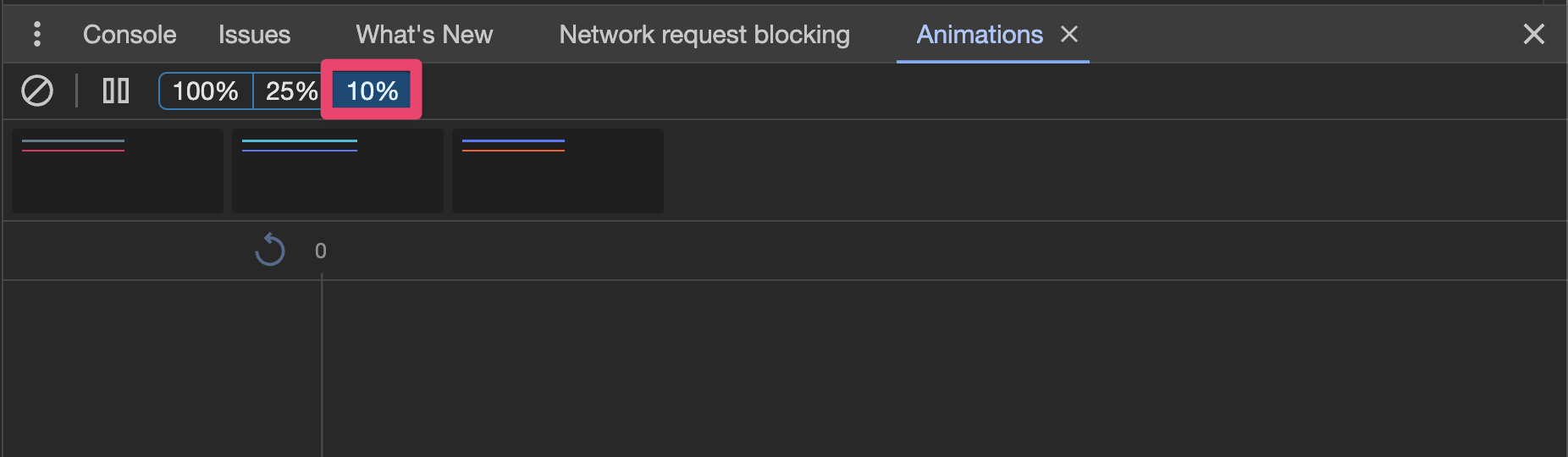
You can then open dev-tools and slow the animation speed to 10%:
- Open and dismiss the action sheet tied to the "Basic" button.
- Verify that the action sheet animates completely off the view when
dismissed.
- Open the and dismiss the action sheet tied to the "Custom CSS Class"
button. This implementation customizes the `--height` of the action
sheet.
- Verify that the action sheet animates completely off the view when
dismissed.
---------
Co-authored-by: ionitron <hi@ionicframework.com>
Co-authored-by: Liam DeBeasi <liamdebeasi@users.noreply.github.com>
@ionic/core
Ionic is an open source App Development Framework that makes it easy to build top quality Native and Progressive Web Apps with web technologies.
The Ionic Core package contains the Web Components that make up the reusable UI building blocks of Ionic Framework. These components are designed to be used in traditional frontend view libraries/frameworks (such as Stencil, React, Angular, or Vue), or on their own through traditional JavaScript in the browser.
Features
- Tiny, highly optimized components built with Stencil
- Styling for both iOS and Material Design
- No build or compiling required
- Simply add the static files to any project
- Lazy-loaded components without configuration
- Asynchronous rendering
- Theming through CSS Variables
How to use
Vanilla HTML
Easiest way to start using Ionic Core is by adding a script tag to the CDN:
<script type="module" src="https://cdn.jsdelivr.net/npm/@ionic/core/dist/ionic/ionic.esm.js"></script>
<script nomodule src="https://cdn.jsdelivr.net/npm/@ionic/core/dist/ionic/ionic.js"></script>
<link href="https://cdn.jsdelivr.net/npm/@ionic/core/css/ionic.bundle.css" rel="stylesheet">
Any Ionic component added to the webpage will automatically load. This includes writing the component tag directly in HTML, or using JavaScript such as document.createElement('ion-toggle').
Additionally, within this package is a dist/ionic.js file and accompanying dist/ionic/ directory. These are the same files which are used by the CDN, and they're available in this package so they can be apart of an app's local development.
Framework Bindings
The @ionic/core package can be used in simple HTML, or by vanilla JavaScript without any framework at all. Ionic also has packages that make it easier to integrate Ionic into a framework's traditional ecosystem and patterns. (However, at the lowest-level framework bindings are still just using Ionic Core and Web Components).
Custom Elements Build
In addition to the default, self lazy-loading components built by Stencil, this package also comes with each component exported as a stand-alone custom element within @ionic/core/components. Each component extends HTMLElement, and does not lazy-load itself. Instead, this package is useful for projects already using a bundler such as Webpack or Rollup. While all components are available to be imported, the custom elements build also ensures bundlers only import what's used, and tree-shakes any unused components.
Below is an example of importing ion-badge, and initializing Ionic so it is able to correctly load the "mode", such as Material Design or iOS. Additionally, the initialize({...}) function can receive the Ionic config.
import { defineCustomElement } from "@ionic/core/components/ion-badge.js";
import { initialize } from "@ionic/core/components";

// Initializes the Ionic config and `mode` behavior
initialize();

//  Defines the `ion-badge` web component
defineCustomElement();
Notice how we import from @ionic/core/components as opposed to @ionic/core. This helps bundlers pull in only the code that is needed.
The defineCustomElement function will automatically define the component as well as any child components that may be required.
For example, if you wanted to use ion-modal, you would do the following:
import { defineCustomElement } from "@ionic/core/components/ion-modal.js";
import { initialize } from "@ionic/core/components";

// Initializes the Ionic config and `mode` behavior
initialize();

//  Defines the `ion-modal` and child `ion-backdrop` web components.
defineCustomElement();
The defineCustomElement function will define ion-modal, but it will also define ion-backdrop, which is a component that ion-modal uses internally.
Using Overlay Controllers
When using an overlay controller, developers will need to define the overlay component before it can be used. Below is an example of using modalController:
import { defineCustomElement } from '@ionic/core/components/ion-modal.js';
import { initialize, modalController } from '@ionic/core/components';

initialize();
defineCustomElement();

const showModal = async () => {
  const modal = await modalController.create({ ... });

  ...
}
How to contribute
Check out the CONTRIBUTE guide