Issue number: resolves#27268
---------
<!-- Please do not submit updates to dependencies unless it fixes an
issue. -->
<!-- Please try to limit your pull request to one type (bugfix, feature,
etc). Submit multiple pull requests if needed. -->
## What is the current behavior?
<!-- Please describe the current behavior that you are modifying. -->
When tabbing on a radio group (modern syntax), it focuses on the next
radio option inside the radio group. It replicates the behavior of the
up/down keys.
## What is the new behavior?
<!-- Please describe the behavior or changes that are being added by
this PR. -->
- When tabbing on a radio group (modern syntax), it focuses on the next
radio option of the next radio group.
A spike ticket has been created to further investigate web accessibility
and browser compatibility.
## Does this introduce a breaking change?
- [ ] Yes
- [x] No
<!-- If this introduces a breaking change, please describe the impact
and migration path for existing applications below. -->
## Other information
<!-- Any other information that is important to this PR such as
screenshots of how the component looks before and after the change. -->
N/A
Bumps [@playwright/test](https://github.com/Microsoft/playwright) from
1.33.0 to 1.34.0.
<details>
<summary>Release notes</summary>
<p><em>Sourced from <a
href="https://github.com/Microsoft/playwright/releases"><code>@playwright/test</code>'s
releases</a>.</em></p>
<blockquote>
<h2>v1.34.0</h2>
<h3>Highlights</h3>
<ul>
<li>
<p>UI Mode now shows steps, fixtures and attachments:
<!-- raw HTML omitted --></p>
</li>
<li>
<p>New property <a
href="https://playwright.dev/docs/api/class-testproject#test-project-teardown"><code>testProject.teardown</code></a>
to specify a project that needs to run after this
and all dependent projects have finished. Teardown is useful to cleanup
any resources acquired by this project.</p>
<p>A common pattern would be a <code>setup</code> dependency with a
corresponding <code>teardown</code>:</p>
<pre lang="js"><code>// playwright.config.ts
import { defineConfig } from '@playwright/test';
<p>export default defineConfig({
projects: [
{
name: 'setup',
testMatch: /global.setup.ts/,
teardown: 'teardown',
},
{
name: 'teardown',
testMatch: /global.teardown.ts/,
},
{
name: 'chromium',
use: devices['Desktop Chrome'],
dependencies: ['setup'],
},
{
name: 'firefox',
use: devices['Desktop Firefox'],
dependencies: ['setup'],
},
{
name: 'webkit',
use: devices['Desktop Safari'],
dependencies: ['setup'],
},
],
});
</code></pre></p>
</li>
<li>
<p>New method <a
href="https://playwright.dev/docs/test-assertions#expectconfigure"><code>expect.configure</code></a>
to create pre-configured expect instance with its own defaults such as
<code>timeout</code> and <code>soft</code>.</p>
<pre lang="js"><code>const slowExpect = expect.configure({ timeout:
10000 });
await slowExpect(locator).toHaveText('Submit');
<p>// Always do soft assertions.
const softExpect = expect.configure({ soft: true });
</code></pre></p>
</li>
</ul>
<!-- raw HTML omitted -->
</blockquote>
<p>... (truncated)</p>
</details>
<details>
<summary>Commits</summary>
<ul>
<li><a
href="4aee014caf"><code>4aee014</code></a>
chore: mark 1.34.0 (<a
href="https://redirect.github.com/Microsoft/playwright/issues/23123">#23123</a>)</li>
<li><a
href="bf25a93617"><code>bf25a93</code></a>
cherry-pick(<a
href="https://redirect.github.com/Microsoft/playwright/issues/23171">#23171</a>):
fix(tracing): when zipping remotely, use correct file na...</li>
<li><a
href="7effaf4f22"><code>7effaf4</code></a>
cherry-pick(<a
href="https://redirect.github.com/Microsoft/playwright/issues/23166">#23166</a>):
chore: fix file view padding</li>
<li><a
href="ef18287266"><code>ef18287</code></a>
cherry-pick(<a
href="https://redirect.github.com/Microsoft/playwright/issues/23165">#23165</a>):
docs: update release notes</li>
<li><a
href="552cba8c05"><code>552cba8</code></a>
cherry-pick(<a
href="https://redirect.github.com/Microsoft/playwright/issues/23148">#23148</a>):
chore: do not annotate actions after failed ones as time...</li>
<li><a
href="cd94a3f01d"><code>cd94a3f</code></a>
cherry-pick(<a
href="https://redirect.github.com/Microsoft/playwright/issues/23144">#23144</a>):
feat(connect): <code>pw:server:channel</code> and <code>pw:socks</code>
debug ...</li>
<li><a
href="3543a741fd"><code>3543a74</code></a>
cherry-pick(<a
href="https://redirect.github.com/Microsoft/playwright/issues/23140">#23140</a>):
docs: add dialog/consoleMessage helper methods for langu...</li>
<li><a
href="7196f82e52"><code>7196f82</code></a>
cherry-pick(<a
href="https://redirect.github.com/Microsoft/playwright/issues/23143">#23143</a>):
test: add attachment tests</li>
<li><a
href="32c247b815"><code>32c247b</code></a>
cherry-pick(<a
href="https://redirect.github.com/Microsoft/playwright/issues/23139">#23139</a>):
chore: opt out of trace attachments</li>
<li><a
href="c551cce74e"><code>c551cce</code></a>
cherry-pick(<a
href="https://redirect.github.com/Microsoft/playwright/issues/23130">#23130</a>):
feat(chromium): roll to r1064 (<a
href="https://redirect.github.com/Microsoft/playwright/issues/23132">#23132</a>)</li>
<li>Additional commits viewable in <a
href="https://github.com/Microsoft/playwright/compare/v1.33.0...v1.34.0">compare
view</a></li>
</ul>
</details>
<br />
[](https://docs.github.com/en/github/managing-security-vulnerabilities/about-dependabot-security-updates#about-compatibility-scores)
Dependabot will resolve any conflicts with this PR as long as you don't
alter it yourself. You can also trigger a rebase manually by commenting
`@dependabot rebase`.
[//]: # (dependabot-automerge-start)
[//]: # (dependabot-automerge-end)
---
<details>
<summary>Dependabot commands and options</summary>
<br />
You can trigger Dependabot actions by commenting on this PR:
- `@dependabot rebase` will rebase this PR
- `@dependabot recreate` will recreate this PR, overwriting any edits
that have been made to it
- `@dependabot merge` will merge this PR after your CI passes on it
- `@dependabot squash and merge` will squash and merge this PR after
your CI passes on it
- `@dependabot cancel merge` will cancel a previously requested merge
and block automerging
- `@dependabot reopen` will reopen this PR if it is closed
- `@dependabot close` will close this PR and stop Dependabot recreating
it. You can achieve the same result by closing it manually
- `@dependabot ignore this major version` will close this PR and stop
Dependabot creating any more for this major version (unless you reopen
the PR or upgrade to it yourself)
- `@dependabot ignore this minor version` will close this PR and stop
Dependabot creating any more for this minor version (unless you reopen
the PR or upgrade to it yourself)
- `@dependabot ignore this dependency` will close this PR and stop
Dependabot creating any more for this dependency (unless you reopen the
PR or upgrade to it yourself)
</details>
---------
Signed-off-by: dependabot[bot] <support@github.com>
Co-authored-by: dependabot[bot] <49699333+dependabot[bot]@users.noreply.github.com>
Co-authored-by: Liam DeBeasi <liamdebeasi@users.noreply.github.com>
Co-authored-by: ionitron <hi@ionicframework.com>
Issue number: resolves#27184
---------
## What is the current behavior?
The modern form controls do not use the same opacity for their labels
when disabled, resulting in inconsistent UI when using two different
types in the same view (select vs checkbox, for example).
## What is the new behavior?
The checkbox, input, radio, range, select, textarea and toggle labels
have been updated on both modes to use the same opacity as each other
when disabled. The checkbox and radio icons have been updated to use a
different opacity than the label for `md` mode.
- Updates `ios` mode so all form controls use the same opacity of `0.3`
- I could not find any guidelines by Apple for what color these should
be, so I decided to just make them the same as what is most commonly
used & match item
- Updates `md` mode so all form control labels use the same opacity of
`0.38`
- I used the [Material Design 3
documentation](https://m2.material.io/components) to get this number as
well as the opacity of the disabled selection controls in the [Material
Design 2 figma design
kit](https://www.figma.com/community/file/778763161265841481). The
Material Design 2 documentation does not mention the opacity, but this
is also the number used by Material Design 1 so it's safe to assume it
is what the disabled form labels should also use for Material Design 2.
- Updates the `md` range so the slotted elements are also included when
setting the opacity on the label
- Updates the range, radio & checkbox tests to make sure there are
screenshots in the different disabled states
- Updates the item/disabled test to include radio & textarea so you can
see all form controls side by side
## Does this introduce a breaking change?
- [ ] Yes
- [x] No
## Other information
I downloaded screenshots of the item disabled tests and put them side by
side for `main` and this branch in order to see the differences in the
labels. The grey boxes to the left of each item are just a bigger
version of the label color for that item, so it's easier to see when
they aren't the same.


---------
Co-authored-by: ionitron <hi@ionicframework.com>
Issue number: resolves#27129
---------
<!-- Please do not submit updates to dependencies unless it fixes an
issue. -->
<!-- Please try to limit your pull request to one type (bugfix, feature,
etc). Submit multiple pull requests if needed. -->
## What is the current behavior?
<!-- Please describe the current behavior that you are modifying. -->
Material Design has 16px of margin between the form control and the
label, but we have 8px:
https://m2.material.io/components/selection-controls#usage
## What is the new behavior?
<!-- Please describe the behavior or changes that are being added by
this PR. -->
- Updates default margin from 8px to 16px for checkbox, input, radio,
range, select, textarea, and toggle.
Note: This should only apply to labels that are on the same line as the
form control. In other words, they do not apply to stacked/floating
labels.
## Does this introduce a breaking change?
- [ ] Yes
- [x] No
<!-- If this introduces a breaking change, please describe the impact
and migration path for existing applications below. -->
## Other information
<!-- Any other information that is important to this PR such as
screenshots of how the component looks before and after the change. -->
---------
Co-authored-by: ionitron <hi@ionicframework.com>
Issue number: resolves#27170
---------
Updates the Material Design border colors for checkbox and radio to
`rgb($text-color-rgb, 0.60)` or `#666666`. This is based on the
[Material Design 2
kit](https://www.figma.com/community/file/778763161265841481/Material-2-Design-Kit).
The border color when disabled is also wrong, but changing this affects
the label so I have reverted this to do as part of FW-4037.
## Does this introduce a breaking change?
- [ ] Yes
- [x] No
---------
Co-authored-by: ionitron <hi@ionicframework.com>
Co-authored-by: Liam DeBeasi <liamdebeasi@users.noreply.github.com>
Issue number: N/A

---------

<!-- Please do not submit updates to dependencies unless it fixes an
issue. -->

<!-- Please try to limit your pull request to one type (bugfix, feature,
etc). Submit multiple pull requests if needed. -->

## What is the current behavior?
<!-- Please describe the current behavior that you are modifying. -->

Radio and radio group tests are using legacy syntax

## What is the new behavior?
<!-- Please describe the behavior or changes that are being added by
this PR. -->

- Radio and radio group tests are using generator syntax


c0256f3ce1

- The radio group basic interaction tests do not vary across modes, so I
removed those extra checks.


579bcacab2

- The basic radio directory had some old screenshots that were not being
used, so I removed them.


997d652864

- The legacy radio keyboard behavior does not vary across modes, so I
removed that extra check

## Does this introduce a breaking change?

- [ ] Yes
- [x] No

<!-- If this introduces a breaking change, please describe the impact
and migration path for existing applications below. -->


## Other information

<!-- Any other information that is important to this PR such as
screenshots of how the component looks before and after the change. -->
Issue number: Internal

---------

<!-- Please refer to our contributing documentation for any questions on
submitting a pull request, or let us know here if you need any help:
https://ionicframework.com/docs/building/contributing -->

<!-- Some docs updates need to be made in the `ionic-docs` repo, in a
separate PR. See
https://github.com/ionic-team/ionic-framework/blob/main/.github/CONTRIBUTING.md#modifying-documentation
for details. -->

<!-- Please do not submit updates to dependencies unless it fixes an
issue. -->

<!-- Please try to limit your pull request to one type (bugfix, feature,
etc). Submit multiple pull requests if needed. -->

## What is the current behavior?
<!-- Please describe the current behavior that you are modifying. -->

`Tab` keyboard navigation tests are disabled for `ion-radio` because
they were extremely flaky in CI.

## What is the new behavior?
<!-- Please describe the behavior or changes that are being added by
this PR. -->

- Re-enables `ion-radio` `Tab` keyboard navigation tests
- Ports a slimmed down version of Wordpress' playwright utilities for
using modifier keys with `Tab` keyboard navigation on environments that
do not support "natural tab navigation"

## Does this introduce a breaking change?

- [ ] Yes
- [x] No

<!-- If this introduces a breaking change, please describe the impact
and migration path for existing applications below. -->


## Other information

<!-- Any other information that is important to this PR such as
screenshots of how the component looks before and after the change. -->

This utility should likely be used in all places where we are using the
`Alt+Tab` logic for webkit-based browsers today. If/when the changes are
agreed upon, I can follow-up with PR that adds this behavior to those
tests.
Issue number: resolves#27305
---------
<!-- Please refer to our contributing documentation for any questions on
submitting a pull request, or let us know here if you need any help:
https://ionicframework.com/docs/building/contributing -->
<!-- Some docs updates need to be made in the `ionic-docs` repo, in a
separate PR. See
https://github.com/ionic-team/ionic-framework/blob/main/.github/CONTRIBUTING.md#modifying-documentation
for details. -->
<!-- Please do not submit updates to dependencies unless it fixes an
issue. -->
<!-- Please try to limit your pull request to one type (bugfix, feature,
etc). Submit multiple pull requests if needed. -->
## What is the current behavior?
<!-- Please describe the current behavior that you are modifying. -->
Checkbox, radio, range, select, and toggle take up 100% of its width
even when in a start/end slot.
## What is the new behavior?
<!-- Please describe the behavior or changes that are being added by
this PR. -->
- Checkbox, radio, range, select, and toggle do not take up 100% of its
width even when in a start/end slot.
. The "no slot" behavior is unchanged and aligns with the legacy select.
## Does this introduce a breaking change?
- [ ] Yes
- [x] No
<!-- If this introduces a breaking change, please describe the impact
and migration path for existing applications below. -->
## Other information
<!-- Any other information that is important to this PR such as
screenshots of how the component looks before and after the change. -->
Issue number: N/A

---------

<!-- Please refer to our contributing documentation for any questions on
submitting a pull request, or let us know here if you need any help:
https://ionicframework.com/docs/building/contributing -->

<!-- Some docs updates need to be made in the `ionic-docs` repo, in a
separate PR. See
https://github.com/ionic-team/ionic-framework/blob/main/.github/CONTRIBUTING.md#modifying-documentation
for details. -->

<!-- Please do not submit updates to dependencies unless it fixes an
issue. -->

<!-- Please try to limit your pull request to one type (bugfix, feature,
etc). Submit multiple pull requests if needed. -->

This is the first PR to introduce the infrastructure required to add
test generators to the Ionic Framework project. This PR introduces the
file name changes necessary to support two playwright configs, so I
recommend reviewing the PR by commit:


1e5012cea1

- Created a `playwright.config-legacy.ts` file and updates
`package.json`.
- Running `npm run test.e2e` will run the generator tests, and running
`npm run test.e2e.legacy` will run the legacy tests.


4fe8de7df7

- Updates the GitHub Action scripts to run both the modern and legacy
E2E tests. I added command modifiers to avoid collisions with output
directories.


e8bcfaf926

- Updates `*.e2e.ts` files to have the legacy format name:
`*.e2e-legacy.ts`. This naming scheme is required for the two Playwright
configs to pull in the correct files. When migrating tests to
generators, team members will rename the file to remove the `-legacy`
part.


5bf196c36d
(warning: lots of files!)

- Updates the `*.e2e.ts-snapshots` directories to have the legacy format
name: `*.e2e-legacy.ts-snapshots`. The screenshot directory in
Playwright is generated based on the test file name which is why we are
updating the screenshot directory. When migrating tests to generators,
team members will rename the directory to remove the `-legacy` part.

## Does this introduce a breaking change?

- [ ] Yes
- [x] No

<!-- If this introduces a breaking change, please describe the impact
and migration path for existing applications below. -->


## Other information

<!-- Any other information that is important to this PR such as
screenshots of how the component looks before and after the change. -->
<!-- Please refer to our contributing documentation for any questions on
submitting a pull request, or let us know here if you need any help:
https://ionicframework.com/docs/building/contributing -->

<!-- Some docs updates need to be made in the `ionic-docs` repo, in a
separate PR. See
https://github.com/ionic-team/ionic-framework/blob/main/.github/CONTRIBUTING.md#modifying-documentation
for details. -->

<!-- Please do not submit updates to dependencies unless it fixes an
issue. -->

<!-- Please try to limit your pull request to one type (bugfix, feature,
etc). Submit multiple pull requests if needed. -->

## What is the current behavior?
<!-- Please describe the current behavior that you are modifying. -->


<!-- Issues are required for both bug fixes and features. -->
Issue URL: resolves
https://github.com/ionic-team/ionic-framework/issues/27159


## What is the new behavior?
<!-- Please describe the behavior or changes that are being added by
this PR. -->

- Radio elements take up the full height when used inside of an item.
This aligns with what checkbox and toggle do:

Checkbox:
cb8f07c553/core/src/components/checkbox/checkbox.scss (L42)
Toggle:
cb8f07c553/core/src/components/toggle/toggle.scss (L43)

## Does this introduce a breaking change?

- [ ] Yes
- [x] No

<!-- If this introduces a breaking change, please describe the impact
and migration path for existing applications below. -->


## Other information

<!-- Any other information that is important to this PR such as
screenshots of how the component looks before and after the change. -->

Dev build: `7.0.2-dev.11681223603.14da7831`
<!-- Please refer to our contributing documentation for any questions on
submitting a pull request, or let us know here if you need any help:
https://ionicframework.com/docs/building/contributing -->

<!-- Some docs updates need to be made in the `ionic-docs` repo, in a
separate PR. See
https://github.com/ionic-team/ionic-framework/blob/main/.github/CONTRIBUTING.md#modifying-documentation
for details. -->

<!-- Please do not submit updates to dependencies unless it fixes an
issue. -->

<!-- Please try to limit your pull request to one type (bugfix, feature,
etc). Submit multiple pull requests if needed. -->

## What is the current behavior?
<!-- Please describe the current behavior that you are modifying. -->


<!-- Issues are required for both bug fixes and features. -->
I forgot to skip the legacy radio test in
https://github.com/ionic-team/ionic-framework/pull/27126.

I also discovered we had duplicate flaky radio keyboard test tech debt
tickets.


https://github.com/ionic-team/ionic-framework/actions/runs/4658963827/jobs/8245309480?pr=27125

## What is the new behavior?
<!-- Please describe the behavior or changes that are being added by
this PR. -->

- skipped legacy radio test
- closed FW-3956 in favor of FW-3747

## Does this introduce a breaking change?

- [ ] Yes
- [x] No

<!-- If this introduces a breaking change, please describe the impact
and migration path for existing applications below. -->


## Other information

<!-- Any other information that is important to this PR such as
screenshots of how the component looks before and after the change. -->
<!-- Please refer to our contributing documentation for any questions on
submitting a pull request, or let us know here if you need any help:
https://ionicframework.com/docs/building/contributing -->

<!-- Some docs updates need to be made in the `ionic-docs` repo, in a
separate PR. See
https://github.com/ionic-team/ionic-framework/blob/main/.github/CONTRIBUTING.md#modifying-documentation
for details. -->

<!-- Please do not submit updates to dependencies unless it fixes an
issue. -->

<!-- Please try to limit your pull request to one type (bugfix, feature,
etc). Submit multiple pull requests if needed. -->

## What is the current behavior?
<!-- Please describe the current behavior that you are modifying. -->


<!-- Issues are required for both bug fixes and features. -->
Similar to the other keyboard tests, this one is flaky on CI:
https://github.com/ionic-team/ionic-framework/actions/runs/4620380152/jobs/8170437661


## What is the new behavior?
<!-- Please describe the behavior or changes that are being added by
this PR. -->

- Skipped flaky test and added tech debt ticket

## Does this introduce a breaking change?

- [ ] Yes
- [x] No

<!-- If this introduces a breaking change, please describe the impact
and migration path for existing applications below. -->


## Other information

<!-- Any other information that is important to this PR such as
screenshots of how the component looks before and after the change. -->
## Pull request checklist
Please check if your PR fulfills the following requirements:
- [ ] Tests for the changes have been added (for bug fixes / features)
- [ ] Docs have been reviewed and added / updated if needed (for bug
fixes / features)
- Some docs updates need to be made in the `ionic-docs` repo, in a
separate PR. See the [contributing
guide](https://github.com/ionic-team/ionic-framework/blob/main/.github/CONTRIBUTING.md#modifying-documentation)
for details.
- [x] Build (`npm run build`) was run locally and any changes were
pushed
- [x] Lint (`npm run lint`) has passed locally and any fixes were made
for failures
## Pull request type
Please check the type of change your PR introduces:
- [x] Bugfix
- [ ] Feature
- [ ] Code style update (formatting, renaming)
- [ ] Refactoring (no functional changes, no api changes)
- [ ] Build related changes
- [ ] Documentation content changes
- [ ] Other (please describe):
## What is the current behavior?
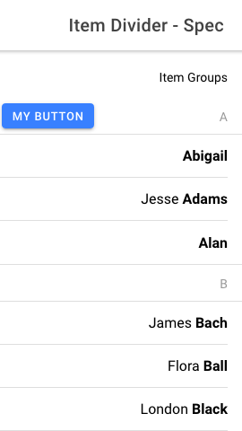
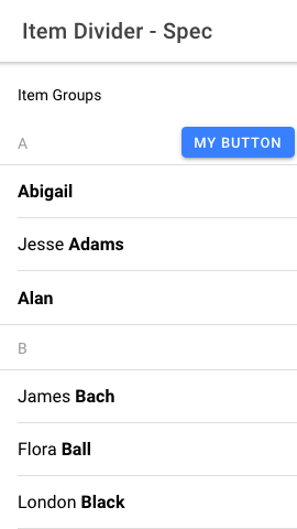
End slots are lacking margin of 2px when in RTL.
Issue URL: Part of #17012
## What is the new behavior?
- Simplifying `property-horizontal` by removing any margin unset
End slots with buttons will have a margin-end of 2px regardless of
direction.
### Screenshots
## Does this introduce a breaking change?
- [ ] Yes
- [x] No
## Other information
- Continuation of ionic-team/ionic-framework#27024 in order to apply it
to Framework v7
---------
Co-authored-by: Liam DeBeasi <liamdebeasi@users.noreply.github.com>
Co-authored-by: ionitron <hi@ionicframework.com>
The Ionic Framework team would like to re-evaluate our approach to improving customization options when building mobile applications. We are looking at other solutions that a) make customizing an app UI easier and b) are applicable to a broader set of developers.