Issue number: resolves#28525
---------
<!-- Please do not submit updates to dependencies unless it fixes an
issue. -->
<!-- Please try to limit your pull request to one type (bugfix, feature,
etc). Submit multiple pull requests if needed. -->
## What is the current behavior?
<!-- Please describe the current behavior that you are modifying. -->
When navigated via tab-key, the ion-item is not highlighted correctly
after switching from button=false to button=true.
## What is the new behavior?
<!-- Please describe the behavior or changes that are being added by
this PR. -->
Now, when dynamically changing the the `button` option to `True`,
there's a `@watch` callback that will make sure the internal
`isFocusable` `@state` will be updated.
- A new unit test was added to item/test. As there was still any unit
test for the `ion-item`, a new files was created - `item.spec.tsx`
## Does this introduce a breaking change?
- [ ] Yes
- [x] No
<!--
If this introduces a breaking change:
1. Describe the impact and migration path for existing applications
below.
2. Update the BREAKING.md file with the breaking change.
3. Add "BREAKING CHANGE: [...]" to the commit description when merging.
See
https://github.com/ionic-team/ionic-framework/blob/main/.github/CONTRIBUTING.md#footer
for more information.
-->
## Other information
<!-- Any other information that is important to this PR such as
screenshots of how the component looks before and after the change. -->
New behavior in runtime:

---------
Co-authored-by: Sean Perkins <sean@ionic.io>
Issue number: N/A
---------
<!-- Please do not submit updates to dependencies unless it fixes an
issue. -->
<!-- Please try to limit your pull request to one type (bugfix, feature,
etc). Submit multiple pull requests if needed. -->
## What is the current behavior?
<!-- Please describe the current behavior that you are modifying. -->
While working on an unrelated task, I noticed the list items in the list
starter app run off the page. This is due to the text wrapping behavior
in v7.6 where we allows the labels to grow/shrink. However, we do not
set a limit on how much they can grow. This means that child elements
inside of `ion-label` with long text can cause the label container to
grow indefinitely.
## What is the new behavior?
<!-- Please describe the behavior or changes that are being added by
this PR. -->
- Labels in item have a max-width of 100%
## Does this introduce a breaking change?
- [ ] Yes
- [x] No
<!--
If this introduces a breaking change:
1. Describe the impact and migration path for existing applications
below.
2. Update the BREAKING.md file with the breaking change.
3. Add "BREAKING CHANGE: [...]" to the commit description when merging.
See
https://github.com/ionic-team/ionic-framework/blob/main/.github/CONTRIBUTING.md#footer
for more information.
-->
## Other information
<!-- Any other information that is important to this PR such as
screenshots of how the component looks before and after the change. -->
Dev build: `7.6.1-dev.11702498225.1ad6eda6`
| before | after |
| - | - |
| 
| 
|
---------
Co-authored-by: ionitron <hi@ionicframework.com>
Issue number: Internal

---------

<!-- Please do not submit updates to dependencies unless it fixes an
issue. -->

<!-- Please try to limit your pull request to one type (bugfix, feature,
etc). Submit multiple pull requests if needed. -->

## What is the current behavior?
<!-- Please describe the current behavior that you are modifying. -->

We currently apply a workaround to `ion-select` so it can wrap correctly
inside of `ion-item`:
357b8b2beb/core/src/components/select/select.scss (L99-L103)

However, this causes issues when a parent element has `display: flex`
because the `ion-select` width becomes 0.

## What is the new behavior?
<!-- Please describe the behavior or changes that are being added by
this PR. -->

- In order to get the desired behavior, we need the `ion-select` (and
other elements in the default slot) to either truncate or wrap within
its own container and then have the entire container (i.e. the entire
`ion-select`) wrap to the next line once the container is too small.

To achieve this, I needed to set a min-width on `.item-inner` to define
the point at which the element should wrap to the next line. I also
changed the flex basis from `auto` to `0` which means the initial main
size of the flex item will be 0px. In reality, this will be
`--inner-min-width` since we also set `min-width:
var(--inner-min-width)`. I used `0` for simplicity but I can change this
to use the CSS variable if that's more clear. Since we also set
`flex-grow: 1` we indicate that the element can grow from that basis
(but it cannot shrink).

I chose `--inner-min-width: 4rem` to minimize the number of diffs. We
can certainly change this, but it may cause some diffs as certain
elements will start wrapping sooner. I also chose to use `rem` because
having a fixed min-width means that fewer characters are going to fit in
the same space as text scales.

I made this a CSS variable but left it undocumented. If developers need
a way of changing this `min-width` they can request it and we can easily
expose this variable. However, I think `4rem` is small enough that this
should be sufficient.

## Does this introduce a breaking change?

- [ ] Yes
- [x] No

<!-- If this introduces a breaking change, please describe the impact
and migration path for existing applications below. -->


## Other information

<!-- Any other information that is important to this PR such as
screenshots of how the component looks before and after the change. -->

The visual diffs here are correct. The table below shows the screenshot
group and an explanation for why the changes are correct.


| Path | Example | Details |
| - | - | - |
| `disabled` |
[Link](https://github.com/ionic-team/ionic-framework/pull/28631/files#diff-d529716f95f7a7aa82c88588104220775b728af67077f48cd47a8afa04423143)
| The searchbar is able to shrink slightly to fit on the same line as
the checkbox at the bottom. |
| `highlight` |
[Link](https://github.com/ionic-team/ionic-framework/pull/28631/files#diff-0b64f24c91393923701d1ced4e330a1c6b926d72ee461b8ab1e135e708be3457)
| We're changing how small the main content can get, so the input is
only wrapping once it gets to `--inner-min-width`. |
| `legacy/fill` |
[Link](https://github.com/ionic-team/ionic-framework/pull/28631/files#diff-2ef8dbfa5e69e2b96c3e1ed29ab962f08cf5ba2aaf2af773e40bd143e38a4bef)
| We're changing how small the main content can get, so the input is
only wrapping once it gets to `--inner-min-width`. |
| `slotted-inputs` |
[Link](https://github.com/ionic-team/ionic-framework/pull/28631/files#diff-2f173c7303969d6a6c58f30a618cebc3caf918d3761fc83df5642fd48dfabd7b)
| We're changing how small the main content can get, so the range is
only wrapping once it gets to `--inner-min-width`. |

`slotted-inputs` note: I'd argue many of these examples are not best
practices. For example, adding a range in the start slot and the end
slot is a bit unusual. I'm not aware of any native apps that implement
this pattern.

popover note: I [removed the `ion-item` from the `popover/test/async`
test](331fcb859c).
There was a diff because the min-width increased, but IMO that component
should not be used in the popover test since we want to test the
popover, not the item.

--------

Demo:

| `feature-7.6` | `branch` |
| - | - |
| <video
src="https://github.com/ionic-team/ionic-framework/assets/2721089/693d4947-fa33-460d-bc7f-7b96b6338032"></video>
| <video
src="https://github.com/ionic-team/ionic-framework/assets/2721089/df35ca73-87aa-4e76-9bb7-99f0f2810640"></video>
|

(In this demo I updated the `ion-select` to wrap within its own
container first instead of truncate. We may want to consider doing this
by default, but I think this is out of scope for this task)

---------

Co-authored-by: ionitron <hi@ionicframework.com>
Co-authored-by: Brandy Carney <brandy@ionic.io>
When an item containing a select is used inside of a flex container, the item collapses to `0px` width. Example code:

```html
<div style="display: flex">
  <ion-item>
    <ion-select aria-label="fruit" placeholder="Select fruit">
      <ion-select-option value="apples">Apples</ion-select-option>
      <ion-select-option value="oranges">Oranges</ion-select-option>
      <ion-select-option value="bananas">Bananas</ion-select-option>
    </ion-select>
  </ion-item>
</div>
```

This change sets the flex property to `1` on `ion-item` so that it will grow inside of a flex container, resulting in the select being displayed. The `flex` property is ignored when item is inside of a block container.
Issue number: N/A

---------

<!-- Please do not submit updates to dependencies unless it fixes an
issue. -->

<!-- Please try to limit your pull request to one type (bugfix, feature,
etc). Submit multiple pull requests if needed. -->

## What is the current behavior?
<!-- Please describe the current behavior that you are modifying. -->

Type checking inside of the Stencil unit tests have been disabled for a
long time. This has resulted in a difficult developer experience and
numerous issues (both types and implementation) within our unit tests.

## What is the new behavior?
<!-- Please describe the behavior or changes that are being added by
this PR. -->

- Type checking is now enabled for all Stencil unit tests
- Tests have been updated to resolve type errors and implementation
errors
- Many `as any` casts were introduced, as many legacy tests test invalid
configurations of functions that require it (for example passing
`undefined` to an argument that cannot be `undefined`).

## Does this introduce a breaking change?

- [ ] Yes
- [x] No

<!-- If this introduces a breaking change, please describe the impact
and migration path for existing applications below. -->


## Other information

<!-- Any other information that is important to this PR such as
screenshots of how the component looks before and after the change. -->

To test this PR you can checkout the branch locally. Install
dependencies in the `/core` directory to make sure you are on at least
`@stencil/core@4.7.2`.

Opening either a `.spec.ts` or `.spec.tsx` file, validate that your IDE
detects types and can provide auto completions for jest global types.

If you desire, you can provide an invalid type and try building the
project - you will observe the build will fail due to the invalid type.
Issue number: Internal
---------
<!-- Please do not submit updates to dependencies unless it fixes an
issue. -->
<!-- Please try to limit your pull request to one type (bugfix, feature,
etc). Submit multiple pull requests if needed. -->
## What is the current behavior?
<!-- Please describe the current behavior that you are modifying. -->
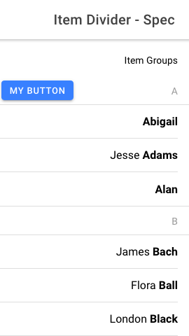
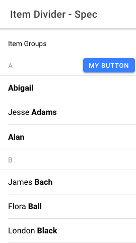
The safe area for Item would change sides when the direction changed.
e.g., if the safe area padding should be on the left, it would be on the
left when the direction was LTR but would be on the right when the
direction was RTL. It should always be on the left.
## What is the new behavior?
<!-- Please describe the behavior or changes that are being added by
this PR. -->
- The left safe area padding is on the left side of Item whether the
direction is LTR or RTL.
- The right safe area padding is on the right side of Item whether the
direction is LTR or RTL.
- There's now a screenshot test for left and right padding for both
directions.
Note: There is a separate ticket for updating the safe area padding for
ion-item-divider.
## Does this introduce a breaking change?
- [ ] Yes
- [x] No
<!-- If this introduces a breaking change, please describe the impact
and migration path for existing applications below. -->
## Other information
<!-- Any other information that is important to this PR such as
screenshots of how the component looks before and after the change. -->
---------
Co-authored-by: ionitron <hi@ionicframework.com>
Co-authored-by: Amanda Johnston <90629384+amandaejohnston@users.noreply.github.com>
Co-authored-by: Brandy Carney <brandyscarney@users.noreply.github.com>
aIssue number: resolves#28388
---------
<!-- Please do not submit updates to dependencies unless it fixes an
issue. -->
<!-- Please try to limit your pull request to one type (bugfix, feature,
etc). Submit multiple pull requests if needed. -->
## What is the current behavior?
<!-- Please describe the current behavior that you are modifying. -->
We added a `min-height: 56px` to the input, textarea, and select
components for MD mode. However, these were added for the outline/solid
style inputs to align with the Material Design spec:
https://material-components.github.io/material-components-web-catalog/#/component/text-field
They should not apply to regular inputs in an item. The end result is
inconsistently sized items when used with non-control items.
## What is the new behavior?
<!-- Please describe the behavior or changes that are being added by
this PR. -->
- Non-filled and non-stacked/floating label controls are now have a
minimum height of 44px.
There should be **no changes** to the following types of controls:
1. iOS controls (all variants)
2. MD filled controls
3. MD stacked controls
## Does this introduce a breaking change?
- [ ] Yes
- [x] No
<!-- If this introduces a breaking change, please describe the impact
and migration path for existing applications below. -->
## Other information
<!-- Any other information that is important to this PR such as
screenshots of how the component looks before and after the change. -->
Dev build: `7.5.2-dev.11697818830.1a33c881`
---------
Co-authored-by: ionitron <hi@ionicframework.com>
Issue number: N/A

---------

<!-- Please do not submit updates to dependencies unless it fixes an
issue. -->

<!-- Please try to limit your pull request to one type (bugfix, feature,
etc). Submit multiple pull requests if needed. -->

## What is the current behavior?
<!-- Please describe the current behavior that you are modifying. -->

This project has several unused Sass variables still in the code base.
The team would like to remove these.

## What is the new behavior?
<!-- Please describe the behavior or changes that are being added by
this PR. -->

- Removed unused Sass variables


## Does this introduce a breaking change?

- [ ] Yes
- [x] No

<!-- If this introduces a breaking change, please describe the impact
and migration path for existing applications below. -->


## Other information

<!-- Any other information that is important to this PR such as
screenshots of how the component looks before and after the change. -->

The original scope of this ticket was for checkbox only, but many other
components had unused sass variables, so I decided to tackle everything
all at once.

Since these variables are not used anywhere:

1. The build should pass
2. There should be no screenshot diffs
1) Wraps the label text and other content in an item when there is not enough room for everything to fit, instead of truncating the label with an ellipsis. Does not apply to items containing legacy inputs.
2) Passes the legacy property up to item from checkbox, input, radio, range, select, textarea and toggle. Item adds classes for all of these and does not wrap its contents if that class exists. If a developer is using a legacy input without the legacy property on it then they will need to add the legacy property to prevent the wrapping.
3) If a developer does not want the text to wrap for labels in modern items, the `ion-text-nowrap` class can be added to the label.
Bumps [@playwright/test](https://github.com/microsoft/playwright) from
1.38.1 to 1.39.0.
<details>
<summary>Release notes</summary>
<p><em>Sourced from <a
href="https://github.com/microsoft/playwright/releases"><code>@playwright/test</code>'s
releases</a>.</em></p>
<blockquote>
<h2>v1.39.0</h2>
<h2>Add custom matchers to your expect</h2>
<p>You can extend Playwright assertions by providing custom matchers.
These matchers will be available on the expect object.</p>
<pre lang="js"><code>import { expect as baseExpect } from
'@playwright/test';
export const expect = baseExpect.extend({
async toHaveAmount(locator: Locator, expected: number, options?: {
timeout?: number }) {
// ... see documentation for how to write matchers.
},
});
<p>test('pass', async ({ page }) => {
await expect(page.getByTestId('cart')).toHaveAmount(5);
});
</code></pre></p>
<p>See the documentation <a
href="https://playwright.dev/docs/test-configuration#add-custom-matchers-using-expectextend">for
a full example</a>.</p>
<h2>Merge test fixtures</h2>
<p>You can now merge test fixtures from multiple files or modules:</p>
<pre lang="js"><code>import { mergeTests } from '@playwright/test';
import { test as dbTest } from 'database-test-utils';
import { test as a11yTest } from 'a11y-test-utils';
<p>export const test = mergeTests(dbTest, a11yTest);
</code></pre></p>
<pre lang="js"><code>import { test } from './fixtures';
test('passes', async ({ database, page, a11y }) => {
// use database and a11y fixtures.
});
</code></pre>
<h2>Merge custom expect matchers</h2>
<p>You can now merge custom expect matchers from multiple files or
modules:</p>
<pre lang="js"><code>import { mergeTests, mergeExpects } from
'@playwright/test';
import { test as dbTest, expect as dbExpect } from
'database-test-utils';
import { test as a11yTest, expect as a11yExpect } from
'a11y-test-utils';
<p>export const test = mergeTests(dbTest, a11yTest);
</tr></table>
</code></pre></p>
</blockquote>
<p>... (truncated)</p>
</details>
<details>
<summary>Commits</summary>
<ul>
<li><a
href="3049d99bc8"><code>3049d99</code></a>
cherry-pick(<a
href="https://redirect.github.com/microsoft/playwright/issues/27555">#27555</a>):
chore: composed->merge</li>
<li><a
href="ae31f58b43"><code>ae31f58</code></a>
chore: mark 1.39.0 (<a
href="https://redirect.github.com/microsoft/playwright/issues/27550">#27550</a>)</li>
<li><a
href="5313514995"><code>5313514</code></a>
cherry-pick(<a
href="https://redirect.github.com/microsoft/playwright/issues/27549">#27549</a>):
docs: update release notes for 1.39</li>
<li><a
href="0d168dc8d0"><code>0d168dc</code></a>
chore: release notes for 1.39 (<a
href="https://redirect.github.com/microsoft/playwright/issues/27537">#27537</a>)</li>
<li><a
href="4f9b285c07"><code>4f9b285</code></a>
chore: update WebKit version to 17.4 (<a
href="https://redirect.github.com/microsoft/playwright/issues/27536">#27536</a>)</li>
<li><a
href="d11380e911"><code>d11380e</code></a>
docs: improve test.step documentation (<a
href="https://redirect.github.com/microsoft/playwright/issues/27535">#27535</a>)</li>
<li><a
href="9edb811434"><code>9edb811</code></a>
feat(chromium-tip-of-tree): roll to r1158 (<a
href="https://redirect.github.com/microsoft/playwright/issues/27533">#27533</a>)</li>
<li><a
href="d05c865389"><code>d05c865</code></a>
test: unflake a few tests (<a
href="https://redirect.github.com/microsoft/playwright/issues/27519">#27519</a>)</li>
<li><a
href="2776d8446b"><code>2776d84</code></a>
docs: how to update playwright in python (<a
href="https://redirect.github.com/microsoft/playwright/issues/27527">#27527</a>)</li>
<li><a
href="2407041090"><code>2407041</code></a>
fix(chromium): avoid premature continue of redirects (<a
href="https://redirect.github.com/microsoft/playwright/issues/27520">#27520</a>)</li>
<li>Additional commits viewable in <a
href="https://github.com/microsoft/playwright/compare/v1.38.1...v1.39.0">compare
view</a></li>
</ul>
</details>
<br />
[](https://docs.github.com/en/github/managing-security-vulnerabilities/about-dependabot-security-updates#about-compatibility-scores)
Dependabot will resolve any conflicts with this PR as long as you don't
alter it yourself. You can also trigger a rebase manually by commenting
`@dependabot rebase`.
[//]: # (dependabot-automerge-start)
[//]: # (dependabot-automerge-end)
---
<details>
<summary>Dependabot commands and options</summary>
<br />
You can trigger Dependabot actions by commenting on this PR:
- `@dependabot rebase` will rebase this PR
- `@dependabot recreate` will recreate this PR, overwriting any edits
that have been made to it
- `@dependabot merge` will merge this PR after your CI passes on it
- `@dependabot squash and merge` will squash and merge this PR after
your CI passes on it
- `@dependabot cancel merge` will cancel a previously requested merge
and block automerging
- `@dependabot reopen` will reopen this PR if it is closed
- `@dependabot close` will close this PR and stop Dependabot recreating
it. You can achieve the same result by closing it manually
- `@dependabot show <dependency name> ignore conditions` will show all
of the ignore conditions of the specified dependency
- `@dependabot ignore this major version` will close this PR and stop
Dependabot creating any more for this major version (unless you reopen
the PR or upgrade to it yourself)
- `@dependabot ignore this minor version` will close this PR and stop
Dependabot creating any more for this minor version (unless you reopen
the PR or upgrade to it yourself)
- `@dependabot ignore this dependency` will close this PR and stop
Dependabot creating any more for this dependency (unless you reopen the
PR or upgrade to it yourself)
</details>
---------
Signed-off-by: dependabot[bot] <support@github.com>
Co-authored-by: dependabot[bot] <49699333+dependabot[bot]@users.noreply.github.com>
Co-authored-by: ionitron <hi@ionicframework.com>
Issue number: resolves#24638, resolves#18592
---------
<!-- Please do not submit updates to dependencies unless it fixes an
issue. -->
<!-- Please try to limit your pull request to one type (bugfix, feature,
etc). Submit multiple pull requests if needed. -->
## What is the current behavior?
<!-- Please describe the current behavior that you are modifying. -->
Developers have requested that Ionic Framework support the dynamic type
feature on iOS for accessibility purposes. Ionic applications do not
respond to font scaling on iOS which can create inaccessible
applications particularly for users with low vision. Ionic apps on
Android devices currently support the Android equivalent due to
functionality in the Chromium webview.
Developers have also requested a way of adjusting the fonts in their
Ionic UI components consistently.
## What is the new behavior?
<!-- Please describe the behavior or changes that are being added by
this PR. -->
- Ionic components now use `rem` instead of `px` where appropriate. This
means devs can change the font size on `html` and the text in supported
Ionic components will scale up/down appropriately
- Add support for Dynamic Type on iOS (the iOS version of Dynamic Font
Scaling)
## Does this introduce a breaking change?
- [ ] Yes
- [x] No
<!-- If this introduces a breaking change, please describe the impact
and migration path for existing applications below. -->
## Other information
<!-- Any other information that is important to this PR such as
screenshots of how the component looks before and after the change. -->
---------
Co-authored-by: Maria Hutt <thetaPC@users.noreply.github.com>
Co-authored-by: Brandy Carney <brandyscarney@users.noreply.github.com>
Co-authored-by: Shawn Taylor <shawn@ionic.io>
Co-authored-by: ionitron <hi@ionicframework.com>
Co-authored-by: Sean Perkins <sean@ionic.io>
Co-authored-by: Sean Perkins <13732623+sean-perkins@users.noreply.github.com>
Co-authored-by: Amanda Johnston <90629384+amandaejohnston@users.noreply.github.com>
Issue number: N/A

---------

<!-- Please do not submit updates to dependencies unless it fixes an
issue. -->

<!-- Please try to limit your pull request to one type (bugfix, feature,
etc). Submit multiple pull requests if needed. -->

## What is the current behavior?
<!-- Please describe the current behavior that you are modifying. -->

The `fill` prop on `ion-item` is currently deprecated (see warning
[here](https://github.com/ionic-team/ionic-framework/blob/main/core/src/components/item/item.tsx#L248-L253))
but the docs have not been updated to reflect this.

## What is the new behavior?
<!-- Please describe the behavior or changes that are being added by
this PR. -->

`@deprecated` flag added to the `fill` prop.

## Does this introduce a breaking change?

- [ ] Yes
- [x] No

<!-- If this introduces a breaking change, please describe the impact
and migration path for existing applications below. -->


## Other information

<!-- Any other information that is important to this PR such as
screenshots of how the component looks before and after the change. -->
Issue number: Resolves#27169
---------
<!-- Please do not submit updates to dependencies unless it fixes an
issue. -->
<!-- Please try to limit your pull request to one type (bugfix, feature,
etc). Submit multiple pull requests if needed. -->
## What is the current behavior?
<!-- Please describe the current behavior that you are modifying. -->
Clicking the padded space within an `ion-item` will not pass the click
event to the slotted `ion-radio`, `ion-checkbox`, `ion-select` or
`ion-toggle`.
## What is the new behavior?
<!-- Please describe the behavior or changes that are being added by
this PR. -->
- The padded space at the start of `.item-native` and at the end of
`.item-inner` is clickable to activate a control.
- When the item is clicked, we check if the event is a result of
clicking the control or clicking the item's padded space. If the click
event is on the control, we don't need to do anything and let the
default behavior occur. If the click event is on the padded space, we
manually call the `.click()` method for the interactive element.
- The cursor pointer displays when hovering over the padded space when a
slotted interactive control is present.
## Does this introduce a breaking change?
- [ ] Yes
- [x] No
<!-- If this introduces a breaking change, please describe the impact
and migration path for existing applications below. -->
## Other information
<!-- Any other information that is important to this PR such as
screenshots of how the component looks before and after the change. -->
Issue number: resolves#27199
---------
<!-- Please do not submit updates to dependencies unless it fixes an
issue. -->
<!-- Please try to limit your pull request to one type (bugfix, feature,
etc). Submit multiple pull requests if needed. -->
## What is the current behavior?
<!-- Please describe the current behavior that you are modifying. -->
When using the modern range in an item, the knob will get cut off by the
item when the value is at either the min or the max.
## What is the new behavior?
<!-- Please describe the behavior or changes that are being added by
this PR. -->
- Range knob is no longer cut off by the item
## Does this introduce a breaking change?
- [ ] Yes
- [x] No
<!-- If this introduces a breaking change, please describe the impact
and migration path for existing applications below. -->
## Other information
<!-- Any other information that is important to this PR such as
screenshots of how the component looks before and after the change. -->
This is an extension of
https://github.com/ionic-team/ionic-framework/pull/27188. I decided to
make a separate branch/PR since I added tests and changed the
implementation a bit. Feel free to take all/some/none of this code.
---------
Co-authored-by: Sean Perkins <sean-perkins@users.noreply.github.com>
Co-authored-by: ionitron <hi@ionicframework.com>
Bumps [@playwright/test](https://github.com/Microsoft/playwright) from
1.37.1 to 1.38.0.
<details>
<summary>Release notes</summary>
<p><em>Sourced from <a
href="https://github.com/Microsoft/playwright/releases"><code>@playwright/test</code>'s
releases</a>.</em></p>
<blockquote>
<h2>v1.38.0</h2>
<h2>UI Mode Updates</h2>
<p><img
src="https://github.com/microsoft/playwright/assets/746130/8ba27be0-58fd-4f62-8561-950480610369"
alt="Playwright UI Mode" /></p>
<ol>
<li>Zoom into time range.</li>
<li>Network panel redesign.</li>
</ol>
<h2>New APIs</h2>
<ul>
<li>[<code>browserContext.on('weberror')</code>]</li>
<li>[<code>locator.pressSequentially()</code>]</li>
<li>The [<code>reporter.onEnd()</code>] now reports
<code>startTime</code> and total run <code>duration</code>.</li>
</ul>
<h2>Deprecations</h2>
<ul>
<li>The following methods were deprecated: [<code>page.type()</code>],
[<code>frame.type()</code>], [<code>locator.type()</code>] and
[<code>elementHandle.type()</code>].
Please use [<code>locator.fill()</code>] instead which is much faster.
Use [<code>locator.pressSequentially()</code>] only if there is a
special keyboard handling on the page, and you need to press keys
one-by-one.</li>
<li>The method [<code>expect(value).toMatchSnapshot()</code>] is
deprecated in favor of [<code>expect(page).toHaveScreenshot()</code>]
and [<code>expect(locator).toHaveScreenshot()</code>].</li>
</ul>
<h2>Breaking Changes: Playwright no longer downloads browsers
automatically</h2>
<blockquote>
<p>[!NOTE]
If you are using <code>@playwright/test</code> package, this change
<strong>does not</strong> affect you.</p>
</blockquote>
<p>Playwright recommends to use <code>@playwright/test</code> package
and download browsers via <code>npx playwright install</code> command.
If you are following this recommendation, nothing has changed for
you.</p>
<p>However, up to v1.38, installing the <code>playwright</code> package
instead of <code>@playwright/test</code> did automatically download
browsers. This is no longer the case, and we recommend to explicitly
download browsers via <code>npx playwright install</code> command.</p>
<p><strong>v1.37 and earlier</strong></p>
<p><code>playwright</code> package was downloading browsers during
<code>npm install</code>, while <code>@playwright/test</code> was
not.</p>
<p><strong>v1.38 and later</strong></p>
<p><code>playwright</code> and <code>@playwright/test</code> packages do
not download browsers during <code>npm install</code>.</p>
<p><strong>Recommended migration</strong></p>
<p>Run <code>npx playwright install</code> to download browsers after
<code>npm install</code>. For example, in your CI configuration:</p>
<pre lang="yml"><code>- run: npm ci
- run: npx playwright install --with-deps
</code></pre>
<p><strong>Alternative migration option - not recommended</strong></p>
<!-- raw HTML omitted -->
</blockquote>
<p>... (truncated)</p>
</details>
<details>
<summary>Commits</summary>
<ul>
<li><a
href="da997ee8c0"><code>da997ee</code></a>
cherry-pick(<a
href="https://redirect.github.com/Microsoft/playwright/issues/27067">#27067</a>):
docs: fix line wrapping in release notes</li>
<li><a
href="94b6fe1bdb"><code>94b6fe1</code></a>
chore: mark 1.38.0 (<a
href="https://redirect.github.com/Microsoft/playwright/issues/27030">#27030</a>)</li>
<li><a
href="55cf8eae25"><code>55cf8ea</code></a>
cherry-pick(<a
href="https://redirect.github.com/Microsoft/playwright/issues/27028">#27028</a>):
docs: add release notes for 1.38</li>
<li><a
href="a0a099fe4a"><code>a0a099f</code></a>
cherry-pick(<a
href="https://redirect.github.com/Microsoft/playwright/issues/27049">#27049</a>):
feat(webkit): roll to r1908 (<a
href="https://redirect.github.com/Microsoft/playwright/issues/27055">#27055</a>)</li>
<li><a
href="cd8b12c0d5"><code>cd8b12c</code></a>
cherry-pick(<a
href="https://redirect.github.com/Microsoft/playwright/issues/27041">#27041</a>):
feat(chromium): roll to r1080 (<a
href="https://redirect.github.com/Microsoft/playwright/issues/27045">#27045</a>)</li>
<li><a
href="9981f1418a"><code>9981f14</code></a>
cherry-pick(<a
href="https://redirect.github.com/Microsoft/playwright/issues/27008">#27008</a>):
chore: polish ui mode for better mac appearance</li>
<li><a
href="5f78f27a7a"><code>5f78f27</code></a>
cherry-pick(<a
href="https://redirect.github.com/Microsoft/playwright/issues/27006">#27006</a>):
chore: document new onEnd params</li>
<li><a
href="7c838653d6"><code>7c83865</code></a>
chore: fix the split view, reset window on timeline click (<a
href="https://redirect.github.com/Microsoft/playwright/issues/27007">#27007</a>)</li>
<li><a
href="d9eabda09d"><code>d9eabda</code></a>
fix(locators): escape quotes in regular expressions (<a
href="https://redirect.github.com/Microsoft/playwright/issues/27002">#27002</a>)</li>
<li><a
href="6bbc09c96c"><code>6bbc09c</code></a>
chore: show channel name in trace viewer metadata (<a
href="https://redirect.github.com/Microsoft/playwright/issues/26987">#26987</a>)</li>
<li>Additional commits viewable in <a
href="https://github.com/Microsoft/playwright/compare/v1.37.1...v1.38.0">compare
view</a></li>
</ul>
</details>
<br />
[](https://docs.github.com/en/github/managing-security-vulnerabilities/about-dependabot-security-updates#about-compatibility-scores)
Dependabot will resolve any conflicts with this PR as long as you don't
alter it yourself. You can also trigger a rebase manually by commenting
`@dependabot rebase`.
[//]: # (dependabot-automerge-start)
[//]: # (dependabot-automerge-end)
---
<details>
<summary>Dependabot commands and options</summary>
<br />
You can trigger Dependabot actions by commenting on this PR:
- `@dependabot rebase` will rebase this PR
- `@dependabot recreate` will recreate this PR, overwriting any edits
that have been made to it
- `@dependabot merge` will merge this PR after your CI passes on it
- `@dependabot squash and merge` will squash and merge this PR after
your CI passes on it
- `@dependabot cancel merge` will cancel a previously requested merge
and block automerging
- `@dependabot reopen` will reopen this PR if it is closed
- `@dependabot close` will close this PR and stop Dependabot recreating
it. You can achieve the same result by closing it manually
- `@dependabot show <dependency name> ignore conditions` will show all
of the ignore conditions of the specified dependency
- `@dependabot ignore this major version` will close this PR and stop
Dependabot creating any more for this major version (unless you reopen
the PR or upgrade to it yourself)
- `@dependabot ignore this minor version` will close this PR and stop
Dependabot creating any more for this minor version (unless you reopen
the PR or upgrade to it yourself)
- `@dependabot ignore this dependency` will close this PR and stop
Dependabot creating any more for this dependency (unless you reopen the
PR or upgrade to it yourself)
</details>
---------
Signed-off-by: dependabot[bot] <support@github.com>
Co-authored-by: dependabot[bot] <49699333+dependabot[bot]@users.noreply.github.com>
Co-authored-by: ionitron <hi@ionicframework.com>
Co-authored-by: Liam DeBeasi <liamdebeasi@users.noreply.github.com>
Issue number: resolves#25340
---------
- Exposes the following parts for a calendar day: `calendar-day`,
`today`, and `active`
- Combines the `calendar-day-highlight` element with the `calendar-day`
element so developers don't have to know to style two different elements
& we don't have to expose them as separate parts
- Improves height parity of the calendar day across browsers
- Updates the `custom` e2e test to include an example of styling days
using the newly exposed CSS parts
- Adds tests for the focus states of the calendar day
Issue number: N/A

---------

<!-- Please do not submit updates to dependencies unless it fixes an
issue. -->

<!-- Please try to limit your pull request to one type (bugfix, feature,
etc). Submit multiple pull requests if needed. -->

## What is the current behavior?
<!-- Please describe the current behavior that you are modifying. -->

There was some confusion on
https://github.com/ionic-team/ionic-framework/issues/27985 as to how the
`--highlight-*` variables on `ion-item` apply to the modern form
controls. These variables only work with the legacy form syntax, but we
did not add a proper deprecation message.

`--highlight-*` variables have been added to `ion-input` and
`ion-textarea` instead so developers can customize the highlight when
using the modern form syntax.

## What is the new behavior?
<!-- Please describe the behavior or changes that are being added by
this PR. -->

- Deprecated the `--highlight-*` variables on `ion-item`.

## Does this introduce a breaking change?

- [ ] Yes
- [x] No

<!-- If this introduces a breaking change, please describe the impact
and migration path for existing applications below. -->


## Other information

<!-- Any other information that is important to this PR such as
screenshots of how the component looks before and after the change. -->
Issue number: resolves#27438
---------
<!-- Please do not submit updates to dependencies unless it fixes an
issue. -->
<!-- Please try to limit your pull request to one type (bugfix, feature,
etc). Submit multiple pull requests if needed. -->
## What is the current behavior?
<!-- Please describe the current behavior that you are modifying. -->
There are a few issues with the modern radio syntax:
1. The native radio is inside the Shadow DOM. As a result, radios are
not announced with their parent group with screen readers (i.e. "1 of
3")
2. The native radio cannot be focused inside of `ion-select-popover` on
Firefox.
3. The `ionFocus` and `ionBlur` events do not fire.
I also discovered an issue with item:
1. Items inside of a Radio Group have a role of `listitem` which prevent
radios from being grouped correctly in some browsers. According to
https://bugzilla.mozilla.org/show_bug.cgi?id=1840916, browsers are
behaving correctly here. The `listitem` role should not be present when
an item is used in a radio group (even if the radio group itself is
inside a list).
## What is the new behavior?
<!-- Please describe the behavior or changes that are being added by
this PR. -->
Most of the changes are test-related, but I broke it down per commit to
make this easier to review:
ae77002afd
- Item no longer has `role="listitem"` when used inside of a radio
group.
- Added spec tests to verify the role behavior
0a9b7fb91d
- I discovered that some the legacy basic test were accidentally using
the modern syntax. I corrected this by adding `legacy="true"` to the
radios.
a8a90e53b2,
412d1d54e7,
and
1d1179b69a
- The current radio group tests only tested the legacy radio syntax, and
not the modern syntax.
- I created a `legacy` directory to house the legacy syntax tests.
- I created new tests in the root test directory for the modern syntax.
- I also deleted the screenshots for the modern tests here because the
tests for `ion-radio` already take screenshots of the radio (even in an
item).
e2c966e68b
- Moved radio roles to the host. This allows Firefox to focus radios and
for screen readers to announce the radios as part of a group.
- I also added focus/blur listeners so ionFocus and ionBlur fire
f10eff47a5
- I cleaned up the tests here to use a common radio fixture
## Does this introduce a breaking change?
- [ ] Yes
- [x] No
<!-- If this introduces a breaking change, please describe the impact
and migration path for existing applications below. -->
## Other information
<!-- Any other information that is important to this PR such as
screenshots of how the component looks before and after the change. -->
I tested this with the following setups. ✅ indicates the screen reader
announces the group count (i.e. "1 of 4"). ❌ indicates the screen reader
does not announce the group count.
**Radio in Radio Group:**
- iOS + VoiceOver: ✅
- Android + TalkBack: ✅
- macOS + VoiceOver + Safari: ✅
- macOS + VoiceOver + Firefox: ✅
- macOS + VoiceOver + Chrome: ✅
- Windows + NVDA + Chrome: ✅
- Windows + NVDA + Firefox: ✅
**Radio in Item in Radio Group :**
- iOS + VoiceOver: ✅
- Android + TalkBack: ❌
(https://bugs.chromium.org/p/chromium/issues/detail?id=1459006)
- macOS + VoiceOver + Safari: ✅
- macOS + VoiceOver + Firefox: ✅
- macOS + VoiceOver + Chrome: ❌
(https://bugs.chromium.org/p/chromium/issues/detail?id=1459003)
- Windows + NVDA + Chrome: ✅
- Windows + NVDA + Firefox: ✅
Issue number: N/A - this does not completely resolve an issue but it
enables users to opt-in to having text wrap in a button by setting a
minimum height

---------

## What is the current behavior?
The current behavior when text is really long in a button is:
- Default buttons expand in width until part of the text (and button) is
off the screen and not in the visible viewport
- Block and full buttons horizontally align the text in the center and
overflow it on both sides (but the overflow is not visible so the text
is cut off at the beginning and end)

## What is the new behavior?
Allow the button height to increase when text wraps and add some padding
so that buttons with wrapped text still look nice. This does **NOT**
wrap the text in a button by default. That will be done in FW-4599.

- Removed `text-overflow: ellipsis` since this does not have any effect
- Changes `height` setting to `min-height` on all button types (small,
large, default) and buttons inside of an item, toolbar or list header
- Increases `padding-top` and `padding-bottom` on the buttons so that
overflowing buttons have padding around them
- Changes `.button-native` display property from `block` to `flex` in
order for anchor tags (`<ion-button href="#">` to align their text
vertically
- Sets `flex-shrink: 0` on slotted `start`/`end` elements to prevent
icons (and other elements) from shrinking to make room for the text
- Adds e2e test for button wrapping including the different types of
buttons that were changed by this PR
- Adds `ion-text-wrap` to the `ion-button` elements used in this test to
verify the height / padding changes are working as desired (to be
removed with FW-4599)
- Screenshot diffs are in the following PR:
https://github.com/ionic-team/ionic-framework/pull/27561

## Does this introduce a breaking change?

- [ ] Yes
- [x] No

<!-- If this introduces a breaking change, please describe the impact
and migration path for existing applications below. -->


## Other information

This does **NOT** wrap the text in a button by default. It only enables
buttons to look nicer and auto adjust their height/padding when the text
is wrapping.

After internal discussion we decided that automatically making the text
wrap inside of a button may have undesired effects on existing apps. For
example, if someone has a button inside of a list header with a long
label, the button will now wrap if it has a space or dash in the text
content.

Developers should set `ion-text-wrap` on the `ion-button` to opt-in to
text wrapping in a button, and this will become the default as part of
FW-4599 (the next major release).

---------

Co-authored-by: ionitron <hi@ionicframework.com>
Co-authored-by: Liam DeBeasi <liamdebeasi@users.noreply.github.com>
Issue number: N/A

---------

<!-- Please do not submit updates to dependencies unless it fixes an
issue. -->

<!-- Please try to limit your pull request to one type (bugfix, feature,
etc). Submit multiple pull requests if needed. -->

## What is the current behavior?
<!-- Please describe the current behavior that you are modifying. -->

The `ion-header` and `ion-footer` use a base64 encoded image for a box
shadow instead of using the CSS box-shadow property directly. The use of
the background image creates CSP violations. The historic reasoning of
using an image instead of box shadow was to improve scroll performance.
Browsers and devices have improved a lot since that was implemented (5
years ago).

## What is the new behavior?
<!-- Please describe the behavior or changes that are being added by
this PR. -->

- Updates the usage of `ion-header` and `ion-footer` to use a box
shadow. The value comes from Material's web implementation:
https://material-components.github.io/material-components-web-catalog/#/component/top-app-bar

## Does this introduce a breaking change?

- [ ] Yes
- [x] No

<!-- If this introduces a breaking change, please describe the impact
and migration path for existing applications below. -->


## Other information

<!-- Any other information that is important to this PR such as
screenshots of how the component looks before and after the change. -->

---------

Co-authored-by: ionitron <hi@ionicframework.com>
Bumps [@playwright/test](https://github.com/Microsoft/playwright) from
1.33.0 to 1.34.0.
<details>
<summary>Release notes</summary>
<p><em>Sourced from <a
href="https://github.com/Microsoft/playwright/releases"><code>@playwright/test</code>'s
releases</a>.</em></p>
<blockquote>
<h2>v1.34.0</h2>
<h3>Highlights</h3>
<ul>
<li>
<p>UI Mode now shows steps, fixtures and attachments:
<!-- raw HTML omitted --></p>
</li>
<li>
<p>New property <a
href="https://playwright.dev/docs/api/class-testproject#test-project-teardown"><code>testProject.teardown</code></a>
to specify a project that needs to run after this
and all dependent projects have finished. Teardown is useful to cleanup
any resources acquired by this project.</p>
<p>A common pattern would be a <code>setup</code> dependency with a
corresponding <code>teardown</code>:</p>
<pre lang="js"><code>// playwright.config.ts
import { defineConfig } from '@playwright/test';
<p>export default defineConfig({
projects: [
{
name: 'setup',
testMatch: /global.setup.ts/,
teardown: 'teardown',
},
{
name: 'teardown',
testMatch: /global.teardown.ts/,
},
{
name: 'chromium',
use: devices['Desktop Chrome'],
dependencies: ['setup'],
},
{
name: 'firefox',
use: devices['Desktop Firefox'],
dependencies: ['setup'],
},
{
name: 'webkit',
use: devices['Desktop Safari'],
dependencies: ['setup'],
},
],
});
</code></pre></p>
</li>
<li>
<p>New method <a
href="https://playwright.dev/docs/test-assertions#expectconfigure"><code>expect.configure</code></a>
to create pre-configured expect instance with its own defaults such as
<code>timeout</code> and <code>soft</code>.</p>
<pre lang="js"><code>const slowExpect = expect.configure({ timeout:
10000 });
await slowExpect(locator).toHaveText('Submit');
<p>// Always do soft assertions.
const softExpect = expect.configure({ soft: true });
</code></pre></p>
</li>
</ul>
<!-- raw HTML omitted -->
</blockquote>
<p>... (truncated)</p>
</details>
<details>
<summary>Commits</summary>
<ul>
<li><a
href="4aee014caf"><code>4aee014</code></a>
chore: mark 1.34.0 (<a
href="https://redirect.github.com/Microsoft/playwright/issues/23123">#23123</a>)</li>
<li><a
href="bf25a93617"><code>bf25a93</code></a>
cherry-pick(<a
href="https://redirect.github.com/Microsoft/playwright/issues/23171">#23171</a>):
fix(tracing): when zipping remotely, use correct file na...</li>
<li><a
href="7effaf4f22"><code>7effaf4</code></a>
cherry-pick(<a
href="https://redirect.github.com/Microsoft/playwright/issues/23166">#23166</a>):
chore: fix file view padding</li>
<li><a
href="ef18287266"><code>ef18287</code></a>
cherry-pick(<a
href="https://redirect.github.com/Microsoft/playwright/issues/23165">#23165</a>):
docs: update release notes</li>
<li><a
href="552cba8c05"><code>552cba8</code></a>
cherry-pick(<a
href="https://redirect.github.com/Microsoft/playwright/issues/23148">#23148</a>):
chore: do not annotate actions after failed ones as time...</li>
<li><a
href="cd94a3f01d"><code>cd94a3f</code></a>
cherry-pick(<a
href="https://redirect.github.com/Microsoft/playwright/issues/23144">#23144</a>):
feat(connect): <code>pw:server:channel</code> and <code>pw:socks</code>
debug ...</li>
<li><a
href="3543a741fd"><code>3543a74</code></a>
cherry-pick(<a
href="https://redirect.github.com/Microsoft/playwright/issues/23140">#23140</a>):
docs: add dialog/consoleMessage helper methods for langu...</li>
<li><a
href="7196f82e52"><code>7196f82</code></a>
cherry-pick(<a
href="https://redirect.github.com/Microsoft/playwright/issues/23143">#23143</a>):
test: add attachment tests</li>
<li><a
href="32c247b815"><code>32c247b</code></a>
cherry-pick(<a
href="https://redirect.github.com/Microsoft/playwright/issues/23139">#23139</a>):
chore: opt out of trace attachments</li>
<li><a
href="c551cce74e"><code>c551cce</code></a>
cherry-pick(<a
href="https://redirect.github.com/Microsoft/playwright/issues/23130">#23130</a>):
feat(chromium): roll to r1064 (<a
href="https://redirect.github.com/Microsoft/playwright/issues/23132">#23132</a>)</li>
<li>Additional commits viewable in <a
href="https://github.com/Microsoft/playwright/compare/v1.33.0...v1.34.0">compare
view</a></li>
</ul>
</details>
<br />
[](https://docs.github.com/en/github/managing-security-vulnerabilities/about-dependabot-security-updates#about-compatibility-scores)
Dependabot will resolve any conflicts with this PR as long as you don't
alter it yourself. You can also trigger a rebase manually by commenting
`@dependabot rebase`.
[//]: # (dependabot-automerge-start)
[//]: # (dependabot-automerge-end)
---
<details>
<summary>Dependabot commands and options</summary>
<br />
You can trigger Dependabot actions by commenting on this PR:
- `@dependabot rebase` will rebase this PR
- `@dependabot recreate` will recreate this PR, overwriting any edits
that have been made to it
- `@dependabot merge` will merge this PR after your CI passes on it
- `@dependabot squash and merge` will squash and merge this PR after
your CI passes on it
- `@dependabot cancel merge` will cancel a previously requested merge
and block automerging
- `@dependabot reopen` will reopen this PR if it is closed
- `@dependabot close` will close this PR and stop Dependabot recreating
it. You can achieve the same result by closing it manually
- `@dependabot ignore this major version` will close this PR and stop
Dependabot creating any more for this major version (unless you reopen
the PR or upgrade to it yourself)
- `@dependabot ignore this minor version` will close this PR and stop
Dependabot creating any more for this minor version (unless you reopen
the PR or upgrade to it yourself)
- `@dependabot ignore this dependency` will close this PR and stop
Dependabot creating any more for this dependency (unless you reopen the
PR or upgrade to it yourself)
</details>
---------
Signed-off-by: dependabot[bot] <support@github.com>
Co-authored-by: dependabot[bot] <49699333+dependabot[bot]@users.noreply.github.com>
Co-authored-by: Liam DeBeasi <liamdebeasi@users.noreply.github.com>
Co-authored-by: ionitron <hi@ionicframework.com>
Issue number: resolves#27184
---------
## What is the current behavior?
The modern form controls do not use the same opacity for their labels
when disabled, resulting in inconsistent UI when using two different
types in the same view (select vs checkbox, for example).
## What is the new behavior?
The checkbox, input, radio, range, select, textarea and toggle labels
have been updated on both modes to use the same opacity as each other
when disabled. The checkbox and radio icons have been updated to use a
different opacity than the label for `md` mode.
- Updates `ios` mode so all form controls use the same opacity of `0.3`
- I could not find any guidelines by Apple for what color these should
be, so I decided to just make them the same as what is most commonly
used & match item
- Updates `md` mode so all form control labels use the same opacity of
`0.38`
- I used the [Material Design 3
documentation](https://m2.material.io/components) to get this number as
well as the opacity of the disabled selection controls in the [Material
Design 2 figma design
kit](https://www.figma.com/community/file/778763161265841481). The
Material Design 2 documentation does not mention the opacity, but this
is also the number used by Material Design 1 so it's safe to assume it
is what the disabled form labels should also use for Material Design 2.
- Updates the `md` range so the slotted elements are also included when
setting the opacity on the label
- Updates the range, radio & checkbox tests to make sure there are
screenshots in the different disabled states
- Updates the item/disabled test to include radio & textarea so you can
see all form controls side by side
## Does this introduce a breaking change?
- [ ] Yes
- [x] No
## Other information
I downloaded screenshots of the item disabled tests and put them side by
side for `main` and this branch in order to see the differences in the
labels. The grey boxes to the left of each item are just a bigger
version of the label color for that item, so it's easier to see when
they aren't the same.


---------
Co-authored-by: ionitron <hi@ionicframework.com>
Issue number: resolves#27129
---------
<!-- Please do not submit updates to dependencies unless it fixes an
issue. -->
<!-- Please try to limit your pull request to one type (bugfix, feature,
etc). Submit multiple pull requests if needed. -->
## What is the current behavior?
<!-- Please describe the current behavior that you are modifying. -->
Material Design has 16px of margin between the form control and the
label, but we have 8px:
https://m2.material.io/components/selection-controls#usage
## What is the new behavior?
<!-- Please describe the behavior or changes that are being added by
this PR. -->
- Updates default margin from 8px to 16px for checkbox, input, radio,
range, select, textarea, and toggle.
Note: This should only apply to labels that are on the same line as the
form control. In other words, they do not apply to stacked/floating
labels.
## Does this introduce a breaking change?
- [ ] Yes
- [x] No
<!-- If this introduces a breaking change, please describe the impact
and migration path for existing applications below. -->
## Other information
<!-- Any other information that is important to this PR such as
screenshots of how the component looks before and after the change. -->
---------
Co-authored-by: ionitron <hi@ionicframework.com>
Issue number: resolves#27170
---------
Updates the Material Design border colors for checkbox and radio to
`rgb($text-color-rgb, 0.60)` or `#666666`. This is based on the
[Material Design 2
kit](https://www.figma.com/community/file/778763161265841481/Material-2-Design-Kit).
The border color when disabled is also wrong, but changing this affects
the label so I have reverted this to do as part of FW-4037.
## Does this introduce a breaking change?
- [ ] Yes
- [x] No
---------
Co-authored-by: ionitron <hi@ionicframework.com>
Co-authored-by: Liam DeBeasi <liamdebeasi@users.noreply.github.com>
Issue number: N/A

---------

<!-- Please do not submit updates to dependencies unless it fixes an
issue. -->

<!-- Please try to limit your pull request to one type (bugfix, feature,
etc). Submit multiple pull requests if needed. -->

## What is the current behavior?
<!-- Please describe the current behavior that you are modifying. -->

I missed the `inputs` tests when migration `ion-item` to generators.

## What is the new behavior?
<!-- Please describe the behavior or changes that are being added by
this PR. -->

- The item input tests use the generator syntax.


a6f8563f31

- I removed the RTL checks for the disabled state screenshots since that
behavior does not vary across directions.

## Does this introduce a breaking change?

- [ ] Yes
- [x] No

<!-- If this introduces a breaking change, please describe the impact
and migration path for existing applications below. -->


## Other information

<!-- Any other information that is important to this PR such as
screenshots of how the component looks before and after the change. -->
Issue number: N/A

---------

<!-- Please refer to our contributing documentation for any questions on
submitting a pull request, or let us know here if you need any help:
https://ionicframework.com/docs/building/contributing -->

<!-- Some docs updates need to be made in the `ionic-docs` repo, in a
separate PR. See
https://github.com/ionic-team/ionic-framework/blob/main/.github/CONTRIBUTING.md#modifying-documentation
for details. -->

<!-- Please do not submit updates to dependencies unless it fixes an
issue. -->

<!-- Please try to limit your pull request to one type (bugfix, feature,
etc). Submit multiple pull requests if needed. -->

## What is the current behavior?
<!-- Please describe the current behavior that you are modifying. -->

Item tests use legacy syntax

## What is the new behavior?
<!-- Please describe the behavior or changes that are being added by
this PR. -->

- Item tests use modern syntax


414494a56d

- This behavior does not vary across directions, so I removed the RTL
screenshots.


8e9d0d5cbd

- This behavior does not vary across directions, so I removed the RTL
screenshots.


0d46d00eb0

- This behavior does not vary across directions, so I removed the RTL
screenshots.


505c054bd8

- This behavior does not vary across directions, so I removed the RTL
screenshots.

## Does this introduce a breaking change?

- [ ] Yes
- [x] No

<!-- If this introduces a breaking change, please describe the impact
and migration path for existing applications below. -->


## Other information

<!-- Any other information that is important to this PR such as
screenshots of how the component looks before and after the change. -->
Issue number: N/A

---------

<!-- Please refer to our contributing documentation for any questions on
submitting a pull request, or let us know here if you need any help:
https://ionicframework.com/docs/building/contributing -->

<!-- Some docs updates need to be made in the `ionic-docs` repo, in a
separate PR. See
https://github.com/ionic-team/ionic-framework/blob/main/.github/CONTRIBUTING.md#modifying-documentation
for details. -->

<!-- Please do not submit updates to dependencies unless it fixes an
issue. -->

<!-- Please try to limit your pull request to one type (bugfix, feature,
etc). Submit multiple pull requests if needed. -->

This is the first PR to introduce the infrastructure required to add
test generators to the Ionic Framework project. This PR introduces the
file name changes necessary to support two playwright configs, so I
recommend reviewing the PR by commit:


1e5012cea1

- Created a `playwright.config-legacy.ts` file and updates
`package.json`.
- Running `npm run test.e2e` will run the generator tests, and running
`npm run test.e2e.legacy` will run the legacy tests.


4fe8de7df7

- Updates the GitHub Action scripts to run both the modern and legacy
E2E tests. I added command modifiers to avoid collisions with output
directories.


e8bcfaf926

- Updates `*.e2e.ts` files to have the legacy format name:
`*.e2e-legacy.ts`. This naming scheme is required for the two Playwright
configs to pull in the correct files. When migrating tests to
generators, team members will rename the file to remove the `-legacy`
part.


5bf196c36d
(warning: lots of files!)

- Updates the `*.e2e.ts-snapshots` directories to have the legacy format
name: `*.e2e-legacy.ts-snapshots`. The screenshot directory in
Playwright is generated based on the test file name which is why we are
updating the screenshot directory. When migrating tests to generators,
team members will rename the directory to remove the `-legacy` part.

## Does this introduce a breaking change?

- [ ] Yes
- [x] No

<!-- If this introduces a breaking change, please describe the impact
and migration path for existing applications below. -->


## Other information

<!-- Any other information that is important to this PR such as
screenshots of how the component looks before and after the change. -->
Issue number: N/A

---------

<!-- Please refer to our contributing documentation for any questions on
submitting a pull request, or let us know here if you need any help:
https://ionicframework.com/docs/building/contributing -->

<!-- Some docs updates need to be made in the `ionic-docs` repo, in a
separate PR. See
https://github.com/ionic-team/ionic-framework/blob/main/.github/CONTRIBUTING.md#modifying-documentation
for details. -->

<!-- Please do not submit updates to dependencies unless it fixes an
issue. -->

<!-- Please try to limit your pull request to one type (bugfix, feature,
etc). Submit multiple pull requests if needed. -->

## What is the current behavior?
<!-- Please describe the current behavior that you are modifying. -->

`page.locator` is synchronous, but we were `await`ing the calls:
https://playwright.dev/docs/api/class-page#page-locator

We were also doing `page.locator(...).click()` when we can just do
`page.click([selector])` directly,

## What is the new behavior?
<!-- Please describe the behavior or changes that are being added by
this PR. -->

- Removes `await` usage from `page.locator`
- Removes `page.locator().click()` usage in favor of `page.click()`

## Does this introduce a breaking change?

- [ ] Yes
- [x] No

<!-- If this introduces a breaking change, please describe the impact
and migration path for existing applications below. -->


## Other information

<!-- Any other information that is important to this PR such as
screenshots of how the component looks before and after the change. -->
Issue URL: resolves#27218
---------
<!-- Please refer to our contributing documentation for any questions on
submitting a pull request, or let us know here if you need any help:
https://ionicframework.com/docs/building/contributing -->
<!-- Some docs updates need to be made in the `ionic-docs` repo, in a
separate PR. See
https://github.com/ionic-team/ionic-framework/blob/main/.github/CONTRIBUTING.md#modifying-documentation
for details. -->
<!-- Please do not submit updates to dependencies unless it fixes an
issue. -->
<!-- Please try to limit your pull request to one type (bugfix, feature,
etc). Submit multiple pull requests if needed. -->
## What is the current behavior?
<!-- Please describe the current behavior that you are modifying. -->
Padding is not applied to the `.native-textarea` element when using a
legacy textarea. It is applied in v6:
ae9689bf3e/core/src/components/textarea/textarea.scss (L98-L100)
The modern textarea is not impacted.
## What is the new behavior?
<!-- Please describe the behavior or changes that are being added by
this PR. -->
- Padding is now added to `.native-textarea` with the legacy textarea.
## Does this introduce a breaking change?
- [ ] Yes
- [x] No
<!-- If this introduces a breaking change, please describe the impact
and migration path for existing applications below. -->
## Other information
<!-- Any other information that is important to this PR such as
screenshots of how the component looks before and after the change. -->
---------
Co-authored-by: ionitron <hi@ionicframework.com>
<!-- Please refer to our contributing documentation for any questions on
submitting a pull request, or let us know here if you need any help:
https://ionicframework.com/docs/building/contributing -->

<!-- Some docs updates need to be made in the `ionic-docs` repo, in a
separate PR. See
https://github.com/ionic-team/ionic-framework/blob/main/.github/CONTRIBUTING.md#modifying-documentation
for details. -->

<!-- Please do not submit updates to dependencies unless it fixes an
issue. -->

<!-- Please try to limit your pull request to one type (bugfix, feature,
etc). Submit multiple pull requests if needed. -->

## What is the current behavior?
<!-- Please describe the current behavior that you are modifying. -->

There are tests for `ion-item` that use the legacy syntax for form
controls, without being in the `/legacy` test folder.

<!-- Issues are required for both bug fixes and features. -->
Issue URL: N/A


## What is the new behavior?
<!-- Please describe the behavior or changes that are being added by
this PR. -->

- Updates the tests to use the modern form syntax
- Moves the `fill` and `form` tests to a `/legacy` folder
- Removes invalid control UI from test templates (i.e. rendering a
segment with other controls in a single item).

## Does this introduce a breaking change?

- [ ] Yes
- [x] No

<!-- If this introduces a breaking change, please describe the impact
and migration path for existing applications below. -->


## Other information

<!-- Any other information that is important to this PR such as
screenshots of how the component looks before and after the change. -->

---------

Co-authored-by: ionitron <hi@ionicframework.com>
<!-- Please refer to our contributing documentation for any questions on
submitting a pull request, or let us know here if you need any help:
https://ionicframework.com/docs/building/contributing -->

<!-- Some docs updates need to be made in the `ionic-docs` repo, in a
separate PR. See
https://github.com/ionic-team/ionic-framework/blob/main/.github/CONTRIBUTING.md#modifying-documentation
for details. -->

<!-- Please do not submit updates to dependencies unless it fixes an
issue. -->

<!-- Please try to limit your pull request to one type (bugfix, feature,
etc). Submit multiple pull requests if needed. -->

## What is the current behavior?
<!-- Please describe the current behavior that you are modifying. -->


<!-- Issues are required for both bug fixes and features. -->
Issue URL: resolves
https://github.com/ionic-team/ionic-framework/issues/27130

The active/focus background colors on ion-item for iOS are always #000.
This allows for the correct contrast on light mode. This is a problem on
dark mode because the item background color defaults to #000 as well.

## What is the new behavior?
<!-- Please describe the behavior or changes that are being added by
this PR. -->

- Updates the default active/focus colors to be the text color. This
ensures that the active/focus colors are always the opposite of what the
default item background color is.

## Does this introduce a breaking change?

- [ ] Yes
- [x] No

Note: We are updating the default values of CSS Variables, but our
implementation of the spec is wrong and creates color contrast issues.

<!-- If this introduces a breaking change, please describe the impact
and migration path for existing applications below. -->


## Other information

<!-- Any other information that is important to this PR such as
screenshots of how the component looks before and after the change. -->

---------

Co-authored-by: ionitron <hi@ionicframework.com>
## Pull request checklist
Please check if your PR fulfills the following requirements:
- [ ] Tests for the changes have been added (for bug fixes / features)
- [ ] Docs have been reviewed and added / updated if needed (for bug
fixes / features)
- Some docs updates need to be made in the `ionic-docs` repo, in a
separate PR. See the [contributing
guide](https://github.com/ionic-team/ionic-framework/blob/main/.github/CONTRIBUTING.md#modifying-documentation)
for details.
- [x] Build (`npm run build`) was run locally and any changes were
pushed
- [x] Lint (`npm run lint`) has passed locally and any fixes were made
for failures
## Pull request type
Please check the type of change your PR introduces:
- [x] Bugfix
- [ ] Feature
- [ ] Code style update (formatting, renaming)
- [ ] Refactoring (no functional changes, no api changes)
- [ ] Build related changes
- [ ] Documentation content changes
- [ ] Other (please describe):
## What is the current behavior?
End slots are lacking margin of 2px when in RTL.
Issue URL: Part of #17012
## What is the new behavior?
- Simplifying `property-horizontal` by removing any margin unset
End slots with buttons will have a margin-end of 2px regardless of
direction.
### Screenshots
## Does this introduce a breaking change?
- [ ] Yes
- [x] No
## Other information
- Continuation of ionic-team/ionic-framework#27024 in order to apply it
to Framework v7
---------
Co-authored-by: Liam DeBeasi <liamdebeasi@users.noreply.github.com>
Co-authored-by: ionitron <hi@ionicframework.com>