- Adds support for dynamic type by converting `font-size` to use `rem` units.
- Updates the button width/height for icon only buttons in `md` to use `rem` units to scale the icon larger
- Adds test for scaling the font which checks default buttons, clear buttons (because they use a different `font-size`), buttons with an icon, and a button containing only an icon
Issue number: N/A

---------

## What is the current behavior?
The datetime button does not support dynamic type.

## What is the new behavior?
Adds support for dynamic type by converting `font-size` to use `rem`
units and adding an ellipsis to text when the size is too large.

## Does this introduce a breaking change?

- [ ] Yes
- [x] No


## Other information

Dynamic type can be enabled with the following CSS:

```css
html {
  --ion-dynamic-type: var(--ion-default-dynamic-font);
}
```
Issue number: resolves#27654
---------
<!-- Please do not submit updates to dependencies unless it fixes an
issue. -->
<!-- Please try to limit your pull request to one type (bugfix, feature,
etc). Submit multiple pull requests if needed. -->
## What is the current behavior?
<!-- Please describe the current behavior that you are modifying. -->
When Capacitor and the Keyboard plugin are available,
`Keyboard.getEngine()` returns an object:
d3232dcc00/core/src/utils/native/keyboard.ts (L19)
When Capacitor is _not_ available this method returns `undefined`.
However, when Capacitor is available but the Keyboard plugin is not,
`Keyboard.getEngine()` returns `false`.
In https://github.com/ionic-team/ionic-framework/pull/27569 I fixed a
bug where the wrong listeners were being used to emit keyboard lifecycle
events. However, I did not know that method can return `false`, and our
tests only account for the `undefined` or defined edge cases. As a
result, if you are using Capacitor in an app that is deployed to the
browser then the visual viewport Ionic keyboard events never fire.
## What is the new behavior?
<!-- Please describe the behavior or changes that are being added by
this PR. -->
- Visual viewport Ionic keyboard events fire in browser
## Does this introduce a breaking change?
- [ ] Yes
- [x] No
<!-- If this introduces a breaking change, please describe the impact
and migration path for existing applications below. -->
## Other information
<!-- Any other information that is important to this PR such as
screenshots of how the component looks before and after the change. -->
Issue number: resolves#27567
---------
<!-- Please do not submit updates to dependencies unless it fixes an
issue. -->
<!-- Please try to limit your pull request to one type (bugfix, feature,
etc). Submit multiple pull requests if needed. -->
## What is the current behavior?
Translucent toasts do not have the appropriate background color when the
`color` property is set on the toast.
<!-- Please describe the current behavior that you are
modifying. -->
<img width="554" alt="Screenshot 2023-06-14 at 5 46 45 PM"
src="https://github.com/ionic-team/ionic-framework/assets/14926794/05f7522c-23bc-44f8-af42-b82034cbe067">
## What is the new behavior?
- Translucent toasts can have a background color based on the `color`
property of the toast.
<!-- Please describe the behavior or changes that are being added by
this PR. -->
<img width="553" alt="Screenshot 2023-06-14 at 5 46 28 PM"
src="https://github.com/ionic-team/ionic-framework/assets/14926794/28a6345b-5bf3-494c-af81-0d53877295df">
## Does this introduce a breaking change?
- [ ] Yes
- [x] No
<!-- If this introduces a breaking change, please describe the impact
and migration path for existing applications below. -->
## Other information
Note: Translucent toasts are only available in `ios` mode.
<!-- Any other information that is important to this PR such as
screenshots of how the component looks before and after the change. -->
---------
Co-authored-by: ionitron <hi@ionicframework.com>
Issue number: N/A

---------

<!-- Please do not submit updates to dependencies unless it fixes an
issue. -->

<!-- Please try to limit your pull request to one type (bugfix, feature,
etc). Submit multiple pull requests if needed. -->

## What is the current behavior?
<!-- Please describe the current behavior that you are modifying. -->

Ionic Framework references a deprecated object,`Context`, exposed by
Stencil

## What is the new behavior?
<!-- Please describe the behavior or changes that are being added by
this PR. -->

starting with stencil v4, the deprecated `Context` object will no longer
be exposed by stencil. this change was introduced in
https://github.com/ionic-team/stencil/pull/4437, and will be present in
the first v4 prerelease following v4.0.0-beta.2. in anticipation for
this change, we seek to remove references to `Context` early.

## Does this introduce a breaking change?

- [ ] Yes
- [x] No - To the best of my knowledge

<!-- If this introduces a breaking change, please describe the impact
and migration path for existing applications below. -->


## Other information

ATM, the Stencil v4 nightly build is passing, as it's grabbing
`@stencil/core@4.0.0-beta.2`. The change in which we remove the
`Context` object will occur in the _next_ pre-release. I'm removing
`Context` here to try to get a jump on things.


The current iteration of the code that I'm deleting was added in
c415bbe1d7 (diff-ce62e75f0c31a76aac491f13a64e9c7771a6cbae8ca6635541164b69f0479bf1)
<!-- Any other information that is important to this PR such as
screenshots of how the component looks before and after the change. -->
Issue number: resolves#27601
---------
## What is the current behavior?
The current behavior restores overflow styles while moving (within the
setCSS function).
## What is the new behavior?
Overflow styles are restored when refresher gesture ends.
## Does this introduce a breaking change?
- [ ] Yes
- [x] No
<!-- If this introduces a breaking change, please describe the impact
and migration path for existing applications below. -->
Honestly, I don't know exactly. From code perspective I would say 'Yes',
but I can't get the impact of the change.
Ionic Team edit: There are no changes to the public API, and this is
fixing a behavior that used to work so there are no breaking changes.
## Other information
<!-- Any other information that is important to this PR such as
screenshots of how the component looks before and after the change. -->
---------
Co-authored-by: Liam DeBeasi <liamdebeasi@users.noreply.github.com>
Issue number: internal
---------
<!-- Please do not submit updates to dependencies unless it fixes an
issue. -->
<!-- Please try to limit your pull request to one type (bugfix, feature,
etc). Submit multiple pull requests if needed. -->
## What is the current behavior?
<!-- Please describe the current behavior that you are modifying. -->
The keyboard navigation was being skipped due to flakiness.
## What is the new behavior?
<!-- Please describe the behavior or changes that are being added by
this PR. -->
The keyboard navigation is no longer being skipped.
- Using the `pageUtils` to Tab
- Verify the buttons are visible before keyboard press
## Does this introduce a breaking change?
- [ ] Yes
- [x] No
<!-- If this introduces a breaking change, please describe the impact
and migration path for existing applications below. -->
## Other information
<!-- Any other information that is important to this PR such as
screenshots of how the component looks before and after the change. -->
The flaky test would occur due to the keyboard being pressed before the
buttons have loaded in. Weirdly, this only happens when testing "Mobile
Chrome" but works fine outside testing.

I would recommend adding `only` to the test and using `npm run test.e2e
segment -- --repeat-each 50` to verify that it works.
Issue number: N/A

---------

<!-- Please do not submit updates to dependencies unless it fixes an
issue. -->

<!-- Please try to limit your pull request to one type (bugfix, feature,
etc). Submit multiple pull requests if needed. -->

## What is the current behavior?
<!-- Please describe the current behavior that you are modifying. -->

The `navigation` test for `ion-back-button` errors out in the console
and doesn't display when attempting to host it locally.

## What is the new behavior?
<!-- Please describe the behavior or changes that are being added by
this PR. -->

Test removed, since it had no E2E file and the functionality appears to
be redundant with the tests for `ion-nav`.

## Does this introduce a breaking change?

- [ ] Yes
- [x] No

<!-- If this introduces a breaking change, please describe the impact
and migration path for existing applications below. -->


## Other information

<!-- Any other information that is important to this PR such as
screenshots of how the component looks before and after the change. -->
Issue number: N/A

---------

<!-- Please do not submit updates to dependencies unless it fixes an
issue. -->

<!-- Please try to limit your pull request to one type (bugfix, feature,
etc). Submit multiple pull requests if needed. -->

## What is the current behavior?
<!-- Please describe the current behavior that you are modifying. -->

The `ion-header` and `ion-footer` use a base64 encoded image for a box
shadow instead of using the CSS box-shadow property directly. The use of
the background image creates CSP violations. The historic reasoning of
using an image instead of box shadow was to improve scroll performance.
Browsers and devices have improved a lot since that was implemented (5
years ago).

## What is the new behavior?
<!-- Please describe the behavior or changes that are being added by
this PR. -->

- Updates the usage of `ion-header` and `ion-footer` to use a box
shadow. The value comes from Material's web implementation:
https://material-components.github.io/material-components-web-catalog/#/component/top-app-bar

## Does this introduce a breaking change?

- [ ] Yes
- [x] No

<!-- If this introduces a breaking change, please describe the impact
and migration path for existing applications below. -->


## Other information

<!-- Any other information that is important to this PR such as
screenshots of how the component looks before and after the change. -->

---------

Co-authored-by: ionitron <hi@ionicframework.com>
Reverts ionic-team/ionic-framework#27570

-------

The team is reconsidering this approach as it causes us to fight against
the browser. Discussions are ongoing internally, so I am going to revert
this patch until we can reach consensus.
Issue number: resolves#25578
---------
<!-- Please do not submit updates to dependencies unless it fixes an
issue. -->
<!-- Please try to limit your pull request to one type (bugfix, feature,
etc). Submit multiple pull requests if needed. -->
## What is the current behavior?
<!-- Please describe the current behavior that you are modifying. -->
If `ion-item-option`s are added or removed from an `ion-item-sliding`
asyncronously/after it has initialized, the sliding behavior of the item
will not update. If options are added to an item that didn't have any,
the item will not be openable. If all options are removed, the item will
still be openable, though no options will render.
## What is the new behavior?
<!-- Please describe the behavior or changes that are being added by
this PR. -->
The item now re-checks its options when it detects that any have been
added or removed, using the same utility/behavior as `ion-select`.
## Does this introduce a breaking change?
- [ ] Yes
- [x] No
<!-- If this introduces a breaking change, please describe the impact
and migration path for existing applications below. -->
## Other information
<!-- Any other information that is important to this PR such as
screenshots of how the component looks before and after the change. -->
Issue number: N/A

---------

<!-- Please do not submit updates to dependencies unless it fixes an
issue. -->

<!-- Please try to limit your pull request to one type (bugfix, feature,
etc). Submit multiple pull requests if needed. -->

## What is the current behavior?
<!-- Please describe the current behavior that you are modifying. -->
The click event was firing twice.

## What is the new behavior?
<!-- Please describe the behavior or changes that are being added by
this PR. -->

- The click event fires once.

## Does this introduce a breaking change?

- [ ] Yes
- [x] No

<!-- If this introduces a breaking change, please describe the impact
and migration path for existing applications below. -->


## Other information

<!-- Any other information that is important to this PR such as
screenshots of how the component looks before and after the change. -->
You can use the test file to see that the event now fires once, and
before this change it fired twice. I couldn't figure out how to write an
automated test for this that fails before the change and passes after
the change. (Perhaps because of how Jest "clicks" elements? Not sure.)

Also, you can use the repro repo in the Jira ticket and update it to
`"@ionic/angular": "7.0.10-dev.11685472954.170be0cc",` and see that the
issue is fixed.
Issue number: resolves#27268
---------
<!-- Please do not submit updates to dependencies unless it fixes an
issue. -->
<!-- Please try to limit your pull request to one type (bugfix, feature,
etc). Submit multiple pull requests if needed. -->
## What is the current behavior?
<!-- Please describe the current behavior that you are modifying. -->
When tabbing on a radio group (modern syntax), it focuses on the next
radio option inside the radio group. It replicates the behavior of the
up/down keys.
## What is the new behavior?
<!-- Please describe the behavior or changes that are being added by
this PR. -->
- When tabbing on a radio group (modern syntax), it focuses on the next
radio option of the next radio group.
A spike ticket has been created to further investigate web accessibility
and browser compatibility.
## Does this introduce a breaking change?
- [ ] Yes
- [x] No
<!-- If this introduces a breaking change, please describe the impact
and migration path for existing applications below. -->
## Other information
<!-- Any other information that is important to this PR such as
screenshots of how the component looks before and after the change. -->
N/A
Issue number: resolves#27558
---------
<!-- Please do not submit updates to dependencies unless it fixes an
issue. -->
<!-- Please try to limit your pull request to one type (bugfix, feature,
etc). Submit multiple pull requests if needed. -->
## What is the current behavior?
<!-- Please describe the current behavior that you are modifying. -->
The keyboard lifecycle util was always listening on visual viewport
events even when in native environments. The visual viewport API is not
reliable due to how the Ionic webview customizes how it resizes. We
should only be listening on the native keyboard events in native
environments.
https://github.com/ionic-team/capacitor/issues/37302e883f3932/keyboard/ios/Plugin/Keyboard.m (L90-L98)
## What is the new behavior?
<!-- Please describe the behavior or changes that are being added by
this PR. -->
- Keyboard lifecycle util listens on native keyboard events only when in
native environment
## Does this introduce a breaking change?
- [ ] Yes
- [x] No
<!-- If this introduces a breaking change, please describe the impact
and migration path for existing applications below. -->
## Other information
<!-- Any other information that is important to this PR such as
screenshots of how the component looks before and after the change. -->
Issue number: N/A

---------

<!-- Please do not submit updates to dependencies unless it fixes an
issue. -->

<!-- Please try to limit your pull request to one type (bugfix, feature,
etc). Submit multiple pull requests if needed. -->

## What is the current behavior?
<!-- Please describe the current behavior that you are modifying. -->
Sometimes the datetime picker hasn't scrolled to the correct date yet
before the screenshot is taken. (See JIRA ticket for a failing build.)

## What is the new behavior?
<!-- Please describe the behavior or changes that are being added by
this PR. -->

- The test waits until the picker has scrolled before taking the
screenshot.

## Does this introduce a breaking change?

- [ ] Yes
- [x] No

<!-- If this introduces a breaking change, please describe the impact
and migration path for existing applications below. -->


## Other information

<!-- Any other information that is important to this PR such as
screenshots of how the component looks before and after the change. -->
Hopefully this is all that's needed. I did a few runs and it hasn't
failed, but it's hard to know with flaky tests 🙃
Issue number: N/A

---------

<!-- Please do not submit updates to dependencies unless it fixes an
issue. -->

<!-- Please try to limit your pull request to one type (bugfix, feature,
etc). Submit multiple pull requests if needed. -->

## What is the current behavior?
<!-- Please describe the current behavior that you are modifying. -->

The basic list test screenshots capture a portion of the box shadow from
the `ion-header`.

## What is the new behavior?
<!-- Please describe the behavior or changes that are being added by
this PR. -->

- Removes the `ion-header` from the test template for screenshot capture
- Only visually captures the `ion-list`

## Does this introduce a breaking change?

- [ ] Yes
- [x] No

<!-- If this introduces a breaking change, please describe the impact
and migration path for existing applications below. -->


## Other information

<!-- Any other information that is important to this PR such as
screenshots of how the component looks before and after the change. -->

---------

Co-authored-by: ionitron <hi@ionicframework.com>
Bumps [@playwright/test](https://github.com/Microsoft/playwright) from
1.33.0 to 1.34.0.
<details>
<summary>Release notes</summary>
<p><em>Sourced from <a
href="https://github.com/Microsoft/playwright/releases"><code>@playwright/test</code>'s
releases</a>.</em></p>
<blockquote>
<h2>v1.34.0</h2>
<h3>Highlights</h3>
<ul>
<li>
<p>UI Mode now shows steps, fixtures and attachments:
<!-- raw HTML omitted --></p>
</li>
<li>
<p>New property <a
href="https://playwright.dev/docs/api/class-testproject#test-project-teardown"><code>testProject.teardown</code></a>
to specify a project that needs to run after this
and all dependent projects have finished. Teardown is useful to cleanup
any resources acquired by this project.</p>
<p>A common pattern would be a <code>setup</code> dependency with a
corresponding <code>teardown</code>:</p>
<pre lang="js"><code>// playwright.config.ts
import { defineConfig } from '@playwright/test';
<p>export default defineConfig({
projects: [
{
name: 'setup',
testMatch: /global.setup.ts/,
teardown: 'teardown',
},
{
name: 'teardown',
testMatch: /global.teardown.ts/,
},
{
name: 'chromium',
use: devices['Desktop Chrome'],
dependencies: ['setup'],
},
{
name: 'firefox',
use: devices['Desktop Firefox'],
dependencies: ['setup'],
},
{
name: 'webkit',
use: devices['Desktop Safari'],
dependencies: ['setup'],
},
],
});
</code></pre></p>
</li>
<li>
<p>New method <a
href="https://playwright.dev/docs/test-assertions#expectconfigure"><code>expect.configure</code></a>
to create pre-configured expect instance with its own defaults such as
<code>timeout</code> and <code>soft</code>.</p>
<pre lang="js"><code>const slowExpect = expect.configure({ timeout:
10000 });
await slowExpect(locator).toHaveText('Submit');
<p>// Always do soft assertions.
const softExpect = expect.configure({ soft: true });
</code></pre></p>
</li>
</ul>
<!-- raw HTML omitted -->
</blockquote>
<p>... (truncated)</p>
</details>
<details>
<summary>Commits</summary>
<ul>
<li><a
href="4aee014caf"><code>4aee014</code></a>
chore: mark 1.34.0 (<a
href="https://redirect.github.com/Microsoft/playwright/issues/23123">#23123</a>)</li>
<li><a
href="bf25a93617"><code>bf25a93</code></a>
cherry-pick(<a
href="https://redirect.github.com/Microsoft/playwright/issues/23171">#23171</a>):
fix(tracing): when zipping remotely, use correct file na...</li>
<li><a
href="7effaf4f22"><code>7effaf4</code></a>
cherry-pick(<a
href="https://redirect.github.com/Microsoft/playwright/issues/23166">#23166</a>):
chore: fix file view padding</li>
<li><a
href="ef18287266"><code>ef18287</code></a>
cherry-pick(<a
href="https://redirect.github.com/Microsoft/playwright/issues/23165">#23165</a>):
docs: update release notes</li>
<li><a
href="552cba8c05"><code>552cba8</code></a>
cherry-pick(<a
href="https://redirect.github.com/Microsoft/playwright/issues/23148">#23148</a>):
chore: do not annotate actions after failed ones as time...</li>
<li><a
href="cd94a3f01d"><code>cd94a3f</code></a>
cherry-pick(<a
href="https://redirect.github.com/Microsoft/playwright/issues/23144">#23144</a>):
feat(connect): <code>pw:server:channel</code> and <code>pw:socks</code>
debug ...</li>
<li><a
href="3543a741fd"><code>3543a74</code></a>
cherry-pick(<a
href="https://redirect.github.com/Microsoft/playwright/issues/23140">#23140</a>):
docs: add dialog/consoleMessage helper methods for langu...</li>
<li><a
href="7196f82e52"><code>7196f82</code></a>
cherry-pick(<a
href="https://redirect.github.com/Microsoft/playwright/issues/23143">#23143</a>):
test: add attachment tests</li>
<li><a
href="32c247b815"><code>32c247b</code></a>
cherry-pick(<a
href="https://redirect.github.com/Microsoft/playwright/issues/23139">#23139</a>):
chore: opt out of trace attachments</li>
<li><a
href="c551cce74e"><code>c551cce</code></a>
cherry-pick(<a
href="https://redirect.github.com/Microsoft/playwright/issues/23130">#23130</a>):
feat(chromium): roll to r1064 (<a
href="https://redirect.github.com/Microsoft/playwright/issues/23132">#23132</a>)</li>
<li>Additional commits viewable in <a
href="https://github.com/Microsoft/playwright/compare/v1.33.0...v1.34.0">compare
view</a></li>
</ul>
</details>
<br />
[](https://docs.github.com/en/github/managing-security-vulnerabilities/about-dependabot-security-updates#about-compatibility-scores)
Dependabot will resolve any conflicts with this PR as long as you don't
alter it yourself. You can also trigger a rebase manually by commenting
`@dependabot rebase`.
[//]: # (dependabot-automerge-start)
[//]: # (dependabot-automerge-end)
---
<details>
<summary>Dependabot commands and options</summary>
<br />
You can trigger Dependabot actions by commenting on this PR:
- `@dependabot rebase` will rebase this PR
- `@dependabot recreate` will recreate this PR, overwriting any edits
that have been made to it
- `@dependabot merge` will merge this PR after your CI passes on it
- `@dependabot squash and merge` will squash and merge this PR after
your CI passes on it
- `@dependabot cancel merge` will cancel a previously requested merge
and block automerging
- `@dependabot reopen` will reopen this PR if it is closed
- `@dependabot close` will close this PR and stop Dependabot recreating
it. You can achieve the same result by closing it manually
- `@dependabot ignore this major version` will close this PR and stop
Dependabot creating any more for this major version (unless you reopen
the PR or upgrade to it yourself)
- `@dependabot ignore this minor version` will close this PR and stop
Dependabot creating any more for this minor version (unless you reopen
the PR or upgrade to it yourself)
- `@dependabot ignore this dependency` will close this PR and stop
Dependabot creating any more for this dependency (unless you reopen the
PR or upgrade to it yourself)
</details>
---------
Signed-off-by: dependabot[bot] <support@github.com>
Co-authored-by: dependabot[bot] <49699333+dependabot[bot]@users.noreply.github.com>
Co-authored-by: Liam DeBeasi <liamdebeasi@users.noreply.github.com>
Co-authored-by: ionitron <hi@ionicframework.com>
Issue number: resolves#27566
---------
<!-- Please do not submit updates to dependencies unless it fixes an
issue. -->
<!-- Please try to limit your pull request to one type (bugfix, feature,
etc). Submit multiple pull requests if needed. -->
## What is the current behavior?
<!-- Please describe the current behavior that you are modifying. -->
The `touchstart` listener for focus visible is not marked as passive.
This causes a browser delay in case `touchstart` calls
`ev.preventDefault()`. However, we are not doing that in this block of
code.
## What is the new behavior?
<!-- Please describe the behavior or changes that are being added by
this PR. -->
- Added `passive: true` to the `touchstart` listener to avoid the
browser delay.
Note that this is only needed for touch and wheel events which is why I
only modified `touchstart`:
https://developer.mozilla.org/en-US/docs/Web/API/EventTarget/addEventListener
## Does this introduce a breaking change?
- [ ] Yes
- [x] No
<!-- If this introduces a breaking change, please describe the impact
and migration path for existing applications below. -->
## Other information
<!-- Any other information that is important to this PR such as
screenshots of how the component looks before and after the change. -->
Issue number: Resolves#27503
---------
<!-- Please do not submit updates to dependencies unless it fixes an
issue. -->
<!-- Please try to limit your pull request to one type (bugfix, feature,
etc). Submit multiple pull requests if needed. -->
## What is the current behavior?
<!-- Please describe the current behavior that you are modifying. -->
Ionic Framework wraps the implementation around Capacitor's Keyboard
plugin API, to provide additional functionality and behavior
"automatically" in Ionic, when the plugin is installed.
Certain methods such as `getResizeMode()` are only available for certain
platforms and will cause an error when running in the unsupported
platform.
Ionic Framework does not check to see if that platform is active before
calling potentially unsupported methods, which leads to an exception for
scenarios such as this - calling `getResizeMode()` on Android.
## What is the new behavior?
<!-- Please describe the behavior or changes that are being added by
this PR. -->
- Handles the uncaught exception by returning `undefined` if the plugin
method is unavailable.
- Developers do not receive an uncaught exception on Android when using
the Capacitor Keyboard plugin with Ionic Framework
## Does this introduce a breaking change?
- [ ] Yes
- [x] No
<!-- If this introduces a breaking change, please describe the impact
and migration path for existing applications below. -->
## Other information
<!-- Any other information that is important to this PR such as
screenshots of how the component looks before and after the change. -->
Dev-build: `7.0.8-dev.11684444351.1b1ab142` (outdated)
Issue number: resolves#27338
---------
## What is the current behavior?
Segment button on `md` mode shows two ripple effects: once on
pointerdown and again on pointerup
## What is the new behavior?
Segment button on `md` mode only shows a ripple effect on pointerdown
## Does this introduce a breaking change?
- [ ] Yes
- [x] No
---------
Co-authored-by: Brandy Carney <brandy@ionic.io>
Issue number: resolves#21205
---------
<!-- Please do not submit updates to dependencies unless it fixes an
issue. -->
<!-- Please try to limit your pull request to one type (bugfix, feature,
etc). Submit multiple pull requests if needed. -->
## What is the current behavior?
<!-- Please describe the current behavior that you are modifying. -->
`picker-column` keeps using LTR display when using RTL.
LTR:
`Column 1 Column 2`
RTL:
`Column 1 Column 2`
## What is the new behavior?
<!-- Please describe the behavior or changes that are being added by
this PR. -->
`picker-column` correctly displays for RTL.
LTR:
`Column 1 Column 2`
RTL:
`Column 2 Column 1`
## Does this introduce a breaking change?
- [ ] Yes
- [x] No
<!-- If this introduces a breaking change, please describe the impact
and migration path for existing applications below. -->
## Other information
<!-- Any other information that is important to this PR such as
screenshots of how the component looks before and after the change. -->
This PR is already being tested through the `picker -> basic` and
`picker -> value` screenshots. Due to those tests, a new test is not
needed to verify the fix.
The current fix is only changing the `picker` and `picker-column`. The
`datetime` and `datetime-button` do not change, leaving the format up to
the users. It wouldn't change the functionality that was provided
through PR ionic-team/ionic-framework#17018.
---------
Co-authored-by: ionitron <hi@ionicframework.com>
Issue number: N/A

---------

<!-- Please do not submit updates to dependencies unless it fixes an
issue. -->

<!-- Please try to limit your pull request to one type (bugfix, feature,
etc). Submit multiple pull requests if needed. -->

## What is the current behavior?
<!-- Please describe the current behavior that you are modifying. -->

The `basic` test for `ion-select` contains a lot of content that is
either duplicated within the test, duplicated by other tests, or simply
not used/needed. Additionally, some select options (notably gender and
hair color) are not inclusive.

## What is the new behavior?
<!-- Please describe the behavior or changes that are being added by
this PR. -->

Test template cleaned up, and options replaced with less personal ones
as needed. Legacy test HTML was intentionally left alone since we'll be
removing that in the near future anyway, though I did have to tweak a
legacy E2E test since it was visiting the non-legacy page.

## Does this introduce a breaking change?

- [ ] Yes
- [x] No

<!-- If this introduces a breaking change, please describe the impact
and migration path for existing applications below. -->


## Other information

<!-- Any other information that is important to this PR such as
screenshots of how the component looks before and after the change. -->
Issue number: Resolves#22176
---------
<!-- Please do not submit updates to dependencies unless it fixes an
issue. -->
<!-- Please try to limit your pull request to one type (bugfix, feature,
etc). Submit multiple pull requests if needed. -->
## What is the current behavior?
<!-- Please describe the current behavior that you are modifying. -->
Translucent popovers do not get blurred in Chromium
## What is the new behavior?
<!-- Please describe the behavior or changes that are being added by
this PR. -->
- Translucent popover gets blurred in Chromium
Note: existing screenshot tests nicely show the change in behavior.
## Does this introduce a breaking change?
- [ ] Yes
- [x] No
<!-- If this introduces a breaking change, please describe the impact
and migration path for existing applications below. -->
## Other information
Because of the [existing, apparently
intentional](https://bugs.chromium.org/p/chromium/issues/detail?id=1148826)
behavior in Chromium browsers with `backdrop-filter` and animation, we
need to either animate the arrow and content instead of the wrapper or
apply the filter to a different element. Here, I've animated the arrow
and content instead of the wrapper.
The fix only needs to apply in `ios` mode. The translucent option is not
supported in `md` mode.
<!-- Any other information that is important to this PR such as
screenshots of how the component looks before and after the change. -->
---------
Co-authored-by: ionitron <hi@ionicframework.com>
Issue number: resolves#27184
---------
## What is the current behavior?
The modern form controls do not use the same opacity for their labels
when disabled, resulting in inconsistent UI when using two different
types in the same view (select vs checkbox, for example).
## What is the new behavior?
The checkbox, input, radio, range, select, textarea and toggle labels
have been updated on both modes to use the same opacity as each other
when disabled. The checkbox and radio icons have been updated to use a
different opacity than the label for `md` mode.
- Updates `ios` mode so all form controls use the same opacity of `0.3`
- I could not find any guidelines by Apple for what color these should
be, so I decided to just make them the same as what is most commonly
used & match item
- Updates `md` mode so all form control labels use the same opacity of
`0.38`
- I used the [Material Design 3
documentation](https://m2.material.io/components) to get this number as
well as the opacity of the disabled selection controls in the [Material
Design 2 figma design
kit](https://www.figma.com/community/file/778763161265841481). The
Material Design 2 documentation does not mention the opacity, but this
is also the number used by Material Design 1 so it's safe to assume it
is what the disabled form labels should also use for Material Design 2.
- Updates the `md` range so the slotted elements are also included when
setting the opacity on the label
- Updates the range, radio & checkbox tests to make sure there are
screenshots in the different disabled states
- Updates the item/disabled test to include radio & textarea so you can
see all form controls side by side
## Does this introduce a breaking change?
- [ ] Yes
- [x] No
## Other information
I downloaded screenshots of the item disabled tests and put them side by
side for `main` and this branch in order to see the differences in the
labels. The grey boxes to the left of each item are just a bigger
version of the label color for that item, so it's easier to see when
they aren't the same.


---------
Co-authored-by: ionitron <hi@ionicframework.com>
Issue number: resolves#25990
---------
<!-- Please do not submit updates to dependencies unless it fixes an
issue. -->
<!-- Please try to limit your pull request to one type (bugfix, feature,
etc). Submit multiple pull requests if needed. -->
## What is the current behavior?
<!-- Please describe the current behavior that you are modifying. -->
The tab bar and footer are being shown too soon after the keyboard
begins to hide. This is happening because the webview resizes _after_
the keyboard begins to dismiss. As a result, it is possible for the tab
bar and footer to briefly appear on the top of the keyboard in
environments where the webview resizes.
## What is the new behavior?
<!-- Please describe the behavior or changes that are being added by
this PR. -->
- The tab bar and footer wait until after the webview has resized before
showing again
| before | after |
| - | - |
| <video
src="https://user-images.githubusercontent.com/2721089/236905066-42ac17a5-a5bf-458b-9c62-005fcce05e20.MP4"></video>
| <video
src="https://user-images.githubusercontent.com/2721089/236905185-d2f539d1-6d93-4385-b1cb-24dd7aa06393.MP4"></video>
|
This code works by adding an optional parameter to the keyboard
controller callback called `waitForResize`. When defined, code within
Ionic can wait for the webview to resize as a result of the keyboard
opening or closing. Tab bar and footer wait for this `waitForResize`
promise to resolve before re-showing the relevant elements.
This `waitForResize` parameter is only only defined when all of the
following are two:
**1. The webview resize mode is known and is _not_ "None".**
If the webview resize mode is unknown then either the Keyboard plugin is
not installed (in which case the tab bar/footer are never hidden in the
first place) or the app is being deployed in a browser/PWA environment
(in which case the web content typically does not resize). If the
webview resize mode is "None" then that means the keyboard plugin is
installed, but the webview is configured to never resize when the
keyboard opens/closes. As a result, there is no need to wait for the
webview to resize.
**2. The webview has previously resized.**
If the keyboard is closed _before_ the opening keyboard animation
completes then it is possible for the webview to never resize. In this
case, the webview is at full height and the tab bar/footer can
immediately be re-shown.
------
Under the hood, we use a
[ResizeObserver](https://developer.mozilla.org/en-US/docs/Web/API/ResizeObserver)
to listen for when the web content resizes. Which element we listen on
depends on the resize mode set in the developer's Capacitor app. We
determine this in the `getResizeContainer` function.
From there, we wait for the ResizeObserver callback, then wait 1 more
frame so the promise resolves _after_ the resize has finished.
## Does this introduce a breaking change?
- [ ] Yes
- [x] No
<!-- If this introduces a breaking change, please describe the impact
and migration path for existing applications below. -->
## Other information
<!-- Any other information that is important to this PR such as
screenshots of how the component looks before and after the change. -->
Dev build: `7.0.6-dev.11683905366.13943af0`
Issue number: resolves#21764
---------
<!-- Please do not submit updates to dependencies unless it fixes an
issue. -->
<!-- Please try to limit your pull request to one type (bugfix, feature,
etc). Submit multiple pull requests if needed. -->
## What is the current behavior?
<!-- Please describe the current behavior that you are modifying. -->
The `prevSelected` returns the same value as `selectedIndex`.
When a user has selected the first option then the second:
- `prevSelected` returns `1`
- `selectedIndex` returns `1`
## What is the new behavior?
<!-- Please describe the behavior or changes that are being added by
this PR. -->
The `prevSelected` returns the index of the last selected option.
When a user has selected the first option then the second:
- `prevSelected` returns `0`
- `selectedIndex` returns `1`
## Does this introduce a breaking change?
- [ ] Yes
- [x] No
<!-- If this introduces a breaking change, please describe the impact
and migration path for existing applications below. -->
## Other information
<!-- Any other information that is important to this PR such as
screenshots of how the component looks before and after the change. -->
Read the comment below regarding `toHaveReceivedEventDetail`.
Issue number: resolves#27478
---------
<!-- Please do not submit updates to dependencies unless it fixes an
issue. -->
<!-- Please try to limit your pull request to one type (bugfix, feature,
etc). Submit multiple pull requests if needed. -->
## What is the current behavior?
<!-- Please describe the current behavior that you are modifying. -->
The modern syntax render function was missing `renderHiddenInput` which
caused modern `ion-select` instances to not participate in form
submission. Legacy syntax is not affected.
## What is the new behavior?
<!-- Please describe the behavior or changes that are being added by
this PR. -->
- Modern syntax calls `renderHiddenInput`.
## Does this introduce a breaking change?
- [ ] Yes
- [x] No
<!-- If this introduces a breaking change, please describe the impact
and migration path for existing applications below. -->
## Other information
<!-- Any other information that is important to this PR such as
screenshots of how the component looks before and after the change. -->
Dev build: `7.0.7-dev.11684158250.1920157d`
Issue number: resolves#27129
---------
<!-- Please do not submit updates to dependencies unless it fixes an
issue. -->
<!-- Please try to limit your pull request to one type (bugfix, feature,
etc). Submit multiple pull requests if needed. -->
## What is the current behavior?
<!-- Please describe the current behavior that you are modifying. -->
Material Design has 16px of margin between the form control and the
label, but we have 8px:
https://m2.material.io/components/selection-controls#usage
## What is the new behavior?
<!-- Please describe the behavior or changes that are being added by
this PR. -->
- Updates default margin from 8px to 16px for checkbox, input, radio,
range, select, textarea, and toggle.
Note: This should only apply to labels that are on the same line as the
form control. In other words, they do not apply to stacked/floating
labels.
## Does this introduce a breaking change?
- [ ] Yes
- [x] No
<!-- If this introduces a breaking change, please describe the impact
and migration path for existing applications below. -->
## Other information
<!-- Any other information that is important to this PR such as
screenshots of how the component looks before and after the change. -->
---------
Co-authored-by: ionitron <hi@ionicframework.com>
Issue number: resolves#27116
---------
<!-- Please do not submit updates to dependencies unless it fixes an
issue. -->
<!-- Please try to limit your pull request to one type (bugfix, feature,
etc). Submit multiple pull requests if needed. -->
## What is the current behavior?
<!-- Please describe the current behavior that you are modifying. -->
With `ion-input`, `ion-select`, or `ion-textarea` using
`fill="outline"`, applying a large value for the `--border-radius` CSS
prop causes the radius to render differently on the left and right
sides:

This is due to the structure of the outline container, which is used to
render the empty space in the border when a `stacked` or `floating`
label floats upwards. The container has three pieces, which combine to
form a seamless-looking border:
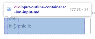
The issue is that the browser will only render a radius that fits within
the element's dimensions, and the piece on the left side (or right on
RTL) is not wide enough.
## What is the new behavior?
<!-- Please describe the behavior or changes that are being added by
this PR. -->
While we could fix this issue by making the left-side piece wider (and
there was originally a PR for this at
https://github.com/ionic-team/ionic-framework/pull/27459), it was
decided to not include this fix in Ionic automatically. This is because
the fix does not work for `label-placement="stacked"` or `"floating"`;
the notch spacer (the middle piece of the outline) is pushed to the
side, leading to broken visuals:
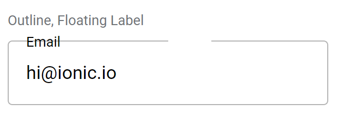
We decided that introducing inconsistent behavior across different
values for `label-placement` would be confusing for developers. Even if
we did restructure the outline container to position the notch spacer
correctly, it could easily be made to fall on the curve of the border,
creating awkward visuals.
Instead, developers looking to use a large `--border-radius` with
`fill="outline"` should either increase `--padding-start` to be at least
as high as the `--border-radius` (which will increase the width of the
left outline piece while also moving the floating label in step), or use
`shape="round"` (which will change both the padding and border radius
automatically). This PR documents this workaround in the
`--border-radius` description.
## Does this introduce a breaking change?
- [ ] Yes
- [x] No
<!-- If this introduces a breaking change, please describe the impact
and migration path for existing applications below. -->
## Other information
<!-- Any other information that is important to this PR such as
screenshots of how the component looks before and after the change. -->
Issue number: Resolves#18115
---------
<!-- Please do not submit updates to dependencies unless it fixes an
issue. -->
<!-- Please try to limit your pull request to one type (bugfix, feature,
etc). Submit multiple pull requests if needed. -->
## What is the current behavior?
<!-- Please describe the current behavior that you are modifying. -->
Resizing the `ion-spinner` by setting the width & height using CSS works
for most spinner variants, but not for `dots`, `bubbles`, and `circles`.
The spacing between the circles on these spinner variants is not scaling
with the spinner.
## What is the new behavior?
<!-- Please describe the behavior or changes that are being added by
this PR. -->
- `ion-spinner` may now be resized by setting the width & height using
CSS for all variants.
## Does this introduce a breaking change?
- [ ] Yes
- [x] No
<!-- If this introduces a breaking change, please describe the impact
and migration path for existing applications below. -->
## Other information
<!-- Any other information that is important to this PR such as
screenshots of how the component looks before and after the change. -->
### Before
<img width="371" alt="Screenshot 2023-05-08 at 5 17 59 PM"
src="https://user-images.githubusercontent.com/14926794/236937361-b8139bb3-192d-4fbf-839c-f9262b7c112a.png">
### After
<img width="373" alt="Screenshot 2023-05-08 at 5 18 45 PM"
src="https://user-images.githubusercontent.com/14926794/236937508-9a8fa74e-60c8-47d9-9d56-c287da03a33f.png">
---------
Co-authored-by: ionitron <hi@ionicframework.com>
Issue number: N/A

---------

<!-- Please do not submit updates to dependencies unless it fixes an
issue. -->

<!-- Please try to limit your pull request to one type (bugfix, feature,
etc). Submit multiple pull requests if needed. -->

## What is the current behavior?
<!-- Please describe the current behavior that you are modifying. -->

Chip tests currently take screenshots are entire pages with lots of
chips. This makes it hard to understand what exactly is being tested.
Additionally, there are redundant configurations are being tested.

## What is the new behavior?
<!-- Please describe the behavior or changes that are being added by
this PR. -->

- Broke the chip tests up into the following checks:

1. Basic rendering. This checks rendering across text directions.
2. Outline rendering
3. Solid + Color rendering
4. Solid + Outline rendering
5. Disabled state rendering
6. Customization/CSS Variable rendering

## Does this introduce a breaking change?

- [ ] Yes
- [x] No

<!-- If this introduces a breaking change, please describe the impact
and migration path for existing applications below. -->


## Other information

<!-- Any other information that is important to this PR such as
screenshots of how the component looks before and after the change. -->

---------

Co-authored-by: ionitron <hi@ionicframework.com>
Issue number: resolves#27461
---------
<!-- Please do not submit updates to dependencies unless it fixes an
issue. -->
<!-- Please try to limit your pull request to one type (bugfix, feature,
etc). Submit multiple pull requests if needed. -->
## What is the current behavior?
<!-- Please describe the current behavior that you are modifying. -->
If an accordion group has a value, and an accordion updates its value to
equal the accordion group value then the state of the accordion does not
change.
## What is the new behavior?
<!-- Please describe the behavior or changes that are being added by
this PR. -->
- If an accordion value changes it will call `this.updateState` to see
if it should open in the event its value now matches the value of the
parent accordion group.
## Does this introduce a breaking change?
- [ ] Yes
- [x] No
<!-- If this introduces a breaking change, please describe the impact
and migration path for existing applications below. -->
## Other information
<!-- Any other information that is important to this PR such as
screenshots of how the component looks before and after the change. -->
Dev build: `7.0.7-dev.11683898881.13edb102`
Issue number: resolves#27201
---------
<!-- Please do not submit updates to dependencies unless it fixes an
issue. -->
<!-- Please try to limit your pull request to one type (bugfix, feature,
etc). Submit multiple pull requests if needed. -->
## What is the current behavior?
<!-- Please describe the current behavior that you are modifying. -->
Selects with a floating label, no value, and a placeholder should have
the label cover the placeholder when blurred. One focus, the label
should translate to the top of the select, and the placeholder should be
visible.
## What is the new behavior?
<!-- Please describe the behavior or changes that are being added by
this PR. -->
- Floating label now covers the select and hides the placeholder when
the select is blurred, matching the `ion-input` and `ion-textarea`
behaviors.
## Does this introduce a breaking change?
- [ ] Yes
- [x] No
<!-- If this introduces a breaking change, please describe the impact
and migration path for existing applications below. -->
## Other information
<!-- Any other information that is important to this PR such as
screenshots of how the component looks before and after the change. -->
---------
Co-authored-by: ionitron <hi@ionicframework.com>





