aIssue number: resolves#28388
---------
<!-- Please do not submit updates to dependencies unless it fixes an
issue. -->
<!-- Please try to limit your pull request to one type (bugfix, feature,
etc). Submit multiple pull requests if needed. -->
## What is the current behavior?
<!-- Please describe the current behavior that you are modifying. -->
We added a `min-height: 56px` to the input, textarea, and select
components for MD mode. However, these were added for the outline/solid
style inputs to align with the Material Design spec:
https://material-components.github.io/material-components-web-catalog/#/component/text-field
They should not apply to regular inputs in an item. The end result is
inconsistently sized items when used with non-control items.
## What is the new behavior?
<!-- Please describe the behavior or changes that are being added by
this PR. -->
- Non-filled and non-stacked/floating label controls are now have a
minimum height of 44px.
There should be **no changes** to the following types of controls:
1. iOS controls (all variants)
2. MD filled controls
3. MD stacked controls
## Does this introduce a breaking change?
- [ ] Yes
- [x] No
<!-- If this introduces a breaking change, please describe the impact
and migration path for existing applications below. -->
## Other information
<!-- Any other information that is important to this PR such as
screenshots of how the component looks before and after the change. -->
Dev build: `7.5.2-dev.11697818830.1a33c881`
---------
Co-authored-by: ionitron <hi@ionicframework.com>
Issue number: resolves#24638, resolves#18592
---------
<!-- Please do not submit updates to dependencies unless it fixes an
issue. -->
<!-- Please try to limit your pull request to one type (bugfix, feature,
etc). Submit multiple pull requests if needed. -->
## What is the current behavior?
<!-- Please describe the current behavior that you are modifying. -->
Developers have requested that Ionic Framework support the dynamic type
feature on iOS for accessibility purposes. Ionic applications do not
respond to font scaling on iOS which can create inaccessible
applications particularly for users with low vision. Ionic apps on
Android devices currently support the Android equivalent due to
functionality in the Chromium webview.
Developers have also requested a way of adjusting the fonts in their
Ionic UI components consistently.
## What is the new behavior?
<!-- Please describe the behavior or changes that are being added by
this PR. -->
- Ionic components now use `rem` instead of `px` where appropriate. This
means devs can change the font size on `html` and the text in supported
Ionic components will scale up/down appropriately
- Add support for Dynamic Type on iOS (the iOS version of Dynamic Font
Scaling)
## Does this introduce a breaking change?
- [ ] Yes
- [x] No
<!-- If this introduces a breaking change, please describe the impact
and migration path for existing applications below. -->
## Other information
<!-- Any other information that is important to this PR such as
screenshots of how the component looks before and after the change. -->
---------
Co-authored-by: Maria Hutt <thetaPC@users.noreply.github.com>
Co-authored-by: Brandy Carney <brandyscarney@users.noreply.github.com>
Co-authored-by: Shawn Taylor <shawn@ionic.io>
Co-authored-by: ionitron <hi@ionicframework.com>
Co-authored-by: Sean Perkins <sean@ionic.io>
Co-authored-by: Sean Perkins <13732623+sean-perkins@users.noreply.github.com>
Co-authored-by: Amanda Johnston <90629384+amandaejohnston@users.noreply.github.com>
Issue number: resolves#22142
---------
<!-- Please do not submit updates to dependencies unless it fixes an
issue. -->
<!-- Please try to limit your pull request to one type (bugfix, feature,
etc). Submit multiple pull requests if needed. -->
## What is the current behavior?
<!-- Please describe the current behavior that you are modifying. -->
Textarea always takes up the entire width of a line which prevents the
`cols` property from working correctly.
## What is the new behavior?
<!-- Please describe the behavior or changes that are being added by
this PR. -->
- The textarea respects the `col` property value only when `autoGrow` is
`false`
## Does this introduce a breaking change?
- [ ] Yes
- [x] No
<!-- If this introduces a breaking change, please describe the impact
and migration path for existing applications below. -->
## Other information
<!-- Any other information that is important to this PR such as
screenshots of how the component looks before and after the change. -->
Dev build: `7.3.2-dev.11693402720.1adb3bcf`
---------
Co-authored-by: ionitron <hi@ionicframework.com>
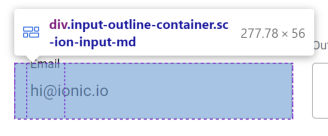
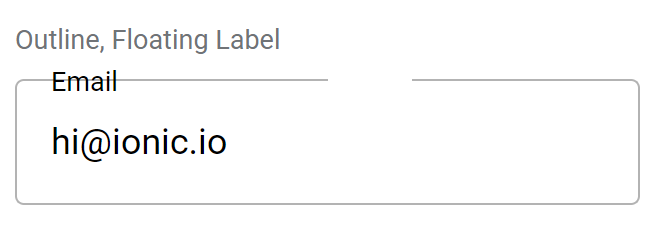
Issue number: resolves#27812
---------
<!-- Please do not submit updates to dependencies unless it fixes an
issue. -->
<!-- Please try to limit your pull request to one type (bugfix, feature,
etc). Submit multiple pull requests if needed. -->
## What is the current behavior?
<!-- Please describe the current behavior that you are modifying. -->
We currently have CSS to ensure the floating/stacked label is not
obscured by the input/textarea when using the outline styles. However,
it was discovered that this scenario can happen with any
floating/stacked label not just when the input/textarea is using the
outline style.
## What is the new behavior?
<!-- Please describe the behavior or changes that are being added by
this PR. -->
- Floating/stacked labels appear on top of the input/textarea regardless
of fill mode.
## Does this introduce a breaking change?
- [ ] Yes
- [x] No
<!-- If this introduces a breaking change, please describe the impact
and migration path for existing applications below. -->
## Other information
<!-- Any other information that is important to this PR such as
screenshots of how the component looks before and after the change. -->
Dev build: `7.2.1-dev.11690464203.1b2b4419`
---------
Co-authored-by: ionitron <hi@ionicframework.com>
Issue number: resolves#27345
---------
<!-- Please do not submit updates to dependencies unless it fixes an
issue. -->
<!-- Please try to limit your pull request to one type (bugfix, feature,
etc). Submit multiple pull requests if needed. -->
## What is the current behavior?
<!-- Please describe the current behavior that you are modifying. -->
WebKit has a bug where children of grid elements placed inside flex
elements have the wrong size. This is causing textarea's dimensions to
spill out of its grid container. Grid is used for autogrow
functionality, and the grid itself is placed inside `.label-wrapper`
which uses flexbox for aligning the label and control.
## What is the new behavior?
<!-- Please describe the behavior or changes that are being added by
this PR. -->
- Adds `grid-auto-rows: 100%` to avoid the WebKit bug which specifies
the size of implicitly-created grid rows.
## Does this introduce a breaking change?
- [ ] Yes
- [x] No
<!-- If this introduces a breaking change, please describe the impact
and migration path for existing applications below. -->
## Other information
<!-- Any other information that is important to this PR such as
screenshots of how the component looks before and after the change. -->
Dev build: `7.1.3-dev.11688748118.18ff9e7d`
WebKit bug: https://bugs.webkit.org/show_bug.cgi?id=256781
---------
Co-authored-by: ionitron <hi@ionicframework.com>
Issue number: resolves#27688
---------
<!-- Please do not submit updates to dependencies unless it fixes an
issue. -->
<!-- Please try to limit your pull request to one type (bugfix, feature,
etc). Submit multiple pull requests if needed. -->
## What is the current behavior?
<!-- Please describe the current behavior that you are modifying. -->
Autogrow broke as a result of
8bcd9e8b35.
`white-space: pre-wrap` used to be on the host, but it was discovered
that this caused textareas that had any white space to break visually.
As a result, I moved `white-space: pre-wrap` to apply on the host only
for the legacy textarea. The modern textarea had `white-space: pre-wrap`
set on the native textarea.
We also had `white-space: pre-wrap` set on the `::after` pseudo element
for autogrow:
f29c66aee2/core/src/components/textarea/textarea.scss (L311)
However, we also use the `text-inherit` mixin:
f29c66aee2/core/src/components/textarea/textarea.scss (L322)
This mixin sets `white-space: inherit` and also overrides the `pre-wrap`
we had set. As a result, the whitespace was being inherited from the
default white space instead of `pre-wrap`.
## What is the new behavior?
<!-- Please describe the behavior or changes that are being added by
this PR. -->
- Textarea no longer overrides the explicit `white-space: pre-wrap` on
the `::after` element.
- Re-enabled a skipped autogrow test that would have caught this bug
- Fixed a whitespace issue in another autogrow test
Note: The legacy screenshot diffs in
6ba2093166
are unrelated to this PR. Now that we are unskipping them the
screenshots have been updated. I verified this in
https://github.com/ionic-team/ionic-framework/pull/27692. This PR shows
a branch created off `7.0.x` (which does not have the reported
regression) and the tests enabled w/ the screenshots updated. The linked
verification PR can be closed when this PR merges.
## Does this introduce a breaking change?
- [ ] Yes
- [x] No
<!-- If this introduces a breaking change, please describe the impact
and migration path for existing applications below. -->
## Other information
<!-- Any other information that is important to this PR such as
screenshots of how the component looks before and after the change. -->
Dev build: 7.1.1-dev.11687532007.11a1a9a4
---------
Co-authored-by: ionitron <hi@ionicframework.com>
Issue number: resolves#27061
---------
<!-- Please do not submit updates to dependencies unless it fixes an
issue. -->
<!-- Please try to limit your pull request to one type (bugfix, feature,
etc). Submit multiple pull requests if needed. -->
## What is the current behavior?
<!-- Please describe the current behavior that you are modifying. -->
Textarea does not accept custom HTML labels
## What is the new behavior?
<!-- Please describe the behavior or changes that are being added by
this PR. -->
- Textarea accepts custom HTML labels as an experimental feature. We
marked this as experimental because it makes use of "scoped slots" which
is an emulated version of Web Component slots. As a result, there may be
instances where the slot behavior does not exactly match the native slot
behavior.
Note to reviewers: This is a combination of previously reviewed PRs. The
implementation is complete, so feel free to bikeshed.
## Does this introduce a breaking change?
- [ ] Yes
- [x] No
<!-- If this introduces a breaking change, please describe the impact
and migration path for existing applications below. -->
## Other information
<!-- Any other information that is important to this PR such as
screenshots of how the component looks before and after the change. -->
Docs PR: https://github.com/ionic-team/ionic-docs/pull/3001
---------
Co-authored-by: ionitron <hi@ionicframework.com>
Issue number: resolves#27184
---------
## What is the current behavior?
The modern form controls do not use the same opacity for their labels
when disabled, resulting in inconsistent UI when using two different
types in the same view (select vs checkbox, for example).
## What is the new behavior?
The checkbox, input, radio, range, select, textarea and toggle labels
have been updated on both modes to use the same opacity as each other
when disabled. The checkbox and radio icons have been updated to use a
different opacity than the label for `md` mode.
- Updates `ios` mode so all form controls use the same opacity of `0.3`
- I could not find any guidelines by Apple for what color these should
be, so I decided to just make them the same as what is most commonly
used & match item
- Updates `md` mode so all form control labels use the same opacity of
`0.38`
- I used the [Material Design 3
documentation](https://m2.material.io/components) to get this number as
well as the opacity of the disabled selection controls in the [Material
Design 2 figma design
kit](https://www.figma.com/community/file/778763161265841481). The
Material Design 2 documentation does not mention the opacity, but this
is also the number used by Material Design 1 so it's safe to assume it
is what the disabled form labels should also use for Material Design 2.
- Updates the `md` range so the slotted elements are also included when
setting the opacity on the label
- Updates the range, radio & checkbox tests to make sure there are
screenshots in the different disabled states
- Updates the item/disabled test to include radio & textarea so you can
see all form controls side by side
## Does this introduce a breaking change?
- [ ] Yes
- [x] No
## Other information
I downloaded screenshots of the item disabled tests and put them side by
side for `main` and this branch in order to see the differences in the
labels. The grey boxes to the left of each item are just a bigger
version of the label color for that item, so it's easier to see when
they aren't the same.


---------
Co-authored-by: ionitron <hi@ionicframework.com>
Issue number: resolves#27129
---------
<!-- Please do not submit updates to dependencies unless it fixes an
issue. -->
<!-- Please try to limit your pull request to one type (bugfix, feature,
etc). Submit multiple pull requests if needed. -->
## What is the current behavior?
<!-- Please describe the current behavior that you are modifying. -->
Material Design has 16px of margin between the form control and the
label, but we have 8px:
https://m2.material.io/components/selection-controls#usage
## What is the new behavior?
<!-- Please describe the behavior or changes that are being added by
this PR. -->
- Updates default margin from 8px to 16px for checkbox, input, radio,
range, select, textarea, and toggle.
Note: This should only apply to labels that are on the same line as the
form control. In other words, they do not apply to stacked/floating
labels.
## Does this introduce a breaking change?
- [ ] Yes
- [x] No
<!-- If this introduces a breaking change, please describe the impact
and migration path for existing applications below. -->
## Other information
<!-- Any other information that is important to this PR such as
screenshots of how the component looks before and after the change. -->
---------
Co-authored-by: ionitron <hi@ionicframework.com>
Issue number: resolves#27116
---------
<!-- Please do not submit updates to dependencies unless it fixes an
issue. -->
<!-- Please try to limit your pull request to one type (bugfix, feature,
etc). Submit multiple pull requests if needed. -->
## What is the current behavior?
<!-- Please describe the current behavior that you are modifying. -->
With `ion-input`, `ion-select`, or `ion-textarea` using
`fill="outline"`, applying a large value for the `--border-radius` CSS
prop causes the radius to render differently on the left and right
sides:

This is due to the structure of the outline container, which is used to
render the empty space in the border when a `stacked` or `floating`
label floats upwards. The container has three pieces, which combine to
form a seamless-looking border:
The issue is that the browser will only render a radius that fits within
the element's dimensions, and the piece on the left side (or right on
RTL) is not wide enough.
## What is the new behavior?
<!-- Please describe the behavior or changes that are being added by
this PR. -->
While we could fix this issue by making the left-side piece wider (and
there was originally a PR for this at
https://github.com/ionic-team/ionic-framework/pull/27459), it was
decided to not include this fix in Ionic automatically. This is because
the fix does not work for `label-placement="stacked"` or `"floating"`;
the notch spacer (the middle piece of the outline) is pushed to the
side, leading to broken visuals:
We decided that introducing inconsistent behavior across different
values for `label-placement` would be confusing for developers. Even if
we did restructure the outline container to position the notch spacer
correctly, it could easily be made to fall on the curve of the border,
creating awkward visuals.
Instead, developers looking to use a large `--border-radius` with
`fill="outline"` should either increase `--padding-start` to be at least
as high as the `--border-radius` (which will increase the width of the
left outline piece while also moving the floating label in step), or use
`shape="round"` (which will change both the padding and border radius
automatically). This PR documents this workaround in the
`--border-radius` description.
## Does this introduce a breaking change?
- [ ] Yes
- [x] No
<!-- If this introduces a breaking change, please describe the impact
and migration path for existing applications below. -->
## Other information
<!-- Any other information that is important to this PR such as
screenshots of how the component looks before and after the change. -->
Issue URL: resolves#27086
---------
<!-- Please refer to our contributing documentation for any questions on
submitting a pull request, or let us know here if you need any help:
https://ionicframework.com/docs/building/contributing -->
<!-- Some docs updates need to be made in the `ionic-docs` repo, in a
separate PR. See
https://github.com/ionic-team/ionic-framework/blob/main/.github/CONTRIBUTING.md#modifying-documentation
for details. -->
<!-- Please do not submit updates to dependencies unless it fixes an
issue. -->
<!-- Please try to limit your pull request to one type (bugfix, feature,
etc). Submit multiple pull requests if needed. -->
## What is the current behavior?
<!-- Please describe the current behavior that you are modifying. -->
When an `ion-select` is inside a card, the label is slightly lower than
it should be, making it out of alignment with the label of an
`ion-input`.
<!-- Issues are required for both bug fixes and features. -->
## What is the new behavior?
<!-- Please describe the behavior or changes that are being added by
this PR. -->
- When inside a card, the labels of `ion-input` and `ion-select` are in
line with each other.
## Does this introduce a breaking change?
- [ ] Yes
- [x] No
<!-- If this introduces a breaking change, please describe the impact
and migration path for existing applications below. -->
## Other information
<!-- Any other information that is important to this PR such as
screenshots of how the component looks before and after the change. -->
This bug was occurring because the label of ion-select is in the shadow
DOM. [As
recommended](https://github.com/ionic-team/ionic-framework/issues/27086#issuecomment-1494427311),
this fix was also added to ion-input and ion-textarea in case those
labels are also later moved to the shadow DOM.
Before:
<img width="534" alt="Screenshot 2023-04-13 at 4 35 44 PM"
src="https://user-images.githubusercontent.com/14926794/231877123-02f8e381-2137-4d3c-8dab-ae9051ad3591.png">
After:
<img width="535" alt="Screenshot 2023-04-13 at 4 36 02 PM"
src="https://user-images.githubusercontent.com/14926794/231877151-bd49b87b-762a-4d20-b6b7-57c1ab3bb368.png">
---------
Co-authored-by: ionitron <hi@ionicframework.com>
Issue number: resolves#27249
---------
<!-- Please refer to our contributing documentation for any questions on
submitting a pull request, or let us know here if you need any help:
https://ionicframework.com/docs/building/contributing -->
<!-- Some docs updates need to be made in the `ionic-docs` repo, in a
separate PR. See
https://github.com/ionic-team/ionic-framework/blob/main/.github/CONTRIBUTING.md#modifying-documentation
for details. -->
<!-- Please do not submit updates to dependencies unless it fixes an
issue. -->
<!-- Please try to limit your pull request to one type (bugfix, feature,
etc). Submit multiple pull requests if needed. -->
## What is the current behavior?
<!-- Please describe the current behavior that you are modifying. -->
The cloned input/textarea for scroll assist is not sized correctly. For
legacy inputs, this causes the clone to be off by ~1px because it does
not have the correct height. For modern inputs, this causes the same bug
as the legacy inputs plus cloned inputs overlap any floating/stacked
labels. This was not a concern for legacy inputs because those inputs
did not contain the label element where modern inputs do.
## What is the new behavior?
<!-- Please describe the behavior or changes that are being added by
this PR. -->
- Sets `bottom: 0` for cloned inputs so they have the correct height
- Sets `position: relative` on the `.native-wrapper` so the cloned input
does not flow outside of the parent container.
**Before**
| Modern Input | Legacy Input |
| - | - |
| <video
src="https://user-images.githubusercontent.com/2721089/233385644-3c15f98e-2646-41e1-b206-34c505791bde.MP4"></video>
| <video
src="https://user-images.githubusercontent.com/2721089/233385681-8d682222-44b4-4cdc-b0de-96ed3fd38792.MP4"></video>
|
(Note: The legacy input bug is subtle -- the input only shifts by ~1px)
**After**
| Modern Input | Legacy Input |
| - | - |
| <video
src="https://user-images.githubusercontent.com/2721089/233385911-243dea95-39b4-4d81-bfe9-26e52382a702.mp4"></video>
| <video
src="https://user-images.githubusercontent.com/2721089/233386237-2c9eede3-ca91-429b-8a35-15428529a883.mp4"></video>
|
## Does this introduce a breaking change?
- [ ] Yes
- [x] No
<!-- If this introduces a breaking change, please describe the impact
and migration path for existing applications below. -->
## Other information
<!-- Any other information that is important to this PR such as
screenshots of how the component looks before and after the change. -->
Issue URL: resolves#27218
---------
<!-- Please refer to our contributing documentation for any questions on
submitting a pull request, or let us know here if you need any help:
https://ionicframework.com/docs/building/contributing -->
<!-- Some docs updates need to be made in the `ionic-docs` repo, in a
separate PR. See
https://github.com/ionic-team/ionic-framework/blob/main/.github/CONTRIBUTING.md#modifying-documentation
for details. -->
<!-- Please do not submit updates to dependencies unless it fixes an
issue. -->
<!-- Please try to limit your pull request to one type (bugfix, feature,
etc). Submit multiple pull requests if needed. -->
## What is the current behavior?
<!-- Please describe the current behavior that you are modifying. -->
Padding is not applied to the `.native-textarea` element when using a
legacy textarea. It is applied in v6:
ae9689bf3e/core/src/components/textarea/textarea.scss (L98-L100)
The modern textarea is not impacted.
## What is the new behavior?
<!-- Please describe the behavior or changes that are being added by
this PR. -->
- Padding is now added to `.native-textarea` with the legacy textarea.
## Does this introduce a breaking change?
- [ ] Yes
- [x] No
<!-- If this introduces a breaking change, please describe the impact
and migration path for existing applications below. -->
## Other information
<!-- Any other information that is important to this PR such as
screenshots of how the component looks before and after the change. -->
---------
Co-authored-by: ionitron <hi@ionicframework.com>
BREAKING CHANGE:

The default value for the `--placeholder-opacity` CSS Variable on `ion-input`, `ion-searchbar`, `ion-select`, and `ion-textarea` has been updated to `0.6`.
- updates components to use shadow DOM or scoped if they require css variables
- moves global styles to an external stylesheet that needs to be imported
- adds support for additional colors and removes the Sass loops to generate colors for each component
- several property renames, bug fixes, and test updates

Co-authored-by: Manu Mtz.-Almeida <manu.mtza@gmail.com>
Co-authored-by: Adam Bradley <adambradley25@gmail.com>
Co-authored-by: Cam Wiegert <cam@camwiegert.com>