Remove a missed `!default` flag in the themes directory and update the
Sass variable guidelines docs to eliminate the `!default` flag from the
code examples, except for in the historic usage section which includes
examples from previous versions where the `!default` flag was used.

---------

Co-authored-by: Brandy Carney <brandy@ionic.io>
Issue number: N/A

---------

## What is the current behavior?
Currently, every Sass variable in Ionic has the `!default` flag added to
the end.

From the [Sass variables
documentation](https://sass-lang.com/documentation/variables/):

> Normally when you assign a value to a variable, if that variable
already had a value, its old value is overwritten. But if you’re writing
a Sass library, you might want to allow your users to configure your
library’s variables before you use them to generate CSS.
>
> To make this possible, Sass provides the `!default` flag. This assigns
a value to a variable only if that variable isn’t defined or its value
is [null](https://sass-lang.com/documentation/values/null). Otherwise,
the existing value will be used.

In past versions of Ionic Framework, developers wrote Sass variables to
rebuild Ionic Framework using their own values. In the latest versions
of Ionic Framework, this is not possible.

## What is the new behavior?
Removes the `!default` flag from all Sass variables.

## Does this introduce a breaking change?

- [ ] Yes
- [x] No

-------

Co-authored-by: brandyscarney <brandyscarney@users.noreply.github.com>
Issue number: N/A
---------
<!-- Please do not submit updates to dependencies unless it fixes an
issue. -->
<!-- Please try to limit your pull request to one type (bugfix, feature,
etc). Submit multiple pull requests if needed. -->
## What is the current behavior?
<!-- Please describe the current behavior that you are modifying. -->
When using an outline-style button in a toolbar on `md` dark mode, the
activated style causes the button to become invisible.
Steps to repro in `main`:
1. Update the `css-variables` themes test to use the latest dark theme
styles (at least for v7) by replacing the contents of [this
file](https://github.com/ionic-team/ionic-framework/blob/main/core/src/themes/test/css-variables/css/dark.css)
with the [styles from the
docs](https://ionicframework.com/docs/theming/dark-mode#ionic-dark-theme).
2. Host the project locally and navigate to the test at
`themes/test/css-variables/index.html`.
3. Switch to dark mode within the page. Note that the activated outline
button isn't visible:

## What is the new behavior?
<!-- Please describe the behavior or changes that are being added by
this PR. -->
- Button styles corrected. The colors were correct for `ios` mode, but
had to be flipped for `md`, so I pulled the relevant styles into the
mode-specific stylesheets.
- CSS variables test has also been updated to use the same dark mode CSS
as in [the
docs](https://ionicframework.com/docs/theming/dark-mode#ionic-dark-theme),
as per the repro steps above. Let me know if you would rather this be
split into a separate PR.
Changes to the toolbar test were split into a separate PR to keep this
one clean and ensure the screenshot changes can be reviewed more
effectively: https://github.com/ionic-team/ionic-framework/pull/29231
## Does this introduce a breaking change?
- [ ] Yes
- [x] No
<!--
If this introduces a breaking change:
1. Describe the impact and migration path for existing applications
below.
5. Update the BREAKING.md file with the breaking change.
6. Add "BREAKING CHANGE: [...]" to the commit description when merging.
See
https://github.com/ionic-team/ionic-framework/blob/main/.github/CONTRIBUTING.md#footer
for more information.
-->
## Other information
<!-- Any other information that is important to this PR such as
screenshots of how the component looks before and after the change. -->
---------
Co-authored-by: ionitron <hi@ionicframework.com>
Issue number: Internal

---------

<!-- Please do not submit updates to dependencies unless it fixes an
issue. -->

<!-- Please try to limit your pull request to one type (bugfix, feature,
etc). Submit multiple pull requests if needed. -->

## What is the current behavior?
<!-- Please describe the current behavior that you are modifying. -->

Ionic Framework currently plans to offer dark and high contrast "themes"
in v8. However this naming nomenclature conflicts with a significant new
feature that the team is working on towards v9+.

## What is the new behavior?
<!-- Please describe the behavior or changes that are being added by
this PR. -->

- Migrates previous dark and high contrast "themes" to "palettes"
- Updates test infrastructure to import from the new stylesheet
locations

## Does this introduce a breaking change?

- [x] Yes
- [ ] No

<!--
  If this introduces a breaking change:
1. Describe the impact and migration path for existing applications
below.
  2. Update the BREAKING.md file with the breaking change.
3. Add "BREAKING CHANGE: [...]" to the commit description when merging.
See
https://github.com/ionic-team/ionic-framework/blob/main/.github/CONTRIBUTING.md#footer
for more information.
-->

Developers that have updated to the Ionic v8 beta and have implemented
the dark and high contrast themes, will need to update the import path:

```diff
-@import '@ionic/angular/css/themes/dark.always.css';
+@import '@ionic/angular/css/palettes/dark.always.css';
```


## Other information

<!-- Any other information that is important to this PR such as
screenshots of how the component looks before and after the change. -->

Blocked by: https://github.com/ionic-team/ionic-framework/pull/29148.
Review that first.

Documentation PR: https://github.com/ionic-team/ionic-docs/pull/3521

---------

Co-authored-by: Liam DeBeasi <liamdebeasi@users.noreply.github.com>
Issue number: N/A

---------

<!-- Please do not submit updates to dependencies unless it fixes an
issue. -->

<!-- Please try to limit your pull request to one type (bugfix, feature,
etc). Submit multiple pull requests if needed. -->

## What is the current behavior?
<!-- Please describe the current behavior that you are modifying. -->

## What is the new behavior?
<!-- Please describe the behavior or changes that are being added by
this PR. -->

- Migrates the test infrastructure to use `palettes` instead of `themes`

## Does this introduce a breaking change?

- [ ] Yes
- [x] No

<!--
  If this introduces a breaking change:
1. Describe the impact and migration path for existing applications
below.
  2. Update the BREAKING.md file with the breaking change.
3. Add "BREAKING CHANGE: [...]" to the commit description when merging.
See
https://github.com/ionic-team/ionic-framework/blob/main/.github/CONTRIBUTING.md#footer
for more information.
-->


## Other information

<!-- Any other information that is important to this PR such as
screenshots of how the component looks before and after the change. -->

This **does not** change where the light/dark/high contrast styles live
or how they are consumed in the test infra. That work is done here:
https://github.com/ionic-team/ionic-framework/pull/29149

Co-authored-by: Liam DeBeasi <liamdebeasi@users.noreply.github.com>
⚠️ This is a combination of previously approved PRs with the
exception of
fe9dca513c.
This change was made as a result of
https://github.com/ionic-team/ionic-framework-design-documents/pull/248.

Issue number: Internal

---------

<!-- Please do not submit updates to dependencies unless it fixes an
issue. -->

<!-- Please try to limit your pull request to one type (bugfix, feature,
etc). Submit multiple pull requests if needed. -->

## What is the current behavior?
<!-- Please describe the current behavior that you are modifying. -->

Users do not have a way of increasing the contrast in Ionic apps. This
is valuable for people with low vision as increasing the contrast
between foreground and background content helps improve readability.

## What is the new behavior?
<!-- Please describe the behavior or changes that are being added by
this PR. -->

- Adds a high contrast light and high contrast dark theme. As with our
other themes, developers can choose between system, class, and always
stylesheets.

While we aim to improve contrast for text and UI components, this
feature prioritizes text in the event that both text and UI component
cannot be improved without one negatively impacting the other.

## Does this introduce a breaking change?

- [ ] Yes
- [x] No

<!--
  If this introduces a breaking change:
1. Describe the impact and migration path for existing applications
below.
  2. Update the BREAKING.md file with the breaking change.
3. Add "BREAKING CHANGE: [...]" to the commit description when merging.
See
https://github.com/ionic-team/ionic-framework/blob/main/.github/CONTRIBUTING.md#footer
for more information.
-->


## Other information

<!-- Any other information that is important to this PR such as
screenshots of how the component looks before and after the change. -->

Dev build: `7.6.7-dev.11706894781.1cd59fde`

Testing instructions:

1. Open `src/themes/test/css-variables`. Activate the high contrast
light and dark themes to verify that contrast does increase.
2. Use the dev build to integrate the theme into a test app (conference
app, starter app, etc).

I'd recommend using these imports:

```css
@import "@ionic/angular/css/themes/high-contrast.system.css";
@import "@ionic/angular/css/themes/high-contrast-dark.system.css";
```
Note: Make sure this is imported **after** `core.scss`

---------

Co-authored-by: Shawn Taylor <shawn@ionic.io>
Co-authored-by: Brandy Carney <brandyscarney@users.noreply.github.com>
Co-authored-by: Sean Perkins <13732623+sean-perkins@users.noreply.github.com>
Co-authored-by: ionitron <hi@ionicframework.com>
Co-authored-by: Maria Hutt <thetaPC@users.noreply.github.com>
Co-authored-by: Amanda Johnston <90629384+amandaejohnston@users.noreply.github.com>
Issue number: internal

---------

## What is the current behavior?
The old `border-radius` mixin added additional selectors and styles
depending on whether the direction was set to `ltr` or `rtl`.

Old mixin usage:

```scss
.old-border-radius {
  @include border-radius(5px, 6px, 7px, 8px)
}
```

generates:

```css
.old-border-radius {
  border-top-left-radius: 5px;
  border-top-right-radius: 6px;
  border-bottom-right-radius: 7px;
  border-bottom-left-radius: 8px;
}

:host-context([dir=rtl]) .old-border-radius {
  border-top-left-radius: 6px;
  border-top-right-radius: 5px;
  border-bottom-right-radius: 8px;
  border-bottom-left-radius: 7px;
}

[dir=rtl] .old-border-radius {
  border-top-left-radius: 6px;
  border-top-right-radius: 5px;
  border-bottom-right-radius: 8px;
  border-bottom-left-radius: 7px;
}

@supports selector(:dir(rtl)) {
  .old-border-radius:dir(rtl) {
    border-top-left-radius: 6px;
    border-top-right-radius: 5px;
    border-bottom-right-radius: 8px;
    border-bottom-left-radius: 7px;
  }
}
```

## What is the new behavior?
The new `border-radius` mixin uses the [logical
properties](https://developer.mozilla.org/en-US/docs/Web/CSS/CSS_logical_properties_and_values/Margins_borders_padding)
which handles switching based on the
[writing-mode](https://developer.mozilla.org/en-US/docs/Web/CSS/writing-mode),
[direction](https://developer.mozilla.org/en-US/docs/Web/CSS/direction),
and
[text-orientation](https://developer.mozilla.org/en-US/docs/Web/CSS/text-orientation):

| Before                       | After                       |
| -----------------------------| ----------------------------|
| `border-top-left-radius`     | `border-start-start-radius` |
| `border-bottom-left-radius`  | `border-end-start-radius`   |
| `border-top-right-radius`    | `border-start-end-radius`   |
| `border-bottom-right-radius` | `border-end-end-radius`     |

New mixin usage:

```scss
.new-border-radius {
  @include border-radius(5px, 6px, 7px, 8px)
}
```

```css
.new-border-radius {
  border-start-start-radius: 5px;
  border-start-end-radius: 6px;
  border-end-end-radius: 7px;
  border-end-start-radius: 8px;
}
```

## Does this introduce a breaking change?

- [ ] Yes
- [x] No

## Other information

The `select` styles have been updated to use the mixin instead of
hardcoding `border-radius`.
Issue number: Internal

---------

<!-- Please do not submit updates to dependencies unless it fixes an
issue. -->

<!-- Please try to limit your pull request to one type (bugfix, feature,
etc). Submit multiple pull requests if needed. -->

## What is the current behavior?
<!-- Please describe the current behavior that you are modifying. -->

Several tests were still using the legacy form syntax.

## What is the new behavior?
<!-- Please describe the behavior or changes that are being added by
this PR. -->

- Migrated tests in `core`, `angular`, and `vue` to use the modern form
syntax (`react` did not have form controls).

I opted not to migrate `item/test/highlight` and `item/test/counter`
because those tests are going to be removed in the future once the
deprecate item APIs are removed.

## Does this introduce a breaking change?

- [ ] Yes
- [x] No

<!--
  If this introduces a breaking change:
1. Describe the impact and migration path for existing applications
below.
  2. Update the BREAKING.md file with the breaking change.
3. Add "BREAKING CHANGE: [...]" to the commit description when merging.
See
https://github.com/ionic-team/ionic-framework/blob/main/.github/CONTRIBUTING.md#footer
for more information.
-->


## Other information

<!-- Any other information that is important to this PR such as
screenshots of how the component looks before and after the change. -->

---------

Co-authored-by: ionitron <hi@ionicframework.com>
Co-authored-by: Maria Hutt <thetaPC@users.noreply.github.com>
Issue number: N/A

---------

<!-- Please do not submit updates to dependencies unless it fixes an
issue. -->

<!-- Please try to limit your pull request to one type (bugfix, feature,
etc). Submit multiple pull requests if needed. -->

## What is the current behavior?
<!-- Please describe the current behavior that you are modifying. -->

Our theme tests currently consume an internal dark theme. This was
needed to add light/dark theme tests prior to us shipping separate
stylesheets to developers. However, now that these stylesheets have been
created we should always be testing with them so we can catch any bugs
in the dark mode stylesheet.

## What is the new behavior?
<!-- Please describe the behavior or changes that are being added by
this PR. -->

- Remove the custom dark.css file and removed references to it
- Added a TODO to do the same thing for the light theme once FW-5862 is
done.

## Does this introduce a breaking change?

- [ ] Yes
- [x] No

<!--
  If this introduces a breaking change:
1. Describe the impact and migration path for existing applications
below.
  2. Update the BREAKING.md file with the breaking change.
3. Add "BREAKING CHANGE: [...]" to the commit description when merging.
See
https://github.com/ionic-team/ionic-framework/blob/main/.github/CONTRIBUTING.md#footer
for more information.
-->


## Other information

<!-- Any other information that is important to this PR such as
screenshots of how the component looks before and after the change. -->
Issue number: Internal

---------

<!-- Please do not submit updates to dependencies unless it fixes an
issue. -->

<!-- Please try to limit your pull request to one type (bugfix, feature,
etc). Submit multiple pull requests if needed. -->

## What is the current behavior?
<!-- Please describe the current behavior that you are modifying. -->

The team would like to ensure that Ionic Framework components that use
an Ionic color (primary, secondary, etc) on top of a contrast color pass
minimum contrast ratios as defined in the WCAG.

## What is the new behavior?
<!-- Please describe the behavior or changes that are being added by
this PR. -->

- Introduces a revised set of Ionic colors that pass AA color contrast
guidelines when with the appropriate contrast.

## Does this introduce a breaking change?

- [ ] Yes
- [x] No

<!--
  If this introduces a breaking change:
1. Describe the impact and migration path for existing applications
below.
  2. Update the BREAKING.md file with the breaking change.
3. Add "BREAKING CHANGE: [...]" to the commit description when merging.
See
https://github.com/ionic-team/ionic-framework/blob/main/.github/CONTRIBUTING.md#footer
for more information.
-->


## Other information

<!-- Any other information that is important to this PR such as
screenshots of how the component looks before and after the change. -->

---------

Co-authored-by: Sean Perkins <13732623+sean-perkins@users.noreply.github.com>
Co-authored-by: Brandy Carney <brandy@ionic.io>
Co-authored-by: Sean Perkins <sean@ionic.io>
Co-authored-by: Shawn Taylor <shawn@ionic.io>
Co-authored-by: Brandy Carney <brandyscarney@users.noreply.github.com>
Co-authored-by: Amanda Johnston <90629384+amandaejohnston@users.noreply.github.com>
Co-authored-by: Maria Hutt <thetaPC@users.noreply.github.com>
Co-authored-by: ionitron <hi@ionicframework.com>
Issue number: resolves#23977
---------
<!-- Please do not submit updates to dependencies unless it fixes an
issue. -->
<!-- Please try to limit your pull request to one type (bugfix, feature,
etc). Submit multiple pull requests if needed. -->
## What is the current behavior?
<!-- Please describe the current behavior that you are modifying. -->
The MD Alert on tablet dimensions does not match the MD spec
## What is the new behavior?
<!-- Please describe the behavior or changes that are being added by
this PR. -->
- MD Alert now follows the MD spec for tablet dimensions
- Added tablet and mobile viewport mixins for alert and the card modal.
(There should be no visual diffs for the card modal)
## Does this introduce a breaking change?
- [ ] Yes
- [x] No
<!-- If this introduces a breaking change, please describe the impact
and migration path for existing applications below. -->
## Other information
<!-- Any other information that is important to this PR such as
screenshots of how the component looks before and after the change. -->
This supersedes https://github.com/ionic-team/ionic-framework/pull/27462
since I needed to add new screenshot tests. The author of that PR has
been given co-author credit here.
---------
Co-authored-by: GlenOttley <GlenOttley@users.noreply.github.com>
Co-authored-by: ionitron <hi@ionicframework.com>
Co-authored-by: Brandy Carney <brandyscarney@users.noreply.github.com>
Issue number: N/A

---------

<!-- Please do not submit updates to dependencies unless it fixes an
issue. -->

<!-- Please try to limit your pull request to one type (bugfix, feature,
etc). Submit multiple pull requests if needed. -->

## What is the current behavior?
<!-- Please describe the current behavior that you are modifying. -->

This project has several unused Sass variables still in the code base.
The team would like to remove these.

## What is the new behavior?
<!-- Please describe the behavior or changes that are being added by
this PR. -->

- Removed unused Sass variables


## Does this introduce a breaking change?

- [ ] Yes
- [x] No

<!-- If this introduces a breaking change, please describe the impact
and migration path for existing applications below. -->


## Other information

<!-- Any other information that is important to this PR such as
screenshots of how the component looks before and after the change. -->

The original scope of this ticket was for checkbox only, but many other
components had unused sass variables, so I decided to tackle everything
all at once.

Since these variables are not used anywhere:

1. The build should pass
2. There should be no screenshot diffs
Issue number: N/A

---------

<!-- Please do not submit updates to dependencies unless it fixes an
issue. -->

<!-- Please try to limit your pull request to one type (bugfix, feature,
etc). Submit multiple pull requests if needed. -->

## What is the current behavior?
<!-- Please describe the current behavior that you are modifying. -->

While working on a safe area padding mixin, I realized that `rtl()`
wasn't being applied for `:host` when using Firefox or Safari. This is
happening because the syntax for `:dir()` is wrong. The placement needs
to be updated for Firefox and Safari to register it.

```scss
:host {
   @include rtl() { // <- won't work
      // styles
   }
}

// generates
:host-context([dir=rtl]) {
  // styles
}

:host:dir(rtl) { // <- wrong syntax
   // styles
}
```

```scss
:host(.class) {
   @include rtl() { // <- won't work
      // styles
   }
}

// generates
:host-context([dir=rtl]):host(.class) {
  // styles
}

:host-context([dir=rtl]).class {
   // styles
}

:host(.class):dir(rtl) { // <- wrong syntax
   // styles
}
```

## What is the new behavior?
<!-- Please describe the behavior or changes that are being added by
this PR. -->

I updated `rtl()` to use `:dir()` as the `addHostSelector` in the
`add-root-selector` function. This generates all the correct selectors
for Firefox and Safari. However, `:dir()` does not have the structure of
`:host-context()` so I had to add a new parameter to `add-root-selector`
to determine whether to use `:host-context()` or not. I set the default
to `true` since the function originally used `:host-context()`.

An extra win is that the updated function will be ready for when
`:host-context()` can be removed from the codebase.


```diff
:host {
   @include rtl() { // <- works
      // styles
   }
}

// generates
:host-context([dir=rtl]) {
  // styles
}

-  :host:dir(rtl) {
+  :host(:dir(rtl)) {
   // styles
}
```

```diff
:host(.class) {
   @include rtl() { // <- works
      // styles
   }
}

// generates
:host-context([dir=rtl]):host(.class) {
  padding-right: 40px;
}

:host-context([dir=rtl]).class {
   // styles
}

-  :host(.class):dir(rtl) {
+  :host(.class:dir(rtl)) {
   // styles
}
```

## Does this introduce a breaking change?

- [ ] Yes
- [x] No

<!-- If this introduces a breaking change, please describe the impact
and migration path for existing applications below. -->


## Other information

<!-- Any other information that is important to this PR such as
screenshots of how the component looks before and after the change. -->

N/A

---------

Co-authored-by: ionitron <hi@ionicframework.com>
Issue number: resolves#24638, resolves#18592
---------
<!-- Please do not submit updates to dependencies unless it fixes an
issue. -->
<!-- Please try to limit your pull request to one type (bugfix, feature,
etc). Submit multiple pull requests if needed. -->
## What is the current behavior?
<!-- Please describe the current behavior that you are modifying. -->
Developers have requested that Ionic Framework support the dynamic type
feature on iOS for accessibility purposes. Ionic applications do not
respond to font scaling on iOS which can create inaccessible
applications particularly for users with low vision. Ionic apps on
Android devices currently support the Android equivalent due to
functionality in the Chromium webview.
Developers have also requested a way of adjusting the fonts in their
Ionic UI components consistently.
## What is the new behavior?
<!-- Please describe the behavior or changes that are being added by
this PR. -->
- Ionic components now use `rem` instead of `px` where appropriate. This
means devs can change the font size on `html` and the text in supported
Ionic components will scale up/down appropriately
- Add support for Dynamic Type on iOS (the iOS version of Dynamic Font
Scaling)
## Does this introduce a breaking change?
- [ ] Yes
- [x] No
<!-- If this introduces a breaking change, please describe the impact
and migration path for existing applications below. -->
## Other information
<!-- Any other information that is important to this PR such as
screenshots of how the component looks before and after the change. -->
---------
Co-authored-by: Maria Hutt <thetaPC@users.noreply.github.com>
Co-authored-by: Brandy Carney <brandyscarney@users.noreply.github.com>
Co-authored-by: Shawn Taylor <shawn@ionic.io>
Co-authored-by: ionitron <hi@ionicframework.com>
Co-authored-by: Sean Perkins <sean@ionic.io>
Co-authored-by: Sean Perkins <13732623+sean-perkins@users.noreply.github.com>
Co-authored-by: Amanda Johnston <90629384+amandaejohnston@users.noreply.github.com>
Issue number: resolves#27184
---------
## What is the current behavior?
The modern form controls do not use the same opacity for their labels
when disabled, resulting in inconsistent UI when using two different
types in the same view (select vs checkbox, for example).
## What is the new behavior?
The checkbox, input, radio, range, select, textarea and toggle labels
have been updated on both modes to use the same opacity as each other
when disabled. The checkbox and radio icons have been updated to use a
different opacity than the label for `md` mode.
- Updates `ios` mode so all form controls use the same opacity of `0.3`
- I could not find any guidelines by Apple for what color these should
be, so I decided to just make them the same as what is most commonly
used & match item
- Updates `md` mode so all form control labels use the same opacity of
`0.38`
- I used the [Material Design 3
documentation](https://m2.material.io/components) to get this number as
well as the opacity of the disabled selection controls in the [Material
Design 2 figma design
kit](https://www.figma.com/community/file/778763161265841481). The
Material Design 2 documentation does not mention the opacity, but this
is also the number used by Material Design 1 so it's safe to assume it
is what the disabled form labels should also use for Material Design 2.
- Updates the `md` range so the slotted elements are also included when
setting the opacity on the label
- Updates the range, radio & checkbox tests to make sure there are
screenshots in the different disabled states
- Updates the item/disabled test to include radio & textarea so you can
see all form controls side by side
## Does this introduce a breaking change?
- [ ] Yes
- [x] No
## Other information
I downloaded screenshots of the item disabled tests and put them side by
side for `main` and this branch in order to see the differences in the
labels. The grey boxes to the left of each item are just a bigger
version of the label color for that item, so it's easier to see when
they aren't the same.


---------
Co-authored-by: ionitron <hi@ionicframework.com>
Issue number: resolves#27129
---------
<!-- Please do not submit updates to dependencies unless it fixes an
issue. -->
<!-- Please try to limit your pull request to one type (bugfix, feature,
etc). Submit multiple pull requests if needed. -->
## What is the current behavior?
<!-- Please describe the current behavior that you are modifying. -->
Material Design has 16px of margin between the form control and the
label, but we have 8px:
https://m2.material.io/components/selection-controls#usage
## What is the new behavior?
<!-- Please describe the behavior or changes that are being added by
this PR. -->
- Updates default margin from 8px to 16px for checkbox, input, radio,
range, select, textarea, and toggle.
Note: This should only apply to labels that are on the same line as the
form control. In other words, they do not apply to stacked/floating
labels.
## Does this introduce a breaking change?
- [ ] Yes
- [x] No
<!-- If this introduces a breaking change, please describe the impact
and migration path for existing applications below. -->
## Other information
<!-- Any other information that is important to this PR such as
screenshots of how the component looks before and after the change. -->
---------
Co-authored-by: ionitron <hi@ionicframework.com>
Issue number: N/A

---------

- Changes the default Material Design tab color to
`$text-color-step-350` or `#a6a6a6`
- Changes the default iOS tab color to `$text-color-step-400` or
`#999999`
- Removes the axe skip in the e2e test

These were the minimum color changes needed to pass axe.

---------

Co-authored-by: ionitron <hi@ionicframework.com>
Co-authored-by: Liam DeBeasi <liamdebeasi@users.noreply.github.com>
Issue URL: resolves#26103, resolves#25285
---------
<!-- Please refer to our contributing documentation for any questions on
submitting a pull request, or let us know here if you need any help:
https://ionicframework.com/docs/building/contributing -->
<!-- Some docs updates need to be made in the `ionic-docs` repo, in a
separate PR. See
https://github.com/ionic-team/ionic-framework/blob/main/.github/CONTRIBUTING.md#modifying-documentation
for details. -->
<!-- Please do not submit updates to dependencies unless it fixes an
issue. -->
<!-- Please try to limit your pull request to one type (bugfix, feature,
etc). Submit multiple pull requests if needed. -->
## What is the current behavior?
<!-- Please describe the current behavior that you are modifying. -->
Options in `item-sliding` will not display when using RTL with Firefox
and Safari.
<!-- Issues are required for both bug fixes and features. -->
## What is the new behavior?
<!-- Please describe the behavior or changes that are being added by
this PR. -->
Issue was coming from `:host-context`. Firefox would keep [removing the
entire](https://www.w3.org/TR/selectors-3/#grouping) compiled style when
using this unsupported style. This would led to the RTL styles to not
being applied to the component.
- Split the CSS group from `add-root-selector()`
- Added comments to make it easier to navigate through
`add-root-selector()`
- Added `:dir()`
## Does this introduce a breaking change?
- [ ] Yes
- [x] No
<!-- If this introduces a breaking change, please describe the impact
and migration path for existing applications below. -->
## Other information
<!-- Any other information that is important to this PR such as
screenshots of how the component looks before and after the change. -->
Co-authored-by: brandyscarney <brandyscarney@users.noreply.github.com>
- Updating `add-root-selector()` would also fix another
[issue](https://github.com/ionic-team/ionic-framework/issues/25285)
unintentionally
---------
Co-authored-by: ionitron <hi@ionicframework.com>
Co-authored-by: Liam DeBeasi <liamdebeasi@users.noreply.github.com>
## Pull request checklist
Please check if your PR fulfills the following requirements:
- [ ] Tests for the changes have been added (for bug fixes / features)
- [ ] Docs have been reviewed and added / updated if needed (for bug
fixes / features)
- Some docs updates need to be made in the `ionic-docs` repo, in a
separate PR. See the [contributing
guide](https://github.com/ionic-team/ionic-framework/blob/main/.github/CONTRIBUTING.md#modifying-documentation)
for details.
- [x] Build (`npm run build`) was run locally and any changes were
pushed
- [x] Lint (`npm run lint`) has passed locally and any fixes were made
for failures
## Pull request type
Please check the type of change your PR introduces:
- [x] Bugfix
- [ ] Feature
- [ ] Code style update (formatting, renaming)
- [ ] Refactoring (no functional changes, no api changes)
- [ ] Build related changes
- [ ] Documentation content changes
- [ ] Other (please describe):
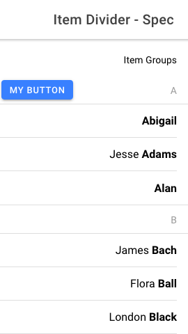
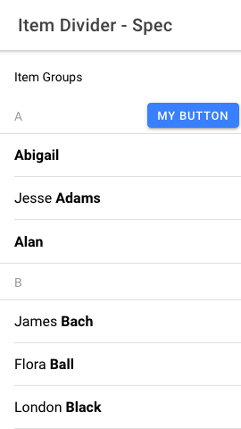
## What is the current behavior?
End slots are lacking margin of 2px when in RTL.
Issue URL: Part of #17012
## What is the new behavior?
- Simplifying `property-horizontal` by removing any margin unset
End slots with buttons will have a margin-end of 2px regardless of
direction.
### Screenshots
## Does this introduce a breaking change?
- [ ] Yes
- [x] No
## Other information
- Continuation of ionic-team/ionic-framework#27024 in order to apply it
to Framework v7
---------
Co-authored-by: Liam DeBeasi <liamdebeasi@users.noreply.github.com>
Co-authored-by: ionitron <hi@ionicframework.com>
BREAKING CHANGE:

The default value for the `--placeholder-opacity` CSS Variable on `ion-input`, `ion-searchbar`, `ion-select`, and `ion-textarea` has been updated to `0.6`.
this commit removes a globally injected style, `ionic.skip-warns.scss`,
from the project. this stylesheet was used to set a variable, `$Ionic`,
that would turn on/off deprecation warnings in (the also removed)
`ionic.deprecation.scss`. any file using either of the aforementioned
files have been updated.

this change is occurring while the stencil team is looking to improve
the size of generated components that use >1 mode. this deprecation was
a part of an initiative to remove sass source files from artifact
published to npm. while that was completed, this deprecation was not
removed (until now)

Co-authored-by: Liam DeBeasi <liamdebeasi@users.noreply.github.com>
BREAKING CHANGE:

- The `swipeToClose` property has been removed in favor of `canDismiss`.
- The `canDismiss` property now defaults to `true` and can no longer be set to `undefined`.


